Work-in-progress 🚧
You are reading the work-in-progress first edition of Causal Inference in R. This chapter is mostly complete, but we might make small tweaks or copyedits.
You are reading the work-in-progress first edition of Causal Inference in R. This chapter is mostly complete, but we might make small tweaks or copyedits.
In this chapter, we’ll analyze data using techniques we learn in this book. We’ll play the whole game of causal analysis using a few key steps:
We’ll focus on the broader ideas behind each step and what they look like all together; however, we don’t expect you to fully digest each idea. We’ll spend the rest of the book taking up each step in detail.
In this guided exercise, we’ll attempt to answer a causal question: does using a bed net reduce the risk of malaria?
Malaria remains a serious public health issue. While malaria incidence has decreased since 2000, 2020 and the COVID-19 pandemic saw an increase in cases and deaths due primarily to service interruption (“World Malaria Report” 2021). About 86% of malaria deaths occurred in 29 countries. Nearly half of all malaria deaths occurred in just six of those countries: Nigeria (27%), the Democratic Republic of the Congo (12%), Uganda (5%), Mozambique (4%), Angola (3%), and Burkina Faso (3%). Most of these deaths occurred in children under 5 (Fink et al. 2022). Malaria also poses severe health risks to pregnant women and worsens birth outcomes, including early delivery and low birth weight.
Bed nets prevent morbidity and mortality due to malaria by providing a barrier against infective bites by the chief host of malaria parasites, the mosquito. Humans have used bed nets since ancient times. Herodotus, the 5th century BC Greek author of The Histories, observed Egyptians using their fishing nets as bed nets:
Against the gnats, which are very abundant, they have contrived as follows:—those who dwell above the fen-land are helped by the towers, to which they ascend when they go to rest; for the gnats by reason of the winds are not able to fly up high: but those who dwell in the fen-land have contrived another way instead of the towers, and this is it:—every man of them has got a casting net, with which by day he catches fish, but in the night he uses it for this purpose, that is to say he puts the casting-net round about the bed in which he sleeps, and then creeps in under it and goes to sleep: and the gnats, if he sleeps rolled up in a garment or a linen sheet, bite through these, but through the net they do not even attempt to bite (Macaulay 2008).
Many modern nets are also treated with insecticide, dating back to Russian soldiers in World War II (Nevill et al. 1996), although some people still use them as fishing nets (Gettleman 2015).
It’s easy to imagine a randomized trial that deals with this question: participants in a study are randomly assigned to use a bed net or not, and we follow them over time to see if there is a difference in malaria risk between groups. Randomization is often the best way to estimate a causal effect of an intervention because it reduces the number of assumptions we need to make for that estimate to be valid (we will discuss these assumptions in Section 3.2). In particular, randomization addresses confounding very well, accounting for confounders about which we may not even know.
Several landmark trials in the 1990s studied the effects of bed net use on malaria risk. A 2004 meta-analysis found that insecticide-treated nets reduced childhood mortality by 17%, malarial parasite prevalence by 13%, and cases of uncomplicated and severe malaria by about 50% (compared to no nets) (Lengeler 2004). Since the World Health Organization began recommending insecticide-treated nets, insecticide resistance has been a big concern. However, a follow-up analysis of trials found that it has yet to impact the public health benefits of bed nets (Pryce, Richardson, and Lengeler 2018).
Trials have also been influential in determining the economics of bed net programs. For instance, one trial compared free net distribution versus a cost-share program (where participants pay a subsidized fee for nets). The study’s authors found that net uptake was similar between the groups and that free net distribution — because it was easier to access — saved more lives, and was cheaper per life saved than the cost-sharing program (Cohen and Dupas 2010).
There are several reasons we might not be able to conduct a new randomized trial to estimate the effect of bed net use on malaria risk, including ethics, cost, and time. We have substantial, robust evidence in favor of bed net use, but let’s consider some conditions where observational causal inference could help.
Imagine we are at a time before trials on this subject, and let’s say people have started to use bed nets for this purpose on their own. Our goal may still be to conduct a randomized trial, but we can answer questions more quickly with observed data. In addition, this study’s results might guide trials’ design or intermediary policy suggestions.
Sometimes, it is also not ethical to conduct a trial. An example of this in malaria research is a question that arose in the study of bed net effectiveness: does malaria control in early childhood result in delayed immunity to the disease, resulting in severe malaria or death later in life? Since we now know bed net use is very effective, withholding nets would be unethical. A recent observational study found that the benefits of bed net use in childhood on all-cause mortality persist into adulthood (Fink et al. 2022).
We may also want to estimate a different effect or the effect for another population than in previous trials. For example, both randomized and observational studies helped us better understand that insecticide-based nets improve malaria resistance in the entire community, not just among those who use nets, so long as net usage is high enough (Howard et al. 2000; Hawley et al. 2003).
As we’ll see in Chapter 6 and Chapter 13, the causal inference techniques that we’ll discuss in this book are often beneficial even when we’re able to randomize.
When we conduct an observational study, it’s still helpful to think through the randomized trial we would run were it possible. The trial we’re trying to emulate in this causal analysis is the target trial. Considering the target trial helps us make our causal question more precise. We’ll use this framework more explicitly in Section 3.3, but for now, let’s consider the causal question posed earlier: does using a bed net (a mosquito net) reduce the risk of malaria? This question is relatively straightforward, but it is still vague. As we saw in Chapter 1, we need to clarify some key areas:
What do we mean by “bed net”? There are several types of nets: untreated bed nets, insecticide-treated bed nets, and newer long-lasting insecticide-treated bed nets.
Risk compared to what? Are we, for instance, comparing insecticide-treated bed nets to no net? Untreated nets? Or are we comparing a new type of net, like long-lasting insecticide-treated bed nets, to nets that are already in use?
Risk as defined by what? Whether or not a person contracted malaria? Whether a person died of malaria?
Risk among whom? What population are we trying to apply this knowledge to? Who is it practical to include in our study? Who might we need to exclude?
We will use simulated data to answer a more specific question: Does using insecticide-treated bed nets compared to no nets decrease the risk of contracting malaria after 1 year? In this particular data, simulated by Dr. Andrew Heiss:
…researchers are interested in whether using mosquito nets decreases an individual’s risk of contracting malaria. They have collected data from 1,752 households in an unnamed country and have variables related to environmental factors, individual health, and household characteristics. The data is not experimental—researchers have no control over who uses mosquito nets, and individual households make their own choices over whether to apply for free nets or buy their own nets, as well as whether they use the nets if they have them.
Because we’re using simulated data, we’ll have direct access to an outcome variable that measures the likelihood of contracting malaria, something we wouldn’t likely have in real life. We’ll stick with this measure because it allows us to more closely inspect the actual effect size, whereas, in practice, we would need to approximate the effect size through another proxy such as regular malaria testing among the population. We can also safely assume that the population in our dataset represents the population we want to make inferences about (the unnamed country) because the data are simulated as such. We can find the simulated data in net_data from the {causalworkshop} package, which includes ten variables:
idan ID variable
net and net_num
a binary variable indicating if the participant used a net (1) or didn’t use a net (0)
malaria_riskrisk of malaria scale ranging from 0-100
incomeweekly income, measured in dollars
healtha health score scale ranging from 0–100
householdnumber of people living in the household
eligiblea binary variable indicating if the household is eligible for the free net program.
temperaturethe average temperature at night, in Celsius
resistanceInsecticide resistance of local mosquitoes. A scale of 0–100, with higher values indicating higher resistance.
The distribution of malaria risk appears to be quite different by net usage.
library(tidyverse)
library(causalworkshop)
net_data |>
  ggplot(aes(malaria_risk, fill = net)) +
  geom_density(color = NA, alpha = 0.8)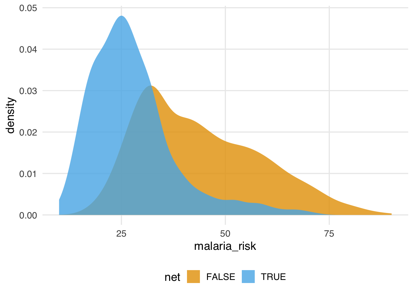
In Figure 2.1, the density of those who used nets is to the left of those who did not use nets. The mean difference in malaria risk is about 16.4, suggesting net use might be protective against malaria.
# A tibble: 2 × 2
  net   malaria_risk
  <lgl>        <dbl>
1 FALSE         43.9
2 TRUE          27.5
And that’s what we see with simple linear regression, as well, as we would expect.
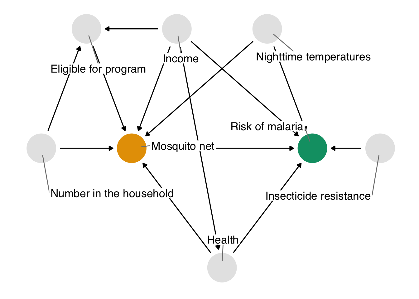
If we attempt to interpret the above simple estimates as causal estimates, a problem that we face is that other factors may be responsible for the effect we’re seeing. In this example, we’ll focus on confounding: a common cause of net usage and malaria will bias the effect we see unless we account for it somehow. One of the best ways to determine which variables we need to account for is to use a causal diagram. These diagrams, also called causal directed acyclic graphs (DAGs), visualize the assumptions that we’re making about the causal relationships between the exposure, outcome, and other variables we think might be related. Importantly, DAG construction is not a data-driven approach; rather, we arrive at our proposed DAG through expert background knowledge regarding the structure of the causal question.
Here’s the DAG that we’re proposing for this question.
We’ll explore how to create and analyze DAGs in Chapter 4.
In DAGs, each point represents a variable, and each arrow represents a cause. In other words, this diagram declares what we think the causal relationships are between these variables. In Figure 2.2, we’re saying that we believe:
You may agree or disagree with some of these assertions. That’s a good thing! Laying bare our assumptions allows us to transparently evaluate the scientific credibility of our analysis. Another benefit of using DAGs is that, thanks to their underlying mathematics, we can determine precisely the subset of variables we need to account for if we assume this DAG is correct.
In this exercise, we’re providing you with a reasonable DAG based on knowledge of how the data were generated. In real life, setting up a DAG is a challenge requiring deep thought, domain expertise, and (often) collaboration between several experts.
The chief problem we’re dealing with is that, when we analyze the data we’re working with, we see the impact of net usage on malaria risk and of all these other relationships. In DAG terminology, we have more than one open causal pathway. If this DAG is correct, we have eight causal pathways: the path between net usage and malaria risk and seven other confounding pathways. The association between bed net use and malaria risk is a mixture of all of these pathways.
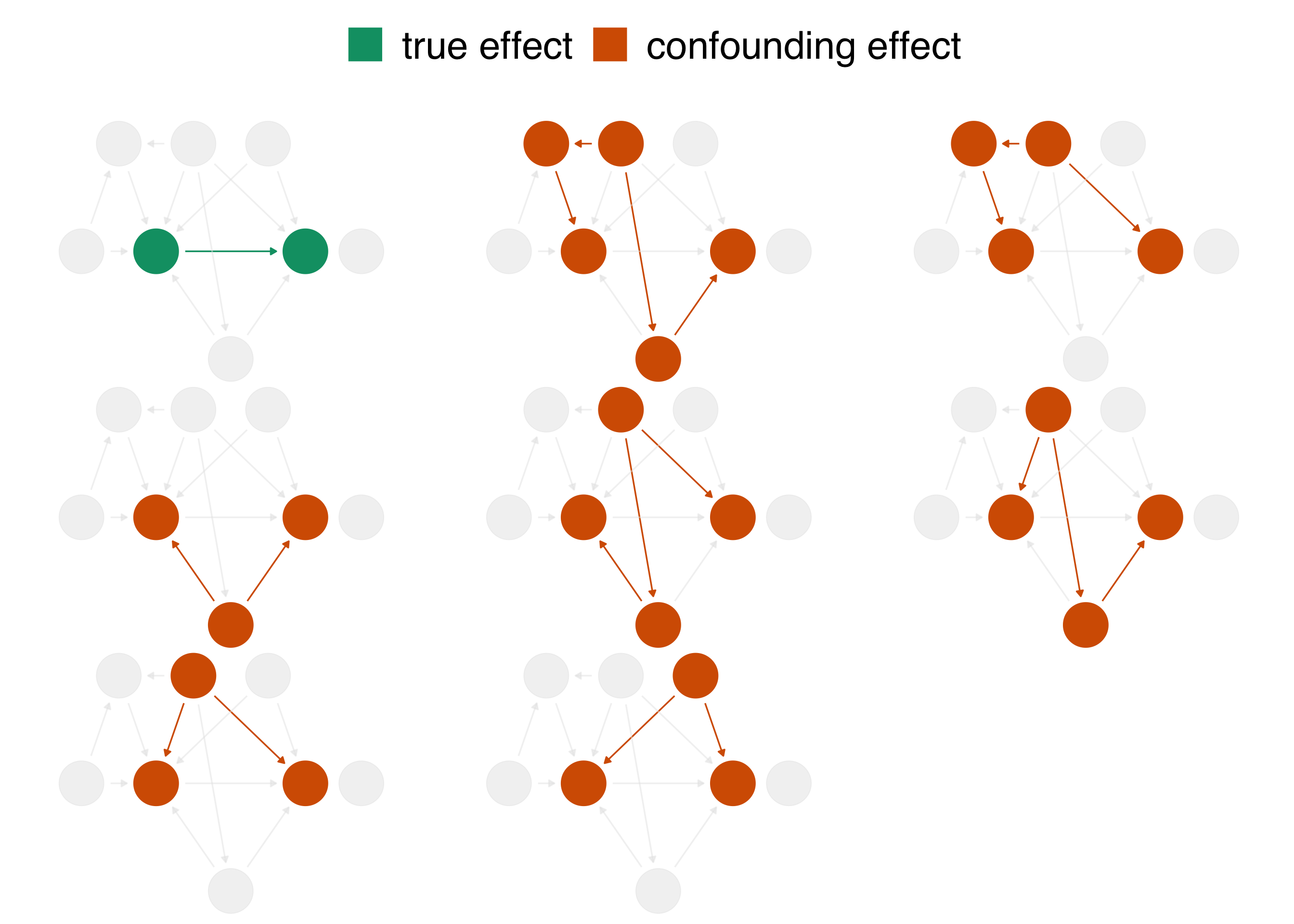
When we calculate a naive linear regression that only includes net usage and malaria risk, the effect we see is incorrect because the seven other confounding pathways in Figure 2.3 distort it. In DAG terminology, we need to block these open pathways that distort the causal estimate we’re after. (We can block paths through several techniques, including stratification, matching, weighting, and more. We’ll see several methods throughout the book.) Luckily, by specifying a DAG, we can precisely determine the variables we need to control for. For this DAG, we need to control for three variables: health, income, and temperature. These three variables are a minimal adjustment set, the minimum set (or sets) of variables you need to block all confounding pathways. We’ll discuss adjustment sets further in Chapter 4.
We’ll use a technique called inverse probability weighting (IPW) to control for these variables, which we’ll discuss in detail in Section 8.2. We’ll use logistic regression to predict the probability of treatment based on the confounders—the propensity score. Then, we’ll calculate inverse probability weights to apply to the linear regression model we fit above. The propensity score model includes the exposure—net use—as the dependent variable and the minimal adjustment set as the independent variables.
Generally speaking, we want to lean on domain expertise and good modeling practices to fit the propensity score model. For instance, we may want to allow continuous confounders to be non-linear using splines, or we may want to add essential interactions between confounders. Because these are simulated data, we know we don’t need these extra parameters (so we’ll skip them), but in practice, you often do. We’ll discuss this more in Section 8.2.
The propensity score model is a logistic regression model with the formula net ~ income + health + temperature, which predicts the probability of bed net usage based on the confounders income, health, and temperature.
propensity_model <- glm(
  net ~ income + health + temperature,
  data = net_data,
  family = binomial()
)

# the first six propensity scores
head(predict(propensity_model, type = "response"))
1 2 3 4 5 6
0.2464 0.2178 0.3230 0.2307 0.2789 0.3060 We can use propensity scores to control for confounding in various ways. In this example, we’ll focus on weighting. In particular, we’ll compute the inverse probability weight for the average treatment effect (ATE). The ATE represents a particular causal question: what if everyone in the study used bed nets vs. what if no one in the study used bed nets?
To calculate the ATE, we’ll use the broom and propensity packages. broom’s augment() function extracts prediction-related information from the model and joins it to the data. propensity’s wt_ate() function calculates the inverse probability weight given the propensity score and exposure.
For inverse probability weighting, the ATE weight is the inverse of probability of receiving the treatment you actually received. In other words, if you used a bed net, the ATE weight is the inverse of the probability that you used a net, and if you did not use a net, it is the the inverse of the probability that you did not use a net.
library(broom)
library(propensity)
net_data_wts <- propensity_model |>
  augment(data = net_data, type.predict = "response") |>
  # .fitted is the value predicted by the model
  # for a given observation
  mutate(wts = wt_ate(.fitted, net))

net_data_wts |>
  select(net, .fitted, wts) |>
  head()
# A tibble: 6 × 3
net .fitted wts
<lgl> <dbl> <psw{ate}>
1 FALSE 0.246 1.327
2 FALSE 0.218 1.279
3 FALSE 0.323 1.477
4 FALSE 0.231 1.300
5 FALSE 0.279 1.387
6 FALSE 0.306 1.441wts represents the amount each observation will be up-weighted or down-weighted in the outcome model we will soon fit. For instance, the 16th household used a bed net and had a predicted probability of 0.41. That’s a pretty low probability considering they did, in fact, use a net, so their weight is higher at 2.42. In other words, this household will be up-weighted compared to the naive linear model we fit above. The first household did not use a bed net; they’re predicted probability of net use was 0.25 (or put differently, a predicted probability of not using a net of 0.75). That’s more in line with their observed value of net, but there’s still some predicted probability of using a net, so their weight is 1.28.
The goal of propensity score weighting is to weight the population of observations such that the distribution of confounders is balanced between the exposure groups. Put another way, we are, in principle, removing the arrows between the confounders and exposure in the DAG, so that the confounding paths no longer distort our estimates. Here’s the distribution of the propensity score by group, created by geom_mirror_histogram() from the {halfmoon} package for assessing balance in propensity score models:
library(halfmoon)
ggplot(net_data_wts, aes(.fitted)) +
  geom_mirror_histogram(
    aes(fill = net),
    bins = 50
  ) +
  scale_y_continuous(labels = abs) +
  labs(x = "propensity score")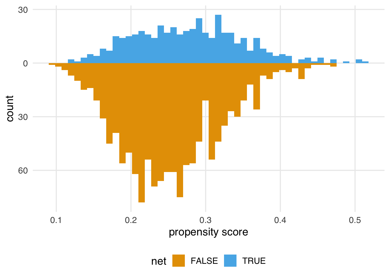
The weighted propensity score creates a pseudo-population where the distributions are much more similar:
ggplot(net_data_wts, aes(.fitted)) +
  geom_mirror_histogram(
    aes(group = net),
    bins = 50
  ) +
  geom_mirror_histogram(
    aes(fill = net, weight = wts),
    bins = 50,
    alpha = 0.5
  ) +
  scale_y_continuous(labels = abs) +
  labs(x = "propensity score")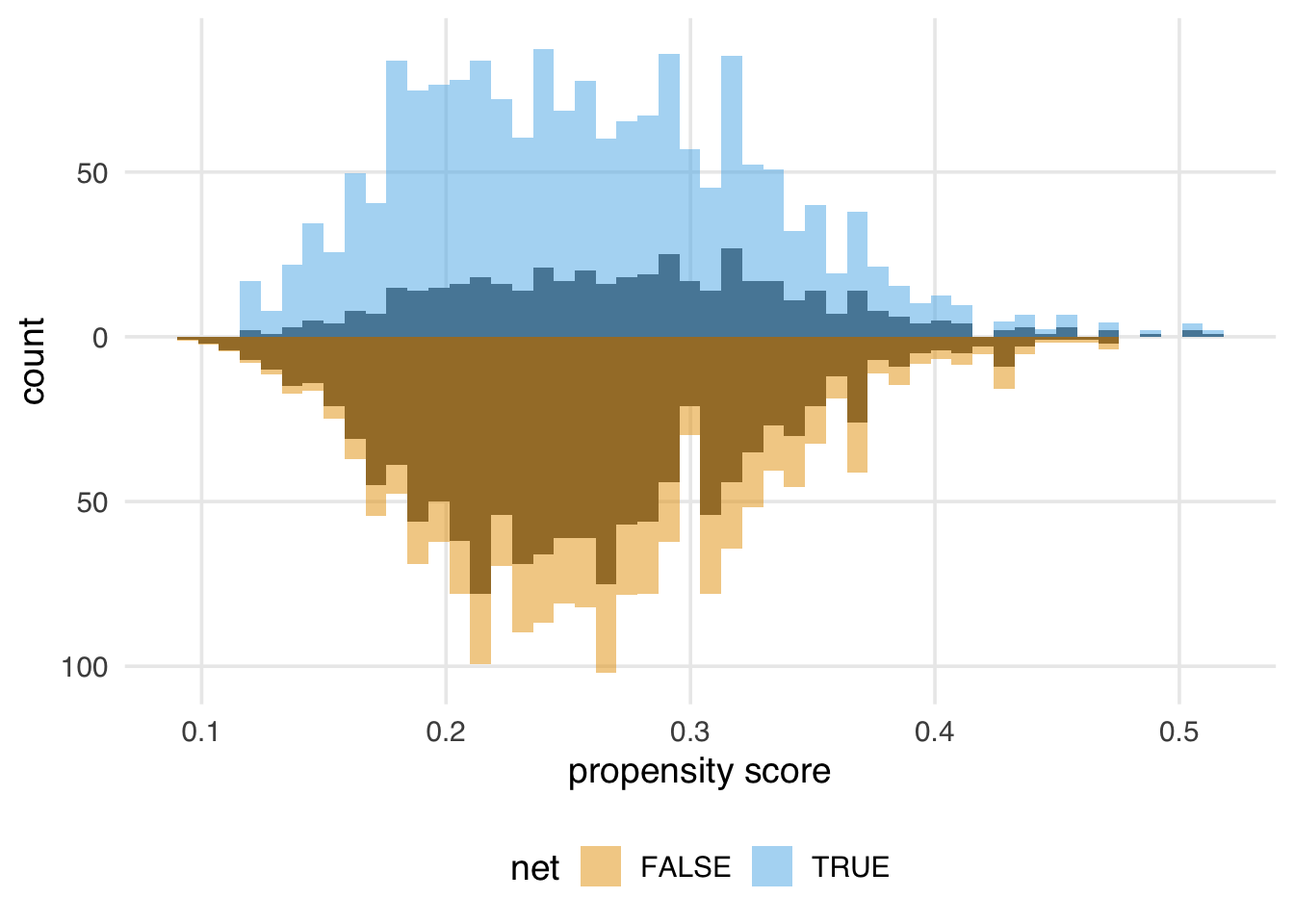
In this example, the unweighted distributions are not awful—the shapes are somewhat similar here, and they overlap quite a bit—but the weighted distributions in Figure 2.5 are much more similar.
Propensity score weighting and most other causal inference techniques only help with observed confounders—ones that we model correctly, at that. Unfortunately, we still may have unmeasured confounding, which we’ll discuss below.
Randomization is one causal inference technique that does deal with unmeasured confounding, one of the reasons it is so powerful.
We might also want to know how well-balanced the groups are by each confounder. One way to do this is to calculate the standardized mean differences (SMDs) for each confounder with and without weights. We’ll calculate the SMDs with tidy_smd() then plot them with geom_love(), both of which are functions from halfmoon.
plot_df <- tidy_smd(
  net_data_wts,
  c(income, health, temperature),
  .group = net,
  .wts = wts
)

ggplot(
  plot_df,
  aes(
    x = abs(smd),
    y = variable,
    group = method,
    color = method
  )
) +
  geom_love()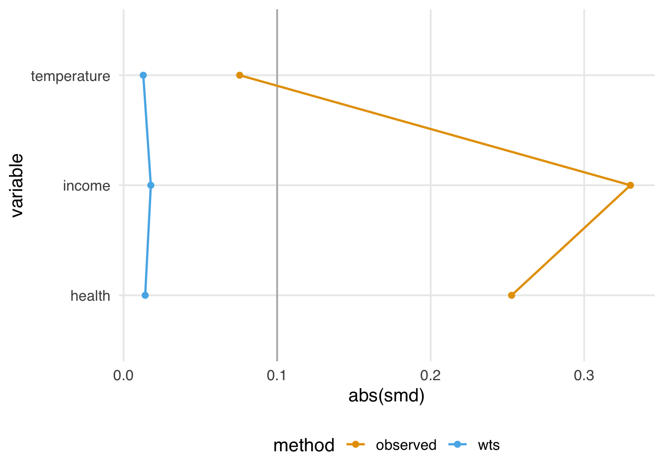
A standard guideline is that balanced confounders should have an SMD of less than 0.1 on the absolute scale. 0.1 is just a rule of thumb, but if we follow it, the variables in Figure 2.6 are well-balanced after weighting (and unbalanced before weighting).
Before we apply the weights to the outcome model, let’s check their overall distribution for extreme weights. Extreme weights can destabilize the estimate and variance in the outcome model, so we want to be aware of it. We’ll also discuss several other types of weights that are less prone to this issue in Chapter 10.
net_data_wts |>
  ggplot(aes(wts)) +
  geom_density(fill = "#CC79A7", color = NA, alpha = 0.8)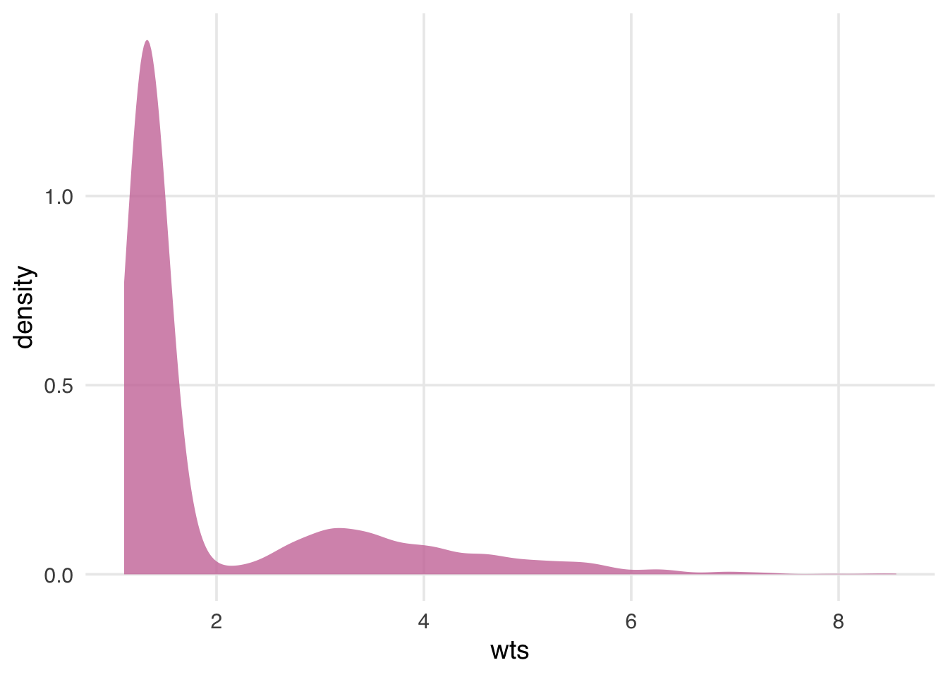
The weights in Figure 2.7 are skewed, but there are no outrageous values. If we saw extreme weights, we might try trimming or stabilizing them, or consider calculating an effect for a different estimand, which we’ll discuss in Chapter 10. It doesn’t look like we need to do that here, however.
We’re now ready to use the ATE weights to (attempt to) account for confounding in the naive linear regression model. Fitting such a model is pleasantly simple in this case: we fit the same model as before but with weights = wts, which will incorporate the inverse probability weights.
# A tibble: 2 × 7
  term   estimate std.error statistic  p.value conf.low
  <chr>     <dbl>     <dbl>     <dbl>    <dbl>    <dbl>
1 (Inte…     42.7     0.442      96.7 0            41.9
2 netTR…    -12.5     0.624     -20.1 5.50e-81    -13.8
# ℹ 1 more variable: conf.high <dbl>
The estimate for the average treatment effect is -12.5 (95% CI -13.8, -11.3). Unfortunately, the confidence intervals we’re using are wrong because they don’t account for the uncertainty in estimating the weights. Generally, confidence intervals for propensity score weighted models will be too narrow unless we account for this uncertainty. The nominal coverage of the confidence intervals will thus be wrong (they aren’t 95% CIs because their coverage is much lower than 95%) and may lead to misinterpretation.
We’ve got several ways to address this problem, which we’ll discuss in detail in Chapter 11, including the bootstrap, robust standard errors, and manually accounting for the estimation procedure with empirical sandwich estimators. For this example, we’ll use the bootstrap, a flexible tool that calculates distributions of parameters using re-sampling. The bootstrap is a useful tool for many causal models where closed-form solutions to problems (particularly standard errors) don’t exist or when we want to avoid parametric assumptions inherent to many such solutions; see Appendix A for a description of what the bootstrap is and how it works. We’ll use the rsample package from the tidymodels ecosystem to work with bootstrap samples.
Because the bootstrap is so flexible, we need to think carefully about the sources of uncertainty in the statistic we’re calculating. It might be tempting to write a function like this to fit the statistic we’re interested in (the point estimate for netTRUE):
library(rsample)

fit_ipw_not_quite_rightly <- function(.split, ...) {
  # get bootstrapped data frame
  .df <- as.data.frame(.split)

  # fit ipw model
  lm(malaria_risk ~ net, data = .df, weights = wts) |>
    tidy()
}
However, this function won’t give us the correct confidence intervals because it treats the inverse probability weights as fixed values. They’re not, of course; we just estimated them using logistic regression! We need to account for this uncertainty by bootstrapping the entire modeling process. For every bootstrap sample, we need to fit the propensity score model, calculate the inverse probability weights, then fit the weighted outcome model.
library(rsample)

fit_ipw <- function(.split, ...) {
  # get bootstrapped data frame
  .df <- as.data.frame(.split)

  # fit propensity score model
  propensity_model <- glm(
    net ~ income + health + temperature,
    data = .df,
    family = binomial()
  )

  # calculate inverse probability weights
  .df <- propensity_model |>
    augment(type.predict = "response", data = .df) |>
    mutate(wts = wt_ate(.fitted, net))

  # fit correctly bootstrapped ipw model
  lm(malaria_risk ~ net, data = .df, weights = wts) |>
    tidy()
}
Now that we know precisely how to calculate the estimate for each iteration let’s create the bootstrapped dataset with rsample’s bootstraps() function. The times argument determines how many bootstrapped datasets to create; we’ll do 1,000.
bootstrapped_net_data <- bootstraps(
  net_data,
  times = 1000,
  # required to calculate CIs later
  apparent = TRUE
)

bootstrapped_net_data
# Bootstrap sampling with apparent sample
# A tibble: 1,001 × 2
splits id
<list> <chr>
1 <split [1752/641]> Bootstrap0001
2 <split [1752/639]> Bootstrap0002
3 <split [1752/660]> Bootstrap0003
4 <split [1752/653]> Bootstrap0004
5 <split [1752/646]> Bootstrap0005
6 <split [1752/649]> Bootstrap0006
7 <split [1752/638]> Bootstrap0007
8 <split [1752/659]> Bootstrap0008
9 <split [1752/649]> Bootstrap0009
10 <split [1752/639]> Bootstrap0010
# ℹ 991 more rowsThe result is a nested data frame: each splits object contains metadata that rsample uses to subset the bootstrap samples for each of the 1,000 samples. We actually have 1,001 rows because apparent = TRUE keeps a copy of the original data frame, as well, which is needed for some types of confidence interval calculations. Next, we’ll run fit_ipw() 1,001 times to create a distribution for estimate. At its heart, the calculation we’re doing is
fit_ipw(bootstrapped_net_data$splits[[n]])Where n is one of 1,001 indices. We’ll use purrr’s map() function to iterate across each split object.
# Bootstrap sampling with apparent sample
# A tibble: 1,001 × 3
   splits             id            boot_fits
   <list>             <chr>         <list>
 1 <split [1752/641]> Bootstrap0001 <tibble [2 × 5]>
 2 <split [1752/639]> Bootstrap0002 <tibble [2 × 5]>
 3 <split [1752/660]> Bootstrap0003 <tibble [2 × 5]>
 4 <split [1752/653]> Bootstrap0004 <tibble [2 × 5]>
 5 <split [1752/646]> Bootstrap0005 <tibble [2 × 5]>
 6 <split [1752/649]> Bootstrap0006 <tibble [2 × 5]>
 7 <split [1752/638]> Bootstrap0007 <tibble [2 × 5]>
 8 <split [1752/659]> Bootstrap0008 <tibble [2 × 5]>
 9 <split [1752/649]> Bootstrap0009 <tibble [2 × 5]>
10 <split [1752/639]> Bootstrap0010 <tibble [2 × 5]>
# ℹ 991 more rows
The result is another nested data frame with a new column, boot_fits. Each element of boot_fits is the result of the IPW for the bootstrapped dataset. For example, in the first bootstrapped data set, the IPW results were:
ipw_results$boot_fits[[1]]# A tibble: 2 × 5
term estimate std.error statistic p.value
<chr> <dbl> <dbl> <dbl> <dbl>
1 (Intercept) 42.6 0.435 98.0 0
2 netTRUE -13.1 0.615 -21.3 1.58e-89Now we have a distribution of estimates:
ipw_results |>
  # remove original data set results
  filter(id != "Apparent") |>
  mutate(
    estimate = map_dbl(
      boot_fits,
      # pull the `estimate` for `netTRUE` for each fit
      \(.fit) {
        .fit |>
          filter(term == "netTRUE") |>
          pull(estimate)
      }
    )
  ) |>
  ggplot(aes(estimate)) +
  geom_histogram(fill = "#D55E00FF", color = "white", alpha = 0.8)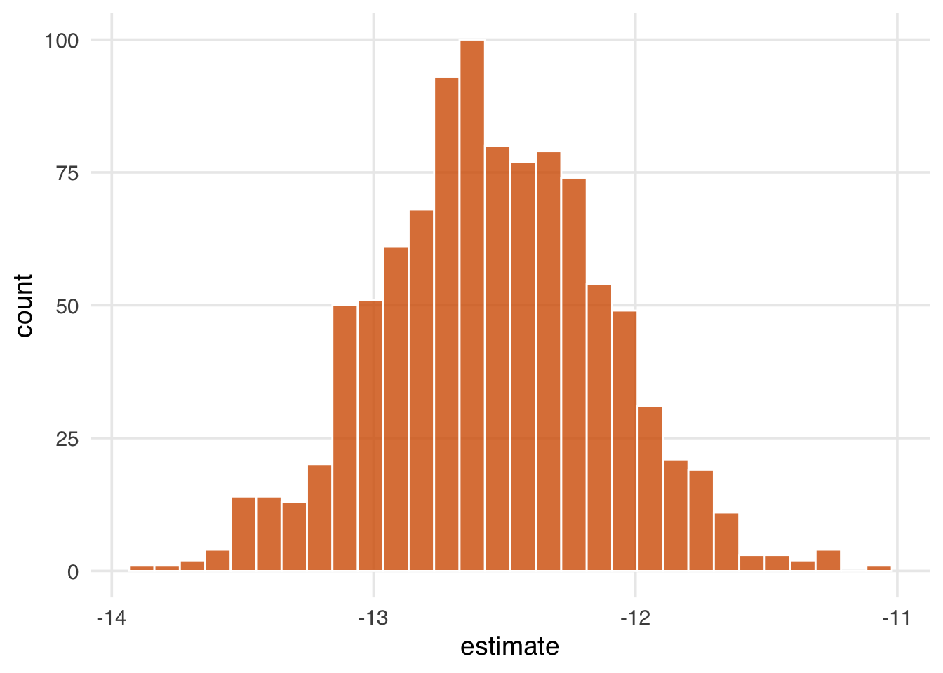
Figure 2.8 gives a sense of the variation in estimate, but let’s calculate 95% confidence intervals from the bootstrapped distribution using rsample’s int_t() :
boot_estimate <- ipw_results |>
  # calculate T-statistic-based CIs
  int_t(boot_fits) |>
  filter(term == "netTRUE")

boot_estimate
# A tibble: 1 × 6
term .lower .estimate .upper .alpha .method
<chr> <dbl> <dbl> <dbl> <dbl> <chr>
1 netTRUE -13.4 -12.6 -11.6 0.05 student-tNow we have a confounder-adjusted estimate with correct standard errors. The estimate of the effect of all households using bed nets versus no households using bed nets on malaria risk is -12.6 (95% CI -13.4, -11.6). Bed nets do indeed seem to reduce malaria risk in this study.
We’ve laid out a roadmap for taking observational data, thinking critically about the causal question we want to ask, identifying the assumptions we need to get there, then applying those assumptions to a statistical model. Getting the correct answer to the causal question relies on getting our assumptions more or less right. But what if we’re more on the less correct side?
Spoiler alert: the answer we just calculated is wrong. After all that effort!
When conducting a causal analysis, it’s a good idea to use sensitivity analyses to test your assumptions. There are many potential sources of bias in any study and many sensitivity analyses to go along with them (Chapter 16); here, we’ll focus on the assumption of no confounding.
Let’s start with a broad sensitivity analysis; then, we’ll ask questions about specific unmeasured confounders. When we have less information about unmeasured confounders, we can use tipping point analysis to ask how much confounding it would take to tip my estimate to the null. In other words, what would the strength of the unmeasured confounder have to be to explain our results away? The tipr package is a toolkit for conducting sensitivity analyses. Let’s examine the tipping point for an unknown, normally-distributed confounder. The tip_coef() function takes an estimate (a beta coefficient from a regression model, or the upper or lower bound of the coefficient). It further requires either the 1) scaled differences in means of the confounder between exposure groups or 2) effect of the confounder on the outcome. For the estimate, we’ll use conf.high, which is closer to 0 (the null), and ask: how much would the confounder have to affect malaria risk to have an unbiased upper confidence interval of 0? We’ll use tipr to calculate this answer for 5 scenarios, where the mean difference in the confounder between exposure groups is 1, 2, 3, 4, or 5.
library(tipr)
tipping_points <- tip_coef(
  boot_estimate$.upper,
  exposure_confounder_effect = 1:5
)

tipping_points |>
  ggplot(aes(confounder_outcome_effect, exposure_confounder_effect)) +
  geom_line(color = "#009E73", linewidth = 1.1) +
  geom_point(fill = "#009E73", color = "white", size = 2.5, shape = 21) +
  labs(
    x = "Confounder-Outcome Effect",
    y = "Scaled mean differences in\n confounder between exposure groups"
  )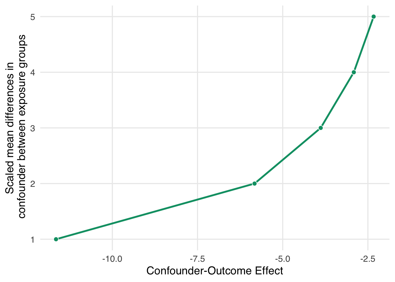
If we had an unmeasured confounder where the standardized mean difference between exposure groups was 1, the confounder would need to decrease malaria risk by about -11.6. That’s pretty strong relative to other effects, but it may be feasible if we have an idea of something we might have missed. Conversely, suppose the relationship between net use and the unmeasured confounder is very strong, with a mean scaled difference of 5. In that case, the confounder-malaria relationship only needs to be -2.3. Now we have to consider: which of these scenarios are plausible given our domain knowledge and the effects we see in this analysis?
Now let’s consider a much more specific sensitivity analysis. Some ethnic groups, such as the Fulani, have a genetic resistance to malaria (Arama et al. 2015). Let’s say that in our simulated data, an unnamed ethnic group in the unnamed country shares this genetic resistance to malaria. For historical reasons, bed net use in this group is also very high. We don’t have this variable in net_data, but let’s say we know from the literature that in this sample, we can estimate at:
With this amount of information, we can use tipr to adjust the estimates we calculated for the unmeasured confounder. We’ll use adjust_coef_with_binary() to calculate the adjusted estimates.
adjusted_estimates <- boot_estimate |>
  select(.estimate, .lower, .upper) |>
  unlist() |>
  adjust_coef_with_binary(
    exposed_confounder_prev = 0.26,
    unexposed_confounder_prev = 0.05,
    confounder_outcome_effect = -10
  )

adjusted_estimates
# A tibble: 3 × 4
effect_adjusted effect_observed
<dbl> <dbl>
1 -10.5 -12.6
2 -11.3 -13.4
3 -9.50 -11.6
# ℹ 2 more variables:
# exposure_confounder_effect <dbl>,
# confounder_outcome_effect <dbl>The adjusted estimate for a situation where genetic resistance to malaria is a confounder is -10.5 (95% CI -11.3, -9.5).
In fact, these data were simulated with just such a confounder. The true effect of net use on malaria is about -10, and the true DAG that generated these data is:
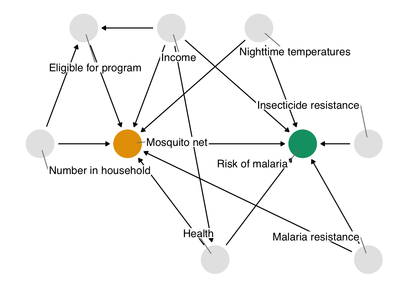
net_data. This DAG is identical to the one we proposed with one addition: genetic resistance to malaria causally reduces the risk of malaria and impacts net use. It’s thus a confounder and a part of the minimal adjustment set required to get an unbiased effect estimate. In otherwords, by not including it, we’ve calculated the wrong effect.
The unmeasured confounder in Figure 2.10 is available in the dataset net_data_full as genetic_resistance. If we recalculate the IPW estimate of the average treatment effect of nets on malaria risk, we get -10.3 (95% CI -11.2, -9.2), much closer to the actual answer of -10.
What do you think? Is this estimate reliable? Did we do a good job addressing the assumptions we need to make for a causal effect, mainly that there is no confounding? How might you criticize this model, and what would you do differently? Ok, we know that -10 is the correct answer because the data are simulated, but in practice, we can never be sure, so we need to continue probing our assumptions until we’re confident they are robust. We’ll explore these techniques and others in Chapter 16.
To calculate this effect, we:
Throughout the rest of the book, we’ll follow these broad steps in examples from many domains. We’ll dive more deeply into propensity score techniques, explore other methods for estimating causal effects, and, most importantly, make sure, over and over again, that the assumptions we’re making are reasonable—even if we’ll never know for sure.