Work-in-progress 🚧
You are reading the work-in-progress first edition of Causal Inference in R. This chapter has its foundations written but is still undergoing changes.
You are reading the work-in-progress first edition of Causal Inference in R. This chapter has its foundations written but is still undergoing changes.
We can never know whether the propensity score model we fit correctly specifies the confounders. However, the propensity score is inherently a balancing score. This fact has a practical implication: if we condition on the propensity score, the distribution of confounders should be similar between exposure groups. In this chapter, we will discuss how to evaluate the practical implications of the propensity score to diagnose potential issues with the propensity score model.
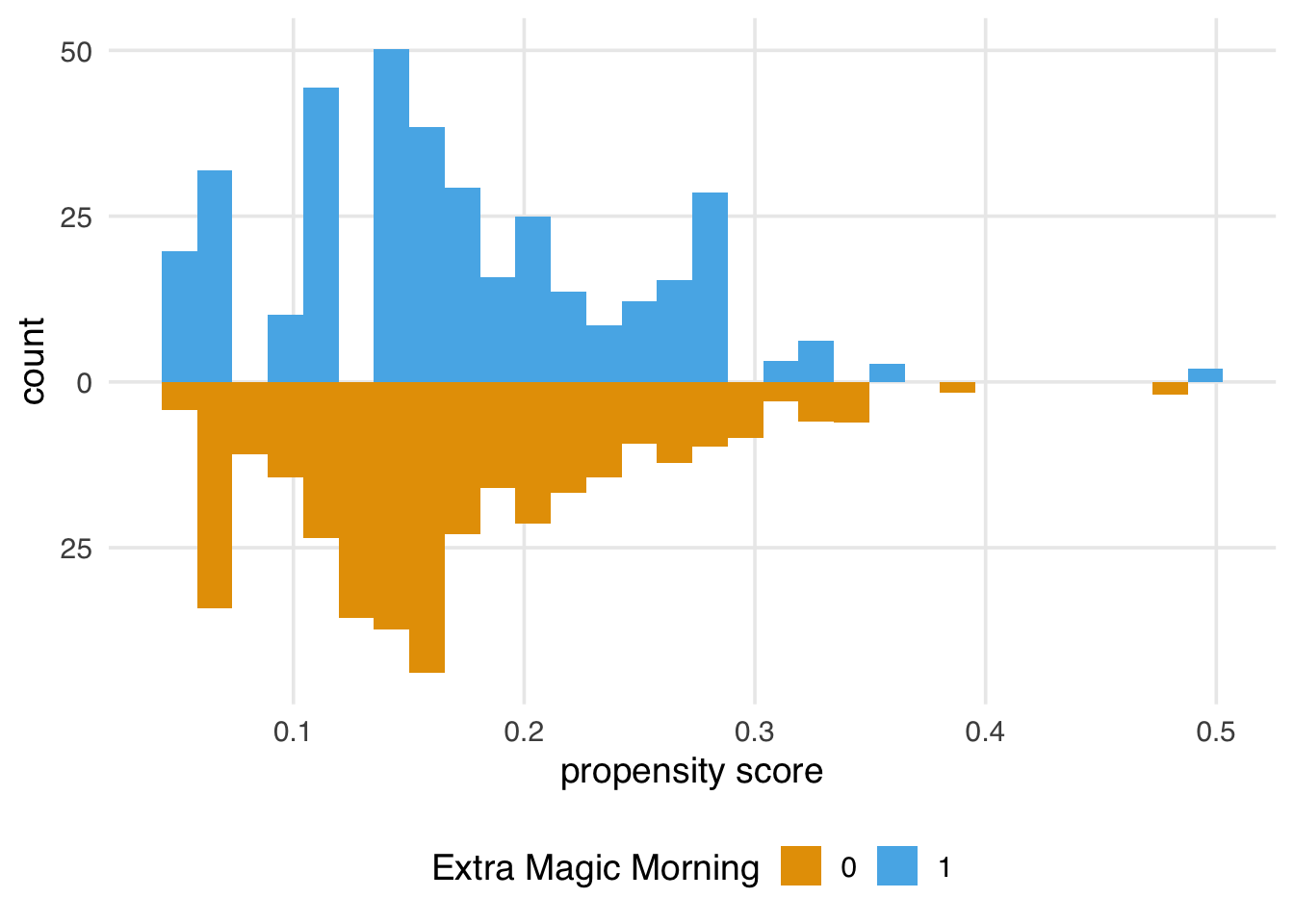
First, let’s revisit some implications of the propensity score at the model level. In Chapter 8, we examined the mirrored distributions of the propensity score between exposure groups. After weighting, we should see greater overlap between the two groups and more similar distributions. Let’s look at an example using the same data as Section 8.2.
library(broom)
library(touringplans)
library(propensity)
library(halfmoon)

seven_dwarfs_9 <- seven_dwarfs_train_2018 |> filter(wait_hour == 9)

seven_dwarfs_9_with_ps <-
  glm(
    park_extra_magic_morning ~
      park_ticket_season + park_close + park_temperature_high,
    data = seven_dwarfs_9,
    family = binomial()
  ) |>
  augment(type.predict = "response", data = seven_dwarfs_9)
seven_dwarfs_9_with_wt <- seven_dwarfs_9_with_ps |>
  mutate(
    w_ate = wt_ate(.fitted, park_extra_magic_morning),
    park_extra_magic_morning = factor(park_extra_magic_morning)
  )
Once we have weights, we can use them in geom_mirror_histogram()’s weight argument to visualize the weighted distributions of the propensity score, as shown in Figure 9.1.
ggplot(
  seven_dwarfs_9_with_wt,
  aes(.fitted, group = park_extra_magic_morning)
) +
  geom_mirror_histogram(
    aes(fill = factor(park_extra_magic_morning), weight = w_ate)
  ) +
  scale_y_continuous(labels = abs) +
  labs(
    x = "propensity score",
    fill = "Extra Magic Morning"
  )
We also might want to look at the weighted and unweighted distributions side-by-side, as shown in Figure 9.2. We can speed up data wrangling and plotting with plot_mirror_distributions().
seven_dwarfs_9_with_wt |>
  plot_mirror_distributions(
    .exposure = park_extra_magic_morning,
    .var = .fitted,
    .weights = w_ate
  ) +
  labs(fill = "extra magic morning")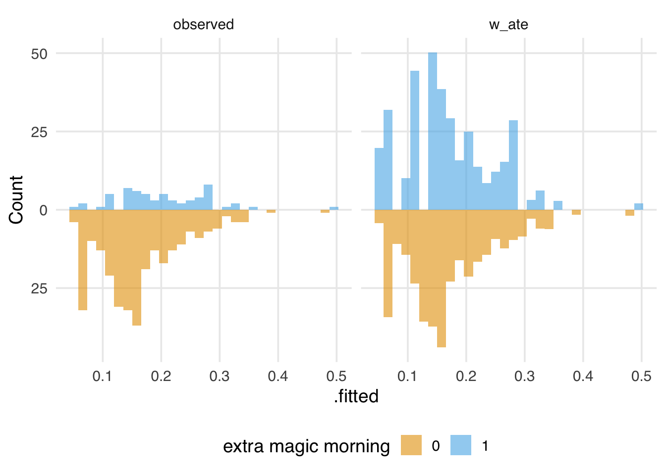
We also examined the ROC curve and AUC for the propensity score model. That is useful for understanding the model’s discrimination and potential positivity violations, but there is also a hidden implication about discrimination: in a randomized trial, the AUC would be about 0.5—there is nothing to distinguish the treatment groups except randomization itself. Likewise, if we weight the ROC curve and AUC calculation, we hope to see the same properties. Indeed, in Figure 9.3, the weighted ROC curve traces the 45-degree line. In a prediction model, this would be bad. In a causal model, however, it means that, after weighting, there is no way to discriminate between the two groups given the included confounders.
seven_dwarfs_9_with_wt |>
  check_model_roc_curve(
    park_extra_magic_morning,
    .fitted,
    .weights = w_ate
  ) |>
  plot_model_roc_curve()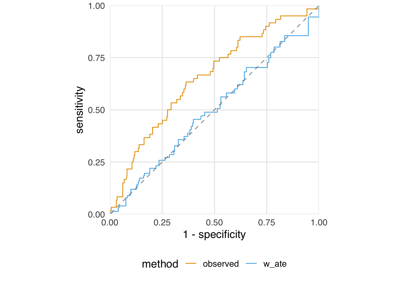
Our model AUC is now 0.50:
check_model_auc(
  seven_dwarfs_9_with_wt,
  .exposure = park_extra_magic_morning,
  .fitted = .fitted,
  .weights = w_ate
)
# A tibble: 2 × 2
method auc
<chr> <dbl>
1 observed 0.654
2 w_ate 0.499One advantage propensity score weights have over matching is statistical efficiency: matching very clearly reduces the sample size when some units don’t get matched. However, weights also introduce variation into the sample, so their precision remains lower than that of the total sample. While summing the weights is a valuable diagnostic, a more intuitive one is the effective sample size (ESS). When using propensity score weights, the ESS represents the approximate number of independent observations—the number of units you would need in an actual sample to get roughly the same precision as the weighted population—after weighting. The formula for ESS is:
\[ ESS = \frac{(\sum_{i=1}^{n} w_i)^2}{\sum_{i=1}^{n} w_i^2} \]
where \(w_i\) represents the weight for observation \(i\). When the weights are all equal to 1, as in the unweighted, unmatched population, the ESS equals the original sample size. When we assign weights via propensity scores, we introduce variation; the greater the variation in the weights, the lower we expect the ESS to be. We’ll see more types of weights in Chapter 10, as well as how we can use ESS to select between weighting schemes, but for now, let’s take a look at the ESS of our ATE weights. The weighted sample will give us the precision of an equivalent 160-day sample, about 46% of the original sample size.
library(scales)
seven_dwarfs_9_with_wt |>
  summarize(
    n = n(),
    ess_ate = ess(w_ate),
    percent_ess_ate = percent(ess_ate / n)
  )
# A tibble: 1 × 3
n ess_ate percent_ess_ate
<int> <dbl> <chr>
1 354 160. 45% It can also be instructive to look at the ESS by exposure group (note that we don’t expect the grouped ESS to sum to the total ESS; the ESS is a measure of the efficiency given the variation in the weights, and this variation differs across the three calculations). We see that the days without Extra Magic Morning retain most of their sample size, indicating less variation in the weights. The days with Extra Magic Morning have a bigger reduction in ESS. The variation in the weights is thus mainly due to the exposed days.
seven_dwarfs_9_with_wt |>
  group_by(park_extra_magic_morning) |>
  summarize(
    n = n(),
    ess_ate = ess(w_ate),
    percent_ess_ate = percent(ess_ate / n)
  )
# A tibble: 2 × 4
park_extra_magic_morn…¹ n ess_ate percent_ess_ate
<fct> <int> <dbl> <chr>
1 0 294 291. 99%
2 1 60 46.7 78%
# ℹ abbreviated name: ¹park_extra_magic_morningWe can see that clearly in the distribution of the weights:
ggplot(
  seven_dwarfs_9_with_wt,
  aes(x = as.numeric(w_ate), fill = park_extra_magic_morning)
) +
  geom_density(color = NA) +
  scale_x_log10() +
  labs(x = "ATE weight", fill = "Extra Magic Morning")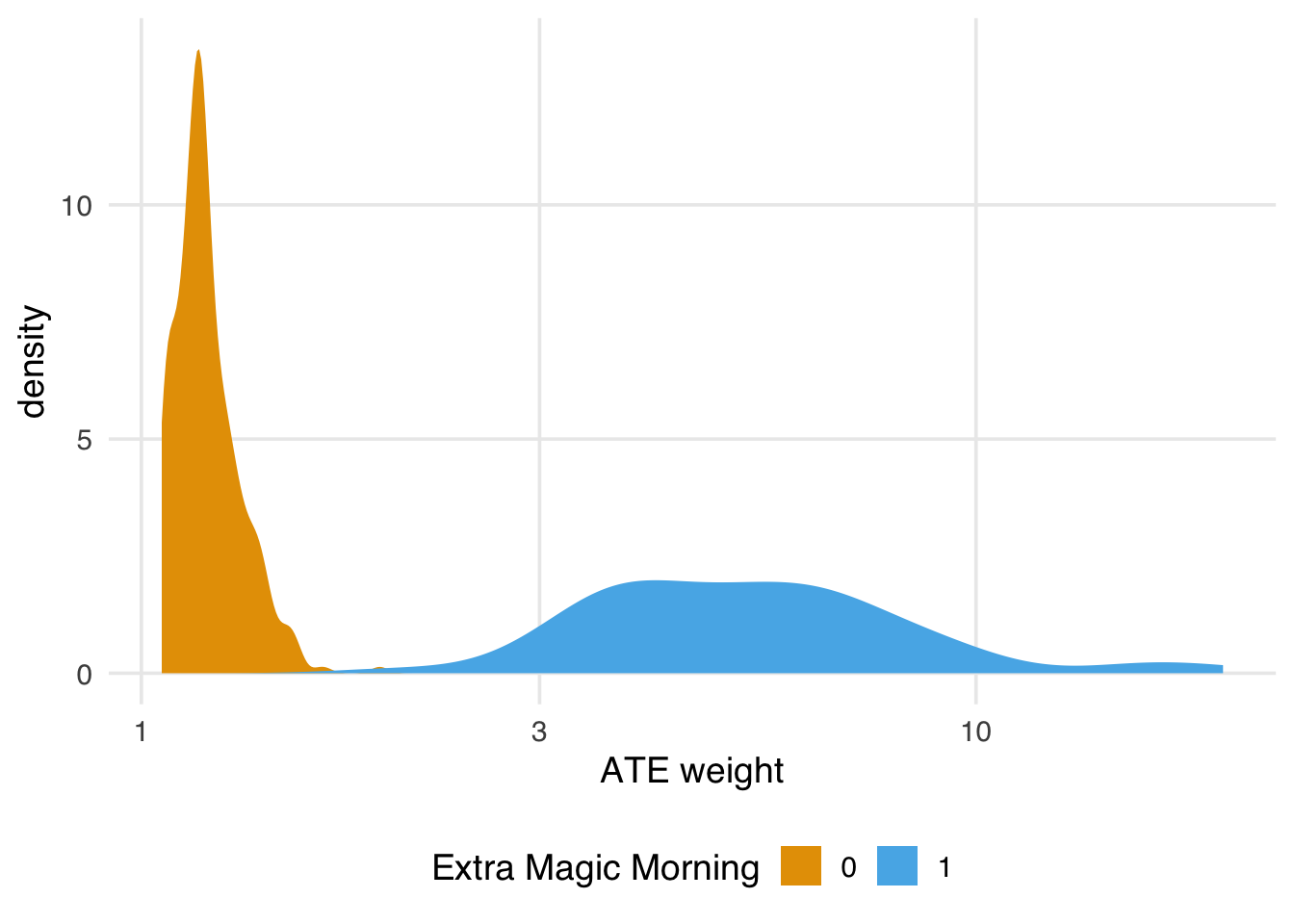
If we find the ESS is too small, we have a few options. First, we could use a different set of weights with better variation, which we’ll discuss in Chapter 10 and Section 9.6.2. Second, we could trim or truncate the ATE weights. For instance, if we truncate the propensity scores to the lower and upper percentiles, then re-calculate the weights, we get a slight improvement to our ESS. The hope here is that the slight modification to the distribution of the weights provides a good balance between ensuring we target the right estimand (the average treatment effect) and improving precision. The more we trim and truncate, though, the more likely we are to be answering questions about a different population than the total population.
seven_dwarfs_9_with_wt |>
  mutate(
    trunc_ps = ps_trunc(.fitted, method = "pctl", lower = 0.01, upper = 0.99),
    w_ate_trunc = wt_ate(trunc_ps, park_extra_magic_morning)
  ) |>
  summarize(
    n = n(),
    ess_ate_trunc = ess(w_ate_trunc),
    percent_ess_ate = percent(ess_ate_trunc / n)
  )
# A tibble: 1 × 3
n ess_ate_trunc percent_ess_ate
<int> <dbl> <chr>
1 354 163. 46% An essential aspect of exchangeability is that we expect the groups to be exchangeable within levels of the confounders. While we can’t observe this directly, a consequence is that we also expect exchangeable groups to be balanced at the variable level. Let’s look at a few more techniques for assessing balance that take this perspective.
One common way to assess balance at the variable level is the standardized mean difference. This measure helps you assess whether the average confounder value is balanced across exposure groups. For example, if you have some continuous confounder, \(Z\), and \(\bar{z}_{exposed} = \frac{\sum Z_i(X_i)}{\sum X_i}\) is the mean value of \(Z\) among the exposed, \(\bar{z}_{unexposed} = \frac{\sum Z_i(1-X_i)}{\sum 1-X_i}\) is the mean value of \(Z\) among the unexposed, \(s_{exposed}\) is the sample standard deviation of \(Z\) among the exposed and \(s_{unexposed}\) is the sample standard deviation of \(Z\) among the unexposed, then the standardized mean difference can be expressed as follows:
\[ d =\frac{\bar{z}_{exposed}-\bar{z}_{unexposued}}{\frac{\sqrt{s^2_{exposed}+s^2_{unexposed}}}{2}} \]
In the case of a binary \(Z\) (a confounder with just two levels), \(\bar{z}\) is replaced with the sample proportion in each group (e.g., \(\hat{p}_{exposed}\) or \(\hat{p}_{unexposed}\) ) and \(s^2=\hat{p}(1-\hat{p})\). In the case where \(Z\) is categorical with more than two categories, \(\bar{z}\) is the vector of proportions of each category level within a group, and the denominator is the multinomial covariance matrix (\(S\) below), as the above can be written more generally as:
\[ d = \sqrt{(\bar{z}_{exposed} - \bar{z}_{unexposed})^TS^{-1}(\bar{z}_{exposed} - \bar{z}_{unexposed})} \]
Often, we calculate the standardized mean difference for each confounder in the complete, unadjusted data set and then compare it to the adjusted standardized mean difference. If the propensity score is incorporated using matching, the adjusted standardized mean difference uses the exact equation above but restricts the sample to only those matched. If the propensity score is incorporated via weighting, the adjusted standardized mean difference weights each of the above components using the constructed propensity score.
In R, the halfmoon package has a function check_balance() that will calculate this and other balance metrics for a data set.
library(halfmoon)

balance_metrics <- check_balance(
  df,
  .vars = c(confounder_1, confounder_2, ...),
  .exposure = exposure,
  .weights = wts # weight is optional
)
Now, using the check_balance() function, we can examine the standardized mean difference before and after weighting.
library(halfmoon)
balance_metrics <-
  seven_dwarfs_9_with_wt |>
  mutate(park_close = as.numeric(park_close)) |>
  check_balance(
    .vars = c(park_ticket_season, park_close, park_temperature_high),
    .exposure = park_extra_magic_morning,
    .weights = w_ate
  )

balance_metrics
# A tibble: 32 × 5
variable group_level method metric estimate
<chr> <chr> <chr> <chr> <dbl>
1 park_close 0 obser… ks 0.171
2 park_close 0 w_ate ks 0.139
3 park_close 0 obser… smd -0.126
4 park_close 0 w_ate smd 0.0566
5 park_close 0 obser… vr 1.92
6 park_close 0 w_ate vr 1.42
7 park_temperature… 0 obser… ks 0.151
8 park_temperature… 0 w_ate ks 0.148
9 park_temperature… 0 obser… smd -0.157
10 park_temperature… 0 w_ate smd -0.0598
# ℹ 22 more rowscheck_balance() also calculates other metrics, but we will focus on the standardized mean difference for now.
smds <- balance_metrics |>
  filter(metric == "smd")

smds
# A tibble: 10 × 5
variable group_level method metric estimate
<chr> <chr> <chr> <chr> <dbl>
1 park_close 0 obser… smd -0.126
2 park_close 0 w_ate smd 0.0566
3 park_temperature… 0 obser… smd -0.157
4 park_temperature… 0 w_ate smd -0.0598
5 park_ticket_seas… 0 obser… smd 0.222
6 park_ticket_seas… 0 w_ate smd 0.0158
7 park_ticket_seas… 0 obser… smd 0.0926
8 park_ticket_seas… 0 w_ate smd -0.0406
9 park_ticket_seas… 0 obser… smd -0.369
10 park_ticket_seas… 0 w_ate smd 0.0347For example, we see above that the observed standardized mean difference (before incorporating the propensity score) for peak ticket season is 0.22; however, after incorporating the propensity score weight this is attenuated, now 0.02. One downside of this metric is that it only quantifies balance on the mean, which may not be sufficient for continuous confounders, as it is possible to be balanced on the mean but severely imbalanced in the tails. At the end of this chapter, we will show you a few tools for examining balance across the full distribution of the confounder.
A complement to the SMD is the variance ratio: \(s_1^2 / s_0^2\). This metric assesses the ratio of the distribution’s variance within groups. Ideally, the variance ratio is as close to 1 as possible.
vrs <- balance_metrics |>
  filter(metric == "vr")

vrs
# A tibble: 10 × 5
variable group_level method metric estimate
<chr> <chr> <chr> <chr> <dbl>
1 park_close 0 obser… vr 1.92
2 park_close 0 w_ate vr 1.42
3 park_temperature… 0 obser… vr 0.947
4 park_temperature… 0 w_ate vr 0.794
5 park_ticket_seas… 0 obser… vr 1.29
6 park_ticket_seas… 0 w_ate vr 1.02
7 park_ticket_seas… 0 obser… vr 0.978
8 park_ticket_seas… 0 w_ate vr 1.01
9 park_ticket_seas… 0 obser… vr 0.538
10 park_ticket_seas… 0 w_ate vr 1.04 We see above that the observed variance ratio for peak ticket season is 1.29. After incorporating the propensity score weight, the variance ratio is closer to 1, now 1.02.
It can be helpful to visualize standardized mean differences and variance ratios. To do so, we like to use a Love Plot (named for Thomas Love, who popularized them). The halfmoon package provides a geom_love() function that simplifies this implementation. In Figure 9.5, we visualize the absolute SMDs: the closer to 0, the better the balance between exposure groups. After weighting, the differences between groups are greatly reduced. Some people suggest a cut-off of 0.1 as a measure of good balance (an SMD of 0.1 corresponds to a correlation of 0.05 for a continuous variable and 7.7% non-overlap between the distributions of the continuous covariate in the two groups (Austin 2009); this is only a rule-of-thumb, and ideally, we would get the SMDs much closer to 0.
ggplot(
  data = smds,
  aes(
    x = abs(estimate),
    y = variable,
    group = method,
    color = method
  )
) +
  geom_love()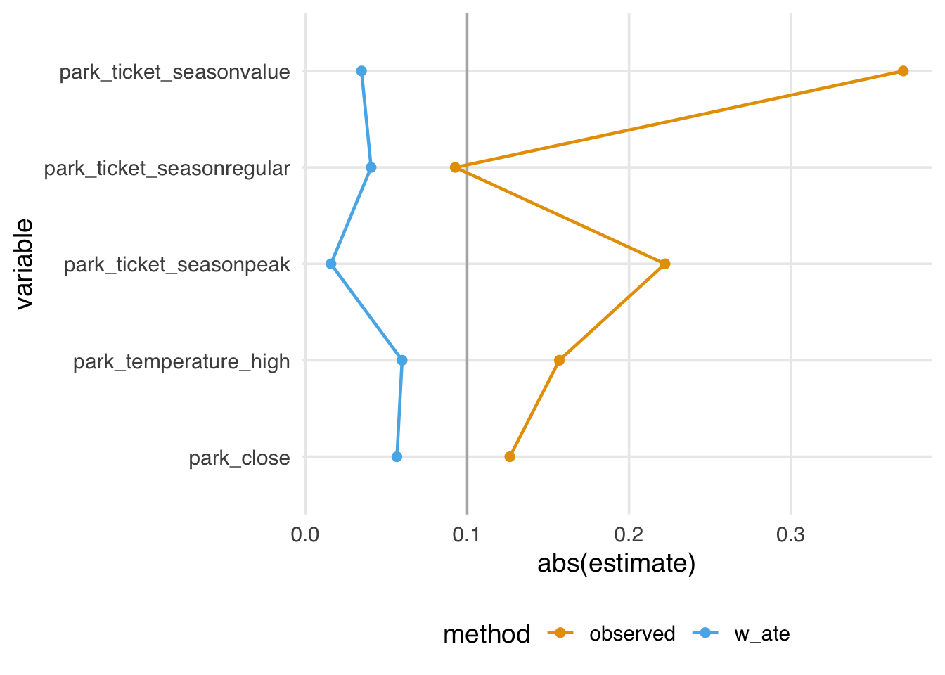
The variance ratios, on the other hand, don’t show as much improvement; while most of the ratios are reduced towards 1, one is slightly worse, and several are still not close to 1, as shown in Figure 9.6.
ggplot(
  data = vrs,
  aes(
    x = estimate,
    y = variable,
    group = method,
    color = method
  )
) +
  geom_love(vline_xintercept = 1)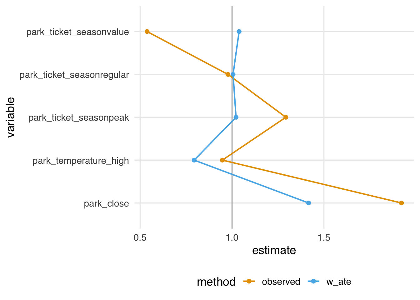
plot_balance() is a helper function to quickly plot the output of check_balance(), which you may find helpful for iterating, as shown in Figure 9.7.
balance_metrics |>
  filter(metric %in% c("smd", "vr")) |>
  plot_balance(facet_scales = "free_x")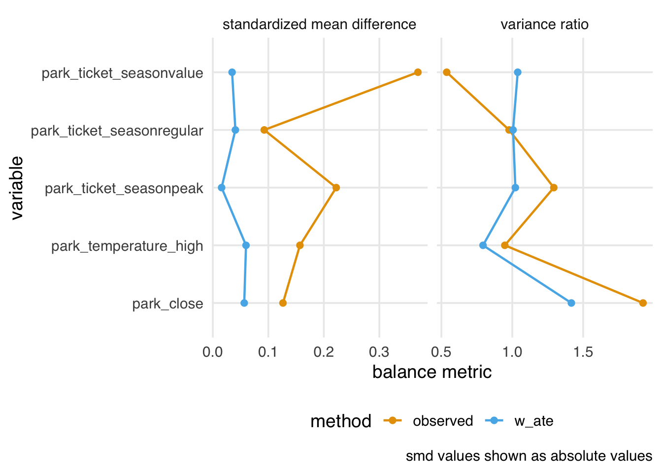
plot_balance() helper function.
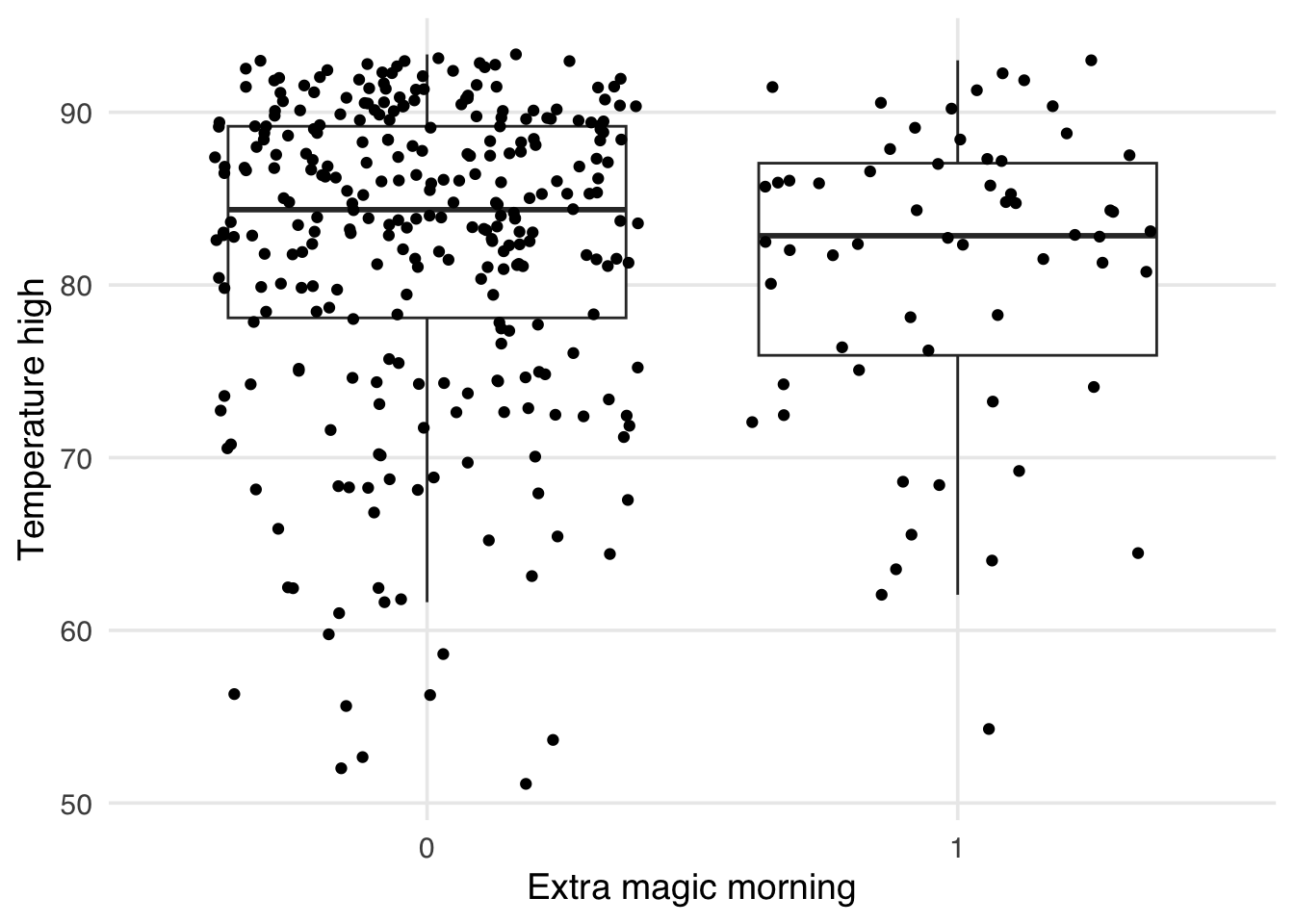
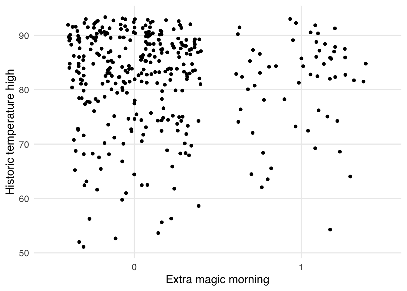
As mentioned above, one issue with standardized mean differences is that they only quantify balance at a single point for continuous confounders (the mean). It can be helpful to visualize the entire distribution to ensure there is no residual imbalance in the tails. Let’s first use a boxplot. As an example, let’s use the park_temperature_high variable. When we make boxplots, we always jitter the points on top to avoid masking and data anomalies; we use geom_jitter() to accomplish this. First, we will make the unweighted boxplot. In Figure 9.8, we see an imbalance in the middle of the distributions, but also differences at the ends, particularly at lower temperatures. SMDs can’t tell us if this is improved.
ggplot(
  seven_dwarfs_9_with_wt,
  aes(
    x = factor(park_extra_magic_morning),
    y = park_temperature_high,
    color = park_extra_magic_morning
  )
) +
  geom_jitter(width = 0.12, height = 0, alpha = 0.5) +
  geom_boxplot(
    outlier.color = NA,
    fill = NA,
    width = 0.3,
    color = "black"
  ) +
  labs(
    color = "Extra magic morning",
    y = "Historic temperature high",
    x = NULL
  )
Now let’s look at a weighted version. In Figure 9.9, we see the improvement in the middle of the distribution we detected with SMDs. The tails of the distribution, while improved, still show some imbalance.
ggplot(
  seven_dwarfs_9_with_wt,
  aes(
    x = factor(park_extra_magic_morning),
    y = park_temperature_high,
    color = park_extra_magic_morning,
    weight = w_ate
  )
) +
  geom_jitter(width = 0.12, height = 0, alpha = 0.5) +
  geom_boxplot(
    outlier.color = NA,
    fill = NA,
    width = 0.3,
    color = "black"
  ) +
  labs(
    color = "Extra magic morning",
    y = "Historic temperature high",
    x = NULL
  )
Many other geoms in ggplot2 accept a weight argument that can be useful for visualizing weighted populations. Make good use of your exploratory data analysis skills by treating the weighted pseudo-population as a real sample!
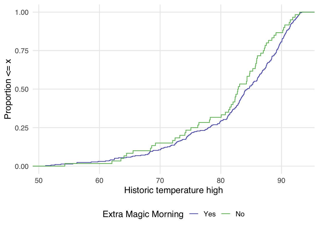
geom_bar()geom_boxplot()geom_contour()geom_count()geom_density()geom_dotplot()geom_freqpoly()geom_hex()geom_histogram()geom_quantile()geom_smooth()geom_violin()Examining the empirical cumulative distribution function (eCDF) for the confounder stratified by each exposure group is also very useful. The unweighted eCDF can be visualized using geom_ecdf() from halfmoon. In a balanced population, we expect the lines to overlap across the distribution of the confounder. Figure 9.10 shows an imbalance between exposure groups across most of the distribution of historical high temperatures.
ggplot(
  seven_dwarfs_9_with_wt,
  aes(
    x = park_temperature_high,
    color = factor(park_extra_magic_morning)
  )
) +
  geom_ecdf() +
  labs(
    x = "Historic temperature high",
    y = "Proportion <= x",
    color = "Extra Magic Morning"
  )
geom_ecdf() allows for the additional weight argument to display a weighted eCDF plot.
ggplot(
  seven_dwarfs_9_with_wt,
  aes(
    x = park_temperature_high,
    color = factor(park_extra_magic_morning)
  )
) +
  geom_ecdf(aes(weights = w_ate)) +
  labs(
    x = "Historic temperature high",
    y = "Proportion <= x",
    color = "Extra Magic Morning"
  )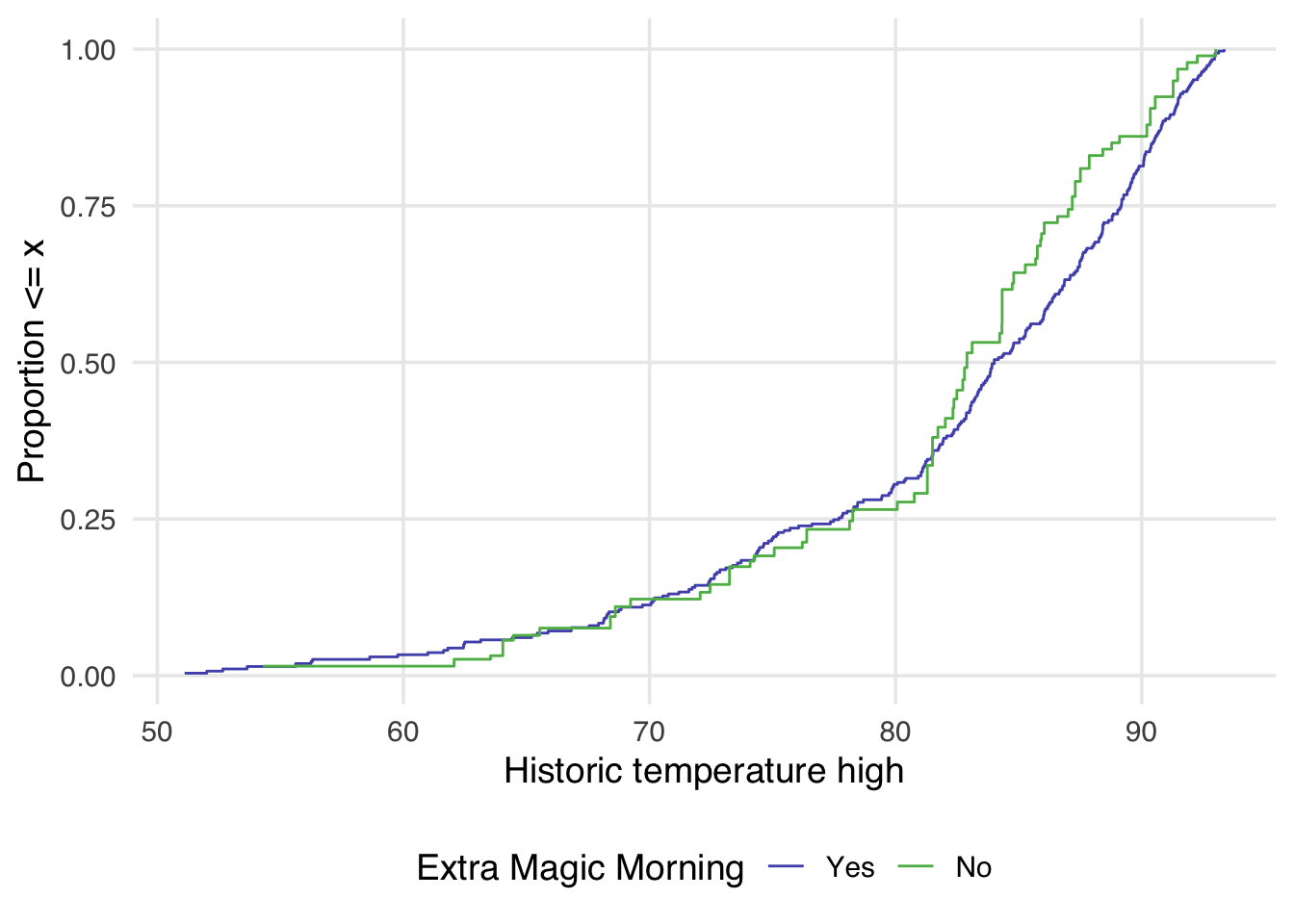
Examining Figure 9.11 reveals a few things. First, compared to Figure 9.10, there is greater overlap between the two distributions. In Figure 9.10, the orange line is almost always noticeably above the blue, whereas in Figure 9.11, the two lines appear to overlap until we reach slightly above 80 degrees. After 80 degrees, the lines appear to diverge in the weighted plot. This is why it can be helpful to examine the full distribution rather than a single summary measure. If we had just used the standardized mean difference, for example, we would have likely said these two groups are balanced and moved on. Looking at Figure 9.11 suggests that there may be a non-linear relationship between the probability of having an extra magic morning and the historical high temperature. Let’s refit our propensity score model using a natural spline. We can use the function splines::ns() for this.
Natural splines, also called restricted cubic splines, are a type of smoothing function that allows us to model non-linear relationships between variables. Unlike polynomial terms (like \(x^2\) or \(x^3\)), which can become extreme at the boundaries of the data, natural splines constrain the function to be linear beyond the boundary knots.
seven_dwarfs_9_with_ps <-
  glm(
    park_extra_magic_morning ~ park_ticket_season +
      park_close +
      # refit model with a spline
      splines::ns(park_temperature_high, df = 5),
    data = seven_dwarfs_9,
    family = binomial()
  ) |>
  augment(type.predict = "response", data = seven_dwarfs_9)
seven_dwarfs_9_with_wt <- seven_dwarfs_9_with_ps |>
  mutate(w_ate = wt_ate(.fitted, park_extra_magic_morning))
Now, let’s see how that impacts the weighted eCDF plot.
ggplot(
  seven_dwarfs_9_with_wt,
  aes(
    x = park_temperature_high,
    color = factor(park_extra_magic_morning)
  )
) +
  geom_ecdf(aes(weights = w_ate)) +
  labs(
    color = "Extra Magic Morning",
    x = "Historic temperature high",
    y = "Proportion <= x"
  )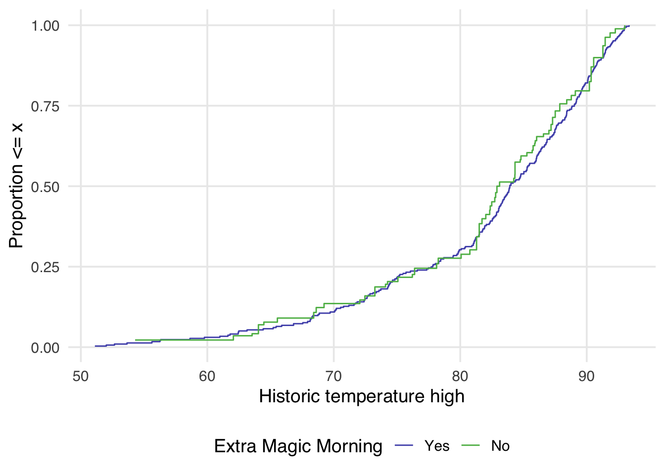
Now in Figure 9.12, the lines appear to overlap better across the whole space.
A single-number summary of the eCDF is the Kolmogorov-Smirnov (KS) statistic1. The KS statistic is the maximum vertical distance between the two eCDF curves. We can calculate it using check_balance():
balance_metrics |>
  filter(metric == "ks")
# A tibble: 10 × 5
variable group_level method metric estimate
<chr> <chr> <chr> <chr> <dbl>
1 park_close 0 obser… ks 0.171
2 park_close 0 w_ate ks 0.139
3 park_temperature… 0 obser… ks 0.151
4 park_temperature… 0 w_ate ks 0.148
5 park_ticket_seas… 0 obser… ks 0.0959
6 park_ticket_seas… 0 w_ate ks 0.00682
7 park_ticket_seas… 0 obser… ks 0.0459
8 park_ticket_seas… 0 w_ate ks 0.0201
9 park_ticket_seas… 0 obser… ks 0.142
10 park_ticket_seas… 0 w_ate ks 0.0133 To better understand what the KS statistic represents, let’s visualize it on the unweighted and weighted eCDF plots. Figure 9.13 shows the maximum distance between the two curves as a red line connecting the two points where this maximum occurs. Note that the KS statistic before and after weighting is not for the same points in the distribution; after weighting, the maximum vertical distance is smaller and more towards the center of the distribution.
# Calculate unweighted ECDFs
ecdf_0 <- seven_dwarfs_9_with_wt |>
  filter(park_extra_magic_morning == 0) |>
  pull(park_temperature_high) |>
  ecdf()

ecdf_1 <- seven_dwarfs_9_with_wt |>
  filter(park_extra_magic_morning == 1) |>
  pull(park_temperature_high) |>
  ecdf()

# Find unweighted KS point
all_temps <- sort(unique(seven_dwarfs_9_with_wt$park_temperature_high))
distances <- abs(ecdf_0(all_temps) - ecdf_1(all_temps))
max_idx <- which.max(distances)

ks_unweighted <- tibble(
  x = all_temps[max_idx],
  y0 = ecdf_0(all_temps[max_idx]),
  y1 = ecdf_1(all_temps[max_idx]),
  ks = distances[max_idx],
  weight_status = "Unweighted"
)

# Calculate weighted ECDFs manually
wt_data_0 <- seven_dwarfs_9_with_wt |>
  filter(park_extra_magic_morning == 0) |>
  arrange(park_temperature_high)

wt_data_1 <- seven_dwarfs_9_with_wt |>
  filter(park_extra_magic_morning == 1) |>
  arrange(park_temperature_high)

# For each unique temp value, calculate weighted cumulative proportion
wecdf_0 <- tibble(temp = all_temps) |>
  mutate(
    ecdf_val = map_dbl(temp, \(t) {
      sum(wt_data_0$w_ate[wt_data_0$park_temperature_high <= t]) /
        sum(wt_data_0$w_ate)
    })
  )

wecdf_1 <- tibble(temp = all_temps) |>
  mutate(
    ecdf_val = map_dbl(temp, \(t) {
      sum(wt_data_1$w_ate[wt_data_1$park_temperature_high <= t]) /
        sum(wt_data_1$w_ate)
    })
  )

# Find weighted KS point
wt_distances <- abs(wecdf_0$ecdf_val - wecdf_1$ecdf_val)
wt_max_idx <- which.max(wt_distances)

ks_weighted <- tibble(
  x = all_temps[wt_max_idx],
  y0 = wecdf_0$ecdf_val[wt_max_idx],
  y1 = wecdf_1$ecdf_val[wt_max_idx],
  ks = wt_distances[wt_max_idx],
  weight_status = "Weighted"
)

ks_both <- bind_rows(ks_unweighted, ks_weighted) |>
  mutate(
    weight_status = factor(weight_status, levels = c("Unweighted", "Weighted"))
  )

plot_data <- seven_dwarfs_9_with_wt |>
  select(park_temperature_high, park_extra_magic_morning, w_ate) |>
  mutate(
    Unweighted = 1,
    Weighted = as.numeric(w_ate)
  ) |>
  pivot_longer(
    cols = c(Unweighted, Weighted),
    names_to = "weight_status",
    values_to = "weight"
  ) |>
  mutate(
    weight_status = factor(weight_status, levels = c("Unweighted", "Weighted"))
  )

ggplot(
  plot_data,
  aes(
    x = park_temperature_high,
    color = factor(park_extra_magic_morning),
    weight = weight
  )
) +
  geom_ecdf(linewidth = 1, alpha = 0.5) +
  geom_segment(
    data = ks_both,
    aes(x = x, xend = x, y = y0, yend = y1),
    color = "#DB5461",
    linewidth = 0.8,
    linetype = "solid",
    inherit.aes = FALSE
  ) +
  geom_point(
    data = ks_both,
    aes(x = x, y = y0),
    color = "#DB5461",
    size = 2,
    inherit.aes = FALSE
  ) +
  geom_point(
    data = ks_both,
    aes(x = x, y = y1),
    color = "#DB5461",
    size = 2,
    inherit.aes = FALSE
  ) +
  geom_label(
    data = ks_both,
    aes(
      x = x,
      y = (y0 + y1) / 2,
      label = paste0("KS = ", round(ks, 3))
    ),
    color = "#DB5461",
    size = 3.5,
    fontface = "bold",
    hjust = 1.1,
    inherit.aes = FALSE
  ) +
  facet_wrap(~weight_status) +
  labs(
    x = "Historic temperature high",
    y = "Proportion <= x",
    color = "Extra Magic Morning"
  ) +
  theme(legend.position = "bottom")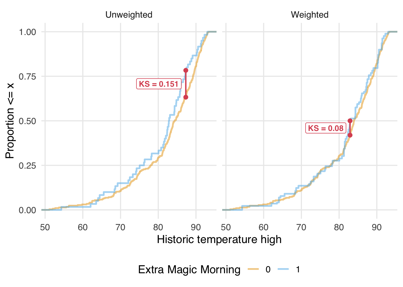
We want the KS statistic to be as close to 0 as possible after weighting or matching, indicating that the distributions overlap well across their entire range.
eCDFs allow us to look across the distribution of a continuous confounder, and SMDs and variance ratios provide different perspectives on its moments. However, for exchangeability to hold, we need balance across the joint distribution of confounders. This means balance across the entire multi-dimensional covariate space, including interactions between variables. For complex data, this is hard to comprehend, let alone assess, but we have a few tools to try.
The simplest method for assessing balance in the joint distribution is to calculate single variables that represent its components. SMDs and friends examine single variables on their original scales, which is one perspective on the joint distribution. Balance is also commonly assessed among interaction terms and squares of continuous confounders (which is closely related to the variance, the second moment of the distribution, so we’ve already had one perspective through variance ratios). check_balance() can do this automatically (as well as cubes).
balance_metrics_joint <-
  seven_dwarfs_9_with_wt |>
  mutate(park_close = as.numeric(park_close)) |>
  check_balance(
    .vars = c(park_ticket_season, park_close, park_temperature_high),
    .exposure = park_extra_magic_morning,
    .weights = w_ate,
    interactions = TRUE,
    squares = TRUE
  )

balance_metrics_joint |>
  filter(metric %in% c("smd", "vr")) |>
  plot_balance(facet_scales = "free_x") +
  theme(axis.title.y = element_blank())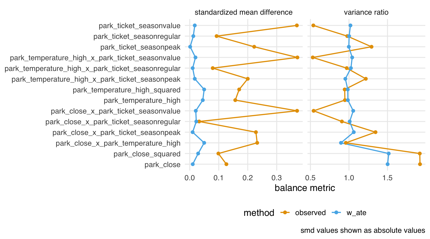
From this perspective, we have decent balance over the subset of the joint distribution we’ve computed.
An alternative measure of balance is the energy statistic. The energy statistic is the average distance across the joint ECDFs. As opposed to looking at many measures across derived variables, the energy statistic is a single-number summary of the joint distribution. Unlike some of the other metrics we’ve seen, the energy metric’s scale depends on the number of covariates and their distribution, making it more helpful for comparing approaches. That said, lower energy indicates better balance across the covariate space; after weighting, we see much lower energy than in the observed sample.
balance_metrics_joint |>
  filter(metric == "energy") |>
  select(method, estimate)
# A tibble: 2 × 2
method estimate
<chr> <dbl>
1 observed 0.241
2 w_ate 0.0434When our initial propensity score model doesn’t achieve good balance, we can improve it by adding more complex terms, such as polynomial functions and interactions between predictors, as we saw in Figure 9.12.
Let’s expand on that modification and create a more flexible propensity score model with non-linear terms and interactions:
ps_improved_model <- glm(
  park_extra_magic_morning ~
    park_ticket_season +
    park_close +
    park_temperature_high +
    splines::ns(park_temperature_high, df = 5) +
    I(as.numeric(park_close)^2) +
    park_ticket_season:park_close +
    park_ticket_season:park_temperature_high +
    park_close:park_temperature_high,
  data = seven_dwarfs_9,
  family = binomial()
)

seven_dwarfs_9_with_improved <- seven_dwarfs_9_with_wt |>
  mutate(
    .fitted_improved = predict(ps_improved_model, type = "response"),
    w_ate_improved = wt_ate(.fitted_improved, park_extra_magic_morning)
  )
Now let’s check the balance with both our original and improved models:
balance_comparison <- seven_dwarfs_9_with_improved |>
  mutate(park_close = as.numeric(park_close)) |>
  check_balance(
    .vars = c(park_ticket_season, park_close, park_temperature_high),
    .exposure = park_extra_magic_morning,
    .weights = c(w_ate, w_ate_improved),
    squares = TRUE,
    interactions = TRUE
  )

balance_comparison |>
  plot_balance() +
  theme(axis.text.y = element_blank())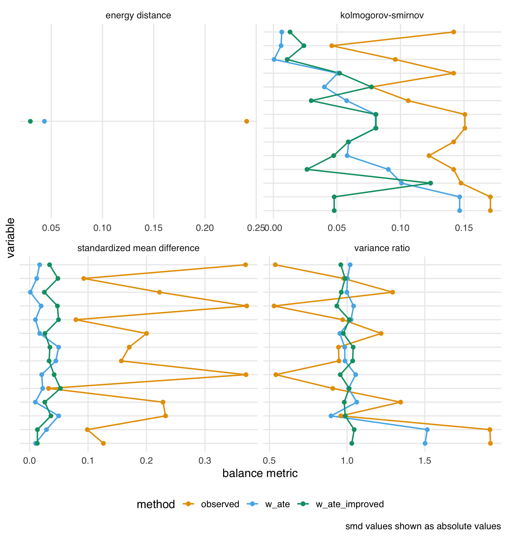
The plot shows that our feature engineering had mixed results. The improved weights (w_ate_improved), however, achieve lower energy than the original weights (w_ate).
Let’s also compare the effective sample sizes:
seven_dwarfs_9_with_improved |>
  summarize(
    n = n(),
    ess_ate_original = ess(w_ate),
    ess_ate_improved = ess(w_ate_improved),
    percent_ess_original = percent(ess_ate_original / n),
    percent_ess_improved = percent(ess_ate_improved / n)
  )
# A tibble: 1 × 5
n ess_ate_original ess_ate_improved
<int> <dbl> <dbl>
1 354 160. 144.
# ℹ 2 more variables: percent_ess_original <chr>,
# percent_ess_improved <chr>While our improved model achieves slightly better balance, it may come at the cost of a lower effective sample size due to more extreme weights. This is a common trade-off in propensity score analysis: better balance often requires more variable weights, which reduces statistical efficiency.
So far, we’ve focused on propensity score weights, which model the treatment assignment mechanism and then use the inverse of those probabilities to create weights. An alternative approach is to directly optimize the weights to achieve balance without explicitly modeling the propensity score. The optweight package implements this approach by solving a constrained optimization problem: it finds weights that minimize variability (maximizing effective sample size) while ensuring that covariates are balanced within specified tolerances. There are two primary benefits to this approach. First, we can reduce the need to iterate between estimating weights and checking balance because optimization-based weights directly target a balancing statistic. Second, the particular class of optimization-based weights that optweight implements, called stable balancing weights, often achieves balance comparable to that of a good propensity score model while providing a better effective sample size.
Let’s use the optweight() function to estimate stable balancing weights. In addition to a formula similar to the propensity score model, we also specify tols, the tolerance of the balance statistic, and min.w, the minimal allowable weight. By setting min.w = 0, we allow optweight() to assign weights of zero, effectively filtering out some observations.
Let’s check the balance achieved by these optimization-based weights and compare it to our propensity score weights:
balance_opt_comparison <- seven_dwarfs_9_with_opt |>
  mutate(park_close = as.numeric(park_close)) |>
  check_balance(
    .vars = c(park_ticket_season, park_close, park_temperature_high),
    .exposure = park_extra_magic_morning,
    .weights = c(w_ate, w_opt)
  )

balance_opt_comparison |>
  plot_balance() +
  theme(axis.title.y = element_blank())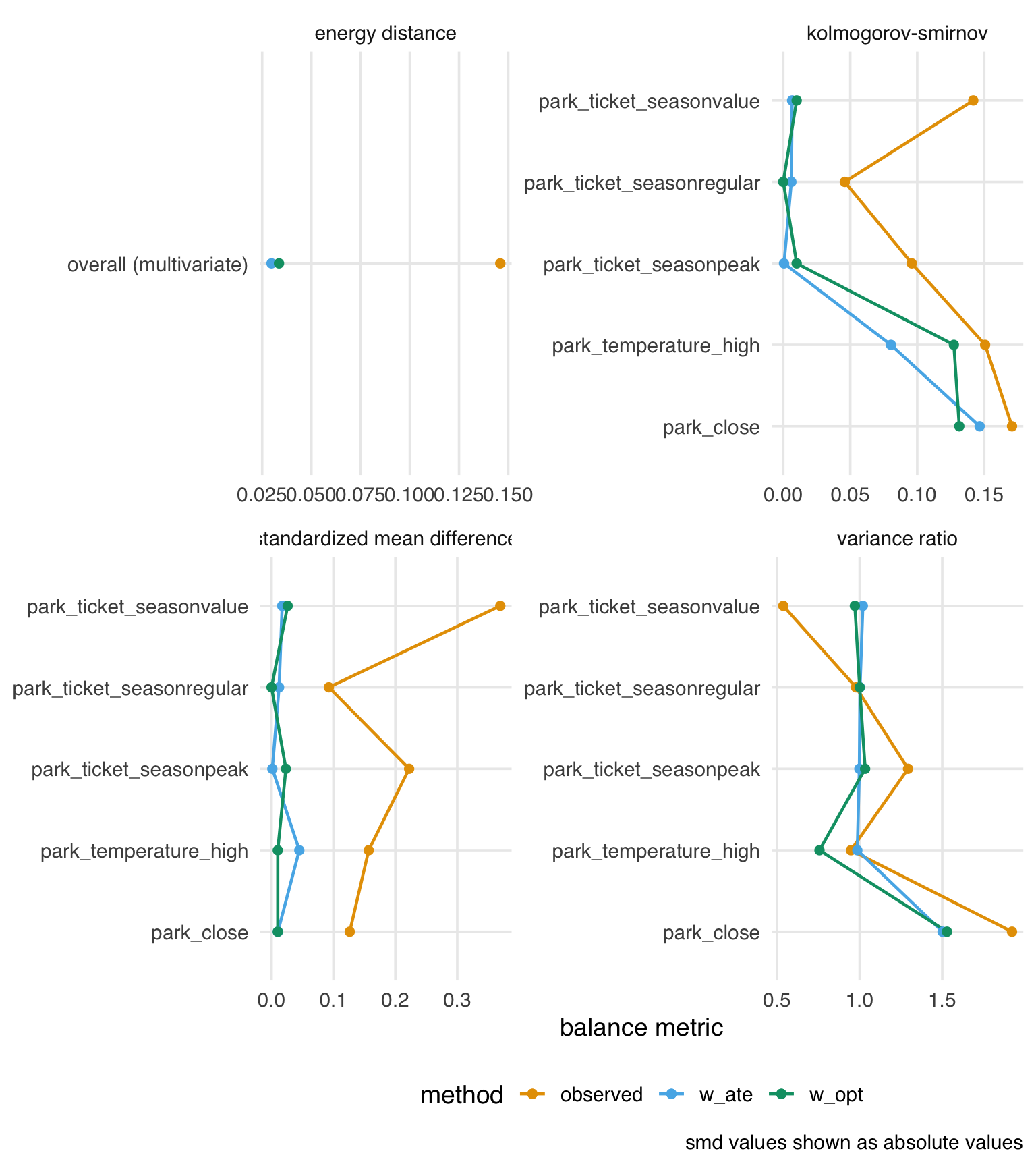
The balance between the two approaches is similar. Now let’s compare the distribution of weights between the two methods:
seven_dwarfs_9_with_opt |>
  select(w_ate, w_opt) |>
  mutate(w_ate = as.numeric(w_ate)) |>
  pivot_longer(everything(), names_to = "method", values_to = "weight") |>
  group_by(method) |>
  reframe(range = range(weight))
# A tibble: 4 × 2
method range
<chr> <dbl>
1 w_ate 1.03
2 w_ate 16.1
3 w_opt 0
4 w_opt 2.32The range of the stable balancing weights is much smaller than the propensity score weights. We also see that one day did indeed receive a weight of 0, removing it from the analysis.
seven_dwarfs_9_with_opt |>
  filter(w_opt == 0) |>
  select(park_date, park_extra_magic_morning)
# A tibble: 1 × 2
park_date park_extra_magic_morning
<date> <dbl>
1 2018-12-21 1Finally, let’s compare the effective sample sizes between the two weighting methods:
seven_dwarfs_9_with_opt |>
  summarize(
    n = n(),
    ess_ate = ess(w_ate),
    ess_opt = ess(w_opt),
    percent_ess_ate = percent(ess_ate / n),
    percent_ess_opt = percent(ess_opt / n)
  )
# A tibble: 1 × 5
n ess_ate ess_opt percent_ess_ate percent_ess_opt
<int> <dbl> <dbl> <chr> <chr>
1 354 160. 341. 45% 96% This class of optimization-based weights often yields a better effective sample size because they directly minimize weight variability while satisfying the specified balance constraints. Larger effective sample size can lead to more precise estimates in the outcome model.
Optimization-based weights are a general technique that can target many aspects of balance. For instance, we may want to target the energy statistic to balance the joint distribution of the covariates. The WeightIt package implements this and many other optimization-based approaches. Let’s estimate energy balancing weights.
Let’s compare the balance achieved by all three methods:
# Check balance with all three sets of weights
balance_all_comparison <- seven_dwarfs_9_with_all |>
  mutate(park_close = as.numeric(park_close)) |>
  check_balance(
    .vars = c(park_ticket_season, park_close, park_temperature_high),
    .exposure = park_extra_magic_morning,
    .weights = c(w_ate, w_opt, w_energy)
  )

balance_all_comparison |>
  filter(metric == "smd") |>
  plot_balance()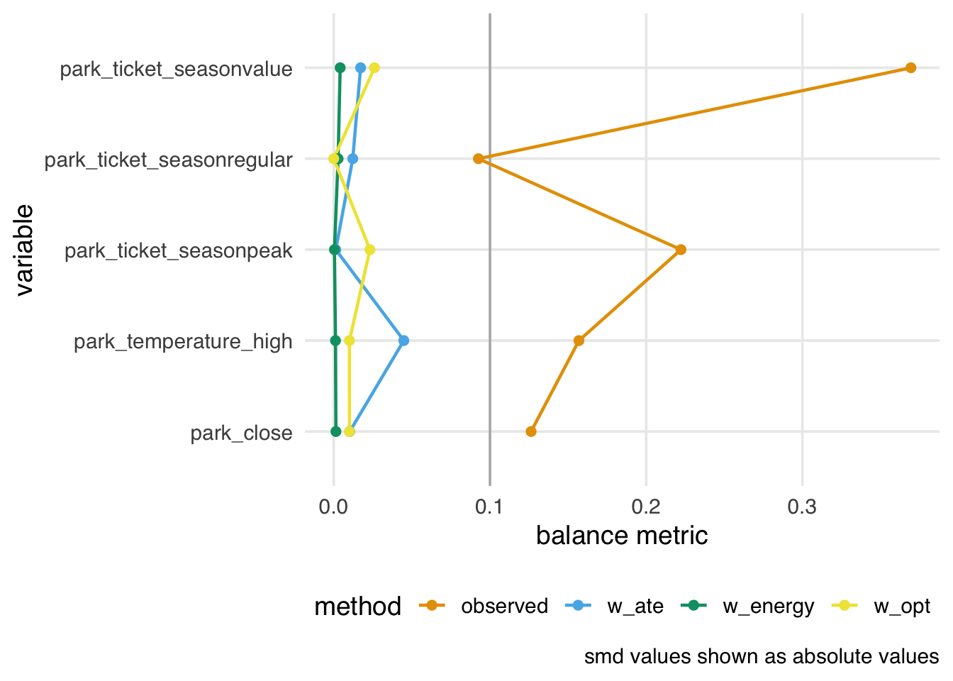
Energy-balancing weights give us excellent balance, but their effective sample sizes are lower.
Since we are looking at differences in distributions between groups, a natural question is: what about p-values? We often use p-values to assess whether a distribution is statistically significantly different between two groups. For balance, however, p-values are inappropriate (Imai, King, and Stuart 2008). First, p-values refer to a hypothetical population from which we have sampled; balance is, however, a property of the sample. Second, p-values are strongly dependent on sample size. If we found a small p-value when assessing balance, we could increase it by randomly removing observations until we are underpowered to detect a difference. That procedure, of course, will not balance groups! So, if we use a p-value to evaluate balance, we will eventually get a non-significant result due to loss of precision. Finally, there is no clear relationship between p-value cut-offs and balance to begin with. We have no theoretical reason to believe that a p-value of < 0.05 would indicate better balance than a different cut-off.
By and large, metrics commonly used for building prediction models are inappropriate for building causal models. Researchers and data scientists often make decisions about models using metrics such as R2, AUC, and accuracy. However, a causal model’s goal is not to predict as much about the outcome as possible (Hernán and Robins 2021); the goal is to estimate the relationship between the exposure and outcome accurately. A causal model needn’t predict particularly well to be unbiased.
These metrics, however, may help identify a model’s best functional form. Generally, we’ll use DAGs and our domain knowledge to build the model itself. However, we may be unsure of the mathematical relationship between a confounder and the outcome or exposure. For instance, we may not know if the relationship is linear. Misspecifying this relationship can lead to residual confounding: we may only partially account for the confounder in question, leaving some bias in the estimate. Testing different functional forms using prediction-focused metrics can improve the model’s accuracy, potentially enabling better control.
In predictive modeling, data scientists often need to prevent their models from overfitting to chance patterns in the data. When a model captures those chance patterns, it doesn’t perform as well on other datasets. So, can you overfit a causal model?
The short answer is yes, though it’s easier to do with machine learning than with logistic regression and friends. An overfit model is, essentially, a misspecified model (Gelman 2017). A misspecified model will lead to residual confounding and, thus, a biased causal effect. Overfitting can also exacerbate stochastic positivity violations (Zivich, Cole, and Westreich 2022). The correct causal model (the functional form that matches the data-generating mechanism) cannot be overfit. The same is true for the correct predictive model.
There’s some nuance to this answer, though. Overfitting in causal inference and prediction is different; we’re not applying the causal estimate to another dataset (the closest to that is transportability and generalizability, an issue we’ll discuss in Chapter 24). It remains true that a causal model doesn’t need to predict particularly well to be unbiased.
In prediction modeling, people often use a bias-variance trade-off to improve out-of-sample predictions. In short, some bias is introduced into the sample to reduce model variance and improve predictions outside the sample. However, we must be careful: the word bias here refers to the discrepancy between the model estimates and the true value of the dependent variable in the dataset. Let’s call this statistical bias. It is not necessarily the same as the difference between the model estimate and the true causal effect in the population. Let’s call this causal bias. If we apply the bias-variance trade-off to causal models, we introduce statistical bias to reduce causal bias. Another subtlety is that overfitting can inflate the standard error of the estimate in the sample, which is not the same variance as the bias-variance trade-off (Schuster, Lowe, and Platt 2016). From a frequentist standpoint, the confidence intervals will also not have nominal coverage (see Appendix A) because of the causal bias in the estimate.
In practice, cross-validation, a technique to reduce overfitting, is often used with causal models that use machine learning, as we’ll discuss in Chapter 21.
A quirk of propensity score matching is that, after we’ve achieved good balance, if we continue to prune matches, we will see the opposite effect: we increase imbalance. The reason for this is that, with propensity score matching, after we’ve achieved balance, there is no good reason to prefer one match over another in terms of pruning; pruning becomes random. The problem is that we are more likely to remove well-matched pairs than to maintain balance.
In Figure 9.16, we see that as we tighten the caliper (resulting in fewer matched pairs), we first improve balance, then, as the caliper approaches zero, we worsen balance.
library(MatchIt)
caliper_widths <- c(0.25, 0.1, 0.05, 0.025, 0.01)

check_balance_by_cal <- function(caliper) {
  match_obj <- matchit(
    park_extra_magic_morning ~
      park_ticket_season + park_close + park_temperature_high,
    data = seven_dwarfs_9,
    method = "nearest",
    caliper = caliper,
    distance = "glm"
  )

  matched_data <- match.data(match_obj)

  balance <- matched_data |>
    mutate(park_close = as.numeric(park_close)) |>
    check_balance(
      .vars = c(park_ticket_season, park_close, park_temperature_high),
      .exposure = park_extra_magic_morning
    )

  balance |>
    filter(metric == "smd") |>
    mutate(
      caliper = caliper,
      n_matched = nrow(matched_data)
    )
}

balance_by_caliper <- map(caliper_widths, check_balance_by_cal) |>
  bind_rows()

ggplot(
  balance_by_caliper,
  aes(x = caliper, y = abs(estimate), color = variable)
) +
  geom_line() +
  geom_point() +
  scale_x_reverse() +
  labs(
    x = "caliper",
    y = "smd"
  ) +
  theme(legend.position = "right")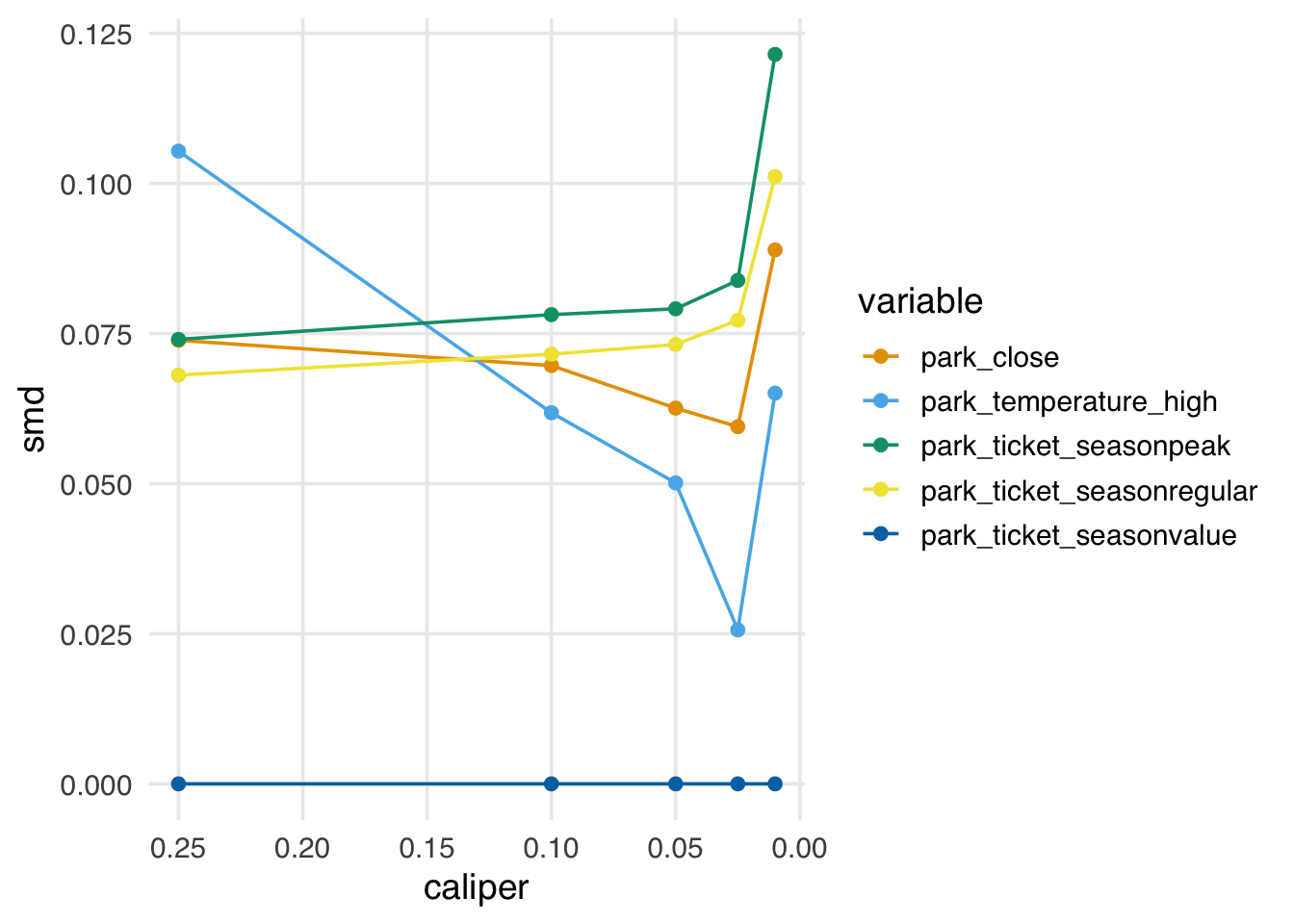
In practice, the propensity score paradox is not such a big deal, for two reasons: first, for many data sets, you will see improved balance by pruning matches well before you start to encounter the paradox. Second, if we start to see that a caliper is too stringent and is worsening balance, we can simply use a less strict caliper. That said, some other matching algorithms, such as coarsened exact matching and Mahalanobis distance matching—both available in MatchIt—don’t suffer from this problem and may be worth considering if you are encountering the paradox but feel you need to continue pruning.
The KS statistic is also the test statistic for the two-sample Kolmogorov-Smirnov test, which tests whether two samples come from the same distribution. However, in the context of balance assessment, we focus on the magnitude of the statistic rather than hypothesis testing.↩︎