Work-in-progress 🚧
You are reading the work-in-progress first edition of Causal Inference in R. This chapter has its foundations written but is still undergoing changes.
You are reading the work-in-progress first edition of Causal Inference in R. This chapter has its foundations written but is still undergoing changes.
In many respects, preparing data and doing exploratory analysis is the same for causal inference as for description and prediction. What differs for causal inference is how we’ll link the process to our causal question and target trial emulation. We’ll also use this opportunity to understand better how well our data might meet the causal assumptions, although, as we’ve seen in Chapter 5, data can never tell us whether we’re right or not.
Let’s look at the data and the causal question we’ll examine for the next several chapters.
Through much of this book, we will be using data obtained from Touring Plans. Touring Plans is a company that helps people plan their trips to Disney and Universal theme parks. One of their goals is to accurately predict attraction wait times at these theme parks by leveraging data and statistical modeling. The touringplans R package includes several datasets containing information about Disney theme park attractions.
library(touringplans)
attractions_metadata
# A tibble: 14 × 8
dataset_name name short_name park land opened_on
<chr> <chr> <chr> <chr> <chr> <date>
1 alien_sauce… Alie… Alien Sau… Disn… Toy … 2018-06-30
2 dinosaur DINO… DINOSAUR Disn… Dino… 1998-04-22
3 expedition_… Expe… Expeditio… Disn… Asia 2006-04-07
4 flight_of_p… Avat… Flight of… Disn… Pand… 2017-05-27
5 kilimanjaro… Kili… Kilimanja… Disn… Afri… 1998-04-22
6 navi_river Na'v… Na'vi Riv… Disn… Pand… 2017-05-27
7 pirates_of_… Pira… Pirates o… Magi… Adve… 1973-12-17
8 rock_n_roll… Rock… Rock Coas… Disn… Suns… 1999-07-29
9 seven_dwarf… Seve… 7 Dwarfs … Magi… Fant… 2014-05-28
10 slinky_dog Slin… Slinky Dog Disn… Toy … 2018-06-30
11 soarin Soar… Soarin' Epcot Worl… 2005-05-05
12 spaceship_e… Spac… Spaceship… Epcot Worl… 1982-10-01
13 splash_moun… Spla… Splash Mo… Magi… Fron… 1992-07-17
14 toy_story_m… Toy … Toy Story… Disn… Toy … 2008-05-31
# ℹ 2 more variables: duration <dbl>,
# average_wait_per_hundred <dbl>Additionally, this package contains a dataset with raw metadata about the parks, with observations recorded daily. The metadata includes information like the Walt Disney World ticket season on a particular day (whether it is peak season—think Christmas—value season—think right when school started—or regular season), what the historic temperatures were in the park on that day, and whether there was a special event, such as Extra Magic Hours (where the park opens early to guests staying in the Walt Disney World resorts) in the park on that day.
parks_metadata_raw# A tibble: 2,079 × 181
date wdw_ticket_season dayofweek dayofyear
<date> <chr> <dbl> <dbl>
1 2015-01-01 <NA> 5 0
2 2015-01-02 <NA> 6 1
3 2015-01-03 <NA> 7 2
4 2015-01-04 <NA> 1 3
5 2015-01-05 <NA> 2 4
6 2015-01-06 <NA> 3 5
7 2015-01-07 <NA> 4 6
8 2015-01-08 <NA> 5 7
9 2015-01-09 <NA> 6 8
10 2015-01-10 <NA> 7 9
# ℹ 2,069 more rows
# ℹ 177 more variables: weekofyear <dbl>,
# monthofyear <dbl>, year <dbl>, season <chr>,
# holidaypx <dbl>, holidaym <dbl>, holidayn <chr>,
# holiday <dbl>, wdwticketseason <chr>,
# wdwracen <chr>, wdweventn <chr>, wdwevent <dbl>,
# wdwrace <dbl>, wdwseason <chr>, …Each year, some days are selected for Extra Magic Hours in the mornings.
parks_metadata_raw |>
  # 0: no extra magic hours, 1 extra magic hours
  count(year, mkemhmorn)
# A tibble: 13 × 3
year mkemhmorn n
<dbl> <dbl> <int>
1 2015 0 290
2 2015 1 75
3 2016 0 300
4 2016 1 66
5 2017 0 293
6 2017 1 72
7 2018 0 304
8 2018 1 61
9 2019 0 250
10 2019 1 115
11 2020 0 135
12 2020 1 14
13 2021 0 104Through 2019, every year totals up to the entire year (2016 was a leap year). In 2020 and 2021, of course, the park was limited by the COVID-19 pandemic, so fewer days are available.
parks_metadata_raw |>
  # extra magic hours
  count(year, mkemhmorn) |>
  group_by(year) |>
  summarize(days = sum(n))
# A tibble: 7 × 2
year days
<dbl> <int>
1 2015 365
2 2016 366
3 2017 365
4 2018 365
5 2019 365
6 2020 149
7 2021 104We also have data on wait times for individual attractions. For instance, here’s the data for an attraction called the Seven Dwarfs Mine Train.
seven_dwarfs_train# A tibble: 321,631 × 4
park_date wait_datetime wait_minutes_actual
<date> <dttm> <dbl>
1 2015-01-01 2015-01-01 07:51:12 NA
2 2015-01-01 2015-01-01 08:02:13 NA
3 2015-01-01 2015-01-01 08:05:30 54
4 2015-01-01 2015-01-01 08:09:12 NA
5 2015-01-01 2015-01-01 08:16:12 NA
6 2015-01-01 2015-01-01 08:22:16 55
7 2015-01-01 2015-01-01 08:23:12 NA
8 2015-01-01 2015-01-01 08:29:12 NA
9 2015-01-01 2015-01-01 08:37:13 NA
10 2015-01-01 2015-01-01 08:44:11 NA
# ℹ 321,621 more rows
# ℹ 1 more variable: wait_minutes_posted <dbl>For each park_date, we have a number of reports of wait times, both posted wait times (wait_minutes_posted, scraped from the times posted on Disney’s website) and actual wait times (wait_minutes_actual, reported by individuals who actually waited in line). Each row is a record of either posted or actual wait minutes at a given wait_datetime, with the other value being NA for that row.
seven_dwarfs_train |>
  count(park_date, sort = TRUE)
# A tibble: 2,334 × 2
park_date n
<date> <int>
1 2021-11-08 363
2 2021-10-01 359
3 2021-11-09 344
4 2021-10-29 333
5 2021-10-15 332
6 2021-10-10 330
7 2021-10-05 329
8 2021-10-17 327
9 2021-10-20 327
10 2021-10-08 323
# ℹ 2,324 more rowsHere’s our causal question that we’re hoping to answer with these datasets:
Is there a relationship between whether there were Extra Magic Hours in the morning at Magic Kingdom and the average posted wait time for the Seven Dwarfs Mine Train the same day between 9 AM and 10 AM in 2018?
Let’s begin by diagramming this causal question (Figure 7.1).
knitr::include_graphics(here::here("images/emm-diagram.png"))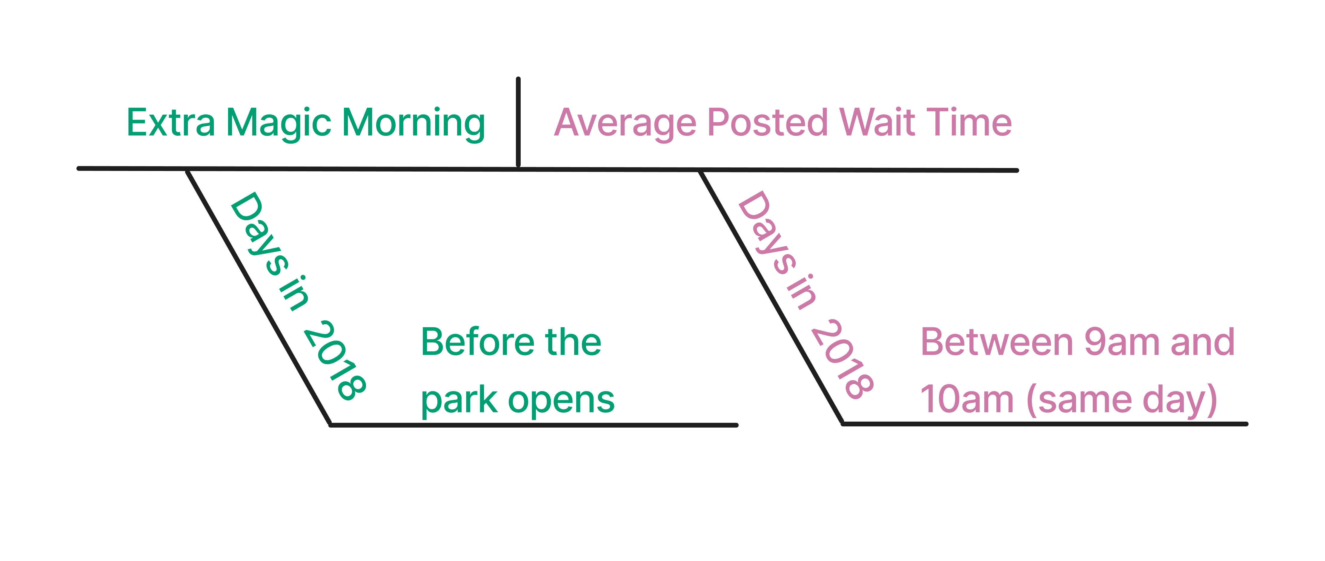
Historically, guests who stayed in a Walt Disney World resort hotel could access the park during Extra Magic Hours, during which the park was closed to all other guests. These extra hours could be in the morning or evening. The Seven Dwarfs Mine Train is a ride at Walt Disney World’s Magic Kingdom. Magic Kingdom may or may not be selected each day to have Extra Magic Hours. We are interested in examining whether Extra Magic Hours in the morning (“Extra Magic Morning”) causes a change in the average posted wait time for the Seven Dwarfs Mine Train on the same day between 9 AM and 10 AM.
Figure 7.2 is a proposed DAG for this question. We assume that Extra Magic Morning is decided based on the time the park closes, the ticket season, and the historic high temperature. Likewise, these three variables are also causes of the average posted wait time. This is a greatly simplified DAG, of course. Moreover, someone at Disney knew the assignment mechanism for deciding Extra Magic Hours for 2018, so if we were working there, we’d want to find out as much as we could about that process. We imagine that the actually causal processes for both the exposure and outcome are more complex than this. For example’s sake, though, we’ll keep it simple.
library(ggdag)
library(ggokabeito)

coord_dag <- list(
  x = c(Season = 0, close = 0, weather = -1, x = 1, y = 2),
  y = c(Season = -1, close = 1, weather = 0, x = 0, y = 0)
)

labels <- c(
  x = "Extra Magic Morning",
  y = "Average wait",
  Season = "Ticket Season",
  weather = "Historic high temperature",
  close = "Time park closed"
)

dagify(
  y ~ x + close + Season + weather,
  x ~ weather + close + Season,
  coords = coord_dag,
  labels = labels,
  exposure = "x",
  outcome = "y"
) |>
  tidy_dagitty() |>
  node_status() |>
  ggplot(
    aes(x, y, xend = xend, yend = yend, color = status)
  ) +
  geom_dag_edges_arc(curvature = c(rep(0, 5), 0.3)) +
  geom_dag_point() +
  geom_dag_label_repel(seed = 1630) +
  scale_color_okabe_ito(na.value = "grey90") +
  theme_dag() +
  theme(legend.position = "none") +
  coord_cartesian(clip = "off")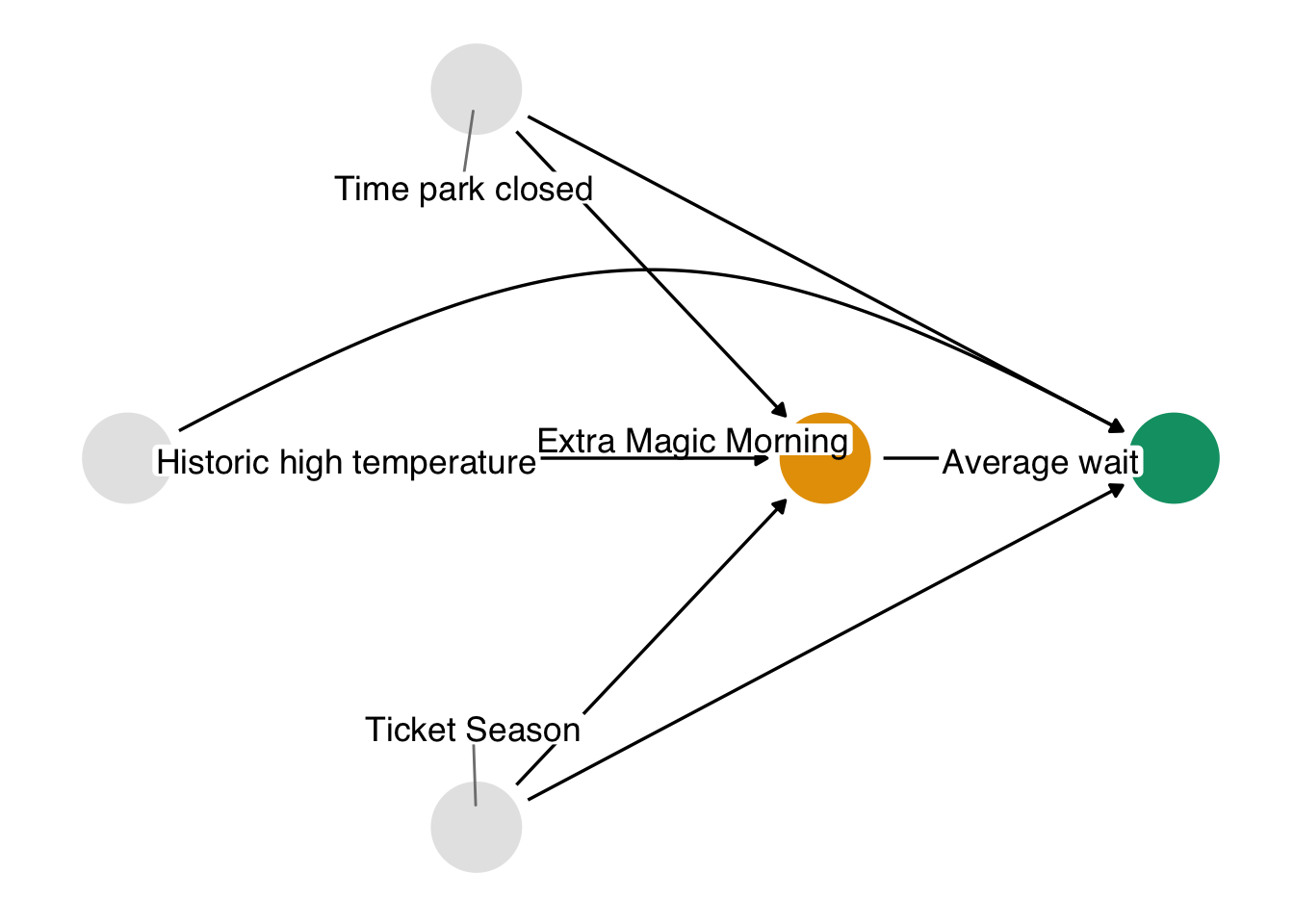
If we were in charge of Walt Disney World’s operations, we might want to randomize dates to have (or not have) Extra Magic Hours. Since we’re not, we need to rely on previously collected observational data and do our best to emulate the target trial that we would have created, should it have been possible. Here, our observations are days. Table 7.1 maps each element of the causal question to elements of the target trial protocol.
| Protocol Step | Description | Target Trial | Emulation |
|---|---|---|---|
| Eligibility criteria | Which days should be included in the study? | Days must be from 2018. | Same as target trial. |
| Exposure definition | When eligible, what precise exposure will days under study receive? | Exposed: Magic Kingdom had Extra Magic Hours in the morning. Otherwise, unexposed. | Same as target trial. |
| Assignment procedures | How will eligible days be assigned to an exposure? | Days are randomized with a 50% probability of having Extra Magic Hours in the morning. The assignment is non-blinded. | Days are assigned the exposure consistent with their data, e.g., whether or not there were Extra Magic Hours that morning. Randomization is emulated using adjustment for confounding. |
| Follow-up period | When does follow-up start and end? | Start: When the park opens the day of the exposure; End: at 10 AM on the same day. | Same as target trial. |
| Outcome definition | What precise outcomes will be measured? | The average posted wait time for the Seven Dwarfs Mine Train between 9 AM and 10 AM on the same day. | Same as target trial. |
| Causal contrast of interest | Which causal estimand will be estimated? | Average Treatment Effect (ATE). | Same as target trial. |
| Analysis plan | What data manipulation and statistical procedures will be applied to the data to estimate the causal contrast of interest? | ATE will be calculated using inverse probability weighting, weighted for historic high temperature, ticket season, and park close time. | Same as target trial. In this case, the variables are confounders, and the adjustment set was determined by assuming the causal structure presented in Figure 7.2. |
You can think of the steps of a protocol as actions to take. In a randomized trial, many of these actions are part of the trial design and data collection. In a target trial emulation, we often need to apply those actions ourselves to the data we are preparing to answer causal questions. Table 7.2 presents the type of actions (here, functions in the tidyverse) we might need to take.
| Target trial protocol element | tidyverse function |
|---|---|
| Eligibility criteria | filter() |
| Exposure definition | mutate() |
| Assignment procedures |
mutate(), select()
|
| Follow-up period |
mutate(), pivot_longer(), pivot_wider()
|
| Outcome definition | mutate() |
| Analysis plan |
select(), mutate(), *_join()
|
We need to manipulate both the seven_dwarfs_train dataset and the parks_metadata_raw dataset to answer our causal question. Let’s start with the seven_dwarfs_train data set. The seven_dwarfs_train dataset in the touringplans package contains information about the date a particular wait time was recorded (park_date), the time of the wait time (wait_datetime), the actual wait time (wait_minutes_actual), and the posted wait time (wait_minutes_posted).
Let’s take a look at this dataset. The range of the dates looks reasonable, as do the posted wait times. The actual wait times, though, have a minimum of -9.2918^{4}!
seven_dwarfs_train |>
  reframe(
    across(
      c(park_date, starts_with("wait_minutes")),
      \(.x) range(.x, na.rm = TRUE)
    )
  )
# A tibble: 2 × 3
park_date wait_minutes_actual wait_minutes_posted
<date> <dbl> <dbl>
1 2015-01-01 -92918 0
2 2021-12-28 217 300We won’t be using this variable just yet, but we’d better remove this row.
The distribution of the wait times is quite wide, with actual times appearing shorter on average than posted times.
seven_dwarfs_train |>
  pivot_longer(
    starts_with("wait_minutes"),
    names_to = "wait_type",
    values_to = "wait_minutes"
  ) |>
  ggplot(aes(wait_minutes, fill = wait_type)) +
  geom_density(color = NA) +
  facet_wrap(~wait_type)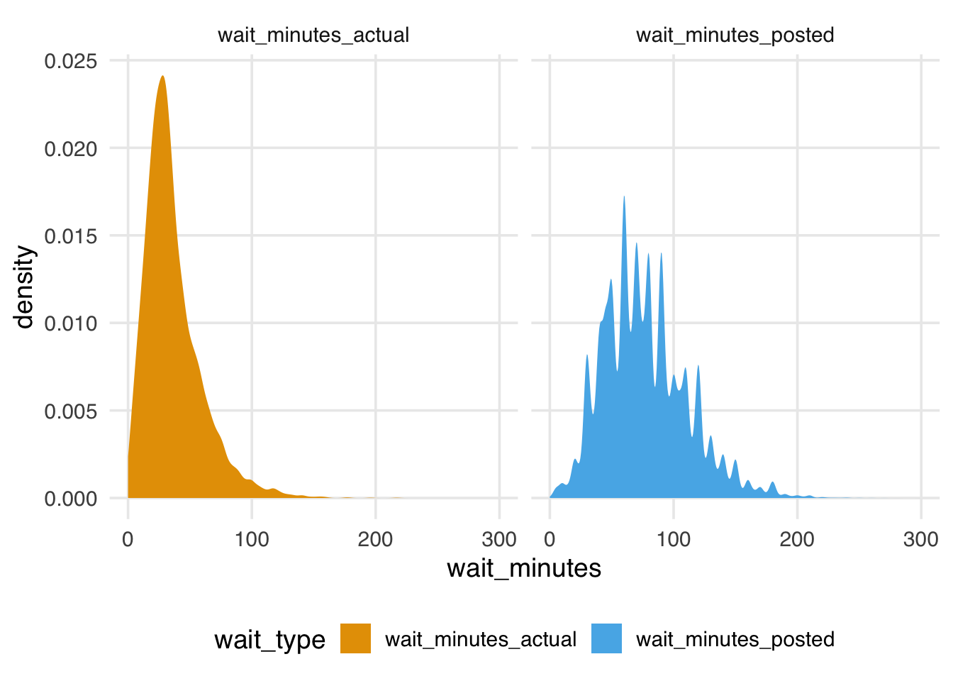
The posted times are also more jagged. They seem to be rounded to the 5 minutes.
 [1]   0   5  10  15  20  25  30  35  40  45  50  55
[13]  60  65  70  75  80  85  90  95 100 105 110 115
[25] 120 125 130 135 140 145 150 155 160 165 170 175
[37] 180 185 190 195 200 205 210 215 220 225 230 235
[49] 240 250 260 270 280 300
Doing this kind of data checking is essential to understand the limits and potential issues in the data. R has many great tools for quickly summarizing data sets, such as skimr::skim() and pointblank::scan_data(). We also recommend using a data validation tool like pointblank to write down and test your expectations about the data.
We need this dataset to calculate our outcome, defined as the average posted wait time between 9 AM and 10 AM. Our eligibility criteria state that we need to restrict our analysis to days in 2018.
seven_dwarfs_9 <- seven_dwarfs_train |>
  # eligibility criteria
  filter(year(park_date) == 2018) |>
  # get hour from wait
  mutate(hour = hour(wait_datetime)) |>
  # outcome definition:
  # calculate average wait minutes by date and hour
  group_by(park_date, hour) |>
  summarize(
    across(
      c(
        wait_minutes_posted,
        wait_minutes_actual
      ),
      \(.x) mean(.x, na.rm = TRUE),
      .names = "{.col}_avg"
    ),
    .groups = "drop"
  ) |>
  # replace NaN with NA
  # this occurs when there is a mean of a
  # vector of length 0, e.g., no observation for the hour
  mutate(across(
    c(
      wait_minutes_posted_avg,
      wait_minutes_actual_avg
    ),
    \(.x) if_else(is.nan(.x), NA, .x)
  )) |>
  # outcome definition:
  # only keep the average wait time between 9 and 10
  filter(hour == 9)

seven_dwarfs_9
# A tibble: 362 × 4
park_date hour wait_minutes_posted_avg
<date> <int> <dbl>
1 2018-01-01 9 60
2 2018-01-02 9 60
3 2018-01-03 9 60
4 2018-01-04 9 68.9
5 2018-01-05 9 70.6
6 2018-01-06 9 33.3
7 2018-01-07 9 46.4
8 2018-01-08 9 69.5
9 2018-01-09 9 64.3
10 2018-01-10 9 74.3
# ℹ 352 more rows
# ℹ 1 more variable: wait_minutes_actual_avg <dbl>Now that we have our outcome settled, we need to get our exposure variable and any other park-specific variables about the day in question that we may adjust for. Examining Figure 7.2, we see that we have three open backdoor paths. We can close them with the three confounders on each path: the ticket season, the time the park closed, and the historic high temperature. These are in the parks_metadata_raw dataset. This data will require extra cleaning since the names are in the original format.
Frequently, we find ourselves merging data from multiple sources when attempting to answer causal questions to ensure we have the outcome, exposure, and confounders joined together. Let’s clean this data up and join it to the outcome data.
parks_metadata_raw contains many more variables than seven_dwarfs_train.
parks_metadata_raw |>
  length()
[1] 181For this analysis, we need date (the observation date, which will work as an ID to join on), wdw_ticket_season (the ticket season for the date), wdwmaxtemp (the historic high temperature), mkclose (the time Magic Kingdom closed), and mkemhmorn (whether Magic Kingdom had an Extra Magic Hour in the morning).
parks_metadata <- parks_metadata_raw |>
  ## exposure definition, assignment procedure,
  ## and analysis plan: select the ID, exposure, and confounders
  select(
    # id
    park_date = date,
    # exposure
    park_extra_magic_morning = mkemhmorn,
    # confounders
    park_ticket_season = wdw_ticket_season,
    park_temperature_high = wdwmaxtemp,
    park_close = mkclose
  ) |>
  ## eligibility criteria: days in 2018
  filter(year(park_date) == 2018)
We like to have our variable names follow a clean convention; one way to do this is to follow Emily Riederer’s “Column Names as Contracts” format (Riederer 2020). The basic idea is to predefine a set of words, phrases, or stubs with precise meanings to index information and use these consistently when naming variables. For example, in these data, variables that are specific to a particular wait time are prepended with the term wait (e.g. wait_datetime and wait_minutes_actual), variables that are specific to the park on a particular day, acquired from parks metadata, are prepended with the term park (e.g. park_date or park_temperature_high).
Between 12 and 16% of days each month had Extra Magic Mornings in 2018, with one exception: 42% of days in December had Extra Magic Mornings.
parks_metadata |>
  group_by(month = month(park_date)) |>
  summarise(prop = sum(park_extra_magic_morning) / n())
# A tibble: 12 × 2
month prop
<dbl> <dbl>
1 1 0.129
2 2 0.143
3 3 0.161
4 4 0.133
5 5 0.129
6 6 0.167
7 7 0.129
8 8 0.161
9 9 0.133
10 10 0.161
11 11 0.133
12 12 0.419Let’s learn a little more about the confounders, too.
Not all ticket season types happen every month. There weren’t any peak tickets in August or September or value tickets in June, July, or December.
count_by_month <- function(parks_metadata, .var) {
  parks_metadata |>
    mutate(
      month = month(
        park_date,
        label = TRUE,
        abbr = TRUE
      )
    ) |>
    count(month, {{ .var }}) |>
    # fill in implicitly missing combos
    complete(
      month,
      {{ .var }},
      fill = list(n = 0)
    )
}

ticket_season_by_month <- parks_metadata |>
  count_by_month(park_ticket_season)

ticket_season_by_month |>
  arrange(n, park_ticket_season)
# A tibble: 36 × 3
month park_ticket_season n
<ord> <chr> <int>
1 Aug peak 0
2 Sep peak 0
3 Jun value 0
4 Jul value 0
5 Dec value 0
6 Jan peak 3
7 May value 3
8 Feb peak 4
9 Jul peak 4
10 Oct peak 4
# ℹ 26 more rowsThere were many more regular ticket days in the summer and more peak ticket days in March, May, and December (Figure 7.3).
ticket_season_by_month |>
  ggplot(aes(month, n, fill = park_ticket_season)) +
  geom_col(position = "fill", alpha = 0.8) +
  labs(
    y = "proportion of days",
    x = NULL,
    fill = "ticket season"
  ) +
  theme(panel.grid.major.x = element_blank())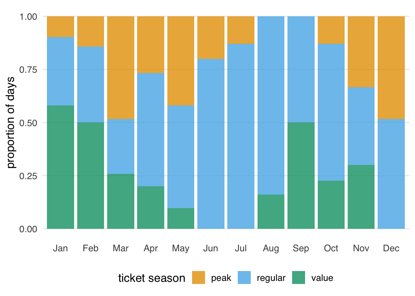
Throughout much of the year, the Magic Kingdom was open until 22:00, 21:00, or midnight, although there was considerable variety, including one day that ended at 16:30.
parks_metadata |>
  count(park_close, sort = TRUE)
# A tibble: 8 × 2
park_close n
<time> <int>
1 22:00 105
2 23:00 93
3 24:00 58
4 18:00 57
5 21:00 28
6 20:00 21
7 25:00 2
8 16:30 1The close time varies across the year, with earlier times happening more often in the late fall and winter (Figure 7.4). Some early times don’t happen in the summer, and some late times don’t happen in late fall.
parks_metadata |>
  count_by_month(park_close) |>
  ggplot(aes(month, n, fill = ordered(park_close))) +
  geom_col(position = "fill", alpha = 0.85) +
  labs(
    y = "proportion of days",
    x = NULL,
    fill = "close time"
  ) +
  theme(panel.grid.major.x = element_blank())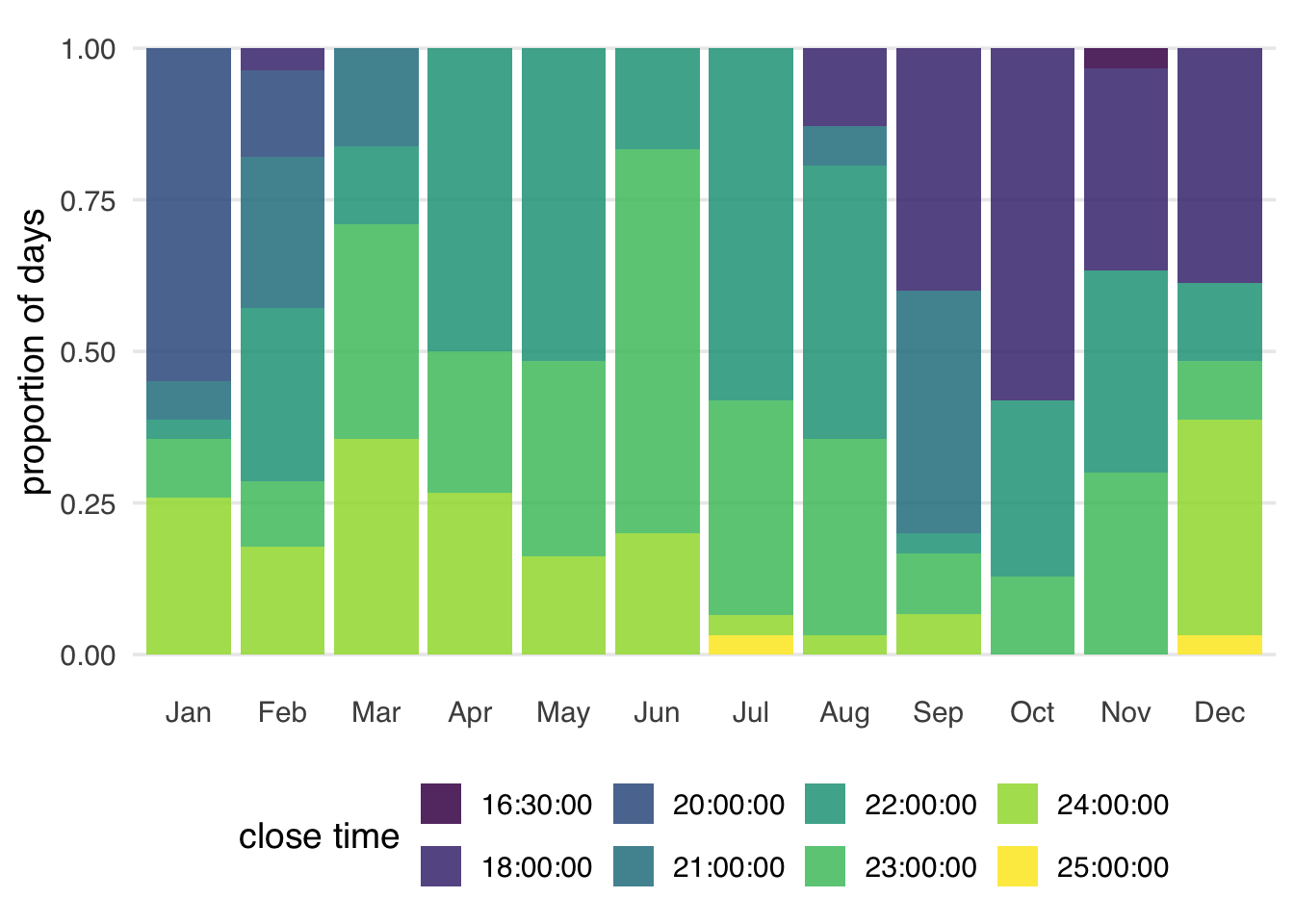
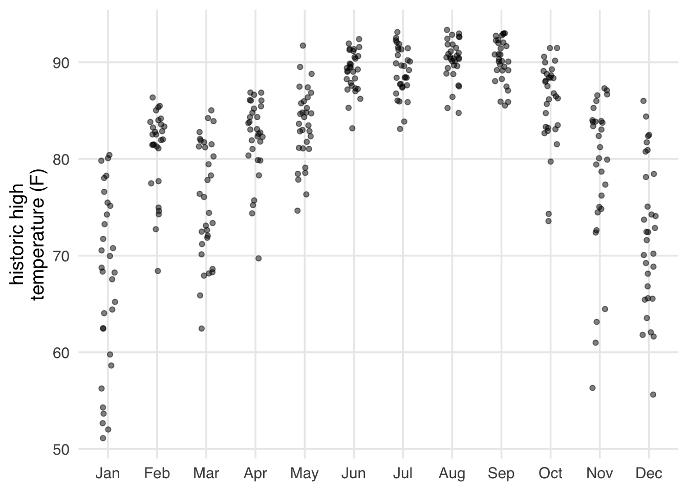
Disney World is in Florida, so it never gets particularly cold, but it gets hot in the summer (Figure 7.5).
parks_metadata |>
  mutate(
    month = month(
      park_date,
      label = TRUE,
      abbr = TRUE
    )
  ) |>
  ggplot(aes(month, park_temperature_high)) +
  geom_jitter(height = 0, width = 0.15, alpha = 0.5) +
  labs(
    y = "historic high\ntemperature (F)",
    x = NULL
  )
Let’s now join the confounder and exposure data (in parks_metadata) to the outcome data (in seven_dwarfs_9) to make a single analytic dataset. In this case, we have a simple, 1:1 match and want to attach parks_metadata to seven_dwarfs_9; we can use a left join for that.
Joining is a nuanced data-wrangling topic but is often essential for creating an analytic dataset. We recommend R for Data Science for a thorough discussion of joins.
Notably, we don’t have a match for every day. 2018 had 365 days, which is how many rows we have in parks_metadata. seven_dwarfs_9, though, only has 362. We can use an anti-join to see which days don’t have a match in seven_dwarfs_9.
parks_metadata |>
  anti_join(seven_dwarfs_9, by = "park_date")
# A tibble: 3 × 5
park_date park_extra_magic_morn…¹ park_ticket_season
<date> <dbl> <chr>
1 2018-05-10 0 regular
2 2018-05-11 1 regular
3 2018-05-12 0 peak
# ℹ abbreviated name: ¹park_extra_magic_morning
# ℹ 2 more variables: park_temperature_high <dbl>,
# park_close <time>These three days in a row are missing records on the posted wait times for 9 AM.
seven_dwarfs_train |>
  filter(
    park_date %in% c("2018-05-10", "2018-05-11", "2018-05-12"),
    hour(wait_datetime) == 9
  )
# A tibble: 0 × 4
# ℹ 4 variables: park_date <date>,
# wait_datetime <dttm>, wait_minutes_actual <dbl>,
# wait_minutes_posted <dbl>At any rate, let’s join the datasets together by date. Now, we have a single analytic dataset on which to do our causal analysis.
seven_dwarfs_9 <- seven_dwarfs_9 |>
  left_join(parks_metadata, by = "park_date")

seven_dwarfs_9
# A tibble: 362 × 8
park_date hour wait_minutes_posted_avg
<date> <int> <dbl>
1 2018-01-01 9 60
2 2018-01-02 9 60
3 2018-01-03 9 60
4 2018-01-04 9 68.9
5 2018-01-05 9 70.6
6 2018-01-06 9 33.3
7 2018-01-07 9 46.4
8 2018-01-08 9 69.5
9 2018-01-09 9 64.3
10 2018-01-10 9 74.3
# ℹ 352 more rows
# ℹ 5 more variables: wait_minutes_actual_avg <dbl>,
# park_extra_magic_morning <dbl>,
# park_ticket_season <chr>,
# park_temperature_high <dbl>, park_close <time>Let’s take a bird’s eye view of the data set by creating a descriptive table. R has many tools for doing so; we are going to use the tbl_summary() function from the gtsummary package. We’ll also use the labelled package to clean up the variable names for the table.
In Table 10.1, we see that more days did not have Extra Magic Hours in the morning. A slight majority of days were in regular ticket season, and both exposed and unexposed days had all three types of ticket season pricing. Among close times, we see that the most common times were 22:00 and 23:00. There are also several sparse or empty cells, e.g., close times, where we may have positivity violations. Days with Extra Magic Mornings were also slightly cooler, but not by much.
library(gtsummary)
library(labelled)
seven_dwarfs_9 |>
  set_variable_labels(
    park_ticket_season = "Ticket Season",
    park_close = "Close Time",
    park_temperature_high = "Historic High Temperature"
  ) |>
  mutate(
    park_close = as.character(park_close),
    park_extra_magic_morning = factor(
      park_extra_magic_morning,
      labels = c("No Extra Magic Hours", "Extra Magic Hours")
    )
  ) |>
  tbl_summary(
    by = park_extra_magic_morning,
    include = c(
      park_ticket_season,
      park_close,
      park_temperature_high
    )
  ) |>
  # add an overall column to the table
add_overall(last = TRUE)| Characteristic |
No Extra Magic Hours N = 3021 |
Extra Magic Hours N = 601 |
Overall N = 3621 |
|---|---|---|---|
| Ticket Season | |||
| peak | 63 (21%) | 18 (30%) | 81 (22%) |
| regular | 161 (53%) | 35 (58%) | 196 (54%) |
| value | 78 (26%) | 7 (12%) | 85 (23%) |
| park_close | |||
| 16:30:00 | 1 (0.3%) | 0 (0%) | 1 (0.3%) |
| 18:00:00 | 39 (13%) | 18 (30%) | 57 (16%) |
| 20:00:00 | 19 (6.3%) | 2 (3.3%) | 21 (5.8%) |
| 21:00:00 | 28 (9.3%) | 0 (0%) | 28 (7.7%) |
| 22:00:00 | 93 (31%) | 11 (18%) | 104 (29%) |
| 23:00:00 | 81 (27%) | 11 (18%) | 92 (25%) |
| 24:00:00 | 40 (13%) | 17 (28%) | 57 (16%) |
| 25:00:00 | 1 (0.3%) | 1 (1.7%) | 2 (0.6%) |
| Historic High Temperature | 84 (78, 89) | 83 (76, 87) | 84 (78, 89) |
| 1 n (%); Median (Q1, Q3) | |||
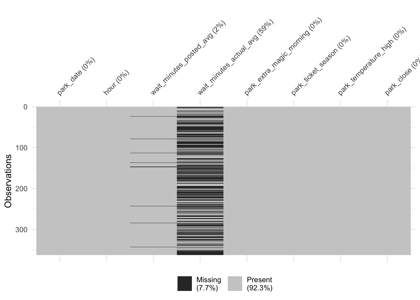
Recognizing whether we have any missing data in our variables is vital for reasons we saw in Chapter 4 and that we’ll explore further in Chapter 15. As we saw from the anti-join, we are indeed missing some data. Let’s take a closer look. The visdat package is great for getting a quick sense of whether we have any missing data.
The missing observations for the posted wait times weren’t limited to the dates with no observations. Some had records that were empty. For instance, on January 24th, there were nine records, but both types of wait times were missing.
seven_dwarfs_train |>
  filter(
    park_date == "2018-01-24",
    hour(wait_datetime) == 9
  ) |>
  select(starts_with("wait_minutes"))
# A tibble: 9 × 2
wait_minutes_actual wait_minutes_posted
<dbl> <dbl>
1 NA NA
2 NA NA
3 NA NA
4 NA NA
5 NA NA
6 NA NA
7 NA NA
8 NA NA
9 NA NAAll said and done, though, we’re only missing posted wait times for 8 days in addition to the 3 days with no records, about 3% of the year total. This amount of missingness isn’t likely to significantly impact our results. For this first analysis, we will ignore the missing values in the posted wait times. We have a lot more missingness in the actual wait times, a topic we’ll revisit in Chapter 15. Since we’re not using this outcome yet, we’ll set that aside, too.
As we’ve seen in Section 3.2 and Chapter 5, data can’t solve the problem of the unverifiable assumptions we need to make to do causal inference. However, it can still provide valuable information.
Exchangeability is a tough assumption to check. In many cases, a confounder will be associated with both the exposure and the outcome. However, the relationships between the confounder and these two variables may themselves be confounded. We’ll save data checks for exchangeability for Chapter 9, where we will have better tools to probe this assumption.
One way we can check for consistency is to use data for multiple versions of treatment. For instance, if our question had instead been about “Extra Magic Hours” rather than “Extra Magic Hours in the morning”, we might have a consistency violation. Extra Magic Hours also happen in the evening, and it’s plausible that that would have a different effect than those in the morning. We could explore the data by separating the two Extra Magic Hours types into separate exposures. We won’t calculate this since we’re already being specific, but the idea is the same as any other type of stratification. Here, we’re grouping by the values of the exposure as we have them assigned and the exposure_type, a variable that tells us more details about the exposure (say, “morning” or “evening” for the exposure “Extra Magic Hours”).
dataset |>
  group_by(exposure, exposure_type) |>
  summarize(...)
There are also harder-to-measure ways that Extra Magic Mornings might be different from one another; we might not be able to check these without a lot of detective work. We won’t probe this assumption further since we’ve already clarified that we’re using Extra Magic Mornings. In practice, you want to be cautious about such a decision; be an expert in your exposure and its potential manifestations.
Let’s dig into positivity. The positivity assumption requires that there are exposed and unexposed subjects within each level and combination of the variables used to achieve exchangeability. We can explore this by visualizing the distribution of each of our proposed confounders stratified by the exposure. This well help us understand if we are missing exposed or unexposed days for a given level. The only way we can tell the difference between stochastic and structural positivity, however, is through background knowledge. For instance, it might just be coincidence that Extra Magic Hours didn’t happen on a day with a given close time (stochastic violation), but there may be days that are ineligible for Extra Magic Hours given the confounders (structural violation).
Figure 7.6 shows the distribution of Magic Kingdom park closing time by whether the date had extra magic hours in the morning. Both exposure levels span the majority of the covariate space, but none of the days where the Magic Kingdom closed at 16:30 and 21:00 had Extra Magic Mornings.
ggplot(
  seven_dwarfs_9,
  aes(
    x = factor(park_close),
    group = factor(park_extra_magic_morning),
    fill = factor(park_extra_magic_morning)
  )
) +
  geom_bar(position = "fill", alpha = 0.8) +
  labs(
    fill = "Extra Magic Morning",
    x = "Time of Park Close"
  ) +
  theme(panel.grid.major.x = element_blank())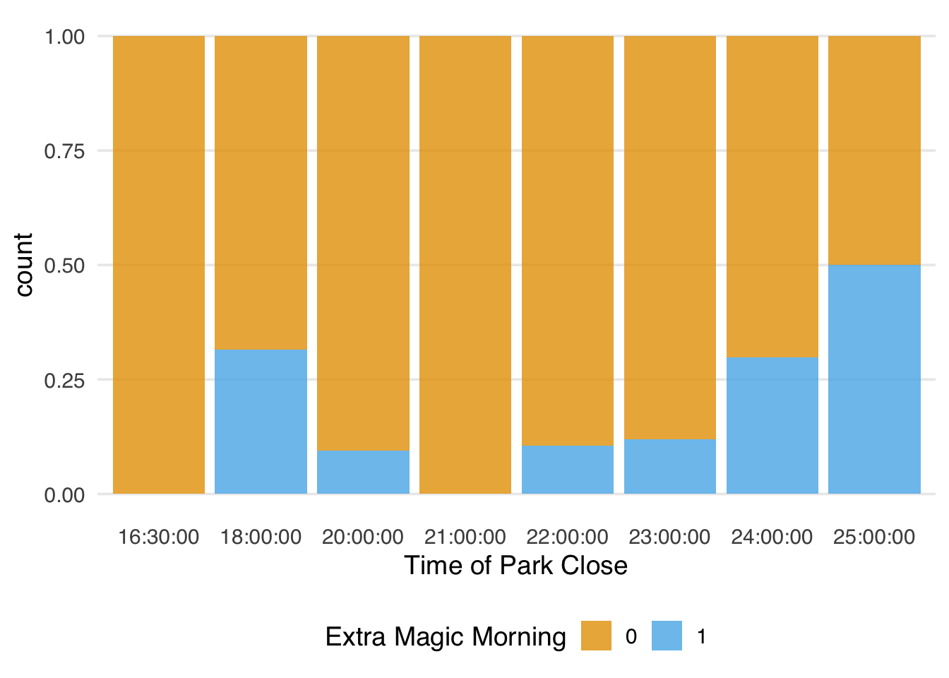
As we know, only one day ended at 16:30, but there were 28 that ended at 21:00, none of which had Extra Magic Mornings. That makes it difficult to make inferences about this region of the covariate space without additional assumptions or without changing the question. We’ll explore both in detail later on.
library(hms)
seven_dwarfs_9 |>
  count(park_close, park_extra_magic_morning) |>
  complete(
    park_close,
    park_extra_magic_morning,
    fill = list(n = 0)
  ) |>
  filter(park_close %in% parse_hm(c("16:30", "21:00")))
# A tibble: 4 × 3
park_close park_extra_magic_morning n
<time> <dbl> <int>
1 16:30 0 1
2 16:30 1 0
3 21:00 0 28
4 21:00 1 0We can use a mirrored histogram to examine the distribution of historic high temperatures at Magic Kingdom by whether the date had Extra Magic Hours in the morning. To create one, we’ll use the halfmoon package’s geom_mirror_histogram(). Examining Figure 7.7, very few days in the exposed group have maximum temperatures less than 60 degrees.
library(halfmoon)
ggplot(
  seven_dwarfs_9,
  aes(
    x = park_temperature_high,
    group = factor(park_extra_magic_morning),
    fill = factor(park_extra_magic_morning)
  )
) +
  geom_mirror_histogram(bins = 20, alpha = 0.8) +
  scale_y_continuous(labels = abs) +
  labs(
    fill = "Extra Magic Morning",
    x = "Historic high temperature (F)"
  )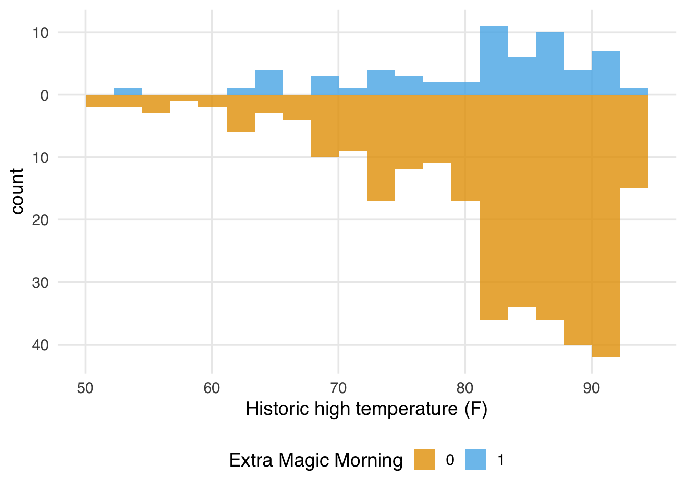
Indeed, there is only one day with Extra Magic Mornings with this historic high temperature. If we found this particularly troubling, given our understanding of the problem, we could consider changing our causal question to restrict the analysis to warmer days. Making such changes would also restrict which days we could draw conclusions about.
seven_dwarfs_9 |>
  filter(park_temperature_high < 60) |>
  count(park_extra_magic_morning)
# A tibble: 2 × 2
park_extra_magic_morning n
<dbl> <int>
1 0 9
2 1 1Finally, let’s look at the distribution of ticket season by whether there were Extra Magic Hours in the morning. Examining Figure 7.8, we do not see any positivity violations.
ggplot(
  seven_dwarfs_9,
  aes(
    x = park_ticket_season,
    group = factor(park_extra_magic_morning),
    fill = factor(park_extra_magic_morning)
  )
) +
  geom_bar(position = "dodge", alpha = 0.8) +
  labs(
    fill = "Extra Magic Morning",
    x = "Magic Kingdom Ticket Season"
  ) +
  theme(panel.grid.major.x = element_blank())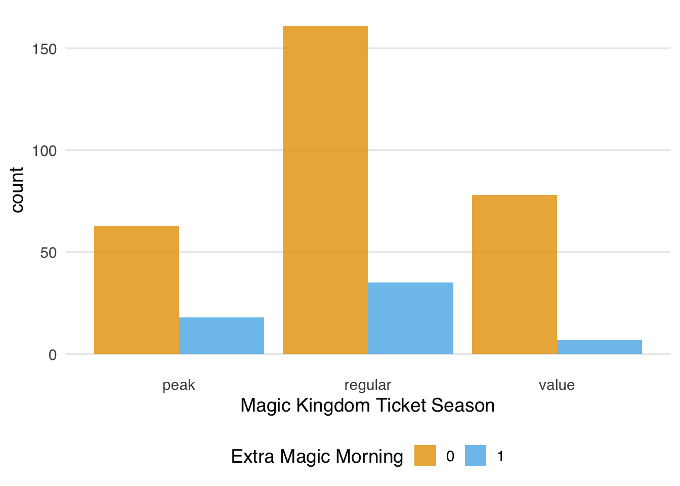
Among the three confounders, we see some potential evidence of positivity violations. We can examine this more closely because we have so few variables here. Let’s start by discretizing the park_temperature_high variable, cutting it into tertiles.
prop_exposed <- seven_dwarfs_9 |>
  ## cut park_temperature_high into tertiles
  mutate(
    park_temperature_high_bin = cut(
      park_temperature_high,
      breaks = 3
    )
  ) |>
  ## bin park close time
  mutate(
    park_close_bin = case_when(
      hour(park_close) < 19 & hour(park_close) > 12 ~ "(1) early",
      hour(park_close) >= 19 & hour(park_close) < 24 ~ "(2) standard",
      hour(park_close) >= 24 | hour(park_close) < 12 ~ "(3) late"
    )
  ) |>
  group_by(
    park_close_bin,
    park_temperature_high_bin,
    park_ticket_season
  ) |>
  ## calculate the proportion exposed in each bin
  summarize(
    prop_exposed = mean(park_extra_magic_morning),
    .groups = "drop"
  ) |>
  complete(
    park_close_bin,
    park_temperature_high_bin,
    park_ticket_season,
    fill = list(prop_exposed = 0)
  )

prop_exposed |>
  ggplot(
    aes(
      x = park_close_bin,
      y = park_temperature_high_bin,
      fill = prop_exposed
    )
  ) +
  geom_tile() +
  scale_fill_viridis_c(begin = 0.1, end = 0.9) +
  facet_wrap(~park_ticket_season) +
  labs(
    y = "Historic High Temperature (F)",
    x = "Magic Kingdom Park Close Time",
    fill = "Proportion of\nDays Exposed"
  ) +
  theme(panel.grid = element_blank())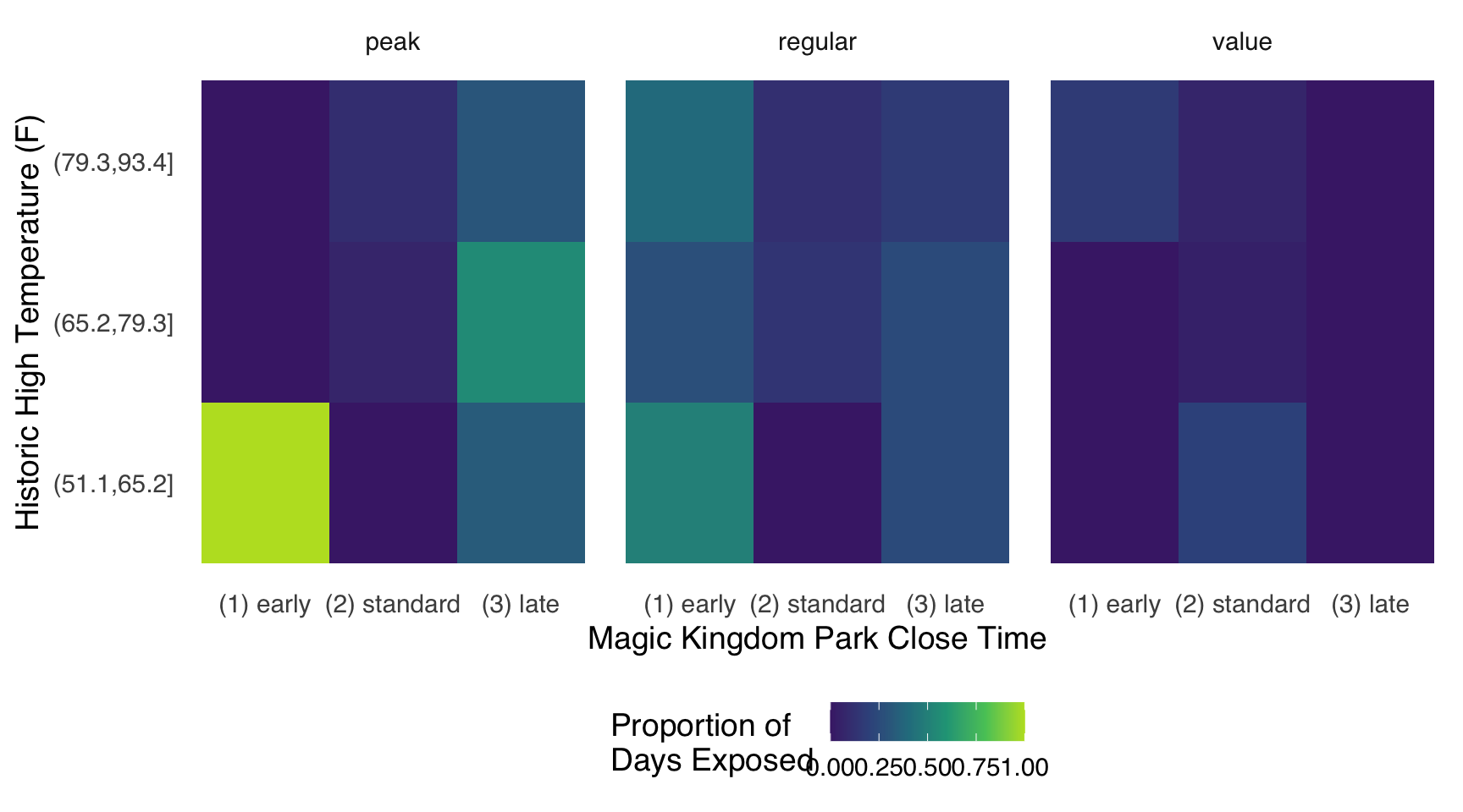
Figure 7.9 shows an interesting potential violation. 100% of days with lower temperatures (historic highs between 51 and 65 degrees) that are in the peak ticket season have Extra Magic Hours in the morning. This actually makes sense if we think a bit about this data set. The only days with cold temperatures in Florida that would also be considered a “peak” time to visit Walt Disney World would be over Christmas and New Year. During this time, there historically were always Extra Magic Hours.
We also have nine combinations that were never exposed.
| Close Time | Temperature | Ticket Season | Proportion Exposed |
|---|---|---|---|
| (1) early | (51.1,65.2] | peak | 1 |
| (1) early | (51.1,65.2] | value | 0 |
| (1) early | (65.2,79.3] | peak | 0 |
| (1) early | (65.2,79.3] | value | 0 |
| (1) early | (79.3,93.4] | peak | 0 |
| (2) standard | (51.1,65.2] | peak | 0 |
| (2) standard | (51.1,65.2] | regular | 0 |
| (3) late | (51.1,65.2] | value | 0 |
| (3) late | (65.2,79.3] | value | 0 |
| (3) late | (79.3,93.4] | value | 0 |
Are these chance occurrences or structural ineligibility for these days to be Extra Magic Mornings? If they are chance occurrences, can we make statistical assumptions that allow us to validly extrapolate across these empty regions of covariate space in our data? In either case, should we change the question we’re asking, either by eligibility or estimand? For now, we are going to continue without making changes to the research question or target trial emulation, but we will keep these observations in mind and explore other options in future sections.
Now that we have a better understanding of the causal question and data (as well as their limitations), let’s turn our attention to using statistical models to improve our estimation of the answer we’re looking for.