Work-in-progress 🚧
You are reading the work-in-progress first edition of Causal Inference in R. This chapter has its foundations written but is still undergoing changes.
You are reading the work-in-progress first edition of Causal Inference in R. This chapter has its foundations written but is still undergoing changes.
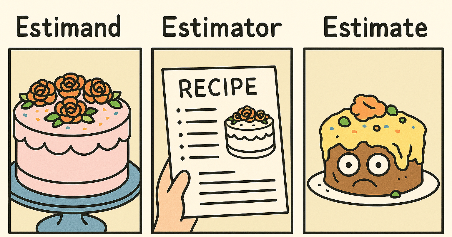
When analyzing to make causal inferences, we need to keep the causal question that we’re interested in close to our chest. The causal question helps guide not only the assumptions we need to make but also how we will answer the question. This chapter deals with three ideas closely related to answering causal questions: the estimand, the estimator, and the estimate. The estimand is the target of interest, the estimator is the method by which we approximate this estimand using data, and the estimate is the value we get when we plug our data into the estimator. You can think of the estimand as a glossy picture of a beautiful cake we are trying to bake, the estimator as the recipe, and the estimate as the cake we pull out of our oven.
So far, we have primarily focused on the average treatment effect, the effect of the exposure of interest averaged across the whole population. The estimand here is the expected value of the difference in potential outcomes across all individuals:
\[ E[Y(1) - Y(0)] \]
The estimator we use depends on the method we’ve chosen. For example, in an A/B test or randomized controlled trial, our estimator could be the average outcome among those who received exposure A minus the average outcome among those who received exposure B.
\[ \sum_{i=1}^{N}\frac{Y_i\times X_i}{N_{\textrm{A}}} - \frac{Y_i\times (1-X_i)}{N_{\textrm{B}}} \]
Where \(X\) is an indicator for exposure A (\(X = 1\) for exposure A and \(X = 0\) for exposure B), \(N_A\) is the total number in group A and \(N_B\) is the total number in group B such that \(N_A + N_B = N\). Let’s motivate this example a bit more. Suppose we have two different designs for a call-to-action (often abbreviated as CTA, a written directive for a marketing campaign) and want to assess whether they lead to a different average number of items a user purchases. We can create an A/B test where we randomly assign a subset of users to see design A or design B. Suppose we have A/B testing data for 100 participants in a dataset called ab. Here is some code to simulate such a data set.
set.seed(928)
ab <- tibble(
  # generate the exposure, x, from a binomial distribution
  # with the probability exposure A of 0.5
  x = rbinom(100, 1, 0.5),
  # generate the "true" average treatment effect of 1
  # we use rnorm(100) to add the random error term that is normally
  # distributed with a mean of 0 and a standard deviation of 1
  y = x + rnorm(100)
)
Here, the exposure is x, and the outcome is y. The true average treatment effect is 1, implying that, on average, seeing call-to-action A increases the number of items purchased by 1.
ab# A tibble: 100 × 2
x y
<int> <dbl>
1 0 -0.280
2 1 1.87
3 1 1.36
4 0 -0.208
5 0 1.13
6 1 0.352
7 1 -0.148
8 1 2.08
9 0 2.09
10 0 -1.41
# ℹ 90 more rowsBelow are two ways to estimate this in R. Using a formula approach, we calculate the difference in y between exposure values in the first example.
ab |>
  summarize(
    n_a = sum(x),
    n_b = sum(1 - x),
    estimate = sum(
      (y * x) / n_a - y * (1 - x) / n_b
    )
  )
# A tibble: 1 × 3
n_a n_b estimate
<int> <dbl> <dbl>
1 54 46 1.15Alternatively, we can group_by() x and summarize() the means of y for each group, then pivot the results to take their difference.
ab |>
  group_by(x) |>
  summarize(avg_y = mean(y)) |>
  pivot_wider(
    names_from = x,
    values_from = avg_y,
    names_prefix = "x_"
  ) |>
  summarize(estimate = x_1 - x_0)
# A tibble: 1 × 1
estimate
<dbl>
1 1.15Because \(X\), the exposure, was randomly assigned, this estimator results in an unbiased estimate of our estimand of interest.
What do we mean by unbiased, though? Notice that while the “true” causal effect is 1, this estimate is not precisely 1; it is 1.149. Why the difference? This A/B test included a sample of 100 participants, not the whole population. As that sample increases, our estimate will get closer to the truth. Let’s try that. Let’s simulate the data again but increase the sample size from 100 to 100,000:
set.seed(928)
ab <- tibble(
  x = rbinom(100000, 1, 0.5),
  y = x + rnorm(100000)
)

ab |>
  summarize(
    n_a = sum(x),
    n_b = sum(1 - x),
    estimate = sum(
      (y * x) / n_a - y * (1 - x) / n_b
    )
  )
# A tibble: 1 × 3
n_a n_b estimate
<int> <dbl> <dbl>
1 49918 50082 1.01Notice how the estimate is 1.01, much closer to the actual average treatment effect, 1.
Suppose \(X\) had not been randomly assigned. In that case, we could use the pre-exposure covariates to estimate the conditional probability of \(X\) (the propensity score) and incorporate this probability in a weight \((w_i)\) to estimate this causal effect. We could extend the unweighted estimator to use weighted means to estimate our average treatment effect estimand. This version of inverse probability weighting is sometimes called the Hajek estimator. While we’ll focus on using regression for outcome models, this simple extension of the unweighted estimator shows how we can modify an estimator to adapt to different estimands.
\[ \frac{\sum_{i=1}^NY_i\times X_i\times w_i}{\sum_{i=1}^NX_i\times w_i}-\frac{\sum_{i=1}^NY_i\times(1-X_i)\times w_i}{\sum_{i=1}^N(1-X_i)\times w_i} \]
Depending on the study’s goal or causal question, we may want to estimate different estimands. Here, we will outline the most common causal estimands, their target populations, the causal questions they may help answer, and the methods used to estimate them (Greifer and Stuart 2021).
A common estimand is the average treatment effect (ATE). The target population is the total sample or population of interest. The estimand here is the expected value of the difference in potential outcomes across all individuals:
\[ E[Y(1) - Y(0)] \]
An example research question is “Should a policy be applied to all eligible patients?” (Greifer and Stuart 2021).
Most randomized controlled trials are designed with the ATE as the target estimand. The estimator we applied to ab earlier will this work. We’ve also seen two other types of estimators we can use: matching and weighting. In a non-randomized setting, you can estimate the ATE using full matching. Each observation in the exposed group is matched to at least one observation in the control group (and vice versa) without replacement. We’ll discuss estimands with matching further in Section 10.3) Alternatively, the following inverse probability weight will allow you to estimate the ATE using propensity score weighting.
\[ w_{ATE} = \frac{X}{p} + \frac{(1 - X)}{1 - p} \]
In other words, the weight is one over the propensity score for those in the exposure group and one over one minus the propensity score for the control group. Intuitively, this weight equates to the inverse probability of being in the exposure group in which you actually were. Note that for both matching and weighting, the estimator also includes fitting an outcome model, as we will do in Chapter 11. That is to say, matching or weighting on the propensity score is only the first step of these estimators of the ATE. It’s using the matched or weighted data in the outcome model that will then generate an estimate of the ATE.
Let’s dig deeper into this causal estimand using the Touring Plans data. Recall that in Section 8.2, we examined the relationship between whether there were “Extra Magic Hours” in the morning and the average wait time for the Seven Dwarfs Mine Train the same day between 9 A.M. and 10 A.M. Let’s reconstruct our data set, seven_dwarfs, and fit the same propensity score model specified previously.
library(broom)
library(touringplans)

seven_dwarfs <- seven_dwarfs_train_2018 |>
  filter(wait_hour == 9) |>
  mutate(
    park_extra_magic_morning = factor(
      park_extra_magic_morning,
      labels = c("No Magic Hours", "Extra Magic Hours")
    )
  )

seven_dwarfs_with_ps <- glm(
  park_extra_magic_morning ~ park_ticket_season +
    park_close +
    park_temperature_high,
  data = seven_dwarfs,
  family = binomial()
) |>
  augment(type.predict = "response", data = seven_dwarfs)
Let’s examine a table of the variables of interest in this data frame. We will use the tbl_summary() function from the gtsummary package to do so. (We’ll also use the labelled package to clean up the variable names for the table.)
library(gtsummary)
library(labelled)
seven_dwarfs_with_ps <- seven_dwarfs_with_ps |>
  set_variable_labels(
    park_ticket_season = "Ticket Season",
    park_close = "Close Time",
    park_temperature_high = "Historic High Temperature"
  )

tbl_summary(
  seven_dwarfs_with_ps,
  by = park_extra_magic_morning,
  include = c(park_ticket_season, park_close, park_temperature_high)
) |>
  # add an overall column to the table
add_overall(last = TRUE)| Characteristic |
No Magic Hours N = 2941 |
Extra Magic Hours N = 601 |
Overall N = 3541 |
|---|---|---|---|
| Ticket Season | |||
| peak | 60 (20%) | 18 (30%) | 78 (22%) |
| regular | 158 (54%) | 35 (58%) | 193 (55%) |
| value | 76 (26%) | 7 (12%) | 83 (23%) |
| Close Time | |||
| 16:30:00 | 1 (0.3%) | 0 (0%) | 1 (0.3%) |
| 18:00:00 | 37 (13%) | 18 (30%) | 55 (16%) |
| 20:00:00 | 18 (6.1%) | 2 (3.3%) | 20 (5.6%) |
| 21:00:00 | 28 (9.5%) | 0 (0%) | 28 (7.9%) |
| 22:00:00 | 91 (31%) | 11 (18%) | 102 (29%) |
| 23:00:00 | 78 (27%) | 11 (18%) | 89 (25%) |
| 24:00:00 | 40 (14%) | 17 (28%) | 57 (16%) |
| 25:00:00 | 1 (0.3%) | 1 (1.7%) | 2 (0.6%) |
| Historic High Temperature | 84 (78, 89) | 83 (76, 87) | 84 (78, 89) |
| 1 n (%); Median (Q1, Q3) | |||
From Table 10.1, 294 days did not have Extra Magic Hours in the morning, and 60 did. We also see that 30% of the Extra Magic Mornings were during peak season compared to 20% of the non-Extra Magic Mornings. Additionally, days with Extra Magic Mornings were more likely to close at 6 P.M. (18:00:00) compared to non-magic hour mornings. The median high temperature on days with Extra Magic Hour mornings is slightly lower (83 degrees) than non-Extra Magic Hour morning days.
Now, let’s construct our propensity score weight to estimate the ATE. As we saw in Chapter 8, the propensity package has helper functions to estimate weights. The wt_ate() function will calculate ATE weights for us.
library(propensity)
seven_dwarfs_wts <- seven_dwarfs_with_ps |>
  mutate(w_ate = wt_ate(.fitted, park_extra_magic_morning))
Let’s look at the distribution of these weights.
ggplot(seven_dwarfs_wts, aes(x = w_ate)) +
  geom_histogram(bins = 50)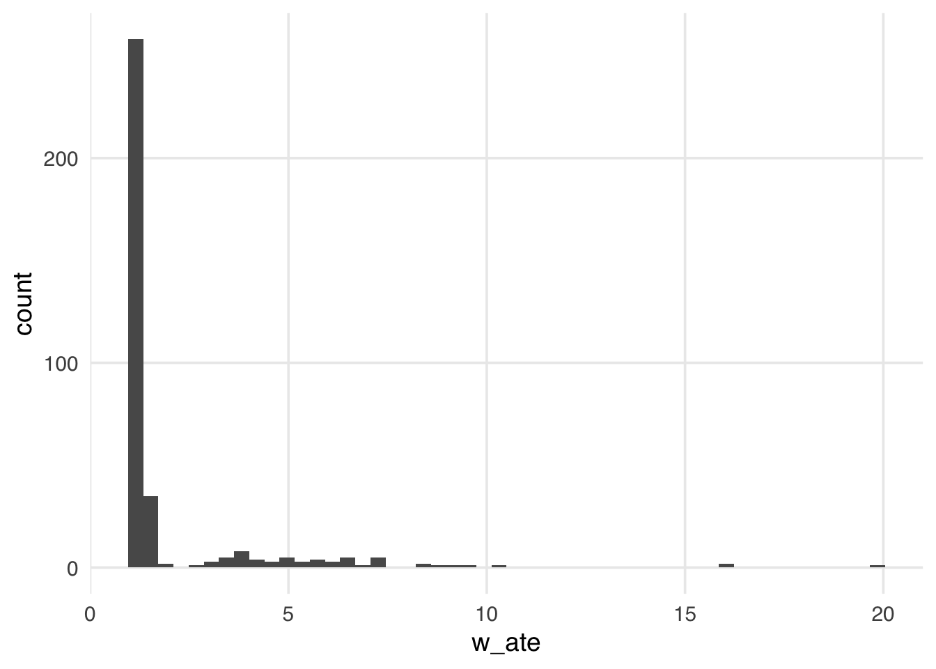
Many weights in Figure 10.2 are close to 1 (the smallest possible value for an ATE weight), with a long tail leading to the largest weight (around 24). This distribution highlights a potential problem with ATE weights. They range from 1 to infinity; if your weights are too large in small samples, this can lead to bias in your estimates (known as finite sample bias). We saw in Chapter 8 that these can destabilize the variance of your estimate, which can be improved through stabilization. However, ATE weights also suffer from finite sample bias, which stabilization cannot address.
We know that not accounting for confounders can bias our causal estimates, but even after accounting for all confounders, we may still get a biased estimate in finite samples. Many of the properties we tout in statistics rely on large samples, but how “large” is defined can be opaque. Let’s look at a quick simulation. Here, we have an exposure, \(X\), an outcome, \(Y\), and one confounder, \(Z\). We will simulate \(Y\), which is only dependent on \(Z\) (so the actual treatment effect is 0), and \(X\), which also depends on \(Z\).
set.seed(928)
n <- 100
finite_sample <- tibble(
  # z is normally distributed with a mean: 0 and sd: 1
  z = rnorm(n),
  # x is defined from a probit selection model with normally distributed errors
  x = case_when(
    0.5 + z + rnorm(n) > 0 ~ 1,
    TRUE ~ 0
  ),
  # y is continuous, dependent only on z with normally distributed errors
  y = z + rnorm(n)
)
If we fit a propensity score model using the one confounder \(Z\) and calculate the weighted estimator, we should get an unbiased result (which, in this case, would be 0).
## fit the propensity score model
finite_sample_wts <- glm(
  x ~ z,
  data = finite_sample,
  family = binomial("probit")
) |>
  augment(data = finite_sample, type.predict = "response") |>
  mutate(wts = wt_ate(.fitted, x))

finite_sample_wts |>
  summarize(
    effect = sum(y * x * wts) /
      sum(x * wts) -
      sum(y * (1 - x) * wts) / sum((1 - x) * wts)
  )
# A tibble: 1 × 1
effect
<dbl>
1 0.197\(X\) is pretty far from 0, although it’s hard to know if this is bias or something we just see by chance in this simulated sample. Let’s rerun this simulation many times at different sample sizes to explore the potential for finite sample bias and plot the results.
sim <- function(n) {
  ## create a simulated dataset
  finite_sample <- tibble(
    z = rnorm(n),
    x = case_when(
      0.5 + z + rnorm(n) > 0 ~ 1,
      TRUE ~ 0
    ),
    y = z + rnorm(n)
  )
  finite_sample_wts <- glm(
    x ~ z,
    data = finite_sample,
    family = binomial("probit")
  ) |>
    augment(data = finite_sample, type.predict = "response") |>
    mutate(wts = wt_ate(.fitted, x))
  bias <- finite_sample_wts |>
    summarize(
      effect = sum(y * x * wts) /
        sum(x * wts) -
        sum(y * (1 - x) * wts) / sum((1 - x) * wts)
    ) |>
    pull()
  tibble(
    n = n,
    bias = bias
  )
}

## Examine 5 different sample sizes, simulate each 1000 times
set.seed(1)
finite_sample_sims <- map_df(
  rep(
    c(50, 100, 500, 1000, 5000, 10000),
    each = 1000
  ),
  sim
)

bias <- finite_sample_sims |>
  group_by(n) |>
  summarize(bias = mean(bias))

ggplot(bias, aes(x = n, y = bias)) +
  geom_point() +
  geom_line() +
  geom_hline(yintercept = 0, lty = 2)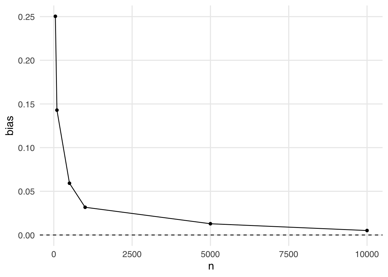
Even when the sample size is large (5,000), we still see some bias away from the “true” effect of 0. It isn’t until a sample size larger than 10,000 that we see this bias disappear.
Estimands that utilize unbounded weights (i.e., that theoretically can be infinitely large) are more likely to suffer from finite sample bias. The likelihood of falling into finite sample bias depends on:
(1) the estimand you have chosen (i.e., are the weights bounded?)
(2) the distribution of the covariates in the exposed and unexposed groups (i.e., is there good overlap? Potential positivity violations, when there is poor overlap, are the regions where weights can become too large)
(3) the sample size.
Inverse probability weighting creates a pseudo-population where observations are (hopefully) balanced on the confounders. This pseudo-population differs from the original sample population, and it’s helpful to try to understand how (both for diagnostic and communication purposes). The gtsummary package allows the creation of weighted tables, which can help us build an intuition for the pseudo-population created by the weights. First, we must load the survey package and create a survey design object. The survey package supports calculating statistics and models using weights. Historically, many researchers have applied techniques that incorporate weights into survey analyses. Even though we are not doing a survey analysis, the same techniques are helpful for our propensity score weights.
library(survey)
library(halfmoon)
hdr <- paste0(
  "**{level}**  \n",
  "N = {n_unweighted}; ESS = {format(n, digits = 1, nsmall = 1)}"
)
seven_dwarfs_svy <- svydesign(
  # ~1 tells survey we don't have clustered data
  ids = ~1,
  data = seven_dwarfs_wts,
  weights = ~w_ate
)
tbl_svysummary(
  seven_dwarfs_svy,
  by = park_extra_magic_morning,
  include = c(park_ticket_season, park_close, park_temperature_high)
) |>
  # give us the *effective sample size* for the groups
  add_ess_header(header = hdr) |>
add_overall(last = TRUE)| Characteristic |
No Magic Hours N = 294; ESS = 291.31 |
Extra Magic Hours N = 60; ESS = 46.71 |
Overall N = 7111 |
|---|---|---|---|
| Ticket Season | |||
| peak | 78 (22%) | 81 (23%) | 160 (22%) |
| regular | 193 (54%) | 187 (52%) | 380 (53%) |
| value | 83 (23%) | 89 (25%) | 172 (24%) |
| Close Time | |||
| 16:30:00 | 2 (0.4%) | 0 (0%) | 2 (0.2%) |
| 18:00:00 | 50 (14%) | 72 (20%) | 122 (17%) |
| 20:00:00 | 20 (5.6%) | 19 (5.3%) | 39 (5.5%) |
| 21:00:00 | 31 (8.7%) | 0 (0%) | 31 (4.3%) |
| 22:00:00 | 108 (30%) | 86 (24%) | 193 (27%) |
| 23:00:00 | 95 (27%) | 81 (23%) | 176 (25%) |
| 24:00:00 | 48 (14%) | 94 (26%) | 142 (20%) |
| 25:00:00 | 1 (0.3%) | 6 (1.6%) | 7 (1.0%) |
| Historic High Temperature | 84 (78, 89) | 83 (78, 87) | 84 (78, 88) |
| 1 n (%); Median (Q1, Q3) | |||
| Abbreviation: ESS = Effective Sample Size | |||
Notice in Table 10.2 that the variables are more balanced between the groups. For example, looking at the variable park_ticket_season in Table 10.1, we see that a higher percentage of the days with Extra Magic Hours in the mornings were during the peak season (30%) compared to the percentage of days without Extra Magic Hours in the morning (23%). In Table 10.2, this is balanced, with a weighted percent of 22% peak days in the Extra Magic Morning group and 22% in the no Extra Magic Morning group. The weights change the variables’ distribution by weighting each observation so that the two groups appear balanced. Also, notice that the distribution of variables in Table 10.2 now matches the Overall column of Table 10.1. ATE weights do exactly this: they make the distribution of variables included in the propensity score for each exposure group look like the overall distribution across the whole sample.
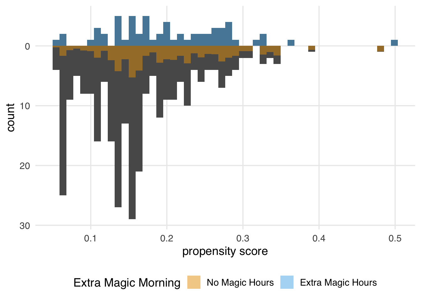
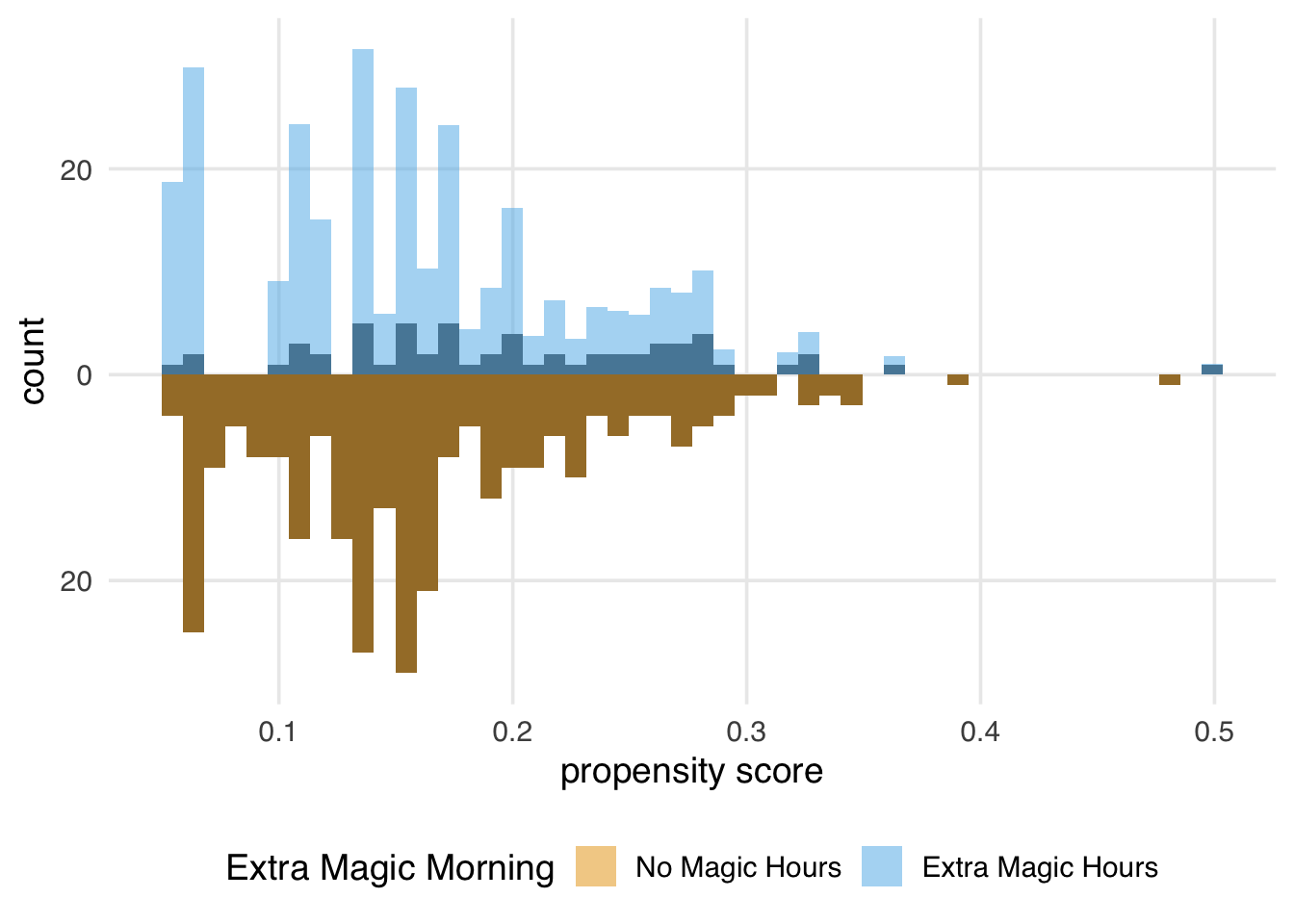
Let’s examine a mirrored histogram, another visualization to help us understand the weighted pseudo-population created by the ATE weights. We will plot the distribution of the propensity score for the days in the exposure group (days with Extra Magic Hours in the morning) on the top half of the plot; then, we will mirror the distribution of the propensity score for the days in the unexposed group below it. This visualization allows us to compare the two distributions quickly. Then, we will overlay weighted histograms to demonstrate how these distributions differ after incorporating the weights. As we saw in Chapter 9, the halfmoon package includes a function geom_mirror_histogram() to assist with this visualization.
library(halfmoon)
ggplot(seven_dwarfs_wts, aes(.fitted, group = park_extra_magic_morning)) +
  geom_mirror_histogram(bins = 50) +
  geom_mirror_histogram(
    aes(fill = park_extra_magic_morning, weight = w_ate),
    bins = 50,
    alpha = 0.5
  ) +
  scale_y_continuous(labels = abs) +
  labs(
    x = "propensity score",
    fill = "Extra Magic Morning"
  )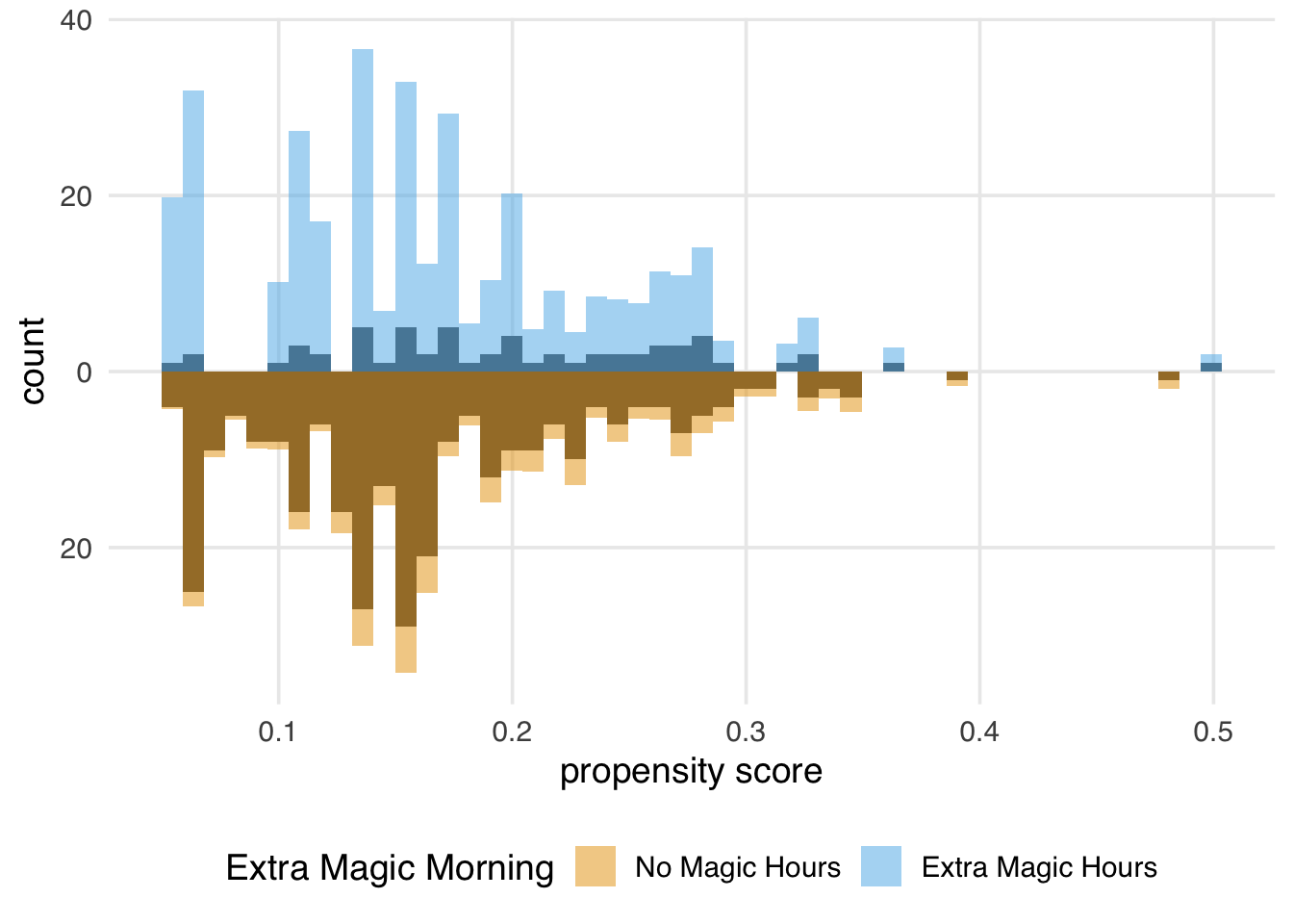
We can learn a few things from Figure 10.4. First, we can see that the observed population has more unexposed days—days without Extra Magic Hours in the morning—than exposed days. We can see this by examining the darker histograms, which show the distributions in the observed sample. Similarly, the exposed days are upweighted more substantially, as evidenced by the light blue we see on the top. We can also see that after weighting, the two distributions look similar; the shape of the blue weighted distribution on top is comparable to that of the orange weighted distribution below.
Recall that our estimand is:
\[ E[Y(1) - Y(0)] \]
To use data to estimate averages of potential outcomes, we need to meet the three causal assumptions discussed in Section 3.2: exchangeability, positivity, and consistency. This estimand also tells us what part of our data we need to make these assumptions about. The ATE is an estimand that targets the entire population. As such, we need to meet these assumptions across the entire range of treatment values; we need to use the treated group to estimate the counterfactuals for the untreated, and we need the untreated group to estimate the counterfactuals for the treated. Because we need to borrow information from both parties, an aspect of the positivity assumption is that our probabilities of being exposed should be greater than zero and less than one: \(0<p<1\).
Another estimand we’ve seen—the default estimand in MatchIt—is the average treatment effect among the treated (ATT). The target population for the ATT is the exposed (treated) population. This causal estimand conditions on those in the exposed group:
\[ E[Y(1) - Y(0) | X = 1] \]
Example research questions where the ATT is of interest could include “Should we stop our marketing campaign to those currently receiving it?” or “Should medical providers stop recommending treatment for those currently receiving it?” (Greifer and Stuart 2021)
The ATT is a common target estimand when matching; here, all exposed observations are included and matched to control observations, some of which may be discarded. Alternatively, we can estimate the ATT via weighting. The ATT weight is estimated by:
\[ w_{ATT} = X + \frac{(1 - X)p}{1 - p} \]
In other words, the treated group receives a weight of 1, while the untreated group receives weights equal to their odds of being treated. Why do these weights work to target this population? Another way to write these weights is as a transformation of the ATE weights. The ATE and ATT weights differ only in their numerator. The numerators of the weights are sometimes called tilting functions. The tilting function for the ATE weights is 1, while the tilting function for the ATT is the probability of being treated. If we multiply the ATE weights by 1, we haven’t changed anything; we’re still dealing with the whole population. If we multiply the ATE weights by the probability of treatment, we scale the weights such that we now target the treated group.
\[ \begin{aligned} w_i^{\mathrm{ATE}} &= \begin{cases} \dfrac{1}{p}, & X_i = 1,\\[8pt] \dfrac{1}{1 - p}, & X_i = 0, \end{cases} \quad \Bigl(tilt_{\rm ATE}(p)=1\Bigr) \\[1em] w_i^{\mathrm{ATT}} &= \begin{cases} \dfrac{p}{p} = 1, & X_i = 1,\\[6pt] \dfrac{p}{1 - p}, & X_i = 0, \end{cases} \quad \Bigl(tilt_{\rm ATT}(p)=p\Bigr) \end{aligned} \]
The tilting function helps us understand how we modify the weights to target a given population and how the weights behave. For instance, for the ATE, the tilting function keeps the target population as-is (the whole population), and the weights can go to infinity (to the left for the treated and to the right for the untreated), as in Figure 10.5.
ps <- seq(0.01, 0.99, by = 0.01)

df <- tibble(ps = ps) |>
  mutate(
    h_ate = 1,
    h_att = ps,
    h_atc = 1 - ps,
    h_ato = ps * (1 - ps),
    h_atm = pmin(ps, 1 - ps),
    w1_ate = h_ate / ps,
    w0_ate = h_ate / (1 - ps),
    w1_att = h_att / ps,
    w0_att = h_att / (1 - ps),
    w1_atc = h_atc / ps,
    w0_atc = h_atc / (1 - ps),
    w1_ato = h_ato / ps,
    w0_ato = h_ato / (1 - ps),
    w1_atm = h_atm / ps,
    w0_atm = h_atm / (1 - ps)
  )

plot_df <- bind_rows(
  df |>
    select(ps, starts_with("h_")) |>
    pivot_longer(
      -ps,
      names_to = "estimand",
      names_prefix = "h_",
      values_to = "value"
    ) |>
    mutate(panel = "tilting"),

  df |>
    select(ps, starts_with("w0_")) |>
    pivot_longer(
      -ps,
      names_to = "estimand",
      names_prefix = "w0_",
      values_to = "value"
    ) |>
    mutate(panel = "control"),
  df |>
    select(ps, starts_with("w1_")) |>
    pivot_longer(
      -ps,
      names_to = "estimand",
      names_prefix = "w1_",
      values_to = "value"
    ) |>
    mutate(panel = "treated")
) |>
  mutate(
    panel = factor(
      panel,
      levels = c("tilting", "control", "treated"),
      labels = c(
        "tilting function",
        "weights (untreated)",
        "weights (treated)"
      )
    )
  )

plot_weight_properties <- function(plot_df, estimand_type) {
  plot_df |>
    filter(estimand == estimand_type) |>
    ggplot(aes(ps, value)) +
    geom_line() +
    facet_wrap(~panel, ncol = 1, scales = "free_y") +
    labs(
      x = "propensity score",
      y = NULL
    ) +
    theme_minimal() +
    xlim(0.01, 0.99) +
    expand_limits(y = c(0, 1))
}

plot_weight_properties(plot_df, "ate")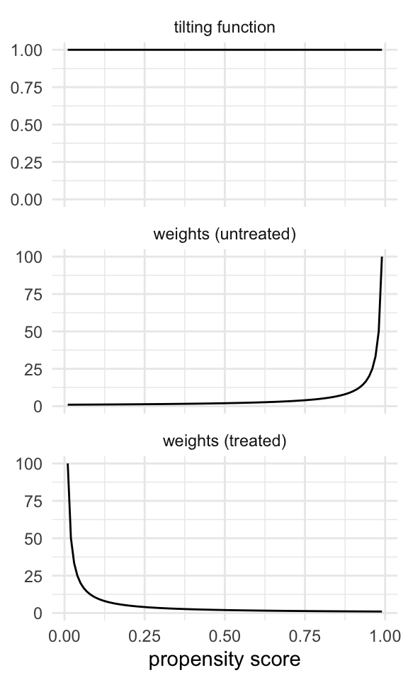
For the ATT, the tilting function tries to make the population more like the treated; the untreated have weights that are the odds of being treated, which range from 0 to infinity, just like in the ATE, but the treated are already like the treated, so they get weights of 1 (Figure 10.6).
plot_weight_properties(plot_df, "att")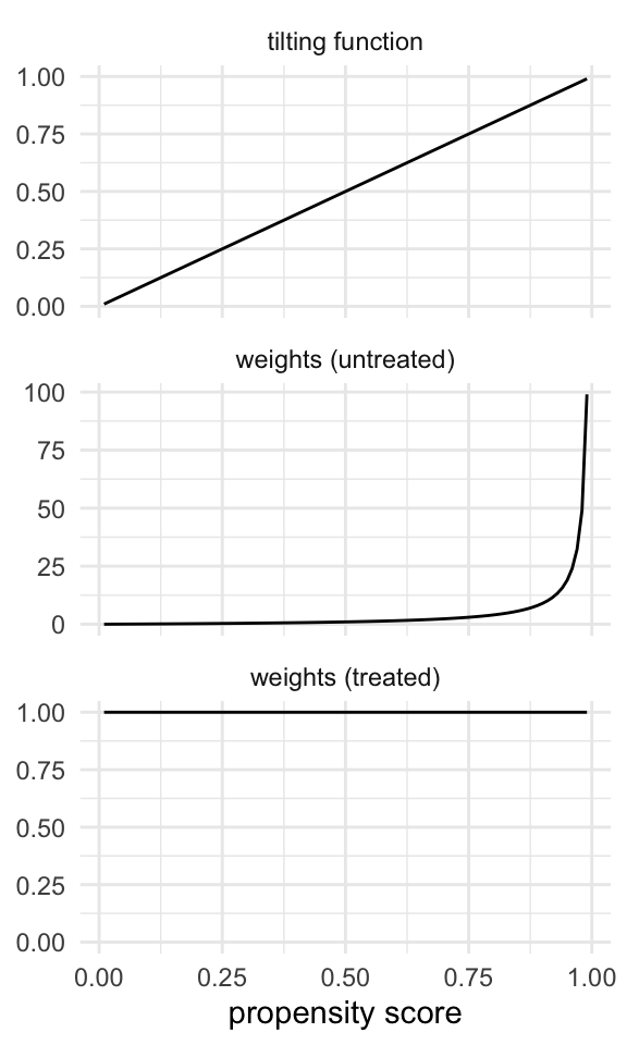
Let’s add the ATT weights to the seven_dwarfs_wts data frame and look at their distribution.
seven_dwarfs_wts <- seven_dwarfs_wts |>
  mutate(w_att = wt_att(.fitted, park_extra_magic_morning))

ggplot(seven_dwarfs_wts, aes(w_att)) +
  geom_histogram(bins = 50)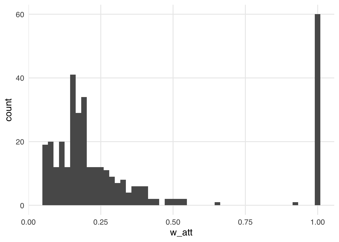
Compared to the ATE weights, the weights in Figure 10.7 look more stable; their distribution is not heavily skewed, and the range is small, from zero to a bit over one, with many at precisely one. These weights are exactly one for all days in the exposed group. Theoretically, these weights can range from zero to infinity for unexposed days. We tend, however, to see more stable weights for the ATT and similar weights. Because this particular sample has many more unexposed days than exposed days, the range is much smaller, meaning the vast majority of unexposed days are downweighted to match the variable distribution of the exposed days. This stability is also what you would expect intuitively: the weight of the untreated group is the odds of being treated. For these weights to be very high, the odds of being treated would also have to be very high, and, of course, that occurs much less frequently for the untreated. Let’s look at the weighted table to understand the pseudo-population we’ve created more clearly.
seven_dwarfs_svy <- svydesign(
  ids = ~1,
  data = seven_dwarfs_wts,
  weights = ~w_att
)
tbl_svysummary(
  seven_dwarfs_svy,
  by = park_extra_magic_morning,
  include = c(park_ticket_season, park_close, park_temperature_high)
) |>
  add_ess_header(header = hdr) |>
add_overall(last = TRUE)| Characteristic |
No Magic Hours N = 294; ESS = 223.11 |
Extra Magic Hours N = 60; ESS = 60.01 |
Overall N = 1201 |
|---|---|---|---|
| Ticket Season | |||
| peak | 18 (30%) | 18 (30%) | 36 (30%) |
| regular | 35 (58%) | 35 (58%) | 70 (58%) |
| value | 7 (12%) | 7 (12%) | 14 (12%) |
| Close Time | |||
| 16:30:00 | 1 (0.9%) | 0 (0%) | 1 (0.4%) |
| 18:00:00 | 13 (21%) | 18 (30%) | 31 (26%) |
| 20:00:00 | 2 (3.3%) | 2 (3.3%) | 4 (3.3%) |
| 21:00:00 | 3 (4.6%) | 0 (0%) | 3 (2.3%) |
| 22:00:00 | 17 (28%) | 11 (18%) | 28 (23%) |
| 23:00:00 | 17 (28%) | 11 (18%) | 28 (23%) |
| 24:00:00 | 8 (14%) | 17 (28%) | 25 (21%) |
| 25:00:00 | 0 (0.3%) | 1 (1.7%) | 1 (1.0%) |
| Historic High Temperature | 83 (74, 88) | 83 (75, 87) | 83 (75, 88) |
| 1 n (%); Median (Q1, Q3) | |||
| Abbreviation: ESS = Effective Sample Size | |||
We again achieve a balance between groups, but the target values in Table 10.3 differ from the previous tables. Recall in our ATE weighted table (Table 10.2), when looking at the wdw_ticket_season variable, we saw the weighted percent in the peak season balanced close to 22%, the overall percent of peak days in the observed sample. The weighted percent of peak season days is 30% in the exposed and unexposed groups, reflecting the percent in the unweighted exposure group. If you compare Table 10.3 to our unweighted table (Table 10.1), you might notice that the columns are most similar to the exposed column from the unweighted table. This similarity is because the target population is the exposed group, the days with Extra Magic Hours in the morning, so we’re trying to make the comparison group (no magic hours) as similar to that group as possible.
We can again create a mirrored histogram to observe the weighted pseudo-population.
ggplot(seven_dwarfs_wts, aes(.fitted, group = park_extra_magic_morning)) +
  geom_mirror_histogram(bins = 50) +
  geom_mirror_histogram(
    aes(fill = park_extra_magic_morning, weight = w_att),
    bins = 50,
    alpha = 0.5
  ) +
  scale_y_continuous(labels = abs) +
  labs(
    x = "propensity score",
    fill = "Extra Magic Morning"
  )
Since every day in the exposed group has a weight of 1, the distribution of the propensity scores (the dark bars above zero on the graph) in Figure 10.8 overlaps exactly with the weighted distribution overlaid in blue. In the unexposed population, almost all observations are downweighted; the dark orange distribution is smaller than the distribution of the propensity scores and more closely matches the exposed distribution above it. The ATT is easier to estimate when there are many more observations in the unexposed group compared to the exposed one.
The ATT and other estimands have an advantage over the ATE: because we only making inferences for a subset of the population, the causal assumptions we need to make only need to be met for that subset of the population. Since the estimand for the ATT is:
\[ E[Y(1) - Y(0) | X = 1] \]
We have a weaker assumption because it only applies to the treated group as opposed to the whole population. For exchangeability, we are no longer trying to estimate the potential outcome y(1) for the untreated; we are only making inferences for the treated and have already observed y(1) for that group. We only need to estimate y(0), and we’ll borrow information from the untreated to do that. This has two consequences for our assumptions: 1) the exchangeability assumption is weakened to be only for the potential outcome y(0) and 2) the positivity assumption is weakened such that we only require \(p<1\); we now only require that there is some probability of not being exposed.
The target population to estimate the average treatment effect among the unexposed (control) (ATU / ATC) is the unexposed (control) population. We’ll use both ATU and ATC to refer to this estimand. This causal estimand conditions on those in the unexposed group.
\[ E[Y(1) - Y(0) | X = 0] \]
Example research questions where the ATU is of interest could include “Should we send our marketing campaign to those not currently receiving it?” or “Should medical providers begin recommending treatment for those not currently receiving it?” (Greifer and Stuart 2021)
The ATU can be also estimated via matching; here, all unexposed observations are included and matched to exposed observations, some of which may be discarded. Alternatively, the ATU can be estimated via weighting. The ATU weight is estimated by:
\[ w_{ATU} = \frac{X(1-p)}{p}+ (1-X) \]
This is the reverse of the ATT: the unexposed group gets a weight of 1, while the exposed group receives weights equal to the odds of being untreated. We’re targeting the untreated group by using the probability of being untreated as a tilting function.
\[ \begin{aligned} w_i^{\mathrm{ATC}} &= \begin{cases} \dfrac{1 - p}{p}, & X_i = 1,\\[6pt] \dfrac{1 - p}{1 - p} = 1, & X_i = 0, \end{cases} \quad \Bigl(tilt_{\rm ATC}(p)=1 - p\Bigr) \end{aligned} \]
The tilting function for the ATC works to make the population more like the untreated. Thus, the untreated get weights of 1, and the treated get weights based on the odds of being untreated, which range from 0 to infinity.
plot_weight_properties(plot_df, "atc")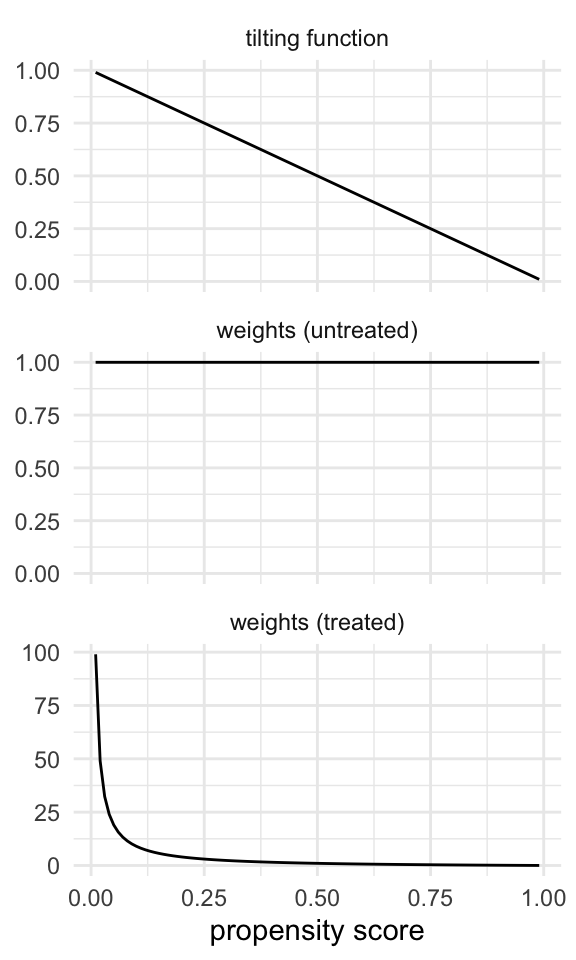
Let’s add the ATU weights to the seven_dwarfs_wts data frame and look at their distribution.
seven_dwarfs_wts <- seven_dwarfs_wts |>
  mutate(w_atu = wt_atu(.fitted, park_extra_magic_morning))

ggplot(seven_dwarfs_wts, aes(w_atu)) +
  geom_histogram(bins = 50)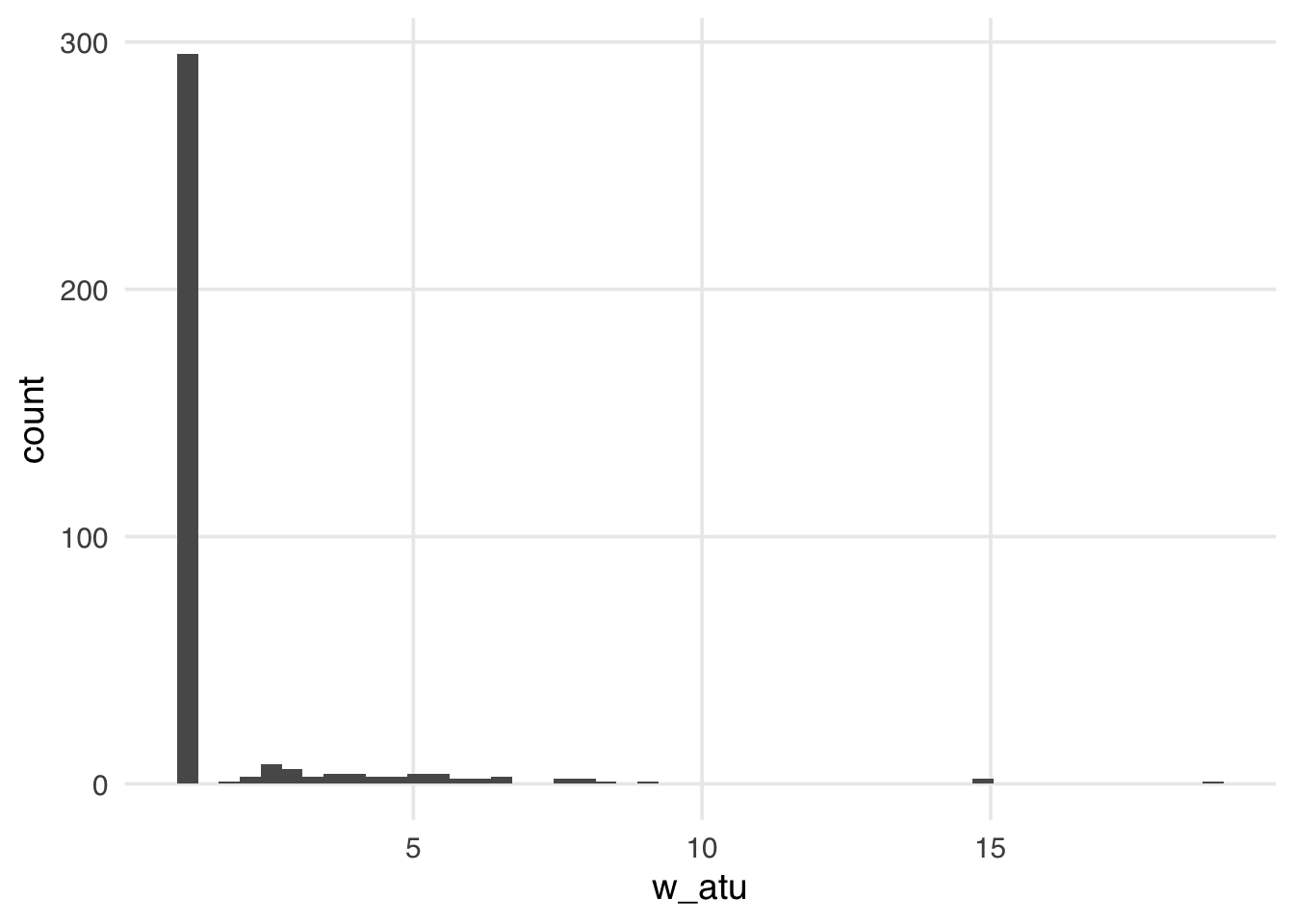
The distribution of the weights in Figure 10.10 weights looks very similar to what we saw with the ATE weights—several around 1, with a long tail. These weights will be 1 for all observations in the unexposed group; they can range from 0 to infinity for the exposed group. Because we have more observations in our unexposed group, our exposed observations are upweighted to match their distribution.
Now, let’s take a look at the weighted table.
seven_dwarfs_svy <- svydesign(
  ids = ~1,
  data = seven_dwarfs_wts,
  weights = ~w_atu
)
tbl_svysummary(
  seven_dwarfs_svy,
  by = park_extra_magic_morning,
  include = c(park_ticket_season, park_close, park_temperature_high)
) |>
  add_ess_header(header = hdr) |>
add_overall(last = TRUE)| Characteristic |
No Magic Hours N = 294; ESS = 294.01 |
Extra Magic Hours N = 60; ESS = 42.51 |
Overall N = 5911 |
|---|---|---|---|
| Ticket Season | |||
| peak | 60 (20%) | 63 (21%) | 123 (21%) |
| regular | 158 (54%) | 152 (51%) | 310 (52%) |
| value | 76 (26%) | 82 (27%) | 158 (27%) |
| Close Time | |||
| 16:30:00 | 1 (0.3%) | 0 (0%) | 1 (0.2%) |
| 18:00:00 | 37 (13%) | 54 (18%) | 91 (15%) |
| 20:00:00 | 18 (6.1%) | 17 (5.7%) | 35 (5.9%) |
| 21:00:00 | 28 (9.5%) | 0 (0%) | 28 (4.7%) |
| 22:00:00 | 91 (31%) | 75 (25%) | 166 (28%) |
| 23:00:00 | 78 (27%) | 70 (23%) | 148 (25%) |
| 24:00:00 | 40 (14%) | 77 (26%) | 117 (20%) |
| 25:00:00 | 1 (0.3%) | 5 (1.6%) | 6 (1.0%) |
| Historic High Temperature | 84 (78, 89) | 83 (78, 87) | 84 (78, 88) |
| 1 n (%); Median (Q1, Q3) | |||
| Abbreviation: ESS = Effective Sample Size | |||
Now, the exposed column of Table 10.4 is weighted to match the unexposed column of the unweighted table.
We can again create a mirrored histogram to observe the weighted pseudo-population.
ggplot(seven_dwarfs_wts, aes(.fitted, group = park_extra_magic_morning)) +
  geom_mirror_histogram(bins = 50) +
  geom_mirror_histogram(
    aes(fill = park_extra_magic_morning, weight = w_atu),
    bins = 50,
    alpha = 0.5
  ) +
  scale_y_continuous(labels = abs) +
  labs(
    x = "propensity score",
    fill = "Extra Magic Morning"
  )
The weights for the unexposed days are all 1, so the distribution of the propensity scores for this group exactly overlaps the weighted pseudo-population in orange. The blue bars indicate that the exposed population is largely upweighted to match the unexposed distribution.
Like the ATT, our estimand conditions on treatment status. For the ATC, we weaken the causal assumptions to be necessary for the untreated group. We only need to estimate y(1) for the unexposed since we’ve already seen y(0) for them. This means we need some exposed observations anywhere we have unexposed ones. In other words, we now have a positivity assumption of \(0 > p\): there needs to be some probability of being treated.
The target population to estimate the average treatment effect among the evenly matchable (ATM) is the evenly matchable. This causal estimand conditions on those deemed “evenly matchable” by some distance metric.
\[ E[Y(1) - Y(0) | M_d = 1] \]
Here, \(d\) denotes a distance measure, and \(M_d=1\) indicates that a unit is evenly matchable under that distance measure (Samuels 2017; D’Agostino McGowan 2018). Example research questions about the ATM could include “Should those at clinical equipoise receive the exposure?” (Greifer and Stuart 2021). In medicine, those at clinical equipoise are those about whom we are genuinely uncertain how to treat. This is very often the part of the population about which we want to make inferences because we want to make the best decision in the face of that uncertainty.
The ATM is a common target estimand when matching. Here, some exposed observations are matched to control observations. However, some observations in both groups may be discarded. This type of matching is often done via a caliper, where observations are only matched if they fall within a pre-specified caliper distance of each other, as we showed in Section 8.3. Alternatively, the ATM can be estimated via weighting. The ATM weight is estimated by:
\[ w_{ATM} = \frac{\min \{p, 1-p\}}{Xp + (1-X)(1-p)} \]
The tilting function for the ATM is \(min\{p, 1-p\}\).
\[ \begin{aligned} w_i^{\mathrm{ATM}} &= \begin{cases} \dfrac{min \{p, 1-p\}}{p}, & X_i = 1,\\[6pt] \dfrac{min \{p, 1-p\}}{1 - p}, & X_i = 0, \end{cases} \quad \Bigl(tilt_{\rm ATM}(p)=min \{p, 1-p\}\Bigr) \end{aligned} \]
This has an interesting effect on the weights. The tilting function scales the weights with a triangular function, with the highest value at 0.5, where we have the most uncertainty between treatment groups (equipoise). Above 0.5, the untreated have a weight of 1, but as they approach a probability of 0, they are downweighted. Those with low probabilities of being treated don’t contribute much information. For the treated, it’s the opposite. Below 0.5, they have a weight of 1 and are downweighted as they approach a probability of 1.
plot_weight_properties(plot_df, "atm")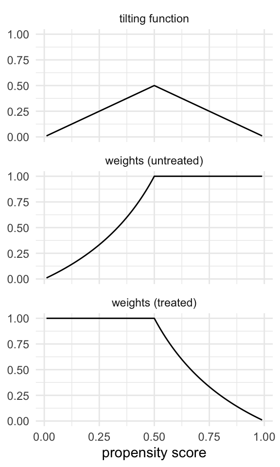
Let’s add the ATM weights to the seven_dwarfs_wts data frame and look at their distribution.
seven_dwarfs_wts <- seven_dwarfs_wts |>
  mutate(w_atm = wt_atm(.fitted, park_extra_magic_morning))

ggplot(seven_dwarfs_wts, aes(w_atm)) +
  geom_histogram(bins = 50)
The distribution of the weights in Figure 10.13 looks very similar to what we saw with the ATT weights. That is because, in this particular sample, there are many more unexposed observations compared to exposed ones. These weights have the nice property that they range from 0 to 1, making them always stable, regardless of the imbalance between exposure groups.
Now, let’s take a look at the weighted table.
seven_dwarfs_svy <- svydesign(
  ids = ~1,
  data = seven_dwarfs_wts,
  weights = ~w_atm
)
tbl_svysummary(
  seven_dwarfs_svy,
  by = park_extra_magic_morning,
  include = c(park_ticket_season, park_close, park_temperature_high)
) |>
  add_ess_header(header = hdr) |>
add_overall(last = TRUE)| Characteristic |
No Magic Hours N = 294; ESS = 223.11 |
Extra Magic Hours N = 60; ESS = 60.01 |
Overall N = 1201 |
|---|---|---|---|
| Ticket Season | |||
| peak | 18 (30%) | 18 (30%) | 36 (30%) |
| regular | 35 (58%) | 35 (58%) | 70 (58%) |
| value | 7 (12%) | 7 (12%) | 14 (12%) |
| Close Time | |||
| 16:30:00 | 1 (0.9%) | 0 (0%) | 1 (0.4%) |
| 18:00:00 | 13 (21%) | 18 (30%) | 31 (26%) |
| 20:00:00 | 2 (3.3%) | 2 (3.3%) | 4 (3.3%) |
| 21:00:00 | 3 (4.6%) | 0 (0%) | 3 (2.3%) |
| 22:00:00 | 17 (28%) | 11 (18%) | 28 (23%) |
| 23:00:00 | 17 (28%) | 11 (18%) | 28 (23%) |
| 24:00:00 | 8 (14%) | 17 (28%) | 25 (21%) |
| 25:00:00 | 0 (0.3%) | 1 (1.7%) | 1 (1.0%) |
| Historic High Temperature | 83 (74, 88) | 83 (75, 87) | 83 (75, 88) |
| 1 n (%); Median (Q1, Q3) | |||
| Abbreviation: ESS = Effective Sample Size | |||
In this particular sample, the ATM weights resemble the ATT weights, so this table looks similar to the ATT weighted table. This similarity is not guaranteed, and the ATM pseudopopulation can look different from the overall, exposed, and unexposed unweighted populations. Thus, it’s essential to examine the weighted table when using ATM weights to understand what population inference will ultimately be drawn.
We can again create a mirrored histogram to observe the ATM-weighted pseudo-population.
ggplot(seven_dwarfs_wts, aes(.fitted, group = park_extra_magic_morning)) +
  geom_mirror_histogram(bins = 50) +
  geom_mirror_histogram(
    aes(fill = park_extra_magic_morning, weight = w_atm),
    bins = 50,
    alpha = 0.5
  ) +
  scale_y_continuous(labels = abs) +
  labs(
    x = "propensity score",
    fill = "Extra Magic Morning"
  )
Since the ATM weights are bounded by 0 and 1, all observations will be downweighted. This removes the potential for finite sample bias due to large weights in small samples and has improved variance properties.
The causal assumptions are also weakened for that ATM: we have the same exchangeability and positivity assumptions as the ATE; however, we only make those assumptions for the evenly matchable, not for those where we don’t have corresponding support in overlap. This is often more feasible simply because the confounding in the middle regions of the propensity score is less extreme and because we, by definition, have better positivity.
The ATM estimates a particular population at equipoise (the evenly matchable), but there are several ways we could consider equipoise. A related target population is to estimate the average treatment effect among the overlap population (ATO). Example research questions where the ATO is of interest are the same as those for the ATM, such as “Should those at clinical equipoise receive the exposure?” (Greifer and Stuart 2021).
Again, these weights are similar to the ATM weights but are slightly attenuated, yielding improved variance properties.
The ATO weight is estimated by:
\[ w_{ATO} = X(1-p) + (1-X)p \]
The tilting function for the ATO is \(p(1-p)\)1.
\[ \begin{aligned} w_i^{\mathrm{ATO}} &= \begin{cases} \dfrac{p(1-p)}{p} = 1-p, & X_i = 1,\\[6pt] \dfrac{p(1-p)}{1 - p} = p, & X_i = 0, \end{cases} \quad \Bigl(tilt_{\rm ATO}(p)=p(1-p)\Bigr) \end{aligned} \]
Like the ATM, the ATO’s tilting function puts the most emphasis on those at a propensity score of 0.5, downweighting those near the probability of 0 and 1. However, the ATO’s tilting function is smoother than the ATM’s, so it has improved variance properties. The effect on the weights is that they are linear across the spectrum of the propensity score, with untreated weights approaching one as the propensity score approaches one and, oppositely, with treated weights approaching one as the propensity approaches zero. We give each group weights equal to the probability of being in the other group!
plot_weight_properties(plot_df, "ato")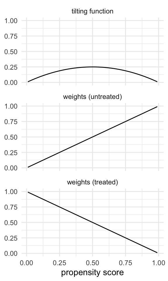
Let’s add the ATO weights to the seven_dwarfs_wts data frame and look at their distribution.
seven_dwarfs_wts <- seven_dwarfs_wts |>
  mutate(w_ato = wt_ato(.fitted, park_extra_magic_morning))

ggplot(seven_dwarfs_wts, aes(w_ato)) +
  geom_histogram(bins = 50)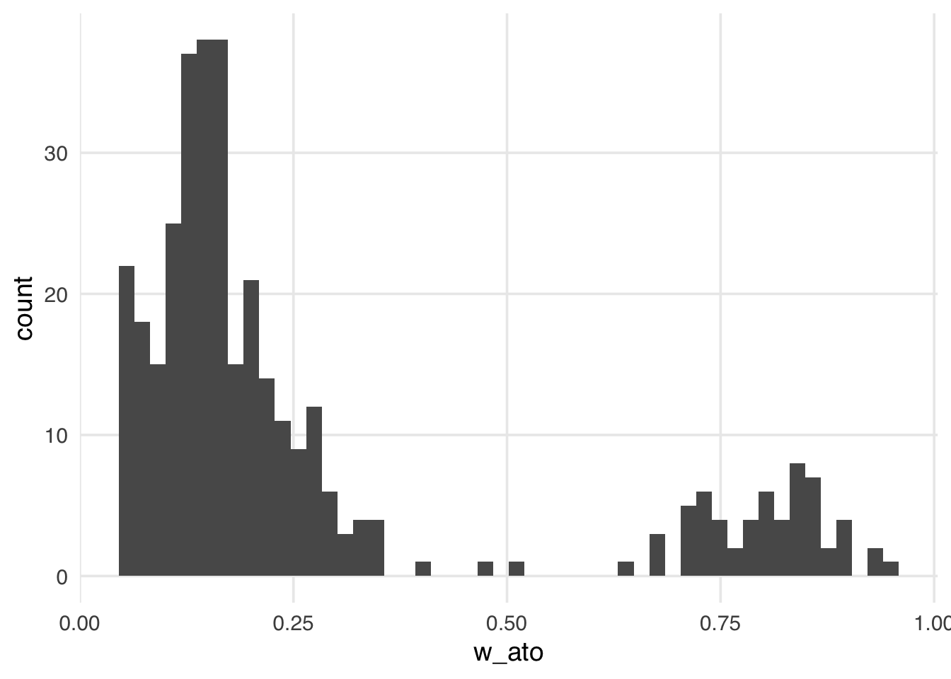
Like the ATM weights, the ATO weights are bounded by 0 and 1, making them more stable than the ATE, ATT, and ATU, regardless of the exposed and unexposed imbalance.
Let’s revisit our finite sample bias simulation, adding the ATO weights to examine whether this potential for bias impacts them.
sim <- function(n) {
  ## create a simulated dataset
  finite_sample <- tibble(
    z = rnorm(n),
    x = case_when(
      0.5 + z + rnorm(n) > 0 ~ 1,
      TRUE ~ 0
    ),
    y = z + rnorm(n)
  )
  finite_sample_wts <- glm(
    x ~ z,
    data = finite_sample,
    family = binomial("probit")
  ) |>
    augment(data = finite_sample, type.predict = "response") |>
    mutate(
      wts_ate = wt_ate(.fitted, x),
      wts_ato = wt_ato(.fitted, x)
    )
  bias <- finite_sample_wts |>
    summarize(
      effect_ate = sum(y * x * wts_ate) /
        sum(x * wts_ate) -
        sum(y * (1 - x) * wts_ate) / sum((1 - x) * wts_ate),
      effect_ato = sum(y * x * wts_ato) /
        sum(x * wts_ato) -
        sum(y * (1 - x) * wts_ato) / sum((1 - x) * wts_ato)
    )
  tibble(
    n = n,
    bias = c(bias$effect_ate, bias$effect_ato),
    weight = c("ATE", "ATO")
  )
}

## Examine 5 different sample sizes, simulate each 1000 times
set.seed(1)
finite_sample_sims <- map_df(
  rep(
    c(50, 100, 500, 1000, 5000, 10000),
    each = 1000
  ),
  sim
)

bias <- finite_sample_sims |>
  group_by(n, weight) |>
  summarize(bias = mean(bias))

ggplot(bias, aes(x = n, y = bias, color = weight)) +
  geom_point() +
  geom_line() +
  geom_hline(yintercept = 0, lty = 2)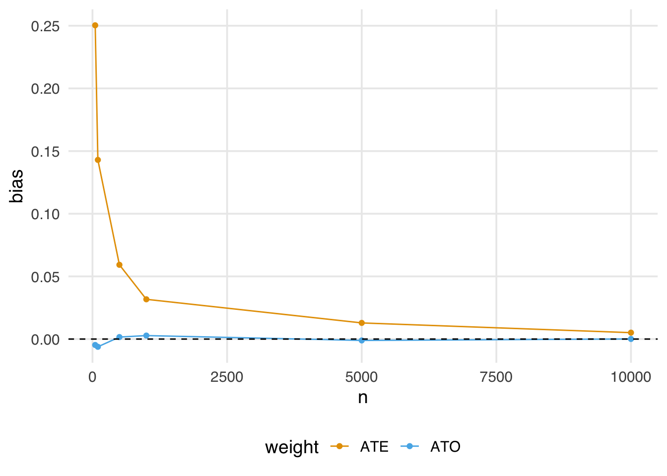
Notice that the ATO weights estimate is almost immediately unbiased, even in relatively small samples.
Now, let’s take a look at the weighted table.
seven_dwarfs_svy <- svydesign(
  ids = ~1,
  data = seven_dwarfs_wts,
  weights = ~w_ato
)
tbl_svysummary(
  seven_dwarfs_svy,
  by = park_extra_magic_morning,
  include = c(park_ticket_season, park_close, park_temperature_high)
) |>
  add_ess_header(header = hdr) |>
add_overall(last = TRUE)| Characteristic |
No Magic Hours N = 294; ESS = 246.21 |
Extra Magic Hours N = 60; ESS = 59.41 |
Overall N = 961 |
|---|---|---|---|
| Ticket Season | |||
| peak | 14 (29%) | 14 (29%) | 28 (29%) |
| regular | 28 (58%) | 28 (58%) | 55 (58%) |
| value | 6 (13%) | 6 (13%) | 13 (13%) |
| Close Time | |||
| 16:30:00 | 0 (0.7%) | 0 (0%) | 0 (0.4%) |
| 18:00:00 | 9 (19%) | 13 (27%) | 22 (23%) |
| 20:00:00 | 2 (3.7%) | 2 (3.7%) | 4 (3.7%) |
| 21:00:00 | 2 (5.1%) | 0 (0%) | 2 (2.5%) |
| 22:00:00 | 14 (29%) | 9 (20%) | 23 (24%) |
| 23:00:00 | 14 (28%) | 9 (19%) | 23 (24%) |
| 24:00:00 | 7 (14%) | 14 (29%) | 21 (22%) |
| 25:00:00 | 0 (0.3%) | 1 (1.7%) | 1 (1.0%) |
| Historic High Temperature | 83 (75, 88) | 83 (76, 87) | 83 (75, 88) |
| 1 n (%); Median (Q1, Q3) | |||
| Abbreviation: ESS = Effective Sample Size | |||
Like the ATM weights, the ATO pseudo-population may not resemble the overall, exposed, or unexposed unweighted populations, so it is essential to examine these weighted tables to understand the population on whom we will draw inferences.
We can again create a mirrored histogram to observe the ATO-weighted pseudo-population.
ggplot(seven_dwarfs_wts, aes(.fitted, group = park_extra_magic_morning)) +
  geom_mirror_histogram(bins = 50) +
  geom_mirror_histogram(
    aes(fill = park_extra_magic_morning, weight = w_ato),
    bins = 50,
    alpha = 0.5
  ) +
  scale_y_continuous(labels = abs) +
  labs(
    x = "propensity score",
    fill = "Extra Magic Morning"
  )
Figure 10.18 looks similar to the ATM pseudo-population, with slight attenuation, as evidenced by the increased downweighting in the exposed population. We prefer using the ATO weights when the overlap (or evenly matchable) population is the target, as they have improved variance properties. Another benefit is that any variables included in the propensity score model (if fit via logistic regression2) will be perfectly balanced on the mean. Let’s look at a Love plot. In Figure 10.19, all three covariates have an SMD of 0 when weighted by ATO weights.
seven_dwarfs_wts |>
  mutate(park_close = as.numeric(park_close)) |>
  tidy_smd(
    .vars = c(park_ticket_season, park_close, park_temperature_high),
    .group = park_extra_magic_morning,
    .wts = w_ato
  ) |>
  ggplot(aes(abs(smd), variable, color = method, group = method)) +
  geom_love()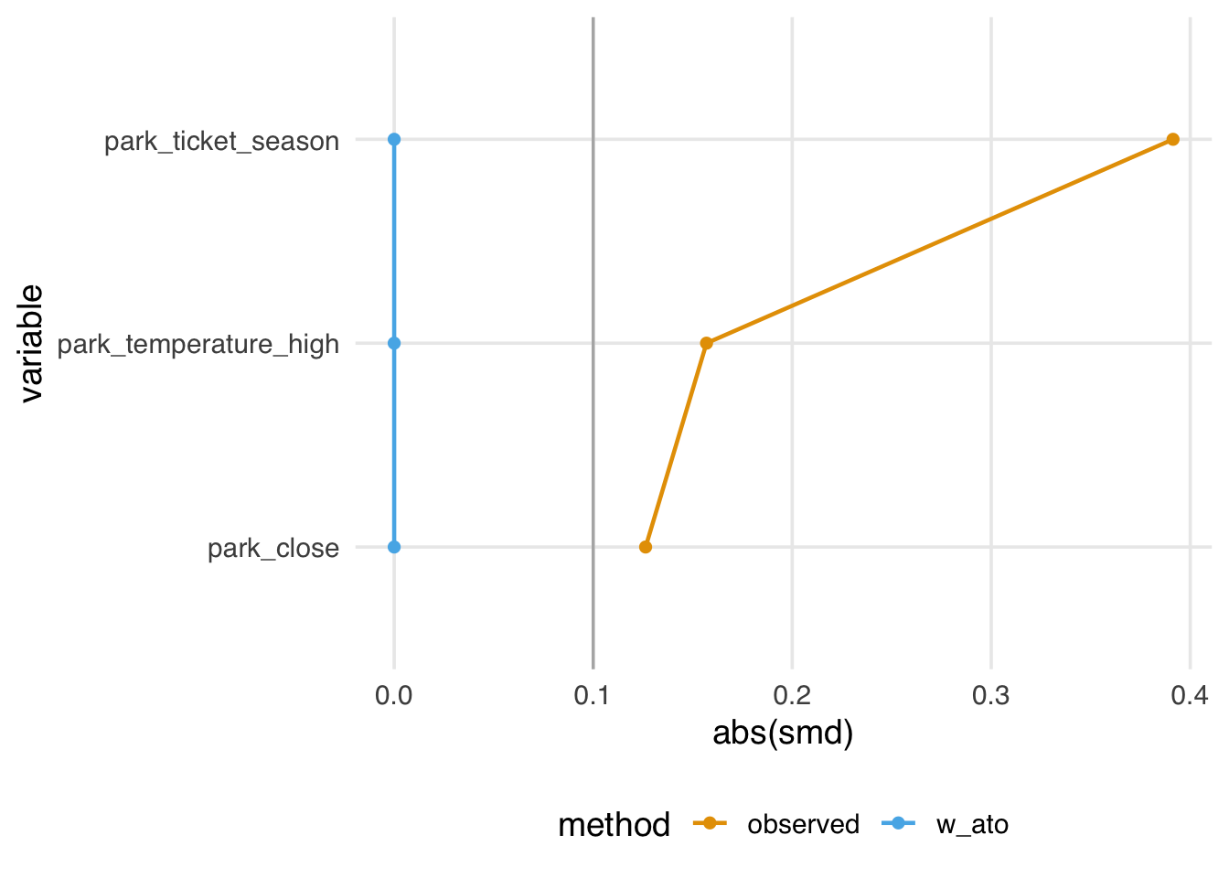
As we saw in Section 8.4, trimming or truncating is a common technique for dealing with positivity and overlap issues. You can think of the resulting estimand as another type of overlap population. For instance, with trimmed observations, the tilting function is either 0 for those that were trimmed or 1 for the observations that remain. Many analysts hope they are still approximating the ATE in doing this—that this target population is close enough to the whole population to give roughly the same answer but with better variance. We also know, however, that the overlap population is a valuable target population. It may be helpful to look at the changes between the populations when trimming or truncating to understand how well your population approximates the entire population or if it is better considered an overlap population.
MatchIt can easily target different estimands with the estimand argument. Note that you need to use full matching for the ATE and a caliper for the ATM.
| estimand | MatchIt command |
|---|---|
| ATE | matchit(…, method = "full", estimand = "ATE") |
| ATT | matchit(…, estimand = "ATT") |
| ATC | matchit(…, estimand = "ATC") |
| ATM | matchit(…, caliper = <caliper>) |
The intuition for how weights target different populations comes down to the tilting function: we scale the weights to represent the population we’re interested in. The intuition for matching is more straightforward: it comes down to who we drop and don’t drop. Mathematically, this is the same: in matching, everyone gets a weight of either 0 or 1, and how we determine those weights is related to an algorithmic tilting function. However, with matching, it’s easier to think about who got dropped and why.
Consider Figure 10.20, which shows a simulated example where we target the ATE, ATT, ATC, and ATM. For the ATE, we are finding matches among the whole population. For the ATT, we are finding matches for the treated group, so an untreated (control) observation might be dropped if it falls outside the range of the treated group. The opposite is true of the ATC: we are finding matches for the control group, so a treated observation with no overlap with the untreated group might be dropped. For the ATM, we are instead focused on the population where there exists an overlap between the two groups, so an observation for either group might be dropped if it doesn’t have a good match. In matching, we control the level of overlap we find acceptable with a caliper.
With matching, we subset the population where we have matches. That means we don’t need to use a weighted table to describe the population we’re making inferences on. However, suppose you are exploring multiple matching schemes. In that case, it can be helpful to use bind_matches() to track the (0 or 1) weights for each matching scheme in the original dataset rather than making multiple copies of the data. You can then use weighted tables with the corresponding binary weights.
We need to consider several factors when choosing an estimand for a given analysis. The first is, of course, the research question itself. Different estimands answer different questions; ideally, we will pick an estimand that matches the question. For example, suppose Disney was interested in assessing whether to add additional Extra Magic Hours on days without them; here, the ATU will be the estimand of interest. We also need to consider how practical it is to answer specific questions based on, for instance, the available sample size and the distribution of the exposed and unexposed observations (i.e., might finite sample bias be an issue?). Since other estimands besides the ATE weaken causal assumptions, they might be more practical targets given the data.
Below is a table summarizing the estimands and methods for estimating them (including R functions), along with sample questions extended from Table 2 in Greifer and Stuart (2021).
| Estimand | Target population | Example Research Question | Matching Method | Weighting Method |
|---|---|---|---|---|
| ATE | Full population |
Should we have Extra Magic Hours all mornings to change the wait time for Seven Dwarfs Mine Train between 5–6 P.M.? Should a specific policy be applied to all eligible observations? |
Full matching Fine stratification
|
ATE Weights |
| ATT | Exposed (treated) observations |
Should we stop Extra Magic Hours to change the wait time for Seven Dwarfs Mine Train between 5–6 P.M.? Should we stop our marketing campaign to those currently receiving it? Should medical providers stop recommending treatment for those currently receiving it? |
Pair matching without a caliper Full matching Fine stratification
|
ATT weights |
| ATU | Unexposed (control) observations |
Should we add Extra Magic Hours for all days to change the wait time for Seven Dwarfs Mine Train between 5–6 P.M.? Should we extend our marketing campaign to those not receiving it? Should medical providers extend treatment to those not currently receiving it? |
Pair matching without a caliper Full matching Fine stratification
|
ATU weights |
| ATM | Evenly matchable |
Are there some days we should change whether we are offering Extra Magic Hours to change the wait time for Seven Dwarfs Mine Train between 5–6 P.M.? Is there an effect of the exposure for some observations? Should those at clinical equipoise receive treatment? |
Caliper matching
Coarsened exact matching Cardinality matching
|
ATM weights |
| ATO | Overlap population | Same as ATM |
ATO weights |
As discussed in Chapter 9, effective sample size (ESS) is a way to understand how efficient various estimates are. It measures how many independent observations would give the same variance as your weighted sample. ESS is useful both as a general check on the efficiency of your chosen method and estimation process, as well as a tool for choosing between methods when multiple approaches address your research question.
When you have more than one set of weights or matching schemes that addresses your research question, comparing the ESS of each can help you decide which to use. All else being equal, pick the one with the highest ESS. ess() and plot_ess() in halfmoon can help with this. In Figure 10.21, we see that the ATE and ATU weights have a much lower ESS than the other weights, which are all relatively similar, with the ATO weights having the highest ESS.
library(halfmoon)
seven_dwarfs_wts |>
  plot_ess(.weights = starts_with("w_"))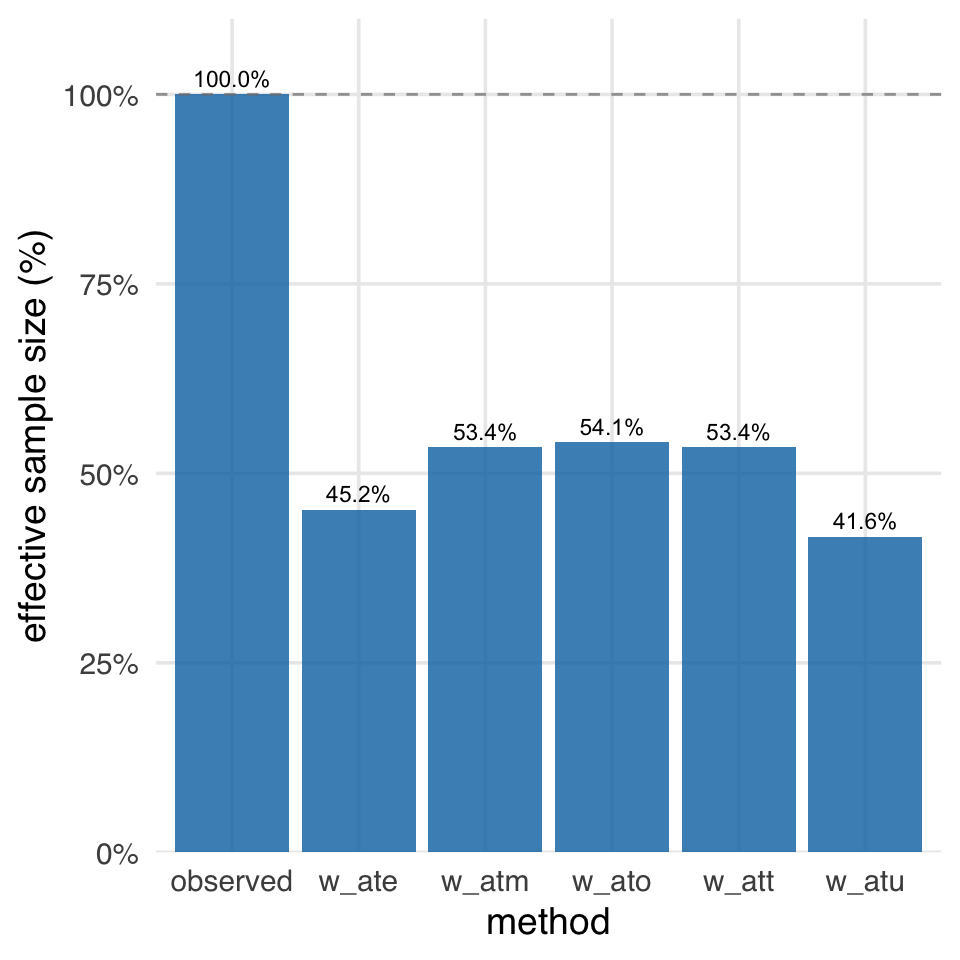
The fundamental tension in looking at balance vs. precision is a bias-variance trade-off. The observed sample size is the highest, but it also has the worst balance and may not address our research question. The ATO has the best balance and the highest ESS, but it addresses a particular sort of research question that may not suit our needs. Had we randomized the exposure, we would have had the best balance and the highest ESS, at least on average and with a high enough (actual) sample size. However, in observational data, we often have to make trade-offs between bias and variance. While weighting reduces our effective sample size, it’s often a necessary trade-off: without it, we’d get a precisely-estimated wrong answer!
In Chapter 6, we discussed when standard methods like multivariable linear regression succeed and fail. But what estimand does a regression estimator like lm(outcome ~ exposure + confounder) estimate?
While exploring simple problems, you’ll notice that the answer you get from multivariable regression is often close to the answer you get for the ATE weights. If you have a distribution among the exposures where the treated or the untreated are disproportionately high, it may be closer to the ATT or ATU.
The reality is that it’s not always clear which estimand we’re dealing with. One way to probe it is to use a technique to derive the implied weights from linear regression (Chattopadhyay and Zubizarreta 2022; Aronow and Samii 2015). The lmw package allows us to calculate these weights. The default is for the ATE, but we can also target other estimands.
These implied weights have some nice properties. They are perfectly balanced on the mean and have the lowest variance of such weights.
seven_dwarfs_with_ps |>
  mutate(park_close = as.numeric(park_close)) |>
  tidy_smd(
    .vars = c(park_ticket_season, park_close, park_temperature_high),
    .group = park_extra_magic_morning,
    .wts = iw
  ) |>
  ggplot(aes(abs(smd), variable, color = method, group = method)) +
  geom_love()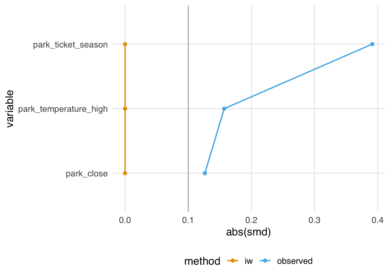
They also have a mean of 1, meaning they sum to the original size of the dataset. The effective sample size is also high relative to the observed sample size.
# A tibble: 1 × 4
   mean   sum     n   ess
  <dbl> <dbl> <int> <dbl>
1     1  354.   354  305.
The problem is that they also have some incoherent properties. Even though they balance on the mean, they may not create balance for the target population. Relatedly, they also sometimes generate negative weights. For instance, if we add interaction terms to this model, some weights are less than 0. Negative weights imply extrapolation beyond the joint distribution of the covariates in the data. Although they are close to 0 here, they can be more extreme. So, even though we’ve targeted the ATE, we may not have done so very precisely; it’s no longer clear who the target population is.
implied_weights_int <- lmw(
  ~ park_extra_magic_morning *
    (park_ticket_season + park_close + park_temperature_high),
  data = seven_dwarfs_with_ps,
  treat = "park_extra_magic_morning"
)

min(implied_weights_int$weights)
[1] -0.1113Suppose you feel OK about how these properties have played out for your problem. In that case, this approach offers an additional benefit: you can now use the techniques in Chapter 8 and Chapter 9 to diagnose the balance and functional form of a multivariable linear model without peeking at the relationship between the outcome and the exposure. Since they are just weights, you can still use all the tools in halfmoon, gtsummary, and any other approach you like for working with weights. lmw even comes with a handy estimation function, lmw_est(), to calculate the effect on the outcome with a robust standard error. So, if your collaborators want to use OLS but you want to think critically about balance and extrapolation, you can have the best of both worlds. If you end up with negative weights and other strange properties, though, it might be better to use another approach, depending on your estimand.
We’ll discuss another way to use a multivariable outcome model like this to target different estimands in Chapter 13.
Interestingly, the tilting function here is the variance of the Bernoulli distribution; we have the most uncertainty at 0.5!↩︎
The perfect balance resulting from using ATO weights here is specific to using logistic regression to estimate the propensity score. Perfect balance is not guaranteed if you use another estimator, including other GLM links.↩︎