Work-in-progress 🚧
You are reading the work-in-progress first edition of Causal Inference in R. This chapter has its foundations written but is still undergoing changes.
You are reading the work-in-progress first edition of Causal Inference in R. This chapter has its foundations written but is still undergoing changes.
As presented in Chapter 7, the causal question we’d like to answer is: is there a relationship between whether there were “Extra Magic Hours” in the morning at Magic Kingdom and the average wait time for an attraction called the “Seven Dwarfs Mine Train” the same day between 9 AM and 10 AM in 2018? Below is a proposed DAG for this question.
library(tidyverse)
library(ggdag)
library(ggokabeito)

coord_dag <- list(
  x = c(Season = 0, close = 0, weather = -1, x = 1, y = 2),
  y = c(Season = -1, close = 1, weather = 0, x = 0, y = 0)
)

labels <- c(
  x = "Extra Magic Morning",
  y = "Average wait",
  Season = "Ticket Season",
  weather = "Historic high temperature",
  close = "Time park closed"
)

dag <- dagify(
  y ~ x + close + Season + weather,
  x ~ weather + close + Season,
  coords = coord_dag,
  labels = labels,
  exposure = "x",
  outcome = "y"
) |>
  tidy_dagitty() |>
  node_status()

dag_plot <- dag |>
  ggplot(
    aes(x, y, xend = xend, yend = yend, color = status)
  ) +
  geom_dag_point() +
  scale_color_okabe_ito(na.value = "grey90") +
  theme_dag() +
  theme(legend.position = "none") +
  coord_cartesian(clip = "off")

dag_plot +
  geom_dag_edges_arc(curvature = c(rep(0, 5), 0.3, 0)) +
  geom_dag_label_repel(seed = 1630)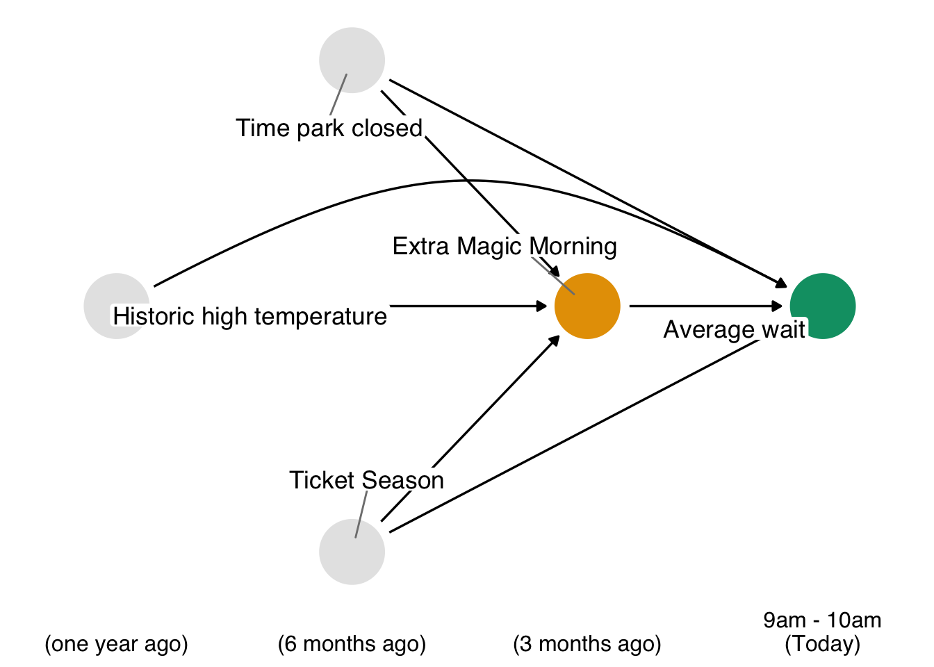
Now that we’ve done some exploratory analysis of these data, how should we go about answering this question? We know from Chapter 4 that we have three backdoor paths to close. Each path has one variable, resulting in three confounders: the historic high temperature on the day, the time the park closed, and the ticket season: value, regular, or peak.
We also know that we have several ways we can close these paths. Stratification isn’t a good solution here because of the curse of dimensionality; we had better use a statistical model. But which relationship should we model? Consider Figure 8.2, Figure 8.3, and Figure 8.4.
dag_plot +
  geom_dag_edges_arc(curvature = c(rep(0, 5), 0.3, 0), edge_color = "grey80") +
  geom_dag_edges_arc(
    data = \(.x) filter(.x, to == "x"),
    curvature = c(0, 0, 0),
    edge_width = 1.1
  )

dag_plot +
  geom_dag_edges_arc(curvature = c(rep(0, 5), 0.3, 0), edge_color = "grey80") +
  geom_dag_edges_arc(
    data = \(.x) filter(.x, name != "x", to == "y"),
    curvature = c(0, 0, 0.3),
    edge_width = 1.1
  )

dag_plot +
  geom_dag_edges_link(
    data = \(.x) filter(.x, name == "x", to == "y"),
    edge_color = "grey80"
  ) +
  geom_dag_edges_arc(
    data = \(.x) filter(.x, name != "x"),
    curvature = c(rep(0, 5), 0.3),
    edge_width = 1.1
  )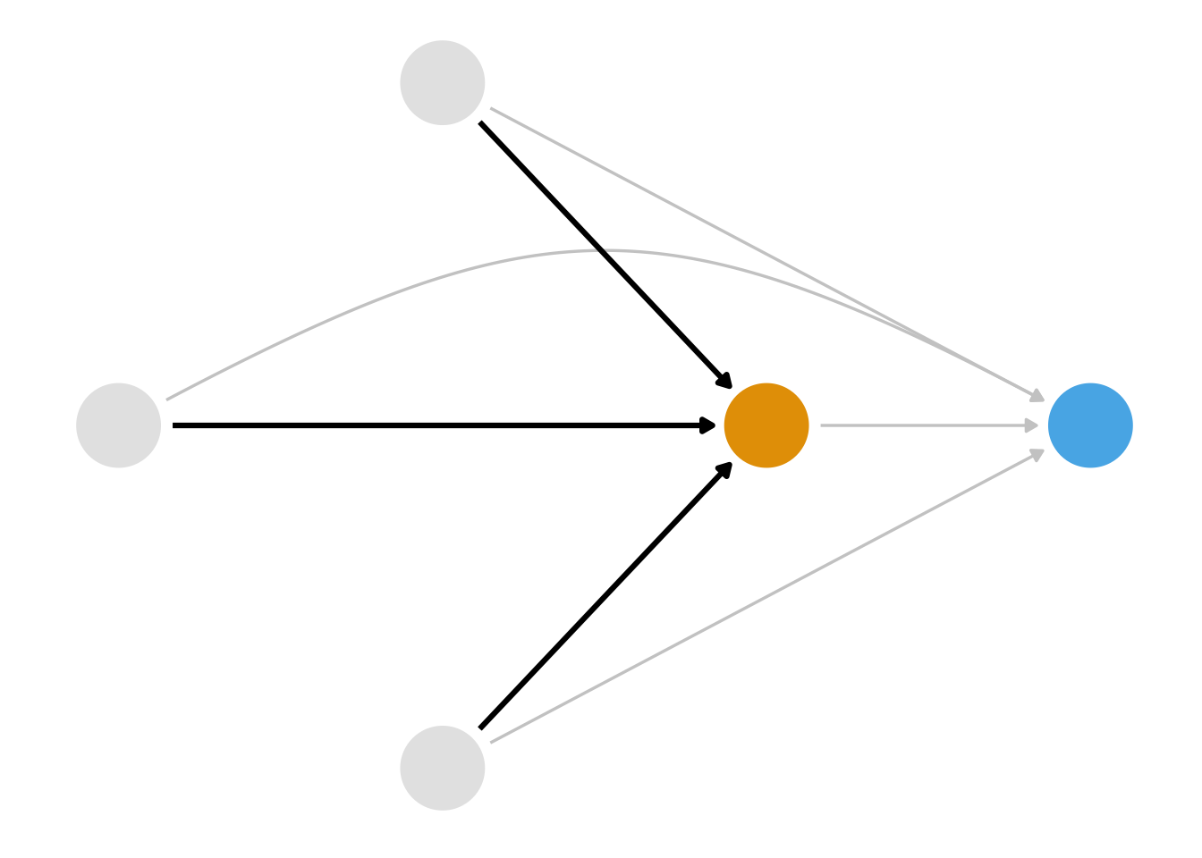
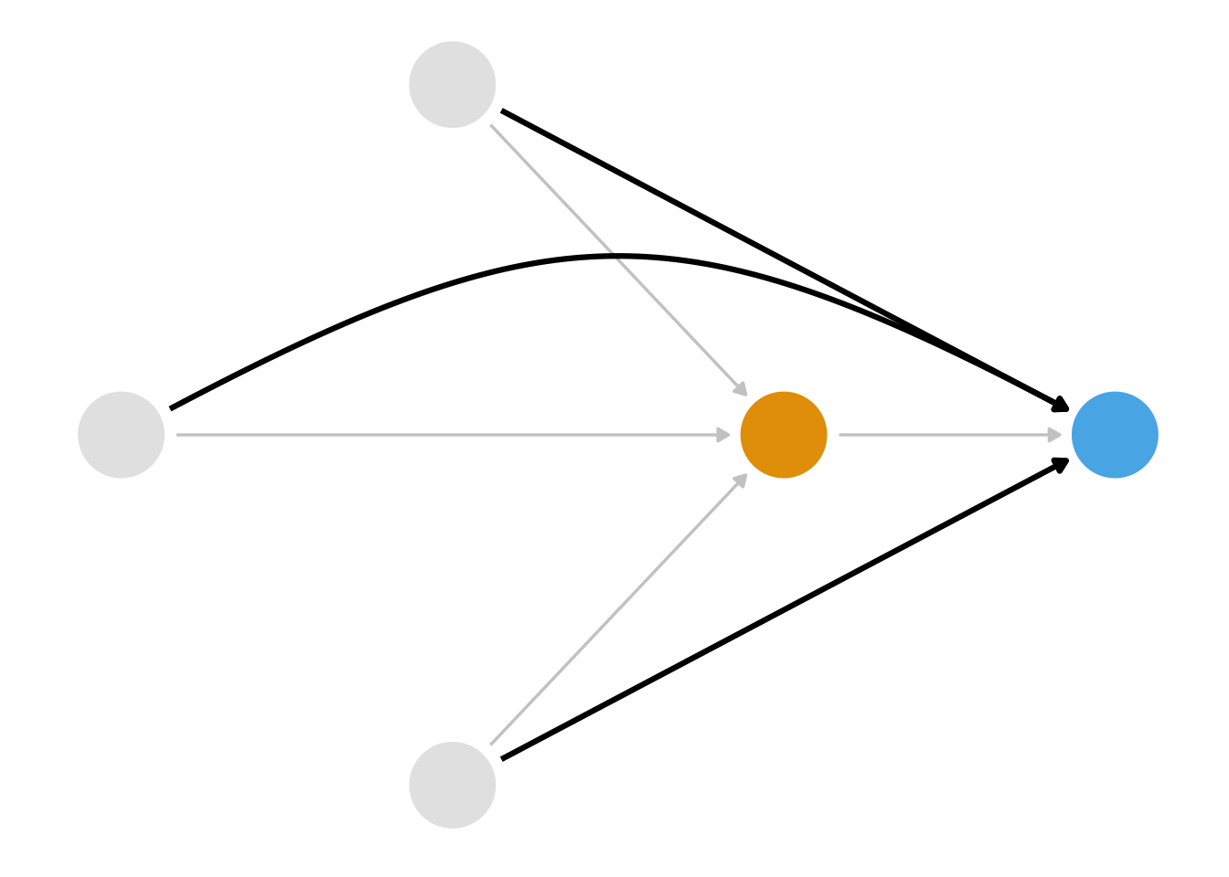
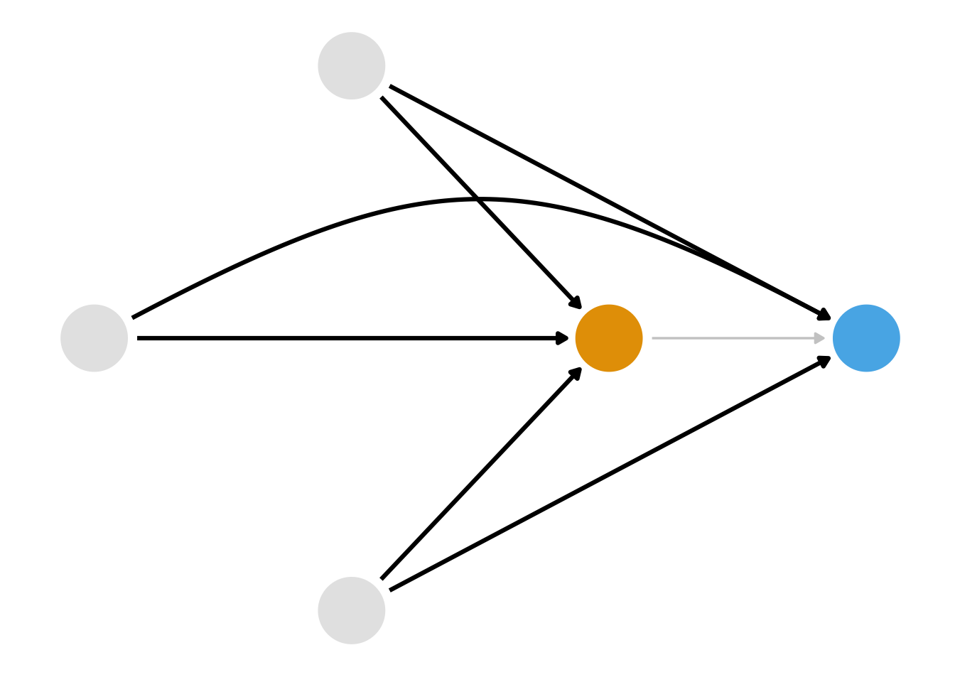
First, we could model the relationship between the confounders and the exposure, as in Figure 8.2. A class of techniques using the propensity score, the probability of exposure, let us do this. Second, we could model the relationship between the confounders and the outcome, as in Figure 8.3. A class of techniques using the outcome model allows us to do this. We saw an outcome model in Chapter 6, and we’ll see another approach in Chapter 13. Both propensity score and outcome model approaches can get us the right answer as long as we’ve got the right DAG and have modeled the relationships correctly. Alternatively, we could model both sets of relationships as in Figure 8.3. A class of techniques called doubly robust estimators allows us to do this, which we’ll revisit in Chapter 20 and Chapter 21.
For the next several chapters, we’ll take up the class of techniques we can use to close the paths via Figure 8.2: propensity scores. First, consider what it would look like if Disney randomized the Extra Magic Mornings assignment. Let’s say each day has a 0.5 probability of being assigned Extra Magic Mornings, so about half the days had them and half didn’t. In this case, the arrows highlighted in Figure 8.2 wouldn’t exist, but the arrows highlighted in Figure 8.3 would: we’ve intervened on the exposure—whether or not a day has Extra Magic Hours—not on the outcome—the posted wait times. The historic high temperature on the day, the time the park closed, and the ticket season still affect the posted wait times, but not Extra Magic Hours. Here, the probability of exposure—the propensity score—is 0.5 for every day. In other words, in an experiment, the propensity score is known. A given day is randomly assigned with rbinom(1, 1, 0.5).
Let’s say Disney conducted a more complex experiment: they randomized the exposure within levels of the three variables of the DAG. For instance, let’s say every day was granted a baseline probability of 0.5. In this experiment, historic temperatures >= 80 degrees Fahrenheit reduced the probability of exposure by 0.1, a park closure time of less than 10 PM increased the probability by 0.2, and being in peak ticket season decreased the probability by 0.3. A day with a historic temperature of 86 degrees that closed at 9:00 PM in peak ticket season, the day would be randomly assigned Extra Magic Hours in the morning with a probability of \(0.5 - 0.1 + 0.2 - 0.25 = 0.35\), or rbinom(1, 1, 0.35). This design is still a randomized experiment, but it’s randomized within levels of the covariates. It gives us conditional exchangeability, much like we have to assume in non-randomized data: days are exchangeable within levels of the covariates.
In our case, though, these probabilities are not known. What if we could find the “hidden experiment” in this non-randomized data? Remember, someone decided to put Extra Magic Hours on certain days. What was that decision process? If we could use a combination of domain knowledge—to understand what factors went into treatment assignment that also affect the outcome—and statistics—to estimate these conditional probabilities—then perhaps we could use those probabilities to achieve exchangeability and calculate an unbiased causal effect. Rosenbaum and Rubin (1983) showed that conditioning on propensity scores in observational studies can lead to unbiased estimates of the exposure effect as long as the assumptions discussed in Section 3.2 hold.
There are many ways to estimate the propensity score; for binary exposures, logistic regression is typically used, although other approaches are also used. While estimates from logistic regression can be difficult to interpret from a causal perspective (we’ll cover this in more detail in Section 11.5), they excel at predicting well-calibrated probabilities. A logistic regression with exposure as the predicted value and the confounders as the covariates is a good place to start with a propensity score.
Below is pseudo-code for using glm() to fit a propensity score model using logistic regression. The first argument is the model, with the exposure on the left side and the confounders on the right. The data argument takes the data frame, and the family = binomial() argument denotes that the model should be fit using logistic regression (as opposed to a different generalized linear model, although other links are sometimes used in propensity score modeling). You’ve likely fit models like this before, but the key details are that we are predicting the probability of exposure (instead of something around the outcome; we’ll get to that!) and that the predictors are the confounders determined from the DAG. As we saw in Section 6.3.1, if we had any predictors of the outcome that weren’t related to the exposure, we’d probably want to include those, too, for precision’s sake.
We can extract the propensity scores by pulling out the predictions on the probability scale using predict() or fitted(). However, using the augment() function from the {broom} package, we can extract these propensity scores and add them to our original data frame in one step, so we’ll use that approach. The predictions will be on the linear logit scale by default. Setting the argument type.predict to "response" indicates that we want to extract the predicted values on the probability scale. The data argument contains the original data frame; if we leave this blank, we’ll only get back a data frame with the variables in the propensity score model. However, we need the outcome, too, so it’s handy to use the whole data frame, even though there are no new days in the data set. This code will output a new data frame consisting of all components in df with six additional columns corresponding to the logistic regression model that was fit. The .fitted column is the propensity score. A convenient detail about broom is that the columns returned from its functions are consistent across models in R, so the code in this chapter will work for many types of broom output.
Let’s apply this recipe to our example.
We can build a propensity score model using the seven_dwarfs_train_2018 data set from the touringplans package. First, we need to subset the data to only include average wait times between 9 and 10 AM. Then, we will use the glm() function to fit the propensity score model, predicting park_extra_magic_morning using the three confounders specified above. We’ll add the propensity scores to the data frame via augment().
library(broom)
library(touringplans)

seven_dwarfs_9 <- seven_dwarfs_train_2018 |>
  filter(wait_hour == 9)

ps_mod <- glm(
  park_extra_magic_morning ~ park_ticket_season +
    park_close +
    park_temperature_high,
  data = seven_dwarfs_9,
  family = binomial()
)

seven_dwarfs_9_with_ps <- ps_mod |>
  augment(type.predict = "response", data = seven_dwarfs_9)
First, we might ask how well this model performs. On the one hand, model statistics can’t tell us how well we’ve adjsuted for confounding. However, we do have expectations about how the model behaves. For instance, the prediction model should be well-calibrated. This means that if we look at all the days with a predicted probability of 0.3, about 30% of those days should have Extra Magic Mornings. We can check this by grouping the data into bins of propensity scores and calculating the observed proportion of days with Extra Magic Mornings in each bin. Figure 8.5 shows a calibration plot for our propensity score model. The points are close to the 45-degree line, indicating that the model is well-calibrated. Logistic regression models tend to be well-calibrated, so this is a good sign. However, we have few points towards the higher end of the propensity score, so we are more uncertain about these. Calibration can be particularly useful for machine learning models, which can be poorly calibrated. If we find that our model is showing issues in this respect, propensity can calibrate the model using logistic regression with ps_calibrate().
library(halfmoon)
plot_model_calibration(ps_mod, method = "windowed")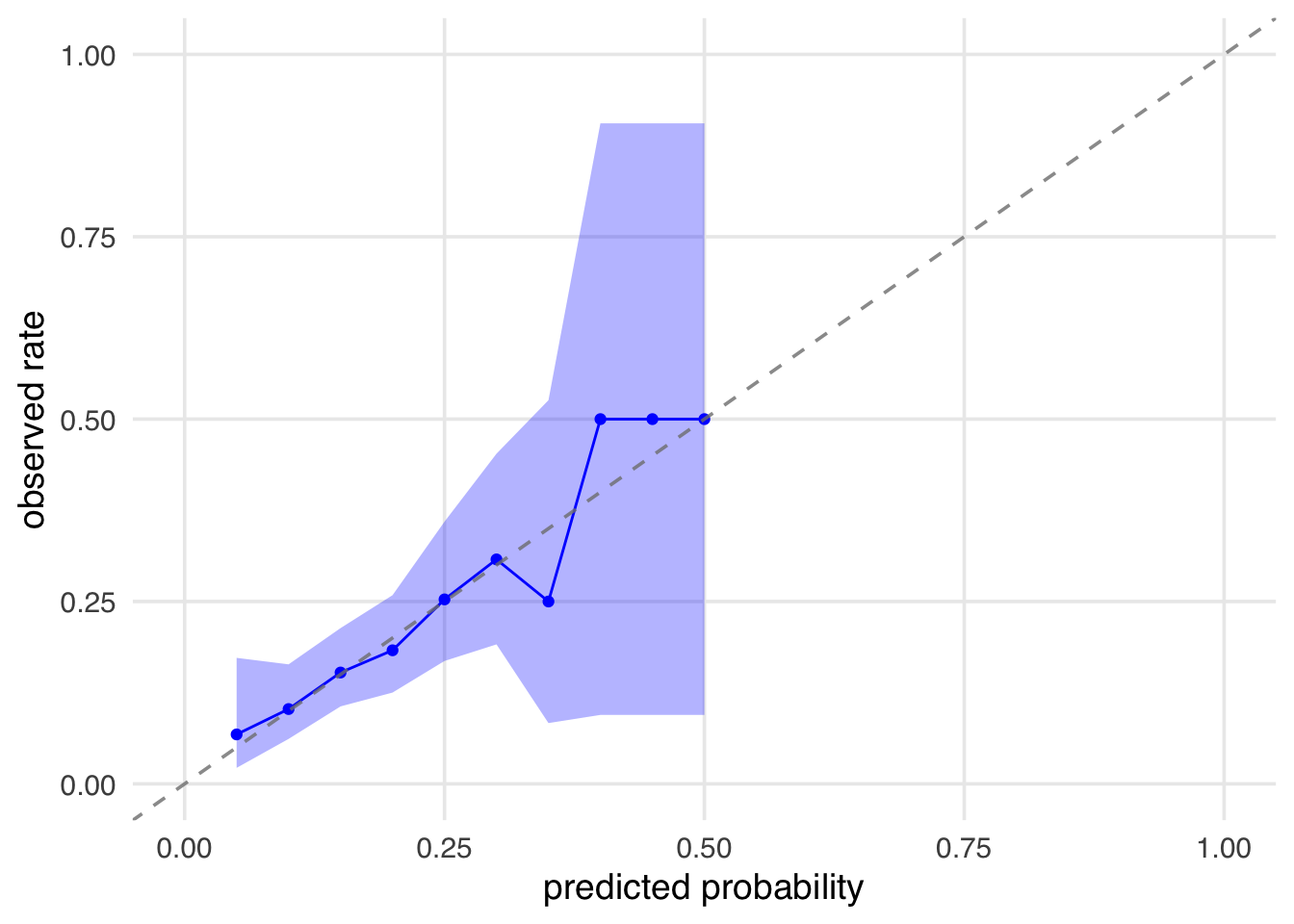
Another common check of model performance is the receiver operating characteristic curve (ROC). The ROC curve plots the true positive rate (sensitivity) against the false positive rate (1 - specificity) at various threshold settings. The ROC is a measure of discrimination: how well the model can distinguish between days with and without Extra Magic Mornings. This means that if we randomly select one day with Extra Magic Mornings and one day without, the model will assign a higher propensity score to the day with Extra Magic Mornings more often than not. A 45 degree line indicates no discrimination (random chance), while a curve that hugs the top left corner indicates perfect discrimination. The area under the curve (AUC) is a summary measure of discrimination, with values ranging from 0.5 (no discrimination) to 1 (perfect discrimination). In prediction modeling, the goal is often to maximize discrimination. However, in a causal model, perfect discrimination would indicate a violation of positivity: some days would have a 0% chance of Extra Magic Mornings, and some would have a 100% chance. Some discrimination, howver, indicates we have identified differences between the groups. There is no clear cutoff for what is a “good” AUC is for causal inference (a randomized trial, for instance, will have an expected AUC of 0.5 because the only thing to discriminate between groups is group assignment), but values between 0.6 and 0.8 usually indicate that we’ve picked up enough signal from the counfounders to use for adjustment but not so much that we have positivity issues. As opposed to prediction modeling, though, we are not trying to optimize the AUC to this range; we are using it as a diagnostic. We’ll revisit AUC and ROC curves in Chapter 9.
seven_dwarfs_9_with_ps |>
  check_model_roc_curve(park_extra_magic_morning, .fitted) |>
  plot_model_roc_curve()
Ignoring unknown labels:
• colour : "method"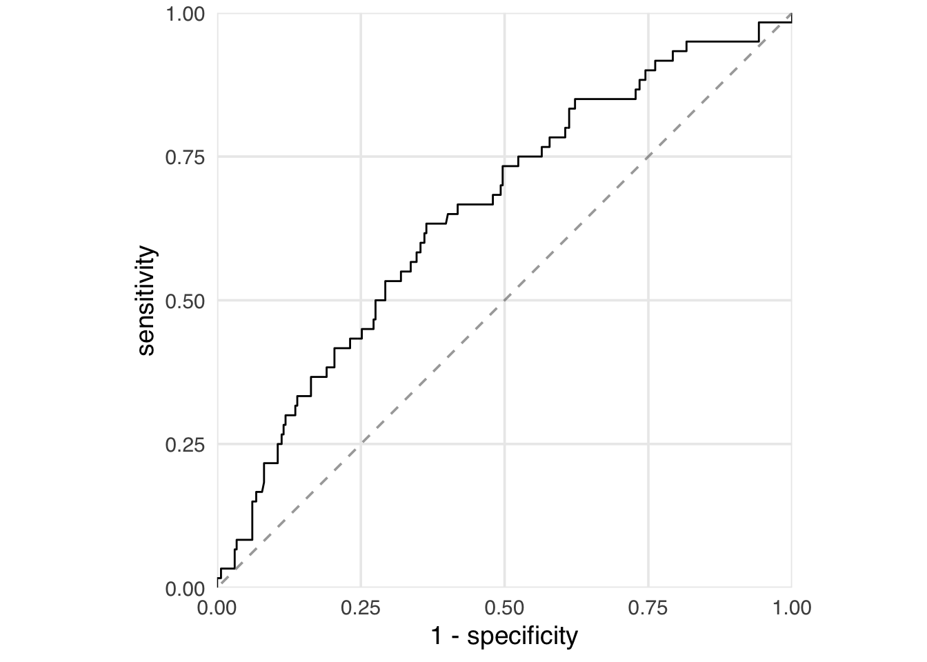
Our model AUC is 0.65:
check_model_auc(
  seven_dwarfs_9_with_ps,
  .exposure = park_extra_magic_morning,
  .fitted = .fitted
)
# A tibble: 1 × 2
method auc
<chr> <dbl>
1 observed 0.654Let’s now take a look at the propensity scores directly. Table 8.1 shows the propensity scores (in the .fitted column) for the first six days in the dataset and the values of each day’s exposure, outcome, and confounders. The propensity score here is the probability that a given date will have Extra Magic Hours in the morning, given the observed confounders, in this case, the historical high temperatures on a given date, the time the park closed, and the ticket season. For example, on January 1, there was a 30.2% chance that there would be Extra Magic Hours at the Magic Kingdom given the ticket season (peak, in this case), time of park closure (11 PM), and the historic high temperature on this date (58.6 degrees Fahrenheit). On this particular day, there were not Extra Magic Hours in the morning (as indicated by the 0 in the first row of the park_extra_magic_morning column). There was likewise a low probability (18.4%) on January 5, but this day did have Extra Magic Hours in the morning.
library(gt)
seven_dwarfs_9_with_ps |>
  select(
    park_date,
    park_extra_magic_morning,
    .fitted,
    park_ticket_season,
    park_close,
    park_temperature_high
  ) |>
  head() |>
  gt() |>
  fmt_number(decimals = 3) |>
  fmt_integer(park_extra_magic_morning) |>
  cols_label(
    .fitted = "P(EMM)",
    park_date = "Date",
    park_extra_magic_morning = "Extra Magic Mornings",
    park_ticket_season = "Ticket Season",
    park_close = "Close time",
    park_temperature_high = "Historic Temp."
)| Date | Extra Magic Mornings | P(EMM) | Ticket Season | Close time | Historic Temp. |
|---|---|---|---|---|---|
| 2018-01-01 | 0 | 0.302 | peak | 23:00:00 | 58.630 |
| 2018-01-02 | 0 | 0.282 | peak | 24:00:00 | 53.650 |
| 2018-01-03 | 0 | 0.290 | peak | 24:00:00 | 51.110 |
| 2018-01-04 | 0 | 0.188 | regular | 24:00:00 | 52.660 |
| 2018-01-05 | 1 | 0.184 | regular | 24:00:00 | 54.290 |
| 2018-01-06 | 0 | 0.207 | regular | 23:00:00 | 56.250 |
seven_dwarfs_9_with_ps dataset, including their propensity scores in the .fitted column.
It’s helpful to visualize the distribution of propensity scores by exposure group. A nice way to visualize this is via mirrored histograms. To create one, we’ll use the halfmoon package’s geom_mirror_histogram(). The code below creates two histograms of the propensity scores, one on the “top” for the exposed group (the dates with Extra Magic Hours in the morning) and one on the “bottom” for the unexposed group. We’ll also tweak the y-axis labels to use absolute values (rather than negative values for the bottom histogram) via scale_y_continuous(labels = abs).
ggplot(
  seven_dwarfs_9_with_ps,
  aes(.fitted, fill = factor(park_extra_magic_morning))
) +
  geom_mirror_histogram(bins = 50) +
  scale_y_continuous(labels = abs) +
  labs(x = "propensity score", fill = "extra magic morning")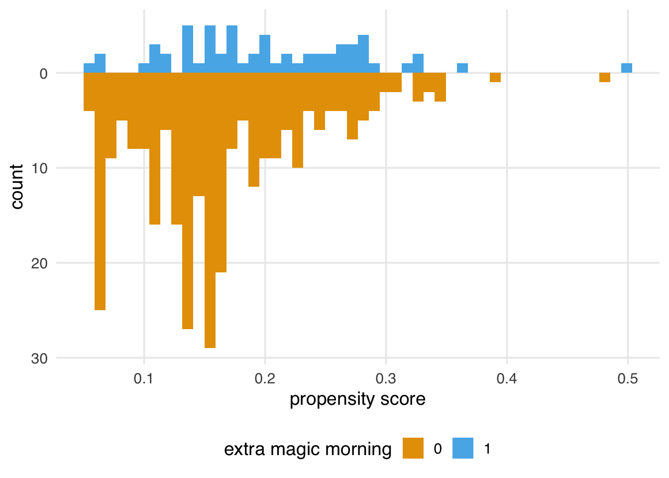
We’ll explore how to assess a propensity score model after applying a method (like weighting or matching) in more detail in Chapter 9; however, let’s think about what we’re seeing from the perspective of the causal assumptions we need to make for valid inferences. In Section 7.7, we saw that we might have issues with both exchangeability and positivity. We were pretty confident that causal consistency wasn’t an issue for this question, but looking at the raw propensity scores (before we apply weighting or matching) can give us some insight into the other two assumptions. While data will never be able to prove our assumptions are right or wrong, it does give us some evidence.
For positivity and exchangeability, we’re looking for two things: overlap and balance. Overlap refers to overlapping ranges of the propensity scores by exposure group, sometimes called common support. Overlap is related to positivity: if there are regions of the propensity score where only one exposure group has observations, we might have a positivity violation. The other thing to look for is balance in the populations. In a randomized setting, we expect the distributions between the two groups to be approximately the same because their likelihood of exposure is unrelated to the baseline covariates. This balance is another perspective on the choice of the word “exchangeable”: we should be able to reassign the two groups to the other exposure and still get the right answer.
Figure 8.8 shows simulated scenarios of the kinds of distributions we will tend to see with good, moderate, and poor overlap and balance. Poor balance and overlap can worsen bias and variance and make us less confident in the causal assumptions we need to make.
library(patchwork)

set.seed(2025)

make_model <- function(n = 1000, intercept, slope) {
  df <- tibble(
    z = rnorm(n),
    exposure = rbinom(n, 1, plogis(intercept + slope * z))
  )
  glm(exposure ~ z, data = df, family = binomial)
}

models_overlap <- list(
  good = make_model(intercept = 0, slope = 0.5),
  moderate = make_model(intercept = 0, slope = 1.5),
  poor = make_model(intercept = 0, slope = 3.0)
)

plot_ps <- function(.x, .y, title = "Overlap") {
  .x |>
    augment(type.predict = "response") |>
    ggplot(aes(.fitted, fill = factor(exposure))) +
    geom_mirror_histogram(bins = 50) +
    scale_y_continuous(labels = abs) +
    labs(
      x = "propensity score",
      fill = "exposure",
      title = paste(str_to_title(.y), title)
    ) +
    theme(legend.position = "none")
}

plots_overlap <- imap(
  models_overlap,
  plot_ps
)

models_balance <- list(
  good = make_model(intercept = 0.0, slope = 1.5),
  moderate = make_model(intercept = log(0.25 / 0.75), slope = 1.5),
  poor = make_model(intercept = log(0.10 / 0.90), slope = 1.5)
)

plots_balance <- imap(
  models_balance,
  plot_ps,
  title = "Balance"
)

plots_balance$moderate <- plots_balance$moderate +
  theme(legend.position = "bottom")

(plots_overlap$good + plots_overlap$moderate + plots_overlap$poor) /
  (plots_balance$good + plots_balance$moderate + plots_balance$poor)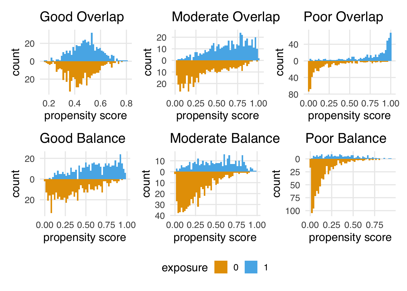
Figure 8.7 gives us a perspective on these assumptions reduced to a single dimension (the propensity score). We definitely see both overlap and balance problems. Clearly, the distribution is different between the groups in terms of shape and number of days. Let’s also look at the range of the propensity score by group.
# A tibble: 4 × 2
  park_extra_magic_morning  range
                     <dbl>  <dbl>
1                        0 0.0547
2                        0 0.482
3                        1 0.0506
4                        1 0.495
The range between groups seems pretty close. One helpful way to look at the tails is to check the number of unexposed observations below the lowest probability for the exposed group and the number of exposed observations above the highest probability for the unexposed group.
seven_dwarfs_9_with_ps |>
  mutate(
    support = case_when(
      park_extra_magic_morning == 0 &
        .fitted < min(.fitted[park_extra_magic_morning == 1]) ~ "unexp_below",
      park_extra_magic_morning == 1 &
        .fitted > max(.fitted[park_extra_magic_morning == 0]) ~ "exp_above",
      .default = "inside_support",
      .ptype = factor(levels = c("unexp_below", "inside_support", "exp_above"))
    )
  ) |>
  count(support, .drop = FALSE)
# A tibble: 3 × 2
support n
<fct> <int>
1 unexp_below 0
2 inside_support 353
3 exp_above 1However, looking at Figure 8.7, we see some areas of sparsity, implying some combinations have positivity violations. For instance, many more days are without Extra Magic Mornings with a probability below 10%.
seven_dwarfs_9_with_ps |>
  count(park_extra_magic_morning, low_prob = .fitted <= 0.1)
# A tibble: 4 × 3
park_extra_magic_morning low_prob n
<dbl> <lgl> <int>
1 0 FALSE 239
2 0 TRUE 55
3 1 FALSE 56
4 1 TRUE 4We’re likely seeing a combination of structural positivity (some days will never or always get Extra Magic Hours per Disney’s decision-making process) and stochastic violations. Since we have a limited number of days in the year and only about 17% of days get Extra Magic Hours in the morning, we expect some sparsity. For instance, Figure 8.9 is what the graph would look like if Extra Magic Mornings were randomized with the same proportions of exposed and unexposed days. (If you try this out with different seeds, you’ll see that these data are prone to such random violations.) Propensity score methods are more susceptible to issues with positivity violations than outcome model-based methods and some doubly robust methods; we’ll have to keep an eye on this.
set.seed(2025)
seven_dwarfs_9 |>
  mutate(randomized_emm = rbinom(n(), 1, 0.17)) |>
  glm(
    randomized_emm ~ park_ticket_season + park_close + park_temperature_high,
    data = _,
    family = binomial()
  ) |>
  augment(type.predict = "response") |>
  ggplot(
    aes(.fitted, fill = factor(randomized_emm))
  ) +
  geom_mirror_histogram(bins = 50) +
  scale_y_continuous(labels = abs) +
  labs(x = "propensity score", fill = "extra magic morning")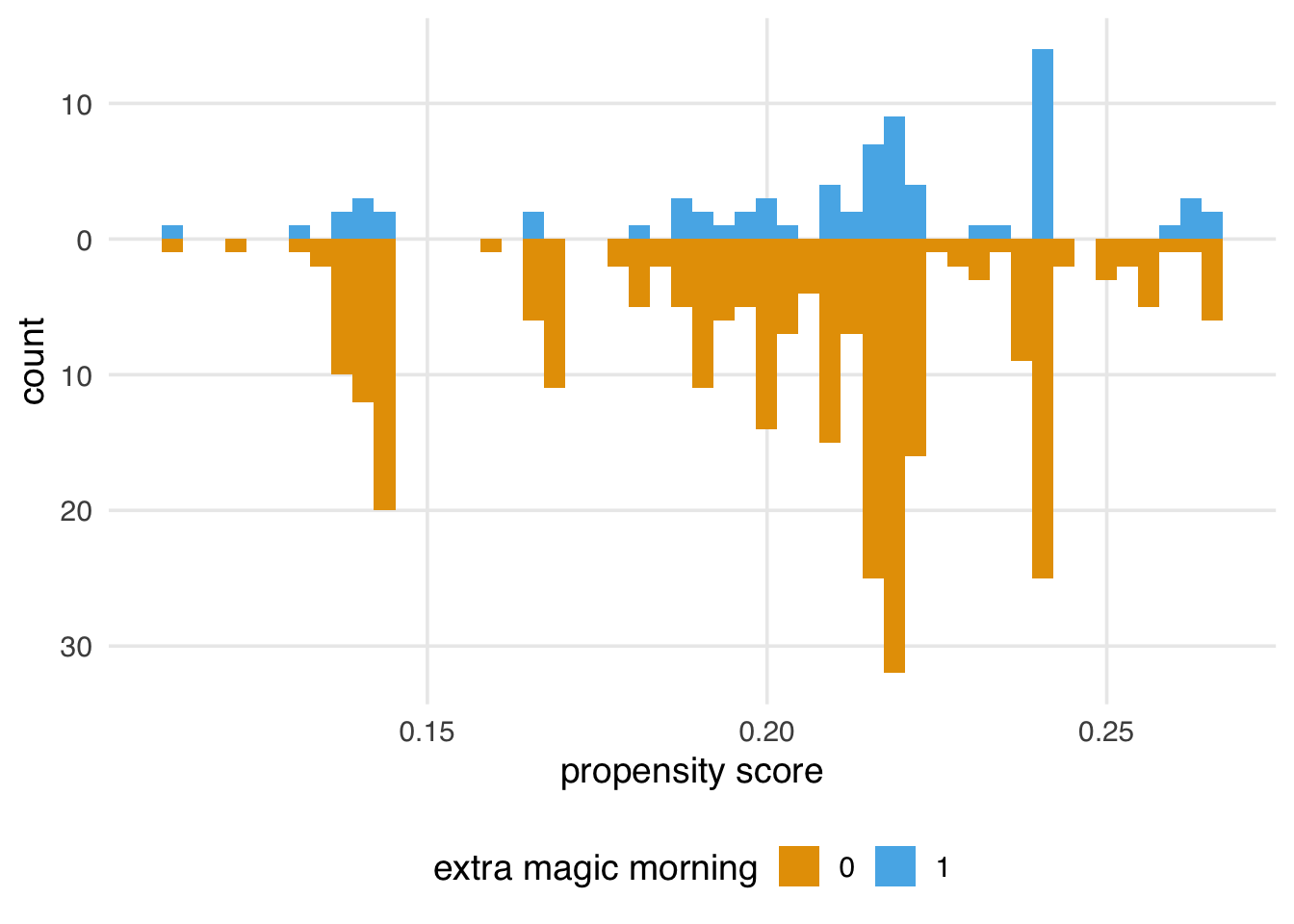
What can we do about these problems? Although we need good domain knowledge to base our assumptions on (and perhaps better exclusion criteria for days that are structurally unable to receive Extra Magic Hours), using the information in the propensity score can help with both exchangeability and, with some methods, positivity.
The propensity score is a balancing tool at its heart. We use it to help us make our exposure groups exchangeable (and, as we’ll see in Chapter 10, we can also sometimes use it to improve positivity). There are many ways to incorporate the propensity score into an analysis. Commonly used techniques include stratification (estimating the causal effect within propensity score strata), matching, weighting, and direct covariate adjustment (including the propensity score as a covariate in the outcome model). This section will focus on matching and weighting.
Matching and weighting are two different ways of creating populations with better confounder balance. In matching, we create a sub-population by selecting a subgroup of observations where we hope exchangeability holds. In weighting, we re-weight the observations to create a pseudo-population where we hope exchangeability holds.
Matching is an intuitive way to create a population where we can make apples-to-apples comparisons. Imagine that we start with an exposed observation. In an infinite population, we could handpick an unexposed observation, the only difference being the exposure status. In other words, we match two observations that have identical confounder values but opposite exposure values. This is called exact matching. Exact matching works well for very large data or very limited numbers (and values) of confounders, but it becomes increasingly complex to find such a match when the number and continuity of confounders increase. This is where the propensity score, a summary measure of all of the confounders, comes into play.
The MatchIt package is one of the most flexible tools for matching in R. Let’s match similar days with matchit(). (If we didn’t include the pre-computed propensity score in the distance argument, matchit() would have refit the logistic regression for us.) There were 60 days in 2018 when the Magic Kingdom had Extra Magic Morning hours. For each of these 60 exposed days, matchit() found a comparable unexposed day, by implementing a nearest-neighbor match using the constructed propensity score. Examining the output, we also see that the default target estimand is an “ATT,” the average treatment effect among the treated. We will discuss this and several other estimands in Chapter 10, but the important thing to know for know is that matchit() is going to keep all the days with Extra Magic Morning and may discard some days that were unexposed.
library(MatchIt)
ps_logit_scale <- predict(ps_mod)
matchit_obj <- matchit(
  park_extra_magic_morning ~ park_ticket_season +
    park_close +
    park_temperature_high,
  data = seven_dwarfs_9_with_ps,
  # match on the propensity score we fit on the logit scale
  # TODO: @Lucy, should we supply this on the logit scale or probability scale?
  distance = ps_logit_scale
)

matchit_obj
A `matchit` object
- method: 1:1 nearest neighbor matching without replacement
- distance: User-defined - number of obs.: 354 (original), 120 (matched)
- target estimand: ATT
- covariates: park_ticket_season, park_close, park_temperature_highWe can use the get_matches() function to create a data frame with the original variables that consists only of those who were matched. Notice that our sample size has been reduced from 354 days to 120.
matched_data <- get_matches(matchit_obj) |>
  as_tibble()

matched_data
# A tibble: 120 × 24
id subclass weights park_date wait_hour
<chr> <fct> <dbl> <date> <int>
1 5 1 1 2018-01-05 9
2 340 1 1 2018-12-17 9
3 12 2 1 2018-01-12 9
4 180 2 1 2018-07-07 9
5 19 3 1 2018-01-19 9
6 236 3 1 2018-09-01 9
7 25 4 1 2018-01-26 9
8 66 4 1 2018-03-08 9
9 33 5 1 2018-02-03 9
10 20 5 1 2018-01-20 9
# ℹ 110 more rows
# ℹ 19 more variables: attraction_name <chr>,
# wait_minutes_actual_avg <dbl>,
# wait_minutes_posted_avg <dbl>,
# attraction_park <chr>, attraction_land <chr>,
# park_open <time>, park_close <time>,
# park_extra_magic_morning <dbl>, …The subclass column tells us which days are matched. For instance, for subclass == 1, we have a pair of days, one with and one without Extra Magic Mornings. Their propensity scores are the same.
# A tibble: 2 × 3
  park_date  park_extra_magic_morning .fitted
  <date>                        <dbl>   <dbl>
1 2018-01-05                        1   0.184
2 2018-12-17                        0   0.184
If we look closer at their covariates, we can see why. These are not exact matches—the temperature and park close variables are slightly different—but we can see these are both regular ticket season days with cooler historic temperatures and later close times. Do they seem like good counterfactuals for one another?
matched_data |>
  filter(subclass == 1) |>
  select(park_date, park_temperature_high, park_ticket_season, park_close)
# A tibble: 2 × 4
park_date park_temperature_high park_ticket_season
<date> <dbl> <chr>
1 2018-01-05 54.3 regular
2 2018-12-17 65.4 regular
# ℹ 1 more variable: park_close <time>Pair 45 also have similar propensity scores, although it is not as close as pair 1.
# A tibble: 2 × 3
  park_date  park_extra_magic_morning .fitted
  <date>                        <dbl>   <dbl>
1 2018-11-16                        1   0.360
2 2018-11-05                        0   0.349
Their actual variables, however, are not as close. There is about a 20 degree difference in the historical temperature, and the park close time, while earlier for both, is a little further apart than pair 1.
matched_data |>
  filter(subclass == 45) |>
  select(park_date, park_temperature_high, park_ticket_season, park_close)
# A tibble: 2 × 4
park_date park_temperature_high park_ticket_season
<date> <dbl> <chr>
1 2018-11-16 64.5 regular
2 2018-11-05 83.9 regular
# ℹ 1 more variable: park_close <time>We might also want to know which days weren’t matched. Since we kept all the days with Extra Magic Hours, we know all of the days that were dropped did not have them. We can check which days aren’t in the matched data with an anti-join.
seven_dwarfs_9_with_ps |>
  anti_join(matched_data, by = "park_date") |>
  select(park_date, park_extra_magic_morning, .fitted)
# A tibble: 234 × 3
park_date park_extra_magic_morning .fitted
<date> <dbl> <dbl>
1 2018-01-01 0 0.302
2 2018-01-03 0 0.290
3 2018-01-04 0 0.188
4 2018-01-06 0 0.207
5 2018-01-08 0 0.102
6 2018-01-09 0 0.0960
7 2018-01-10 0 0.0972
8 2018-01-11 0 0.0895
9 2018-01-13 0 0.165
10 2018-01-14 0 0.171
# ℹ 224 more rowsWe may feel that there is still a lot of valuable statistical information in these dropped data. We could gain extra statistical precision by using more than one match for each day with Extra Magic Hours. Previously, we used \(1:1\) matching, but matchit() also supports \(1:k\) matching with the ratio argument. For instance, for ratio = 2, we would get two matches for every day with Extra Magic Mornings, resulting in a sample size of 180.
However, we need to be cautious about adding extra matches when data are limited. The more days we try to match, the worse the match will get. For instance, when we try to find four matches for each day with Extra Magic Mornings, the day the propensity scores for subclass == 1 start to get pretty different for the later matches. This is a bias-variance trade-off: for more matches, we get better precision, but we make it harder to find good matches, which may increase bias.
matchit(
  park_extra_magic_morning ~ park_ticket_season +
    park_close +
    park_temperature_high,
  data = seven_dwarfs_9_with_ps,
  distance = ps_logit_scale,
  ratio = 4
) |>
  get_matches() |>
  as_tibble() |>
  filter(subclass == 1) |>
  select(park_date, park_extra_magic_morning, .fitted)
# A tibble: 5 × 3
park_date park_extra_magic_morning .fitted
<date> <dbl> <dbl>
1 2018-01-05 1 0.184
2 2018-12-17 0 0.184
3 2018-04-11 0 0.187
4 2018-04-22 0 0.175
5 2018-06-21 0 0.138We can control the quality of the match by asking matchit() to only match observations within a certain distance away. In other words, we can ask not to match observations with propensity scores farther apart than we’d like. We control this by setting a caliper. The caliper is a dynamic distance, on the logit scale, that we accept as the maximum difference between two observations that can be matched. It is dynamic in that sense that whatever value we give to the caliper argument is multiplied by the standard deviation of the propensity score. However, let’s try 1:2 matching with a caliper of 0.2. Matching with a caliper gives us 178 days, two days fewer than \(60 + 60*2\). Two of the days with Extra Magic Mornings only received one matched control instead of two.
mtchs <- matchit(
  park_extra_magic_morning ~ park_ticket_season +
    park_close +
    park_temperature_high,
  data = seven_dwarfs_9_with_ps,
  distance = ps_logit_scale,
  ratio = 2,
  caliper = 0.2
)

mtchs |>
  get_matches() |>
  group_by(subclass) |>
  summarise(n = n()) |>
  filter(n < 3)
# A tibble: 2 × 2
subclass n
<fct> <int>
1 17 2
2 50 2One important point is that by setting a caliper, we may be changing the population about whom we are making inferences depending on which and how many observations are dropped. We’ll revisit this in Chapter 10.
One way to think about matching is as a crude weight: In the final sample, everyone who was matched gets a weight of 1, and everyone who was not matched gets a weight of 0. Another approach is to allow this weight to be smooth, applying a weight to allow, on average, the covariates of interest to be balanced in a weighted pseudo-population. We already have a handy summary of the covariates we need to balance on: the propensity score. Rather than matching on the propensity score, we’ll use it as the basis for these weights. We can calculate many different weights depending on the target estimand of interest (see Chapter 10 for details). In this section, we will focus on the Average Treatment Effect (ATE) weights, commonly referred to as inverse probability weights. The weight is constructed as follows: each observation is weighted by the inverse of the probability of receiving the exposure it actually received.
\[ w_{ATE} = \frac{X}{p} + \frac{(1 - X)}{1 - p} \]
For example, if observation 1 had a very high likelihood of being exposed given their pre-exposure covariates (\(p = 0.9\)), but they in fact were not exposed, their weight would be 10 (\(w_1 = 1 / (1 - 0.9)\)). Likewise, if observation 2 had a very high likelihood of being exposed given their pre-exposure covariates (\(p = 0.9\)), and they were exposed, their weight would be 1.1 (\(w_2 = 1 / 0.9\)). Intuitively, we give more weight to observations that, based on their measured confounders, appear to have helpful information for constructing a counterfactual—we would have predicted that they were exposed, but by chance, they were not, or vice versa.
The propensity package calculates a variety of propensity score weights with functions named to follow the pattern wt_estimand(). To calculate the ATE, we use wt_ate(), which we provide the fitted propensity score and the observed exposure values.
library(propensity)

seven_dwarfs_9_with_wt <- seven_dwarfs_9_with_ps |>
  mutate(w_ate = wt_ate(.fitted, park_extra_magic_morning))
Table 8.2 shows the weights in the first six rows. For instance, January 1 did not have Extra Magic Hours, and it only had a probability of \(1 - 0.3 = 0.7\) of not having them. Therefore, this isn’t a particularly surprising day. It gets a weight of 1.4. January 5, however, is more surprising: it has a probability of receiving Extra Magic Hours of 0.18, but it did, in fact, have them. That makes it a good counterfactual for these other days that didn’t, so it gets a weight of 5.4.
seven_dwarfs_9_with_wt |>
  select(
    park_date,
    park_extra_magic_morning,
    park_ticket_season,
    park_close,
    park_temperature_high,
    .fitted,
    w_ate
  ) |>
  head() |>
  gt() |>
  cols_label(
    .fitted = "P(EMM)",
    park_date = "Date",
    park_extra_magic_morning = "Extra Magic Mornings",
    park_ticket_season = "Ticket Season",
    park_close = "Close time",
    park_temperature_high = "Historic Temp.",
    w_ate = "ATE Weights"
)| Date | Extra Magic Mornings | Ticket Season | Close time | Historic Temp. | P(EMM) | ATE Weights |
|---|---|---|---|---|---|---|
| 2018-01-01 | 0 | peak | 23:00:00 | 58.63 | 0.3019 | 1.433 |
| 2018-01-02 | 0 | peak | 24:00:00 | 53.65 | 0.2815 | 1.392 |
| 2018-01-03 | 0 | peak | 24:00:00 | 51.11 | 0.2900 | 1.408 |
| 2018-01-04 | 0 | regular | 24:00:00 | 52.66 | 0.1881 | 1.232 |
| 2018-01-05 | 1 | regular | 24:00:00 | 54.29 | 0.1841 | 5.432 |
| 2018-01-06 | 0 | regular | 23:00:00 | 56.25 | 0.2074 | 1.262 |
seven_dwarfs_9_with_wt dataset, including their propensity scores in the .fitted column and weight in the w_ate column.
If you like the feel of MatchIt, it has a cousin package called WeightIt with the same design principles and many useful features. We’ll focus on propensity, but WeightIt is easy to use if you are familiar with MatchIt.
wt_it <- WeightIt::weightit(
  park_extra_magic_morning ~ park_ticket_season +
    park_close +
    park_temperature_high,
  data = seven_dwarfs_9_with_ps,
  ps = ".fitted"
)

wt_it
A weightit object
- method: "glm" (propensity score weighting with GLM)
- number of obs.: 354
- sampling weights: none
- treatment: 2-category
- estimand: ATE
- covariates: park_ticket_season, park_close, park_temperature_highhead(wt_it$weights) 1 2 3 4 5 6
1.433 1.392 1.408 1.232 5.432 1.262 A day that had a very low predicted probability of Extra Magic Hours in the morning will receive a high weight if it did, in fact, have them. The minimum of ATE weights is 1, but the maximum is unbounded. The closer the probability of receiving the observed exposure is to 0, the higher the weight will be. That means we need to be cautious about extreme weights. Extreme weights are weights that add undue information to the resulting outcome model. Extreme weights tend to destabilize our estimate, resulting in worse precision and potentially worse bias. Figure 8.10 shows the distribution of the ATE weights.
seven_dwarfs_9_with_wt |>
  ggplot(aes(w_ate)) +
  geom_histogram() +
  scale_x_log10() +
  xlab("ATE Weights")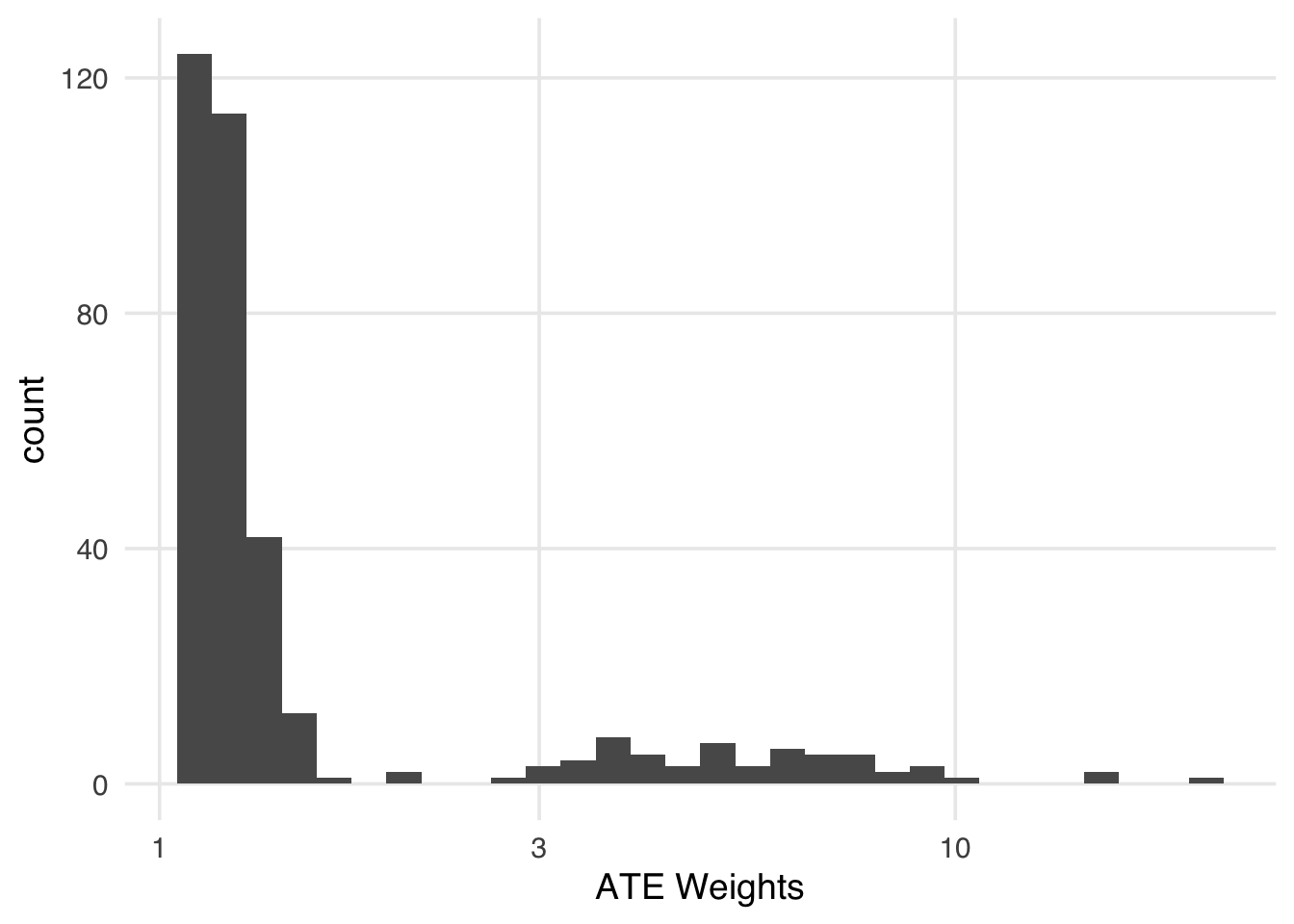
Indeed, we have several days with weights over 10 (Table 8.3). April 27, for instance, is being treated like almost twenty days! It might be a good counterfactual for days without Extra Magic Hours, but a weight that high will add more variance than it will reduce bias.
seven_dwarfs_9_with_wt |>
  filter(w_ate > 10) |>
  select(
    park_date,
    park_extra_magic_morning,
    park_ticket_season,
    park_close,
    park_temperature_high,
    .fitted,
    w_ate
  ) |>
  gt() |>
  cols_label(
    .fitted = "P(EMM)",
    park_date = "Date",
    park_extra_magic_morning = "Extra Magic Mornings",
    park_ticket_season = "Ticket Season",
    park_close = "Close time",
    park_temperature_high = "Historic Temp.",
    w_ate = "ATE Weights"
)| Date | Extra Magic Mornings | Ticket Season | Close time | Historic Temp. | P(EMM) | ATE Weights |
|---|---|---|---|---|---|---|
| 2018-01-26 | 1 | value | 20:00:00 | 73.25 | 0.09867 | 10.13 |
| 2018-02-09 | 1 | value | 22:00:00 | 81.50 | 0.06261 | 15.97 |
| 2018-03-02 | 1 | value | 22:00:00 | 81.29 | 0.06281 | 15.92 |
| 2018-04-27 | 1 | value | 23:00:00 | 84.33 | 0.05059 | 19.77 |
We can mitigate some of the instability of extreme weights by using a stabilization factor: the proportions of the exposed and unexposed. Instead of inverting the probability of the received exposure, we use the proportion in the numerator. Stabilization has an interesting effect on the weights. First, it improves the variance by making the spread of the weights smaller. Second, it creates weights that have a mean of 1. In other words, the pseudo-population is approximately the same size as the original population.
seven_dwarfs_9_with_wt <- seven_dwarfs_9_with_ps |>
  mutate(stbl_wts = wt_ate(.fitted, park_extra_magic_morning, stabilize = TRUE))

seven_dwarfs_9_with_wt |>
  summarize(
    mean = mean(stbl_wts),
    min = min(stbl_wts),
    max = max(stbl_wts),
    n = n(),
    sum = sum(stbl_wts)
  )
# A tibble: 1 × 5
mean min max n sum
<dbl> <dbl> <dbl> <int> <dbl>
1 1.00 0.342 3.35 354 355.seven_dwarfs_9_with_wt |>
ggplot(aes(stbl_wts)) +
geom_histogram() +
scale_x_log10() +
xlab("Stabilized ATE Weights")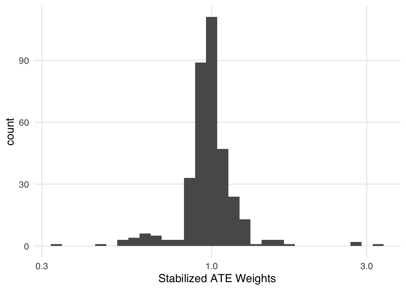
Another set of techniques that are used to address extreme weights (and poor overlap) are trimming and truncation. Trimming is when we set an acceptable range of the propensity score and drop the observations that fall outside of that range from the analysis. When trimming, you should refit the propensity score model to improve the fit and calibration. Truncation is when, instead of dropping observations, we truncate any value outside of the acceptable range to the minimum or maximum of the range. Truncating is also sometimes called Winsorizing. Note that sometimes, authors use “trim” and “truncate” interchangeably or even with the opposite meanings, so be clear about what you mean and make sure you understand what other analysts mean, too.
propensity provides helper functions for managing these processes. ps_trim() will trim the observations, and ps_trunc() will truncate them. ps_refit() will refit the propensity score on only the non-trimmed observations. There are a few things to note here. First, we’re using an adaptive method to decide the best range to trim the scores at; this approach optimizes the variance of the resulting observations. Second, we’re using ps_refit() on the trimmed propensity scores to recalculate the propensity score without the trimmed observations. Third, in ps_trunc(), we’re truncating propensity scores to under the 1st percentile to the 1st percentile. Researchers will commonly truncate to the 1st and 99th percentiles, but since our highest propensity score is about 0.50, these won’t produce extreme weights, so we leave them alone.
Trimming and truncating affect our sample differently. In trimming, we have fewer observations afterward. We can see which observations were trimmed with is_unit_trimmed(). Only observations in the lower range of the original propensity score were trimmed. Their values for trimmed_ps are NA because they were not included in the model when we used ps_refit().
seven_dwarfs_9_with_wt |>
  filter(is_unit_trimmed(trimmed_ps)) |>
  select(park_date, park_extra_magic_morning, .fitted, trimmed_ps)
# A tibble: 36 × 4
park_date park_extra_magic_mor…¹ .fitted trimmed_ps
<date> <dbl> <dbl> <ps_trim>
1 2018-02-02 0 0.0695 NA
2 2018-02-09 1 0.0626 NA
3 2018-02-26 0 0.0581 NA
4 2018-02-27 0 0.0630 NA
5 2018-03-01 0 0.0702 NA
6 2018-03-02 1 0.0628 NA
7 2018-03-03 0 0.0601 NA
8 2018-04-24 0 0.0611 NA
9 2018-04-25 0 0.0631 NA
10 2018-04-26 0 0.0623 NA
# ℹ 26 more rows
# ℹ abbreviated name: ¹park_extra_magic_morningYou can see the overlap in this subset is slightly improved (Figure 8.12).
ggplot(
  seven_dwarfs_9_with_wt,
  aes(trimmed_ps, fill = factor(park_extra_magic_morning))
) +
  geom_mirror_histogram(bins = 50) +
  scale_y_continuous(labels = abs) +
  labs(x = "propensity score", fill = "extra magic morning")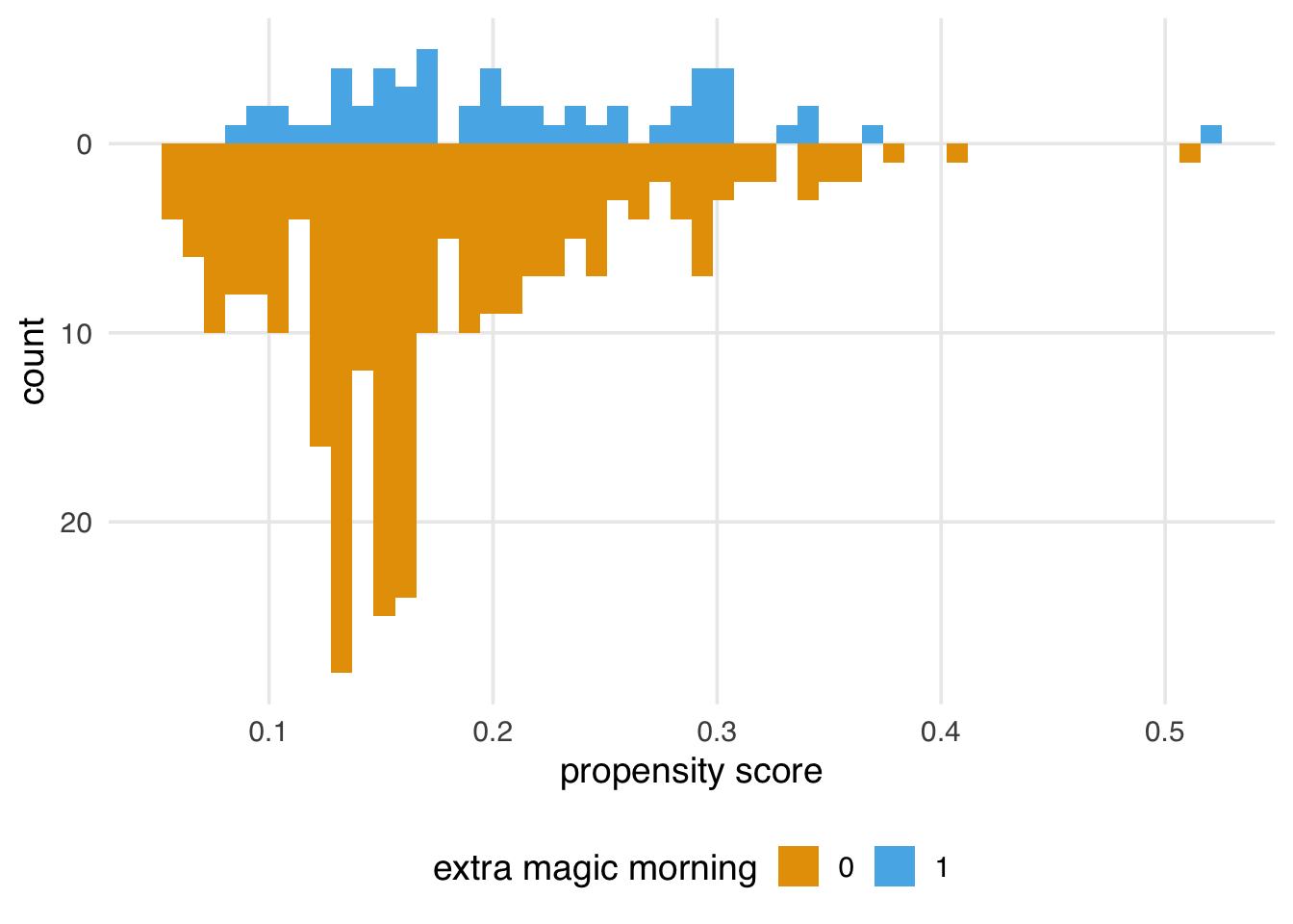
In truncation, we are not removing observations but forcing some observations to be within the acceptable range. All the truncated observations (which we found with is_unit_truncated()) now have the same value in trunc_ps, equal to the 1st percentile of .fitted.
seven_dwarfs_9_with_wt |>
  filter(is_unit_truncated(trunc_ps)) |>
  select(park_date, park_extra_magic_morning, .fitted, trunc_ps)
# A tibble: 4 × 4
park_date park_extra_magic_morning .fitted trunc_ps
<date> <dbl> <dbl> <ps_trun>
1 2018-04-27 1 0.0506 0.05744
2 2018-08-27 0 0.0547 0.05744
3 2018-10-01 0 0.0567 0.05744
4 2018-10-03 0 0.0566 0.05744You can see how the truncation on the left side of the plot forces overlap (Figure 8.13). Truncation doesn’t discard units (improving the sample size over trimming), but this forced change of propensity scores can be unintuitive.
ggplot(
  seven_dwarfs_9_with_wt,
  aes(trunc_ps, fill = factor(park_extra_magic_morning))
) +
  geom_mirror_histogram(bins = 50) +
  scale_y_continuous(labels = abs) +
  labs(x = "propensity score", fill = "extra magic morning")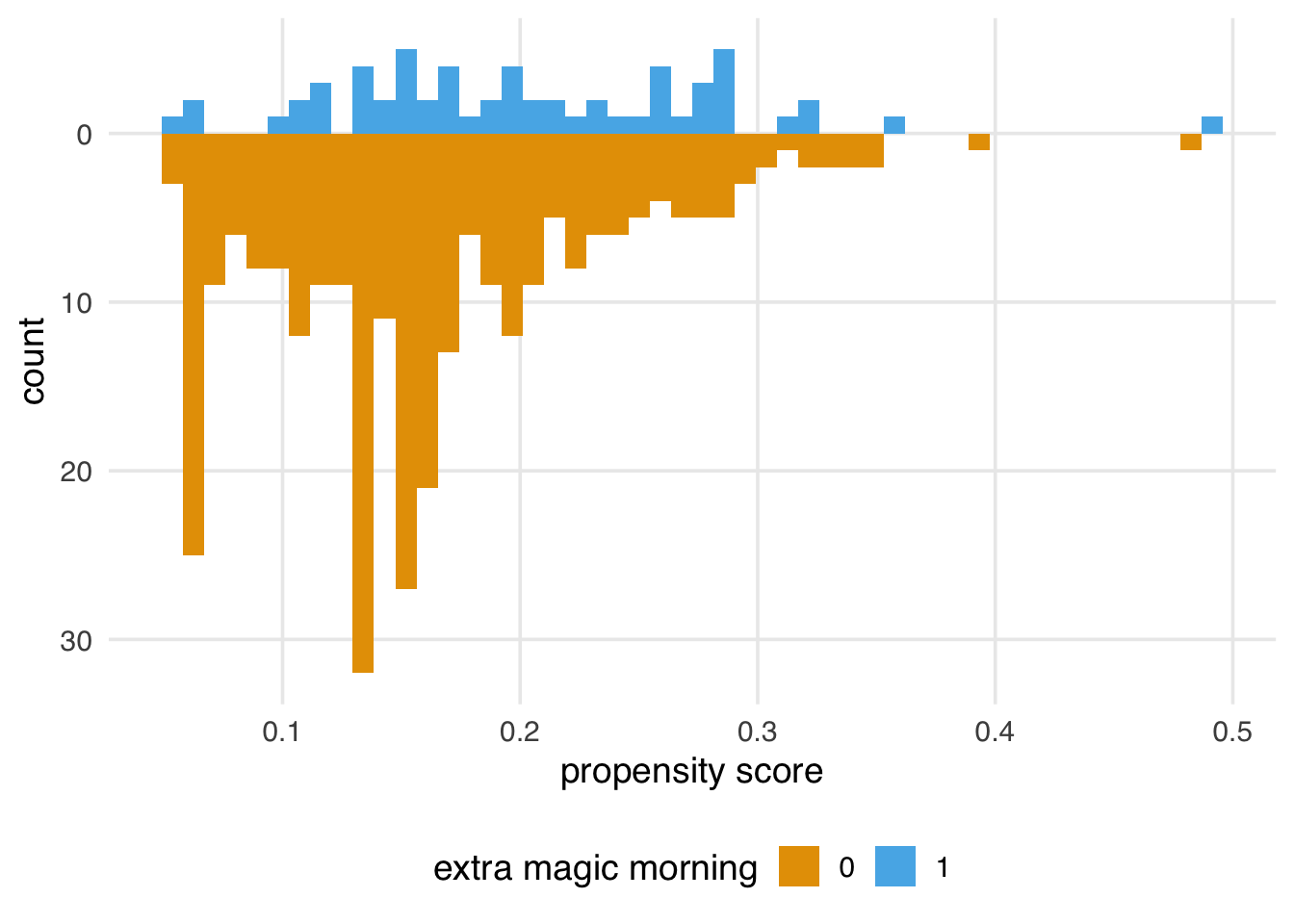
We can then use trimmed or truncated weights to calculate weights. In fact, we can combine these approaches with stabilized weights. Let’s calculate stabilized weights on the truncated propensity scores. (We can also use truncated or trimmed weights with matching and a caliper, but we won’t show that here.) Figure 8.14 shows the distribution of weights after truncating and stabilizing.
seven_dwarfs_9_with_wt <- seven_dwarfs_9_with_wt |>
  mutate(
    trunc_stbl_wt = wt_ate(
      trunc_ps,
      park_extra_magic_morning,
      stabilize = TRUE
    )
  )

seven_dwarfs_9_with_wt |>
  ggplot(aes(trunc_stbl_wt)) +
  geom_histogram() +
  scale_x_log10() +
  xlab("Truncated and Stabilized ATE Weights")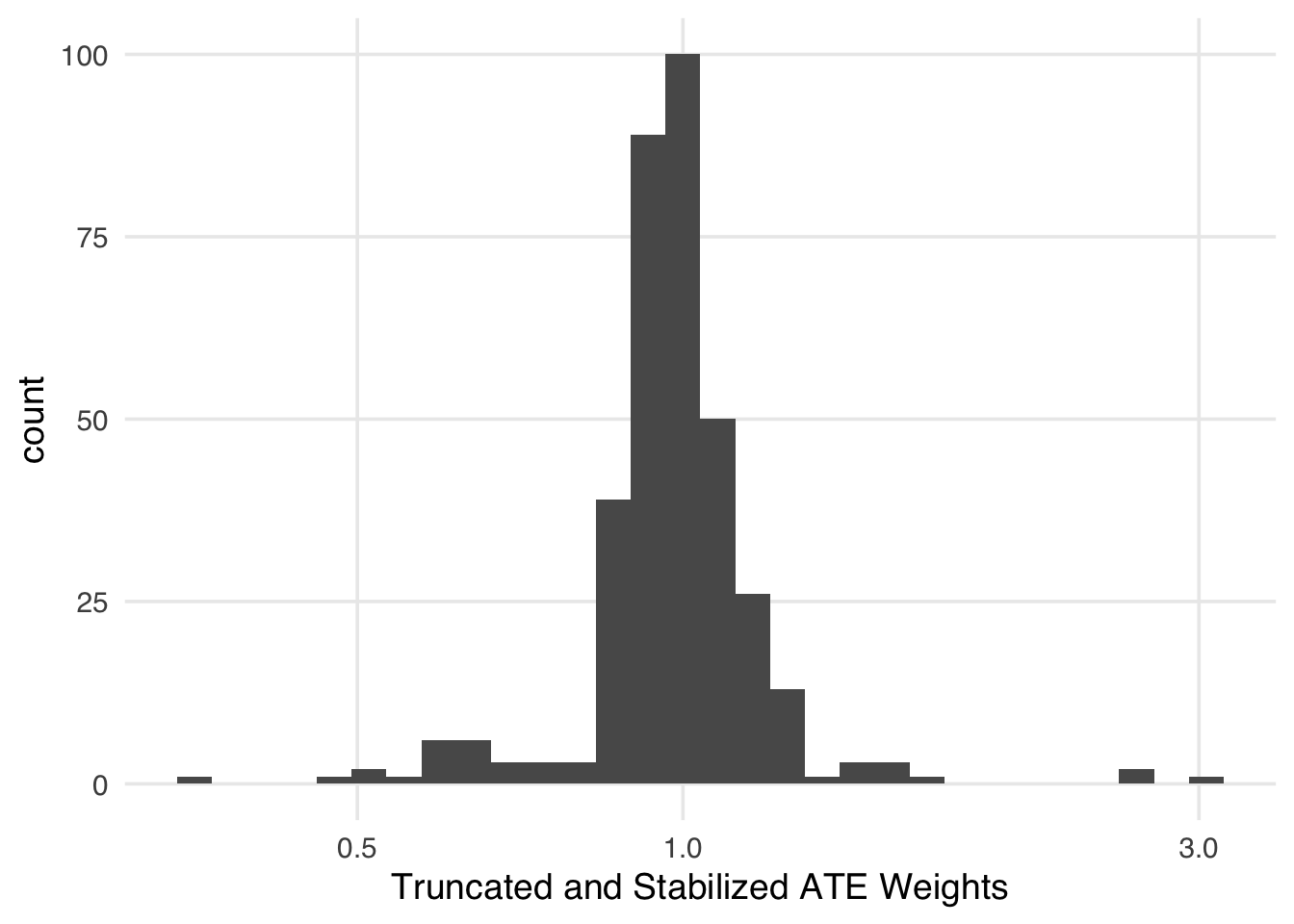
Truncation and trimming, like using a caliper, may change the population we are making inferences about. We’ll investigate this further in Chapter 10.
You may have noticed that extreme weights are often a positivity problem. The days that were trimmed, for instance, mainly were days without Extra Magic Hours that had a low predicted probability of receiving them. Once we’ve fit the propensity score, we can probe the trimmed or truncated results to better understand why we need to modify them in the first place. Here, it seems the trimmed observations were all warm days in the value ticket season with later closing hours. Perhaps these days are structurally unable to receive Extra Magic Hours per Disney’s requirements. We’d want to determine if that was the case, as we may wish to modify our exclusion criteria rather than dynamically removing observations based on their propensity score.
seven_dwarfs_9_with_wt |>
  filter(is_unit_trimmed(trimmed_ps)) |>
  select(
    park_ticket_season,
    park_close,
    park_temperature_high
  )
# A tibble: 36 × 3
park_ticket_season park_close park_temperature_high
<chr> <time> <dbl>
1 value 22:00 74.6
2 value 22:00 81.5
3 value 22:00 86.4
4 value 22:00 81.1
5 value 21:00 85.0
6 value 22:00 81.3
7 value 23:00 73.1
8 value 22:00 83.1
9 value 22:00 81.0
10 value 22:00 81.8
# ℹ 26 more rowsWeighting is statistically more efficient than matching, and we recommend using it over matching when possible. However, matching has a distinct advantage: it’s easy to understand. Someone with a statistical background might be comfortable interpreting results from a weighted analysis, but a stakeholder with a different background may not understand the pseudo-population or why its sample size can be a non-integer value. So, if you have a lot of data and think it will help improve the interpretation of the analysis, matching can be a good option.
We’ll also present some ways to present weighted populations in Chapter 10 that may help stakeholders understand the analysis better, getting the best of both worlds.
Now that we’ve applied the propensity score via weighting and matching, it’s time to ask: do these approaches improve the balance we saw in Figure 8.7? Let’s turn to techniques for probing the results of propensity score techniques.