5 Expressing causal questions as DAGs
5.1 Visualizing Causal Assumptions
Draw your assumptions before your conclusions –Hernán and Robins (2021)
Causal diagrams are a tool to visualize your assumptions about the causal structure of the questions you’re trying to answer. In a randomized experiment, the causal structure is quite simple. While there may be many causes of an outcome, the only cause of the exposure is the randomization process itself (we hope!). In many non-randomized settings, however, the structure of your question can be a complex web of causality. Causal diagrams help communicate what we think this structure looks like. In addition to being open about what we think the causal structure is, causal diagrams have incredible mathematical properties that allow us to identify a way to estimate unbiased causal effects even with observational data.
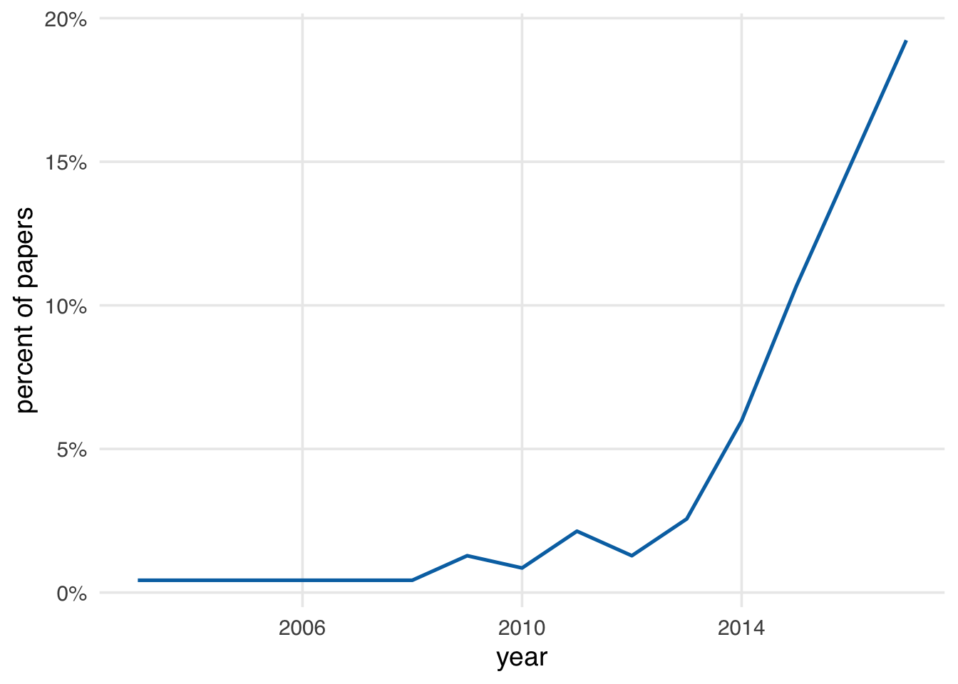
Causal diagrams are also increasingly common. Data collected as a review of causal diagrams in applied health research papers show a drastic increase in use over time (Tennant et al. 2020).
The type of causal diagrams we use are also called directed acyclic graphs (DAGs)1. These graphs are directed because they include arrows going in a specific direction. They’re acyclic because they don’t go in circles; a variable can’t cause itself, for instance. DAGs are used for various problems, but we’re specifically concerned with causal DAGs. This class of DAGs is sometimes called Structural Causal Models (SCMs) because they are a model of the causal structure of a question (Hernán and Robins 2021; Pearl, Glymour, and Jewell 2021).
DAGs depict causal relationships between variables. Visually, the way they depict variables is as edges and nodes. Edges are the arrows going from one variable to another, sometimes called arcs or just arrows. Nodes are the variables themselves, sometimes called vertices, points, or just variables. In Figure 5.2, there are two nodes, x and y, and one edge going from x to y. Here, we are saying that x causes y. y “listens” to x (Pearl, Glymour, and Jewell 2021).
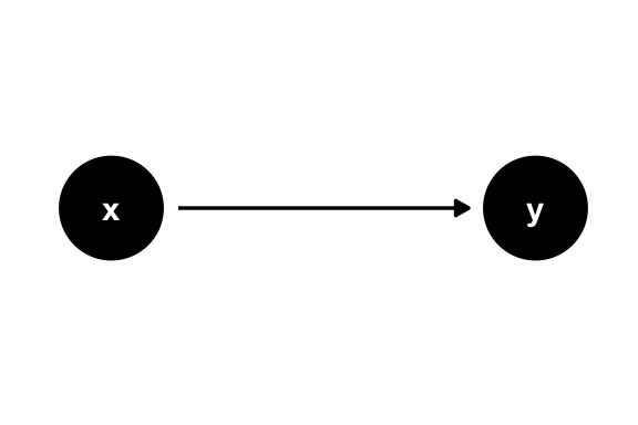
x causes y.If we’re interested in the causal effect of x on y, we’re trying to estimate a numeric representation of that arrow. Usually, though, there are many other variables and arrows in the causal structure of a given question. A series of arrows is called a path. There are three types of paths you’ll see in DAGs: forks, chains, and colliders (sometimes called inverse forks).
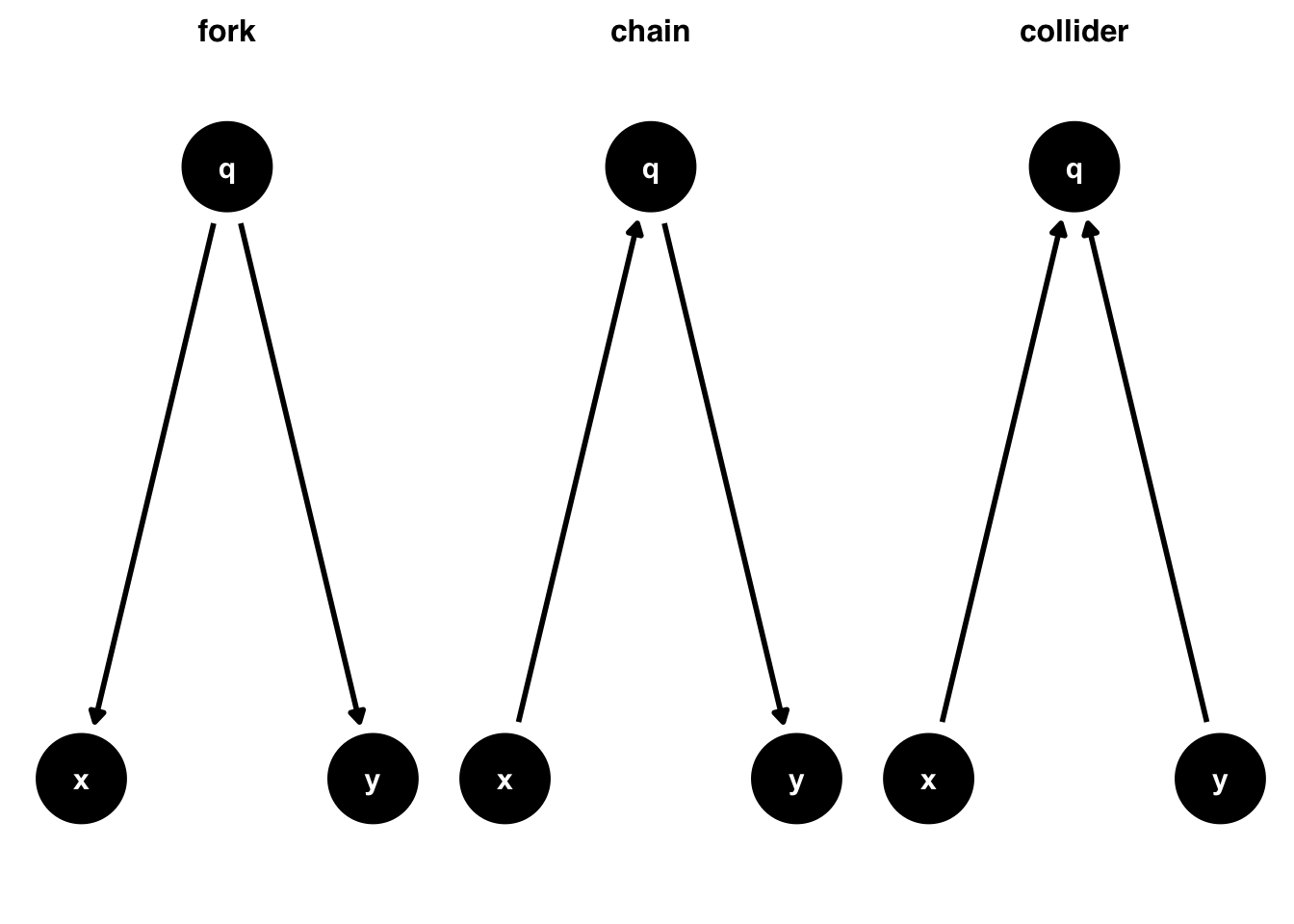
Forks represent a common cause of two variables. Here, we’re saying that q causes both x and y, the traditional definition of a confounder. They’re called forks because the arrows from x to y are in different directions. Chains, on the other hand, represent a series of arrows going in the same direction. Here, q is called a mediator: it is along the causal path from x to y. In this diagram, the only path from x to y is mediated through q. Finally, a collider is a path where two arrowheads meet at a variable. Because causality always goes forward in time, this naturally means that the collider variable is caused by two other variables. Here, we’re saying that x and y both cause q.
Are DAGs SEMs?
If you’re familiar with structural equation models (SEMs), a modeling technique commonly used in psychology and other social science settings, you may notice some similarities between SEMs and DAGs. DAGs are a form of non-parametric SEM. SEMs estimate entire graphs using parametric assumptions. Causal DAGs, on the other hand, don’t estimate anything; an arrow going from one variable to another says nothing about the strength or functional form of that relationship, only that we think it exists.
One of the significant benefits of DAGs is that they help us identify sources of bias and, often, provide clues on how to address them. However, talking about an unbiased effect estimate only makes sense when we have a specific causal question in mind. Since each arrow represents a cause, it’s causality all the way down; no individual arrow is inherently problematic. Here, we’re interested in the effect of x on y. This question defines which paths we’re interested in and which we’re not.
These three types of paths have different implications for the statistical relationship between x and y. If we only look at the correlation between the two variables under these assumptions:
- In the fork,
xandywill be associated, despite there being no arrow fromxtoy. - In the chain,
xandyare related only throughq. - In the collider,
xandywill not be related.
Paths that transmit association are called open paths. Paths that do not transmit association are called closed paths. Forks and chains are open, while colliders are closed.
So, should we adjust for q? That depends on the nature of the path. Forks are confounding paths. Because q causes both x and y, x and y will have a spurious association. They both contain information from q, their mutual cause. That mutual causal relationship makes x and y associated statistically. Adjusting for q will block the bias from confounding and give us the true relationship between x and y.
Adjustment
We can use a variety of techniques to account for a variable. We use the term “adjustment” or “controlling for” to refer to any technique that removes the effect of variables we’re not interested in.
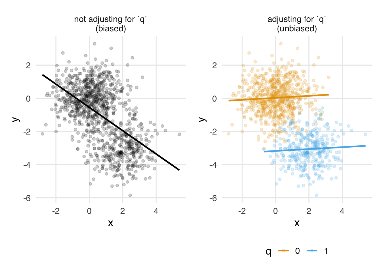
Figure 5.4 depicts this effect visually. Here, x and y are continuous, and by definition of the DAG, they are unrelated. q, however, causes both. The unadjusted effect is biased because it includes information about the open path from x to y via q. Within levels of q, however, x and y are unrelated.
x and y. With forks, the relationship is biased by q. When accounting for q, we see the true null relationship.For chains, whether or not we adjust for mediators depends on the research question. Here, adjusting for q would result in a null estimate of the effect of x on y. Because the only effect of x on y is via q, no other effect remains. The effect of x on y mediated by q is called the indirect effect, while the effect of x on y directly is called the direct effect. If we’re only interested in the direct effect, controlling for q might be what we want. If we want to know about both effects, we shouldn’t try to adjust for q. We’ll learn more about estimating these and other mediation effects in Chapter 20.
Figure 5.5 shows this effect visually. The unadjusted effect of x on y represents the total effect. Since the total effect is due entirely to the path mediated by q, when we adjust for q, no relationship remains. This null effect is the direct effect. Neither of these effects is due to bias, but each answers a different research question.

x and y. With chains, whether and how we should account for q depends on the research question. Without doing so, we see the impact of the total effect of x and y, including the indirect effect via q. When accounting for q, we see the direct (null) effect of x on y.Colliders are different. In the collider DAG of Figure 5.3, x and y are not associated, but both cause q. Adjusting for q has the opposite effect than with confounding: it opens a biasing pathway. Sometimes, people draw the path opened up by conditioning on a collider connecting x and y.
Visually, we can see this happen when x and y are continuous and q is binary. In Figure 5.6, when we don’t include q, we find no relationship between x and y. That’s the correct result. However, when we include q, we can detect information about both x and y, and they appear correlated: across levels of x, those with q = 0 have lower levels of y. Association seemingly flows back in time. Of course, that can’t happen from a causal perspective, so controlling for q is the wrong thing to do. We end up with a biased effect of x on y.
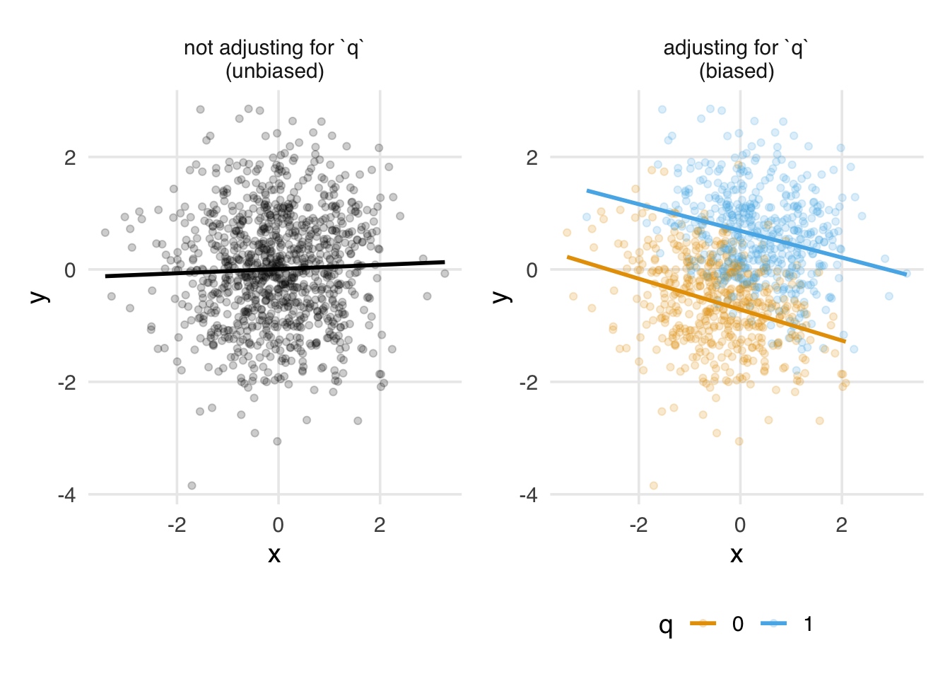
x and y. The unadjusted relationship between the two is unbiased. When accounting for q, we open a colliding backdoor path and bias the relationship between x and y.How can this be? Since x and y happen before q, q can’t impact them. Let’s turn the DAG on its side and consider Figure 5.7. If we break down the two time points, at time point 1, q hasn’t happened yet, and x and y are unrelated. At time point 2, q happens due to x and y. But causality only goes forward in time. q happening later can’t change the fact that x and y happened independently in the past.
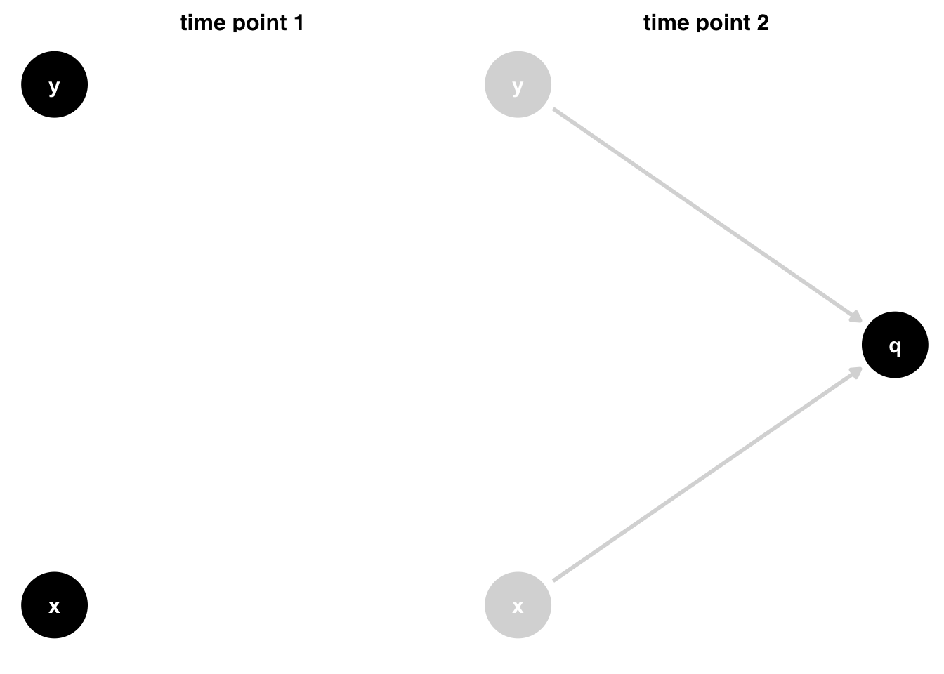
x and y. Both cause q by time point two, but this does not change what already happened at time point one.Causality only goes forward. Association, however, is time-agnostic. It’s just an observation about the numerical relationships between variables. When we control for the future, we risk introducing bias. It takes time to develop an intuition for this. Consider a case where x and y are the only causes of q, and all three variables are binary. When either x or y equals 1, then q happens. If we know q = 1 and x = 0 then logically it must be that y = 1. Thus, knowing about q gives us information about y via x. This example is extreme, but it shows how this type of bias, sometimes called collider-stratification bias or selection bias, occurs: conditioning on q provides statistical information about x and y and distorts their relationship (Banack et al. 2023).
Exchangeability revisited
We commonly refer to exchangability as the assumption of no confounding. Actually, this isn’t quite right. It’s the assumption of no open, non-causal paths (Hernán and Robins 2021). Many times, these are confounding pathways. However, conditioning on a collider can also open paths. Even though these aren’t confounders, doing so creates non-exchangeability between the two groups: they are different in a way that matters to the exposure and outcome.
Open, non-causal paths are also called backdoor paths. We’ll use this terminology often because it captures the idea well: these are any open paths biasing the effect we’re interested in estimating.
Correctly identifying the causal structure between the exposure and outcome thus helps us 1) communicate the assumptions we’re making about the relationships between variables and 2) identify sources of bias. Importantly, in doing 2), we are also often able to identify ways to prevent bias based on the assumptions in 1). In the simple case of the three DAGs in Figure 5.3, we know whether or not to control for q depending on the nature of the causal structure. The set or sets of variables we need to adjust for is called the adjustment set. DAGs can help us identify adjustment sets even in complex settings (Zander, Liśkiewicz, and Textor 2019).
What about interaction?
DAGs don’t make a statement about interaction or effect estimate modification, even though they are an important part of inference. Technically, interaction is a matter of the functional form of the relationships in the DAG. Much as we don’t need to specify how we will model a variable in the DAG (e.g., with splines), we don’t need to determine how variables statistically interact. That’s a matter for the modeling stage.
There are several ways we use interactions in causal inference. In one extreme, they are simply a matter of functional form: interaction terms are included in models but marginalized to get an overall causal effect. Conversely, we’re interested in joint causal effects, where the two variables interacting are both causal. In between, we can use interaction terms to identify heterogeneous causal effects, which vary by a second variable that is not assumed to be causal. As with many tools in causal inference, we use the same statistical technique in many ways to answer different questions. We’ll revisit this topic in detail in Chapter 16.
Many people have tried expressing interaction in DAGs using different types of arcs, nodes, and other annotations, but no approach has taken off as the preferred way (Weinberg 2007; Nilsson et al. 2020).
Let’s take a look at an example in R. We’ll learn to build DAGs, visualize them, and identify important information like adjustment sets.
5.2 DAGs in R
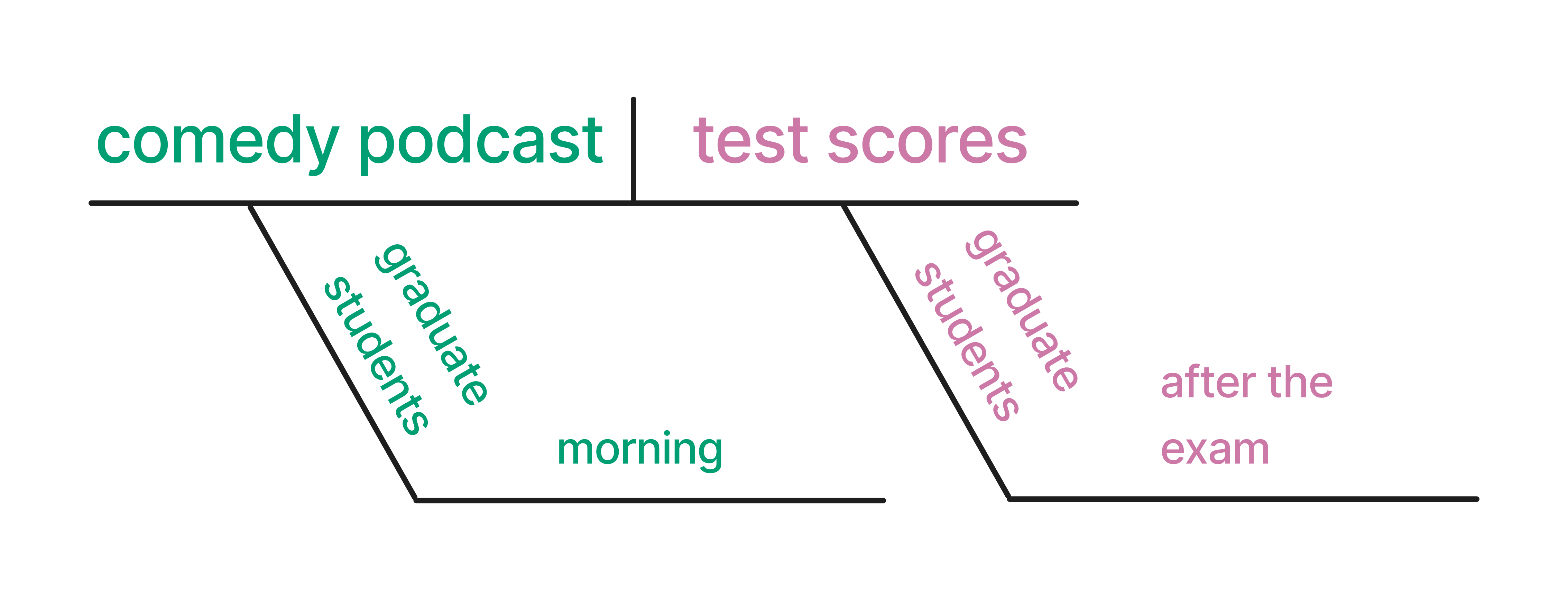
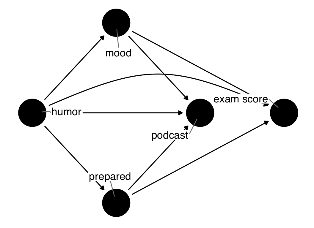
First, consider a research question: Does listening to a comedy podcast the morning before an exam improve graduate students’ test scores? We can diagram this using the method described in Section 1.3 (Figure 5.8).
The tool we’ll use for making DAGs is ggdag. ggdag is a package that connects ggplot2, the most powerful visualization tool in R, to dagitty, an R package with sophisticated algorithms for querying DAGs.
To create a DAG object, we’ll use the dagify() function.dagify() returns a dagitty object that works with both the dagitty and ggdag packages. The dagify() function takes formulas, separated by commas, that specify causes and effects, with the left element of the formula defining the effect and the right all of the factors that cause it. This is just like the type of formula we specify for most regression models in R.
dagify(
  effect1 ~ cause1 + cause2 + cause3,
  effect2 ~ cause1 + cause4,
  ...
)
What are all of the factors that cause graduate students to listen to a podcast the morning before an exam? What are all of the factors that could cause a graduate student to do well on a test? Let’s posit some here.
dag {
exam
humor
mood
podcast
prepared
humor -> podcast
mood -> exam
mood -> podcast
prepared -> exam
prepared -> podcast
}
In the code above, we assume that:
- a graduate student’s mood, sense of humor, and how prepared they feel for the exam could influence whether they listened to a podcast the morning of the test
- their mood and how prepared they are also influence their exam score
Notice we do not see podcast in the exam equation; this means that we assume that there is no causal relationship between podcast and the exam score.
There are some other useful arguments you’ll often find yourself supplying to dagify():
-
exposureandoutcome: Telling ggdag the variables that are the exposure and outcome of your research question is required for many of the most valuable queries we can make of DAGs. -
latent: This argument lets us tell ggdag that some variables in the DAG are unmeasured.latenthelps identify valid adjustment sets with the data we actually have. -
coords: Coordinates for the variables. You can choose between algorithmic or manual layouts, as discussed below. We’ll usetime_ordered_coords()here. -
labels: A character vector of labels for the variables.
Let’s create a DAG object, podcast_dag, with some of these attributes, then visualize the DAG with ggdag(). ggdag() returns a ggplot object, so we can add additional layers to the plot, like themes.
podcast_dag <- dagify(
  podcast ~ mood + humor + prepared,
  exam ~ mood + prepared,
  coords = time_ordered_coords(
    list(
      # time point 1
      c("prepared", "humor", "mood"),
      # time point 2
      "podcast",
      # time point 3
      "exam"
    )
  ),
  exposure = "podcast",
  outcome = "exam",
  labels = c(
    podcast = "podcast",
    exam = "exam score",
    mood = "mood",
    humor = "humor",
    prepared = "prepared"
  )
)
ggdag(podcast_dag, use_labels = "label", text = FALSE) +
  theme_dag()
Warning: The `text` argument of `geom_dag()` no longer accepts
logicals as of ggdag 0.3.0.
ℹ Set `use_text = FALSE`. To use a variable other than
node names, set `text = variable_name`
ℹ The deprecated feature was likely used in the ggdag
package.
Please report the issue at
<https://github.com/r-causal/ggdag/issues>.Warning: The `use_labels` argument of `geom_dag()` must be a
logical as of ggdag 0.3.0.
ℹ Set `use_labels = TRUE` and `label = label`
ℹ The deprecated feature was likely used in the ggdag
package.
Please report the issue at
<https://github.com/r-causal/ggdag/issues>.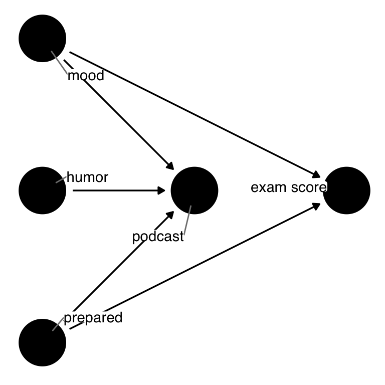
For the rest of the chapter, we’ll use theme_dag(), a ggplot theme from ggdag meant for DAGs.
theme_set(
  theme_dag() %+replace%
    # also add some additional styling
    theme(
      legend.position = "bottom",
      strip.text.x = element_text(margin = margin(2, 0, 2, 0, "mm"))
    )
)
DAG coordinates
You don’t need to specify coordinates to ggdag. If you don’t, it uses algorithms designed for automatic layouts. There are many such algorithms, and they focus on different aspects of the layout, e.g., the shape, the space between the nodes, minimizing how many edges cross, etc. These layout algorithms usually have a component of randomness, so it’s good to use a seed if you want to get the same result.
# no coordinates specified
set.seed(123)
pod_dag <- dagify(
  podcast ~ mood + humor + prepared,
  exam ~ mood + prepared
)

# automatically determine layouts
pod_dag |>
  ggdag(text_size = 2.8)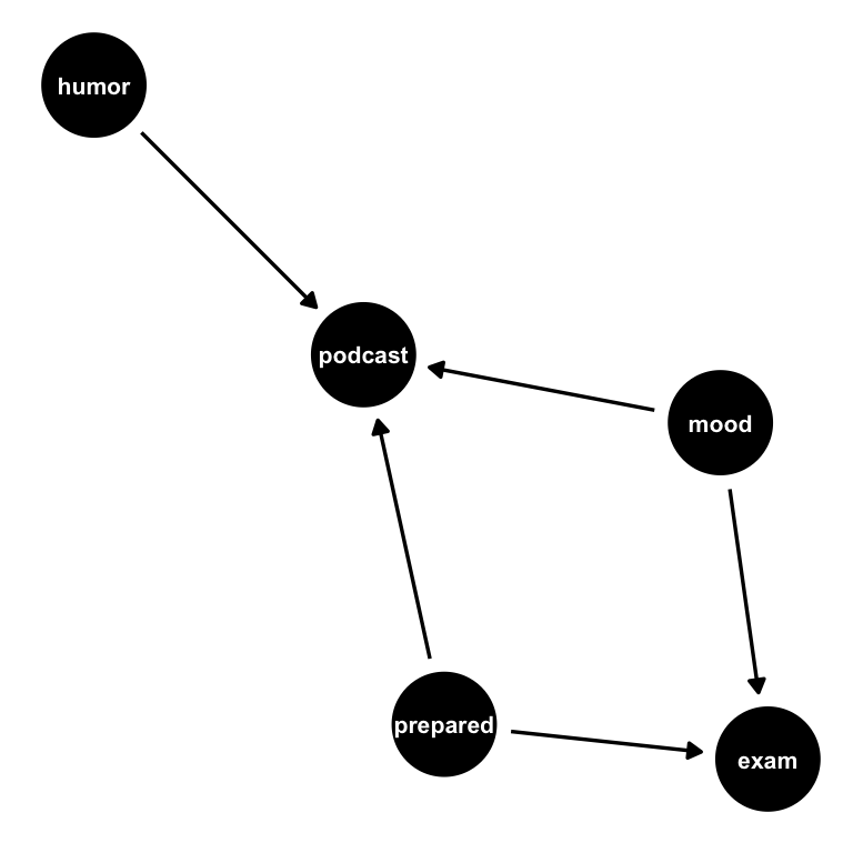
We can also ask for a specific layout, e.g., the popular Sugiyama algorithm for DAGs (Sugiyama, Tagawa, and Toda 1981).
pod_dag |>
  ggdag(layout = "sugiyama", text_size = 2.8)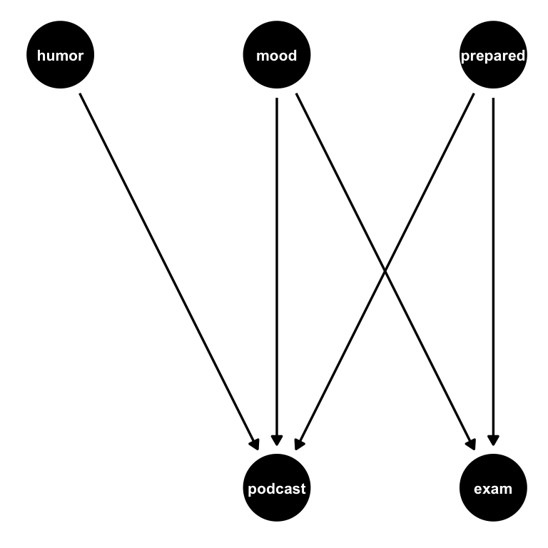
For causal DAGs, the time-ordered layout algorithm is often best, which we can specify with time_ordered_coords() or layout = "time_ordered". We’ll discuss time ordering in greater detail below. Earlier, we explicitly told ggdag which variables were at which time points, but we don’t need to. Notice, though, that the time ordering algorithm puts podcast and exam at the same time point since one doesn’t cause another (and thus predate it). We know that’s not the case: listening to the podcast happened before taking the exam.
pod_dag |>
  ggdag(layout = "time_ordered", text_size = 2.8)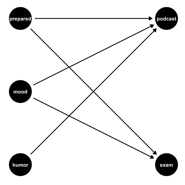
You can manually specify coordinates using a list or data frame and provide them to the coords argument of dagify(). Additionally, because ggdag is based on dagitty, you can use dagitty.net to create and organize a DAG using a graphical interface, then export the result as dagitty code for ggdag to consume.
Algorithmic layouts are lovely for fast visualization of DAGs or particularly complex graphs. Once you want to share your DAG, it’s usually best to be more intentional about the layout, perhaps by specifying the coordinates manually. time_ordered_coords() is often the best of both worlds, and we’ll use it for most DAGs in this book.
We’ve specified the DAG for this question and told ggdag what the exposure and outcome of interest are. According to the DAG, there is no direct causal relationship between listening to a podcast and exam scores. Are there any other open paths? ggdag_paths() takes a DAG and visualizes the open paths. In Figure 5.10, we see two open paths: podcast <- mood -> exam" and podcast <- prepared -> exam. These are both forks—confounding pathways. Since there is no causal relationship between listening to a podcast and exam scores, the only open paths are backdoor paths, these two confounding pathways.
podcast_dag |>
  # show the whole dag as a light gray "shadow"
  # rather than just the paths
  ggdag_paths(shadow = TRUE, text = FALSE, use_labels = "label")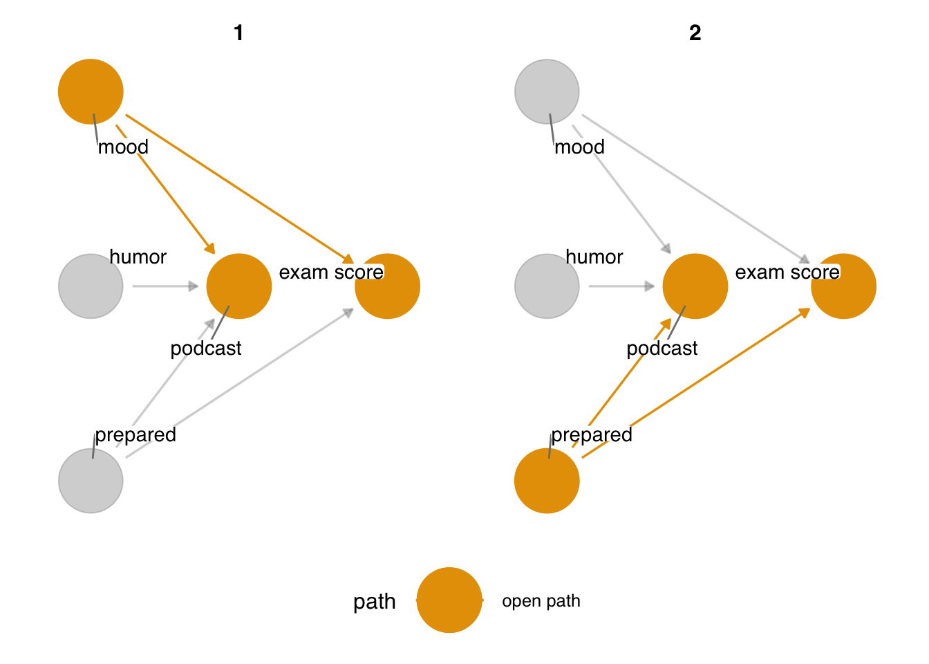
ggdag_paths() visualizes open paths in a DAG. There are two open paths in podcast_dag: the fork from mood and the fork from prepared.dagify() returns a dagitty() object, but underneath the hood, ggdag converts dagitty objects to tidy DAGs, a structure that holds both the dagitty object and a dataframe about the DAG. This is handy if you want to manipulate the DAG programmatically.
podcast_dag_tidy <- podcast_dag |>
  tidy_dagitty()

podcast_dag_tidy
# A DAG with 5 nodes and 5 edges
#
# Exposure: podcast
# Outcome: exam
#
# A tibble: 7 × 9
name x y direction to xend yend
<chr> <int> <int> <fct> <chr> <int> <int>
1 exam 3 0 <NA> <NA> NA NA
2 humor 1 0 -> podcast 2 0
3 mood 1 1 -> exam 3 0
4 mood 1 1 -> podcast 2 0
5 podcast 2 0 <NA> <NA> NA NA
6 prepared 1 -1 -> exam 3 0
7 prepared 1 -1 -> podcast 2 0
# ℹ 2 more variables: circular <lgl>, label <chr>Most of the quick plotting functions transform the dagitty object to a tidy DAG if it’s not already, then manipulate the data in some capacity. For instance, dag_paths() underlies ggdag_paths(); it returns a tidy DAG with data about the paths. You can use several dplyr functions on these objects directly.
# A DAG with 3 nodes and 2 edges
#
# Exposure: podcast
# Outcome: exam
#
# A tibble: 4 × 11
  set   name        x     y direction to     xend  yend
  <chr> <chr>   <int> <int> <fct>     <chr> <int> <int>
1 2     exam        3     0 <NA>      <NA>     NA    NA
2 2     podcast     2     0 <NA>      <NA>     NA    NA
3 2     prepar…     1    -1 ->        exam      3     0
4 2     prepar…     1    -1 ->        podc…     2     0
# ℹ 3 more variables: circular <lgl>, label <chr>,
#   path <chr>
Tidy DAGs are not pure data frames, but you can retrieve either the dataframe or dagitty object to work with them directly using pull_dag_data() or pull_dag(). pull_dag() can be useful when you want to work with dagitty functions:
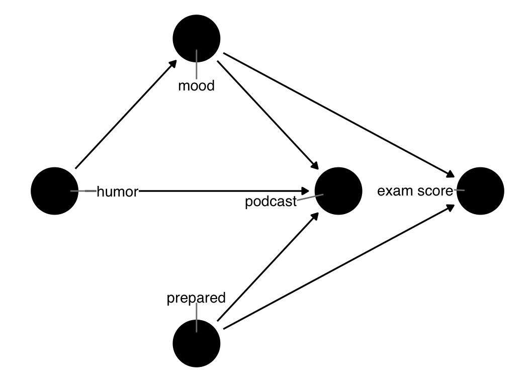
Backdoor paths pollute the statistical association between podcast and exam, so we must account for them. ggdag_adjustment_set() visualizes any valid adjustment sets implied by the DAG. Figure 5.11 shows adjusted variables as squares. Any arrows coming out of adjusted variables are removed from the DAG because the path is longer open at that variable.
ggdag_adjustment_set(
  podcast_dag,
  text = FALSE,
  use_labels = "label"
)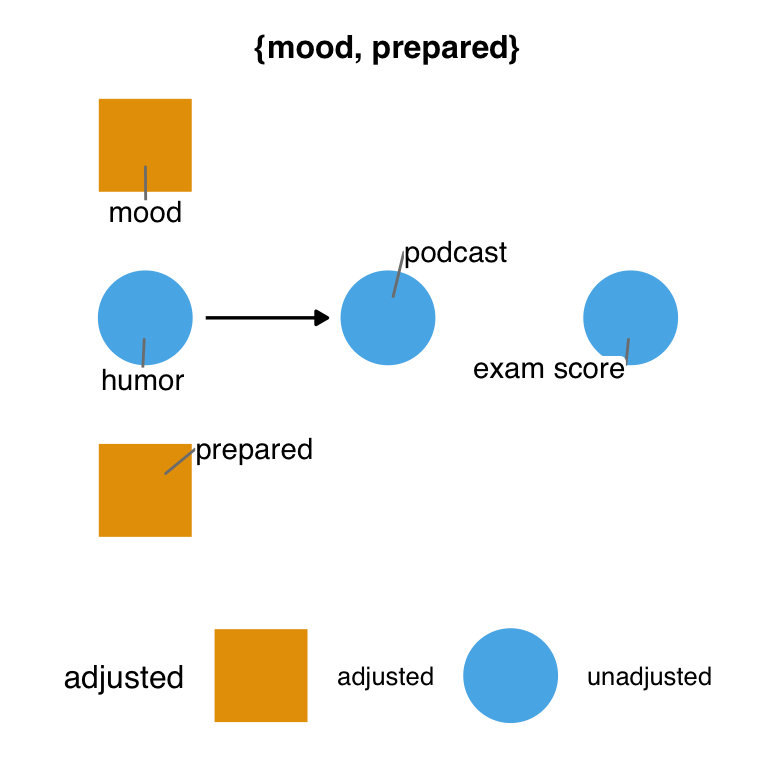
mood and prepared.Figure 5.11 shows the minimal adjustment set. By default, ggdag returns the set(s) that can close all backdoor paths with the fewest number of variables possible. In this DAG, that’s just one set: mood and prepared. This set makes sense because there are two backdoor paths, and the only other variables on them besides the exposure and outcome are these two variables. So, at minimum, we must account for both to get a valid estimate.
ggdag() and friends usually use tidy_dagitty() and dag_*() or node_*() functions to change the underlying data frame. Similarly, the quick plotting functions use ggdag’s geoms to visualize the resulting DAG(s). In other words, you can use the same data manipulation and visualization strategies that you use day-to-day directly with ggdag.
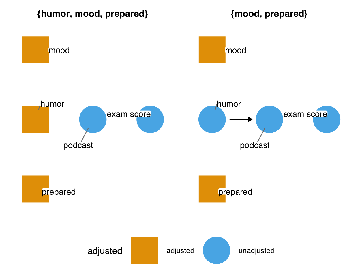
Here’s a condensed version of what ggdag_adjustment_set() is doing:
podcast_dag_tidy |>
  # add adjustment sets to data
  dag_adjustment_sets() |>
  ggplot(aes(
    x = x,
    y = y,
    xend = xend,
    yend = yend,
    color = adjusted,
    shape = adjusted
  )) +
  # ggdag's custom geoms: add nodes, edges, and labels
  geom_dag_point() +
  # remove adjusted paths
  geom_dag_edges_link(data = \(.df) filter(.df, adjusted != "adjusted")) +
  geom_dag_label_repel() +
  # you can use any ggplot function, too
  facet_wrap(~set) +
  scale_shape_manual(values = c(adjusted = 15, unadjusted = 19))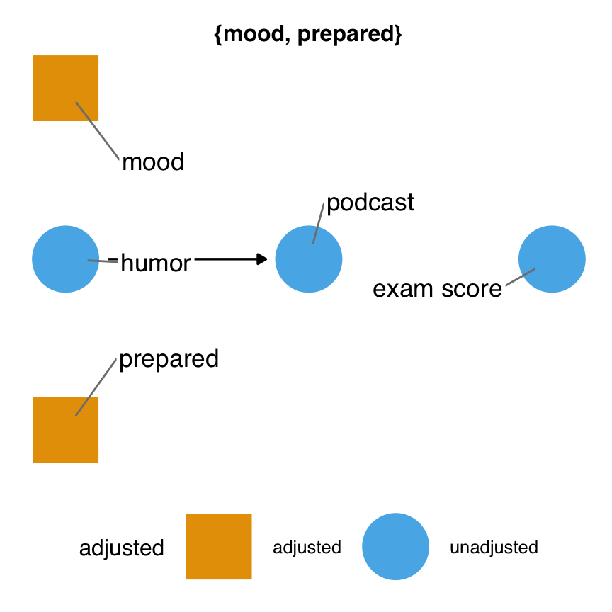
Minimal adjustment sets are only one type of valid adjustment set (Zander, Liśkiewicz, and Textor 2019). Sometimes, other combinations of variables can get us an unbiased effect estimate. Two other options available in ggdag are full adjustment sets and canonical adjustment sets. Full adjustment sets are every combination of variables that result in a valid set.
ggdag_adjustment_set(
  podcast_dag,
  text = FALSE,
  use_labels = "label",
  # get full adjustment sets
  type = "all"
)
podcast_dag.It turns out that we can also control for humor.
Canonical adjustment sets are a bit more complex: they are all possible ancestors of the exposure and outcome minus any likely descendants. In fully saturated DAGs (DAGs where every node causes anything that comes after it in time), the canonical adjustment set is the minimal adjustment set.
Most of the functions in ggdag use dagitty underneath the hood. It’s often helpful to call dagitty functions directly.
adjustmentSets(podcast_dag, type = "canonical"){ humor, mood, prepared }Using our proposed DAG, let’s simulate some data to see how accounting for the minimal adjustment set might occur in practice.
set.seed(10)
sim_data <- podcast_dag |>
simulate_data()sim_data# A tibble: 500 × 5
exam humor mood podcast prepared
<dbl> <dbl> <dbl> <dbl> <dbl>
1 -1.17 -0.275 0.00523 0.555 -0.224
2 -1.19 -0.308 0.224 -0.594 -0.980
3 0.613 -1.93 -0.624 -0.0392 -0.801
4 0.0643 -2.88 -0.253 0.802 0.957
5 -0.376 2.35 0.738 0.0828 0.843
6 0.833 -1.24 0.899 1.05 0.217
7 -0.451 1.40 -0.422 0.125 -0.819
8 2.12 -0.114 -0.895 -0.569 0.000869
9 0.938 -0.205 -0.299 0.230 0.191
10 -0.207 -0.733 1.22 -0.433 -0.873
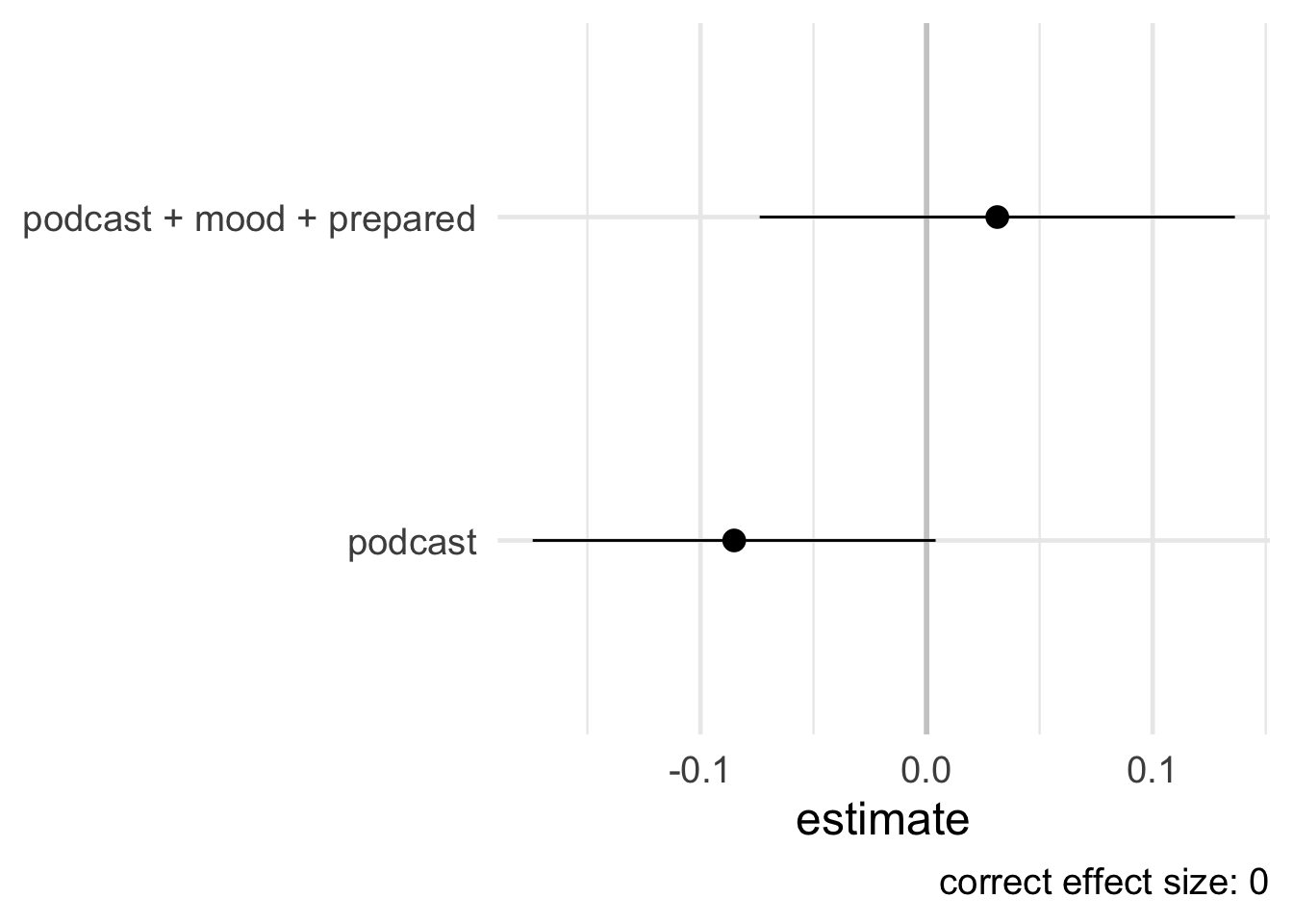
# ℹ 490 more rowsSince we have simulated this data, we know that this is a case where standard methods will succeed (see Section 4.4) and, therefore, can estimate the causal effect using a basic linear regression model. Figure 5.13 shows a forest plot of the simulated data based on our DAG. Notice the model that only included the exposure resulted in a spurious effect (an estimate of -0.1 when we know the truth is 0). In contrast, the model that adjusted for the two variables as suggested by ggdag_adjustment_set() is not spurious (much closer to 0).
## Model that does not close backdoor paths
library(broom)
unadjusted_model <- lm(exam ~ podcast, sim_data) |>
  tidy(conf.int = TRUE) |>
  filter(term == "podcast") |>
  mutate(formula = "podcast")

## Model that closes backdoor paths
adjusted_model <- lm(exam ~ podcast + mood + prepared, sim_data) |>
  tidy(conf.int = TRUE) |>
  filter(term == "podcast") |>
  mutate(formula = "podcast + mood + prepared")

bind_rows(
  unadjusted_model,
  adjusted_model
) |>
  ggplot(aes(x = estimate, y = formula, xmin = conf.low, xmax = conf.high)) +
  geom_vline(xintercept = 0, linewidth = 1, color = "grey80") +
  geom_pointrange(fatten = 3, size = 1) +
  theme_minimal(18) +
  labs(
    y = NULL,
    caption = "correct effect size: 0"
  )
5.3 Structures of Causality
5.3.1 Advanced Confounding
In podcast_dag, mood and prepared were direct confounders: an arrow was going directly from them to podcast and exam. Often, backdoor paths are more complex. Let’s consider such a case by adding two new variables: alertness and skills_course. alertness represents the feeling of alertness from a good mood, thus the arrow from mood to alertness. skills_course represents whether the student took a College Skills Course and learned time management techniques. Now, skills_course is what frees up the time to listen to a podcast as well as being prepared for the exam. mood and prepared are no longer direct confounders: they are two variables along a more complex backdoor path. Additionally, we’ve added an arrow going from humor to mood. Let’s take a look at Figure 5.14.
podcast_dag2 <- dagify(
  podcast ~ mood + humor + skills_course,
  alertness ~ mood,
  mood ~ humor,
  prepared ~ skills_course,
  exam ~ alertness + prepared,
  coords = time_ordered_coords(),
  exposure = "podcast",
  outcome = "exam",
  labels = c(
    podcast = "podcast",
    exam = "exam score",
    mood = "mood",
    alertness = "alertness",
    skills_course = "college\nskills course",
    humor = "humor",
    prepared = "prepared"
  )
)

ggdag(podcast_dag2, use_labels = "label", text = FALSE)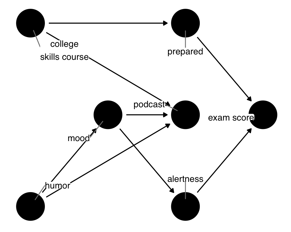
podcast_dag that includes two additional variables: skills_course, representing a College Skills Course, and alertness.Now there are three backdoor paths we need to close: podcast <- humor -> mood -> alertness -> exam, podcast <- mood -> alertness -> exam, andpodcast <- skills_course -> prepared -> exam.
ggdag_paths(podcast_dag2, use_labels = "label", text = FALSE, shadow = TRUE)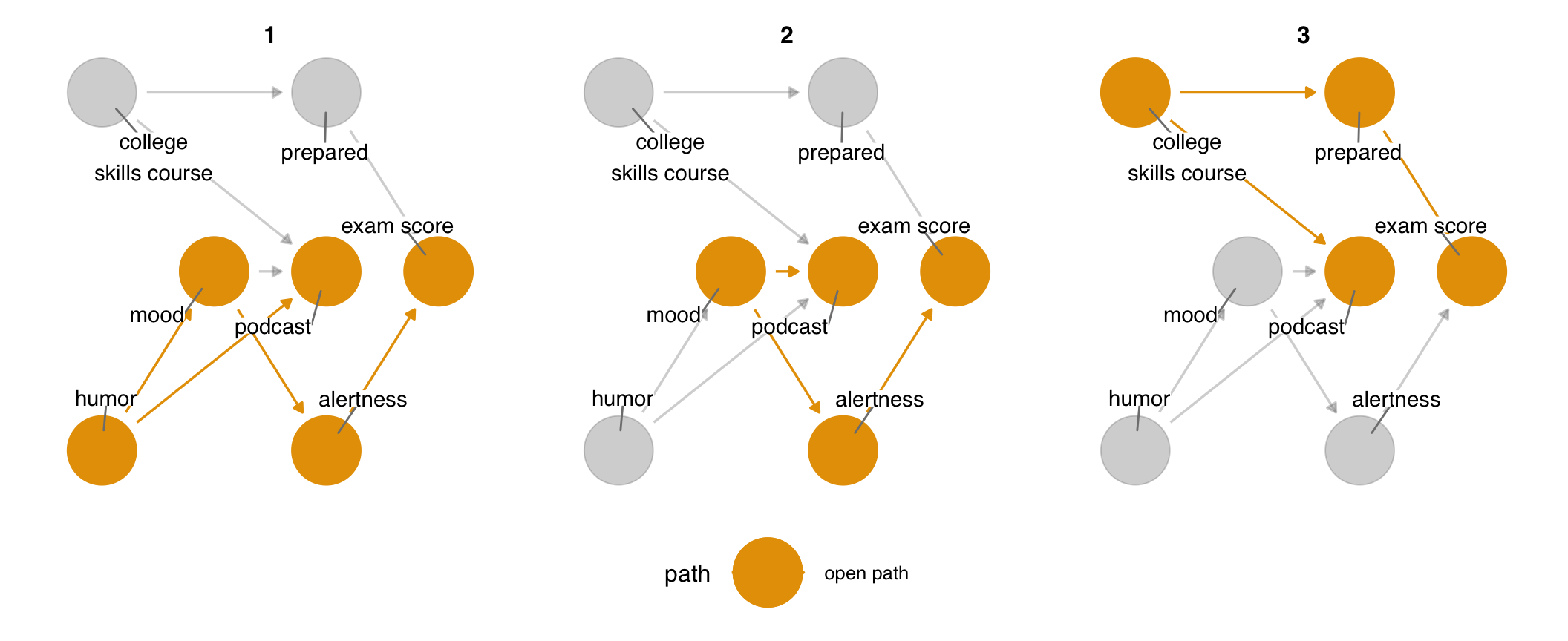
podcast_dag2. Since there is no effect of podcast on exam, all three are backdoor paths that must be closed to get the correct effect.There are four minimal adjustment sets to close all three paths (and eighteen full adjustment sets!). The minimal adjustment sets are alertness + prepared, alertness + skills_course, mood + prepared, mood + skills_course. We can now block the open paths in several ways. mood and prepared still work, but we’ve got other options now. Notably, prepared and alertness could happen at the same time or even after podcast. skills_course and mood still happen before both podcast and exam, so the idea is still the same: the confounding pathway starts before the exposure and outcome.
ggdag_adjustment_set(podcast_dag2, use_labels = "label", text = FALSE)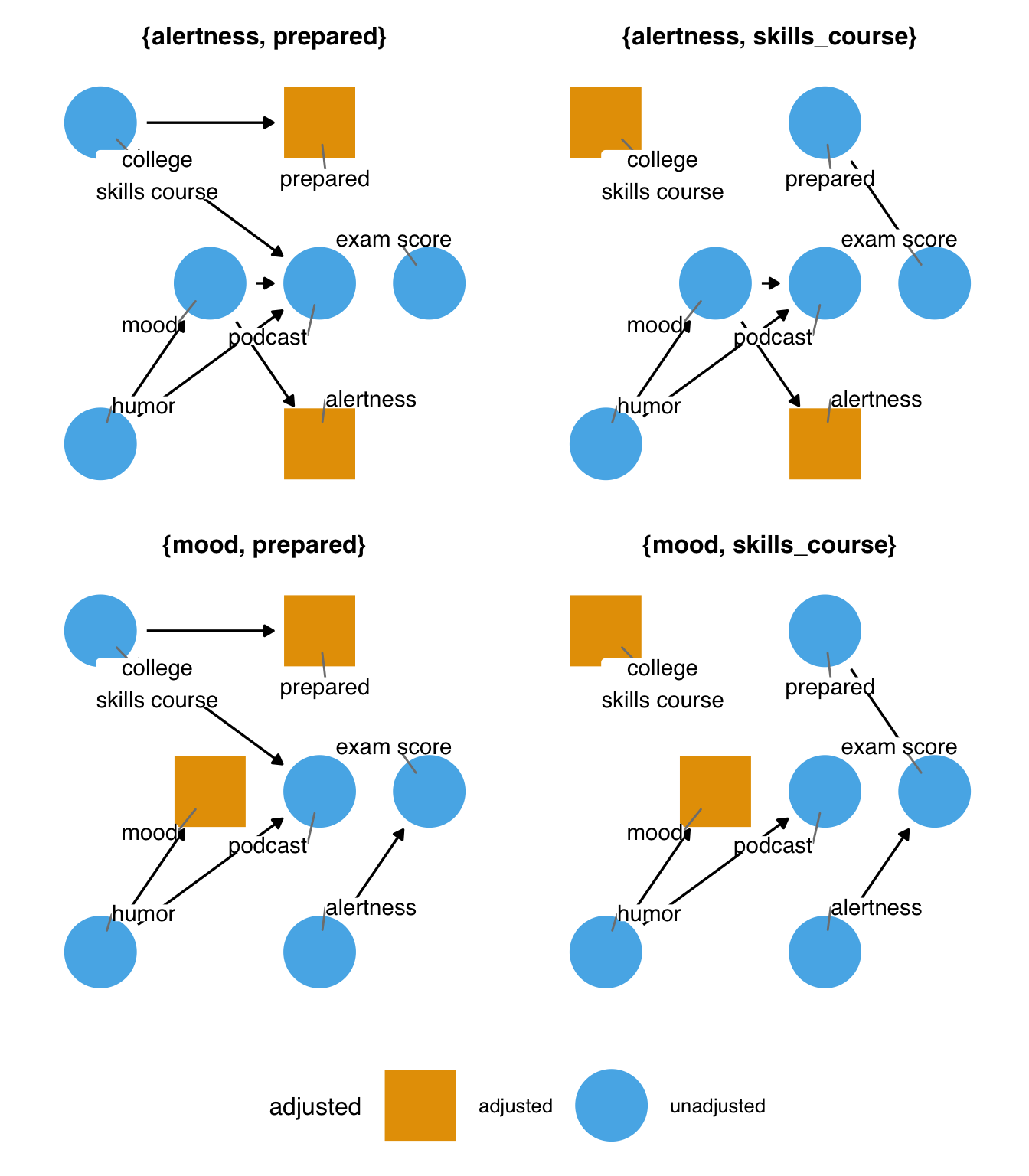
Deciding between these adjustment sets is a matter of judgment: if all data are perfectly measured, the DAG is correct, and we’ve modeled them correctly, then it doesn’t matter which we use. Each adjustment set will result in an unbiased estimate. All three of those assumptions are usually untrue to some degree. Let’s consider the path via skills_course and prepared. It may be that we are better able to assess whether or not someone took the College Skills Course than how prepared for the exam they are. In that case, an adjustment set with skills_course is a better option. But perhaps we better understand the relationship between preparedness and exam results. If we have it measured, controlling for that might be better. We could get the best of both worlds by including both variables: between the better measurement of skills_course and the better modeling of prepared, we might have a better chance of minimizing confounding from this path.
5.3.2 Selection Bias and Mediation
Selection bias is another name for the type of bias that is induced by adjusting for a collider (Lu et al. 2022). It’s called “selection bias” because a common form of collider-induced bias is a variable inherently stratified upon by the design of the study—selection into the study. Let’s consider a case based on the original podcast_dag but with one additional variable: whether or not the student showed up to the exam. Now, there is an indirect effect of podcast on exam: listening to a podcast influences whether or not the students attend the exam. The true result of exam is missing for those who didn’t show up; by studying the group of people who did show up, we are inherently stratifying on this variable.
podcast_dag3 <- dagify(
  podcast ~ mood + humor + prepared,
  exam ~ mood + prepared + showed_up,
  showed_up ~ podcast + mood + prepared,
  coords = time_ordered_coords(
    list(
      # time point 1
      c("prepared", "humor", "mood"),
      # time point 2
      "podcast",
      "showed_up",
      # time point 3
      "exam"
    )
  ),
  exposure = "podcast",
  outcome = "exam",
  labels = c(
    podcast = "podcast",
    exam = "exam score",
    mood = "mood",
    humor = "humor",
    prepared = "prepared",
    showed_up = "showed up"
  )
)
ggdag(podcast_dag3, use_labels = "label", text = FALSE)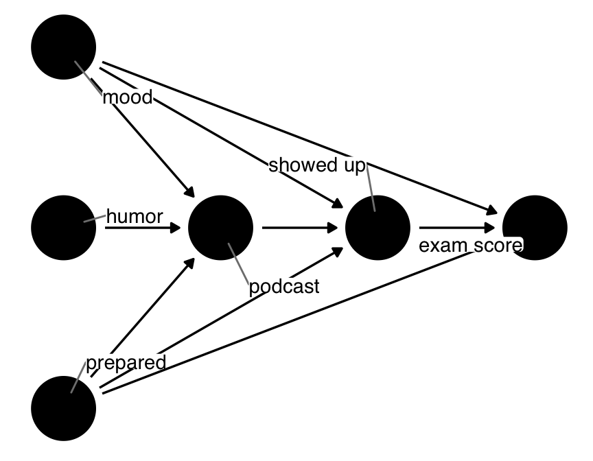
podcast_dag, this time including the inherent stratification on those who appear for the exam. There is still no direct effect of podcast on exam, but there is an indirect effect via showed_up.The problem is that showed_up is both a collider and a mediator: stratifying on it induces a relationship between many of the variables in the DAG but blocks the indirect effect of podcast on exam. Luckily, the adjustment sets can handle the first problem; because showed_up happens before exam, we’re less at risk of collider bias between the exposure and outcome. Unfortunately, we cannot calculate the total effect of podcast on exam because part of the effect is missing: the indirect effect is closed at showed_up.
podcast_dag3 |>
  adjust_for("showed_up") |>
  ggdag_adjustment_set(text = FALSE, use_labels = "label")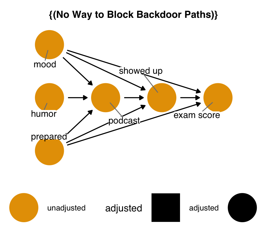
podcast_dag3 given that the data are inherently conditioned on showing up to the exam. In this case, there is no way to recover an unbiased estimate of the total effect of podcast on exam.Sometimes, you can still estimate effects in this situation by changing the estimate you wish to calculate. We can’t calculate the total effect because we are missing the indirect effect, but we can still calculate the direct effect of podcast on exam.
podcast_dag3 |>
  adjust_for("showed_up") |>
  ggdag_adjustment_set(effect = "direct", text = FALSE, use_labels = "label")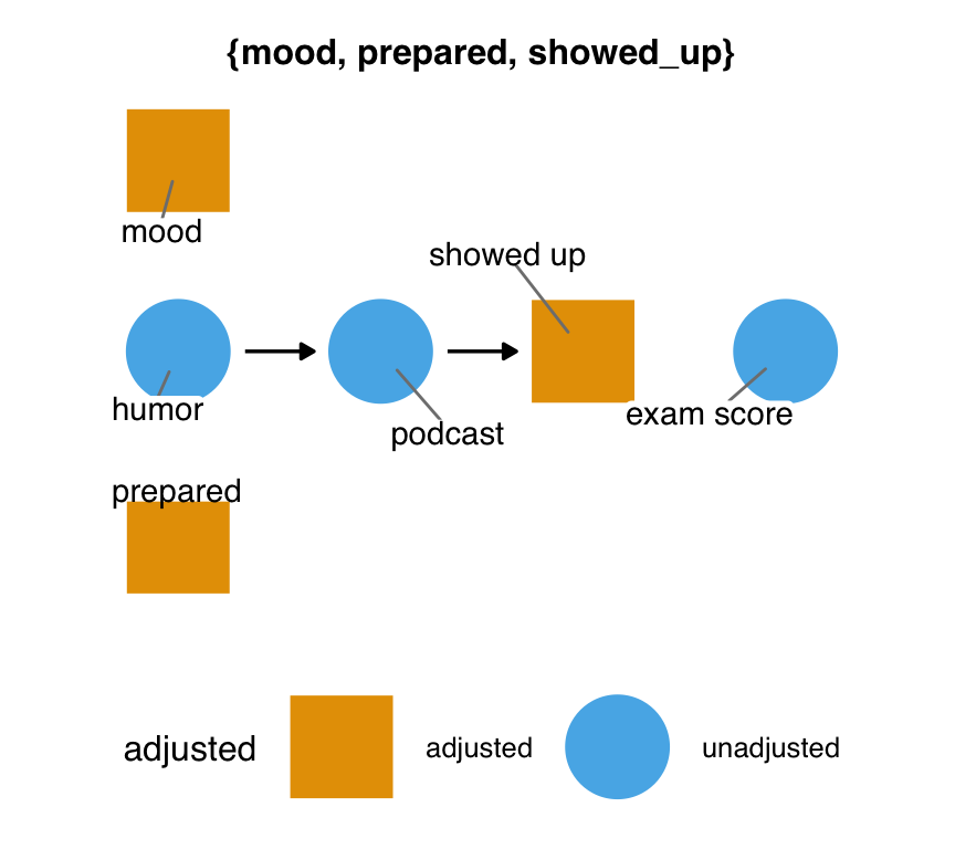
podcast_dag3 when targeting a different effect. There is one minimal adjustment set that we can use to estimate the direct effect of podcast on exam.5.3.2.1 M-Bias and Butterfly Bias
A particular case of selection bias that you’ll often see people talk about is M-bias. It’s called M-bias because it looks like an M when arranged top to bottom.
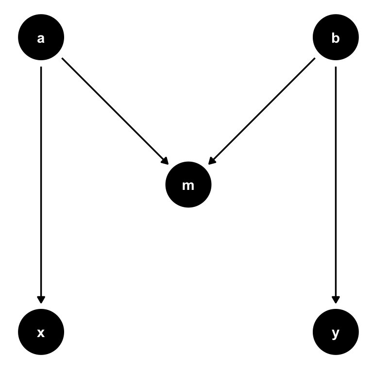
ggdag has several quick-DAGs for demonstrating basic causal structures, including confounder_triangle(), collider_triangle(), m_bias(), and butterfly_bias().
What’s theoretically interesting about M-bias is that m is a collider but occurs before x and y. Remember that association is blocked at a collider, so there is no open path between x and y.
Let’s focus on the mood path of the podcast-exam DAG. What if we were wrong about mood, and the actual relationship was M-shaped? Let’s say that, rather than causing podcast and exam, mood was itself caused by two mutual causes of podcast and exam, u1 and u2, as in Figure 5.21. We don’t know what u1 and u2 are, and we don’t have them measured. As above, there are no open paths in this subset of the DAG.
podcast_dag4 <- dagify(
  podcast ~ u1,
  exam ~ u2,
  mood ~ u1 + u2,
  coords = time_ordered_coords(list(
    c("u1", "u2"),
    "mood",
    "podcast",
    "exam"
  )),
  exposure = "podcast",
  outcome = "exam",
  labels = c(
    podcast = "podcast",
    exam = "exam score",
    mood = "mood",
    u1 = "unmeasured",
    u2 = "unmeasured"
  ),
  # we don't have them measured
  latent = c("u1", "u2")
)

ggdag(podcast_dag4, use_labels = "label", text = FALSE)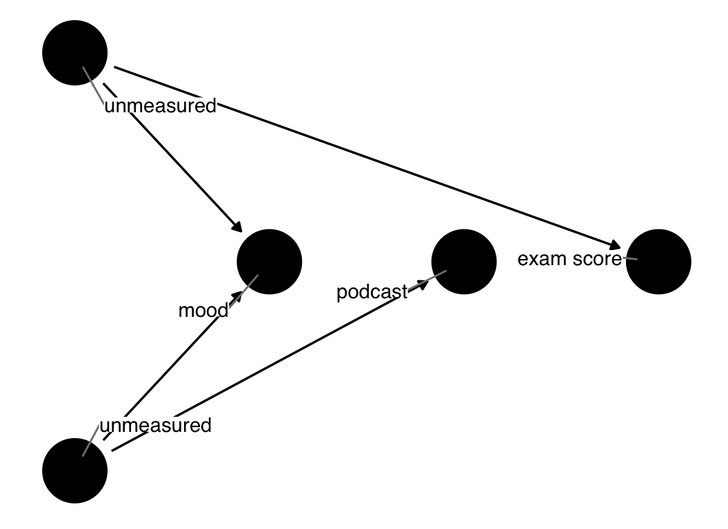
mood is a collider on an M-shaped path.The problem arises when we think our original DAG is the right DAG: mood is in the adjustment set, so we control for it. But this induces bias! It opens up a path between u1 and u2, thus creating a path from podcast to exam. If we had either u1 or u2 measured, we could adjust for them to close this path, but we don’t. There is no way to close this open path.
podcast_dag4 |>
  adjust_for("mood") |>
  ggdag_adjustment_set(use_labels = "label", text = FALSE)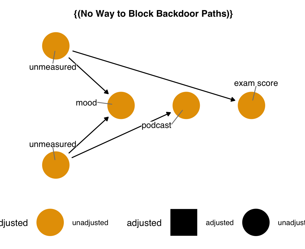
mood is a collider. If we control for mood and don’t know about or have the unmeasured causes of mood, we have no means of closing the backdoor path opened by adjusting for a collider.Of course, the best thing to do here is not control for mood at all. Sometimes, though, that is not an option. Imagine if, instead of mood, this turned out to be the real structure for showed_up: since we inherently control for showed_up, and we don’t have the unmeasured variables, our study results will always be biased. It’s essential to understand if we’re in that situation so we can address it with sensitivity analysis to understand just how biased the effect would be.
Let’s consider a variation on M-bias where mood causes podcast and exam and u1 and u2 are mutual causes of mood and the exposure and outcome. This arrangement is sometimes called butterfly or bowtie bias, again because of its shape.
butterfly_bias(x = "podcast", y = "exam", m = "mood", a = "u1", b = "u2") |>
  ggdag(text = FALSE, use_labels = "label")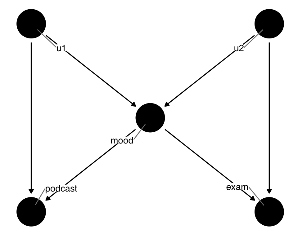
mood is both a collider and a confounder. Controlling for the bias induced by mood opens a new pathway because we’ve also conditioned on a collider. We can’t properly close all backdoor paths without either u1 or u2.Now, we’re in a challenging position: we need to control for mood because it’s a confounder, but controlling for mood opens up the pathway from u1 to u2. Because we don’t have either variable measured, we can’t then close the path opened from conditioning on mood. What should we do? It turns out that, when in doubt, controlling for mood is the better of the two options: confounding bias tends to be worse than collider bias, and M-shaped structures of colliders are sensitive to slight deviations (e.g., if this is not the exact structure, often the bias isn’t as bad) (Ding and Miratrix 2015).
Another common form of selection bias is from loss to follow-up: people drop out of a study in a way that is related to the exposure and outcome. We’ll come back to this topic in Chapter 18.
5.3.3 Causes of the exposure, causes of the outcome
Let’s consider one other type of causal structure that’s important: causes of the exposure and not the outcome, and their opposites, causes of the outcome and not the exposure. Let’s add a variable, grader_mood, to the original DAG.
podcast_dag5 <- dagify(
  podcast ~ mood + humor + prepared,
  exam ~ mood + prepared + grader_mood,
  coords = time_ordered_coords(
    list(
      # time point 1
      c("prepared", "humor", "mood"),
      # time point 2
      c("podcast", "grader_mood"),
      # time point 3
      "exam"
    )
  ),
  exposure = "podcast",
  outcome = "exam",
  labels = c(
    podcast = "podcast",
    exam = "exam score",
    mood = "student\nmood",
    humor = "humor",
    prepared = "prepared",
    grader_mood = "grader\nmood"
  )
)
ggdag(podcast_dag5, use_labels = "label", text = FALSE)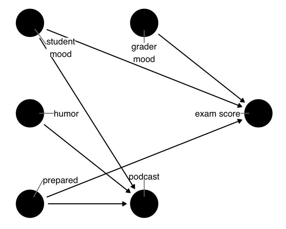
humor) and a cause of the outcome that is not a cause of the exposure (grader_mood).There are now two variables that aren’t related to both the exposure and the outcome: humor, which causes podcast but not exam, and grader_mood, which causes exam but not podcast. Let’s start with humor.
Variables that cause the exposure but not the outcome are also called instrumental variables (IVs). IVs are an unusual circumstance where, under certain conditions, controlling for them can make other types of bias worse. What’s unique about this is that IVs can also be used to conduct an entirely different approach to estimating an unbiased effect of the exposure on the outcome. IVs are commonly used this way in econometrics and are increasingly popular in other areas. In short, IV analysis allows us to estimate the causal effect using a different set of assumptions than the approaches we’ve talked about thus far. Sometimes, a problem intractable using propensity score methods can be addressed using IVs and vice versa. We’ll talk more about IVs in Chapter 23.
So, if you’re not using IV methods, should you include an IV in a model meant to address confounding? If you’re unsure if the variable is an IV or not, you should probably add it to your model: it’s more likely to be a confounder than an IV, and, it turns out, the bias from adding an IV is usually small in practice. So, like adjusting for a potential M-structure variable, the risk of bias is worse from confounding (Myers et al. 2011).
Now, let’s talk about the opposite of an IV: a cause of the outcome that is not the cause of the exposure. These variables are sometimes called competing exposures (because they also cause the outcome) or precision variables (because, as we’ll see, they increase the precision of causal estimates). We’ll call them precision variables because we’re concerned about the relationship to the research question at hand, not to another research question where they are exposures (Brookhart et al. 2006).
Like IVs, precision variables do not occur along paths from the exposure to the outcome. Thus, including them is not necessary. Unlike IVs, including precision variables is beneficial. Including other causes of the outcomes helps a statistical model capture some of its variation. This doesn’t impact the point estimate of the effect, but it does reduce the variance, resulting in smaller standard errors and narrower confidence intervals. Thus, we recommend including them when possible.
So, even though we don’t need to control for grader_mood, if we have it in the data set, we should. Similarly, humor is not a good addition to the model unless we think it really might be a confounder; if it is a valid instrument, we might want to consider using IV methods to estimate the effect instead.
5.3.4 Measurement Error and Missingness
DAGs can also help us understand the bias arising from mismeasurements in the data, including the worst mismeasurement: not measuring it at all. We’ll cover these topics in Chapter 17, but the basic idea is that by separating the actual value from the observed value, we can better understand how such biases may behave (Hernan and Cole 2009). Here’s a basic example of a bias called recall bias. Recall bias is when the outcome influences a participant’s memory of exposure, so it’s a particular problem in retrospective studies where the earlier exposure is not recorded until after the outcome happens. An example of when this can occur is a case-control study of cancer. Someone with cancer may be more motivated to ruminate on their past exposures than someone without cancer. So, their memory about a given exposure may be more refined than someone without. By conditioning on the observed version of the exposure, we open up many collider paths. Unfortunately, there is no way to close them all. If this is the case, we must investigate how severe the bias would be in practice.
error_dag <- dagify(
  exposure_observed ~ exposure_real + exposure_error,
  outcome_observed ~ outcome_real + outcome_error,
  outcome_real ~ exposure_real,
  exposure_error ~ outcome_real,
  labels = c(
    exposure_real = "Exposure\n(truth)",
    exposure_error = "Measurement Error\n(exposure)",
    exposure_observed = "Exposure\n(observed)",
    outcome_real = "Outcome\n(truth)",
    outcome_error = "Measurement Error\n(outcome)",
    outcome_observed = "Outcome\n(observed)"
  ),
  exposure = "exposure_real",
  outcome = "outcome_real",
  coords = time_ordered_coords()
)

error_dag |>
  ggdag(text = FALSE, use_labels = "label")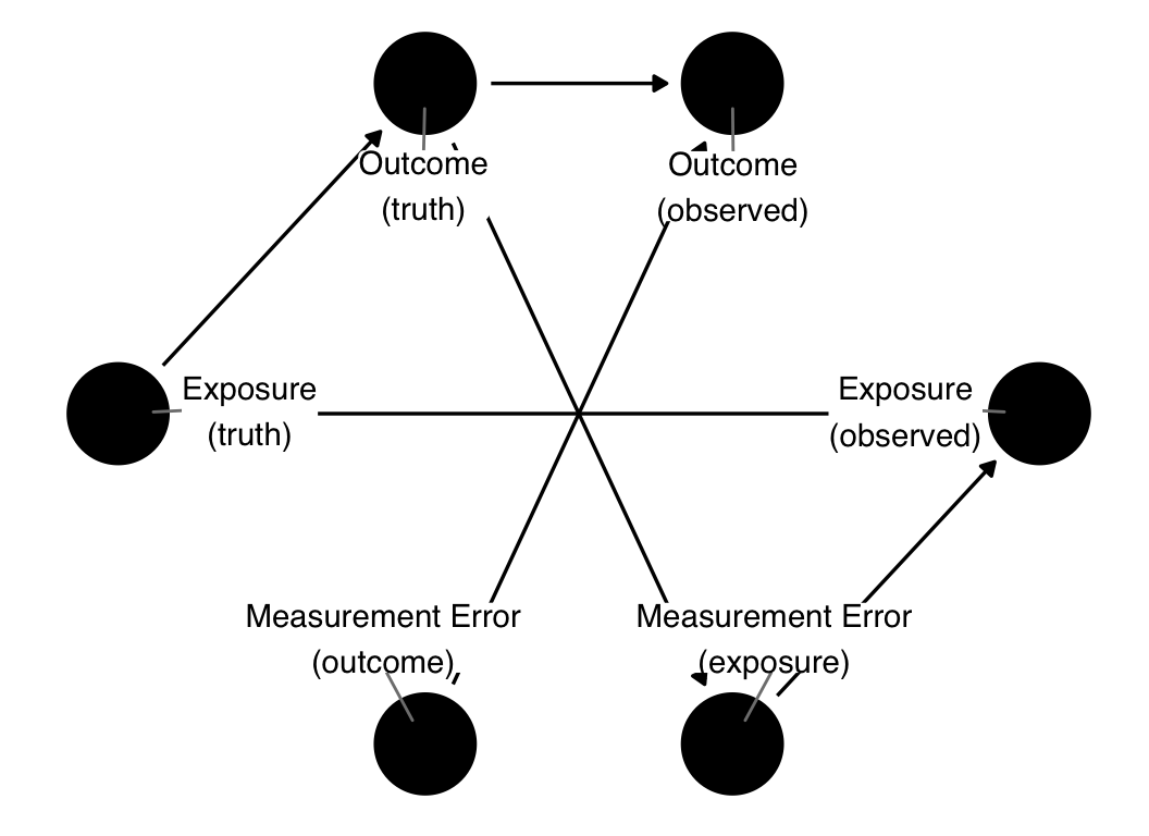
5.4 Recommendations in building DAGs
In principle, using DAGs is easy: specify the causal relationships you think exist and then query the DAG for information like valid adjustment sets. In practice, assembling DAGs takes considerable time and thought. Next to defining the research question itself, it’s one of the most challenging steps in making causal inferences. Very little guidance exists on best practices in assembling DAGs. Tennant et al. (2020) collected data on DAGs in applied health research to better understand how researchers used them. Table 5.1 shows some information they collected: the median number of nodes and arcs in a DAG, their ratio, the saturation percent of the DAG, and how many were fully saturated. Saturating DAGs means adding all possible arrows going forward in time, e.g., in a fully saturated DAG, any given variable at time point 1 has arrows going to all variables in future time points, and so on. Most DAGs were only about half saturated, and very few were fully saturated.
Only about half of the papers using DAGs reported the adjustment set used. In other words, researchers presented their assumptions about the research question but not the implications about how they should handle the modeling stage or if they did use a valid adjustment set. Similarly, the majority of studies did not report the estimand of interest.
The estimand is the target of interest in terms of what we’re trying to estimate, as discussed briefly in Chapter 2. We’ll discuss estimands in detail in Chapter 11.
| Characteristic | N = 1441 |
|---|---|
| DAG properties | |
| Number of Nodes | 12 (9, 16) |
| Number of Arcs | 29 (19, 41) |
| Node to Arc Ratio | 2.30 (1.78, 3.00) |
| Saturation Proportion | 0.46 (0.31, 0.67) |
| Fully Saturated | |
| Yes | 4 (3%) |
| No | 140 (97%) |
| Reporting | |
| Reported Estimand | |
| Yes | 40 (28%) |
| No | 104 (72%) |
| Reported Adjustment Set | |
| Yes | 80 (56%) |
| No | 64 (44%) |
| 1 Median (IQR); n (%) | |
In this section, we’ll offer some advice from Tennant et al. (2020) and our own experience assembling DAGs.
5.4.1 Iterate early and often
One of the best things you can do for the quality of your results is to make the DAG before you conduct the study, ideally before you even collect the data. If you’re already working with your data, at minimum, build your DAG before doing data analysis. This advice is similar in spirit to pre-registered analysis plans: declaring your assumptions ahead of time can help clarify what you need to do, reduce the risk of overfitting (e.g., determining confounders incorrectly from the data), and give you time to get feedback on your DAG.
This last benefit is significant: you should ideally democratize your DAG. Share it early and often with others who are experts on the data, domain, and models. It’s natural to create a DAG, present it to your colleagues, and realize you have missed something important. Sometimes, you will only agree on some details of the structure. That’s a good thing: you know now where there is uncertainty in your DAG. You can then examine the results from multiple plausible DAGs or address the uncertainty with sensitivity analyses.
If you have more than one candidate DAG, check their adjustment sets. If two DAGs have overlapping adjustment sets, focus on those sets; then, you can move forward in a way that satisfies the plausible assumptions you have.
5.4.2 Consider your question
As we saw in Figure 5.17, some questions can be challenging to answer with certain data, while others are more approachable. You should consider precisely what it is you want to estimate. Defining your target estimate is an important topic and the subject of Chapter 11.
Another important detail about how your DAG relates to your question is the population and time. Many causal structures are not static over time and space. Consider lung cancer: the distribution of causes of lung cancer was considerably different before the spread of smoking. In medieval Japan, before the spread of tobacco from the Americas centuries later, the causal structure for lung cancer would have been practically different from what it is in Japan today, both in terms of tobacco use and other factors (age of the population, etc.).
The same is true for confounders. Even if something can cause the exposure and outcome, if the prevalence of that thing is zero in the population you’re analyzing, it’s irrelevant to the causal question. It may also be that, in some populations, it doesn’t affect one of the two. The reverse is also true: something might be unique to the target population. The use of tobacco in North America several centuries ago was unique among the world population, even though ceremonial tobacco use was quite different from modern recreational use. Many changes won’t happen as dramatically as across centuries, but sometimes, they do, e.g., if regulation in one country effectively eliminates the population’s exposure to something.
5.4.3 Order nodes by time
As discussed earlier, we recommend ordering your variables by time, either left-to-right or up-to-down. There are two reasons for this. First, time ordering is an integral part of your assumptions. After all, something happening before another thing is a requirement for it to be a cause. Thinking this through carefully will clarify your DAG and the variables you need to address.
Second, after a certain level of complexity, it’s easier to read a DAG when arranged by time because you have to think less about that dimension; it’s inherent to the layout. The time ordering algorithm in ggdag automates much of this for you, although, as we saw earlier, it’s sometimes helpful to give it more information about the order.
A related topic is feedback loops (Murray and Kunicki 2022). Often, we think about two things that mutually cause each other as happening in a circle, like global warming and A/C use (A/C use increases global warming, which makes it hotter, which increases A/C use, and so on). It’s tempting to visualize that relationship like this:
dagify(
  ac_use ~ global_temp,
  global_temp ~ ac_use,
  labels = c(ac_use = "A/C use", global_temp = "Global\ntemperature")
) |>
  ggdag(layout = "circle", edge_type = "arc", text = FALSE, use_labels = "label")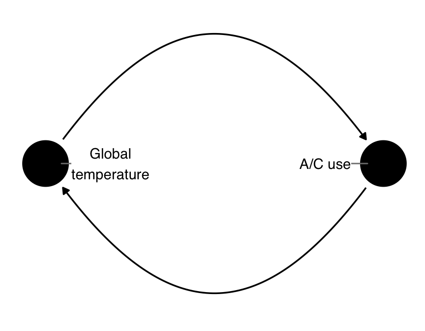
From a DAG perspective, this is a problem because of the A part of DAG: it’s cyclic! Importantly, though, it’s also not correct from a causal perspective. Feedback loops are a shorthand for what really happens, which is that the two variables mutually affect each other over time. Causality only goes forward in time, so it doesn’t make sense to go back and forth like in Figure 5.26.
The real DAG looks something like this:
dagify(
  global_temp_2000 ~ ac_use_1990 + global_temp_1990,
  ac_use_2000 ~ ac_use_1990 + global_temp_1990,
  global_temp_2010 ~ ac_use_2000 + global_temp_2000,
  ac_use_2010 ~ ac_use_2000 + global_temp_2000,
  global_temp_2020 ~ ac_use_2010 + global_temp_2010,
  ac_use_2020 ~ ac_use_2010 + global_temp_2010,
  coords = time_ordered_coords(),
  labels = c(
    ac_use_1990 = "A/C use\n(1990)",
    global_temp_1990 = "Global\ntemperature\n(1990)",
    ac_use_2000 = "A/C use\n(2000)",
    global_temp_2000 = "Global\ntemperature\n(2000)",
    ac_use_2010 = "A/C use\n(2010)",
    global_temp_2010 = "Global\ntemperature\n(2010)",
    ac_use_2020 = "A/C use\n(2020)",
    global_temp_2020 = "Global\ntemperature\n(2020)"
  )
) |>
  ggdag(text = FALSE, use_labels = "label")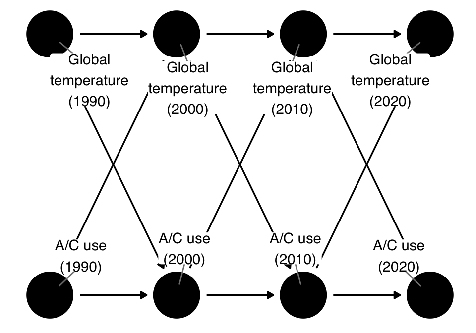
The two variables, rather than being in a feedback loop, are actually in a feedforward loop: they co-evolve over time. Here, we only show four discrete moments in time (the decades from 1990 to 2020), but of course, we could get much finer depending on the question and data.
As with any DAG, the proper analysis approach depends on the question. The effect of A/C use in 2000 on the global temperature in 2020 produces a different adjustment set than the global temperature in 2000 on A/C use in 2020. Similarly, whether we also model this change over time or just those two time points depends on the question. Often, these feedforward relationships require you to address time-varying confounding, which we’ll discuss in Chapter 18.
5.4.4 Consider the whole data collection process
As Figure 5.17 showed us, it’s essential to consider the way we collected data as much as the causal structure of the question. Considering the whole data collection process is particularly true if you’re working with “found” data—a data set not intentionally collected to answer the research question. We are always inherently conditioning on the data we have vs. the data we don’t have. If other variables influenced the data collection process in the causal structure, you need to consider the impact. Do you need to control for additional variables? Do you need to change the effect you are trying to estimate? Can you answer the question at all?
What about case-control studies?
A standard study design in epidemiology is the case-control study. Case-control studies are beneficial when the outcome under study is rare or takes a very long time to happen (like many types of cancer). Participants are selected into the study based on their outcome: once a person has an event, they are entered as a case and matched with a control who hasn’t had the event. Often, they are matched on other factors as well.
Matched case-control studies are selection biased by design (Mansournia, Hernán, and Greenland 2013). In Figure 5.28, when we condition on selection into the study, we lose the ability to close all backdoor paths, even if we control for confounder. From the DAG, it would appear that the entire design is invalid!
dagify(
  outcome ~ confounder + exposure,
  selection ~ outcome + confounder,
  exposure ~ confounder,
  exposure = "exposure",
  outcome = "outcome",
  coords = time_ordered_coords()
) |>
  ggdag(edge_type = "arc", text_size = 2.2)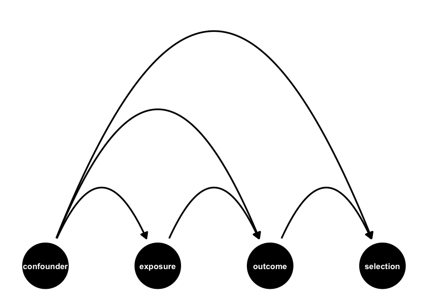
Luckily, this isn’t wholly true. Case-control studies are limited in the type of causal effects they can estimate (causal odds ratios, which under some circumstances approximate causal risk ratios). With careful study design and sampling, the math works out such that these estimates are still valid. Exactly how and why case-control studies work is beyond the scope of this book, but they are a remarkably clever design.
5.4.5 Include variables you don’t have
It’s critical that you include all variables important to the causal structure, not just the variables you have measured in your data. ggdag can mark variables as unmeasured (“latent”); it will then return only usable adjustment sets, e.g., those without the unmeasured variables. Of course, the best thing to do is to use DAGs to help you understand what to measure in the first place, but there are many reasons why your data might be different. Even data intentionally collected for the research question might not have a variable discovered to be a confounder after data collection.
For instance, if we have a DAG where exposure and outcome have a confounding pathway consisting of confounder1 and confounder2, we can control for either to successfully debias the estimate:
dagify(
  outcome ~ exposure + confounder1,
  exposure ~ confounder2,
  confounder2 ~ confounder1,
  exposure = "exposure",
  outcome = "outcome"
) |>
  adjustmentSets()
{ confounder1 }
{ confounder2 }Thus, if just one is missing (latent), then we are ok:
dagify(
  outcome ~ exposure + confounder1,
  exposure ~ confounder2,
  confounder2 ~ confounder1,
  exposure = "exposure",
  outcome = "outcome",
  latent = "confounder1"
) |>
  adjustmentSets()
{ confounder2 }But if both are missing, there are no valid adjustment sets.
When you don’t have a variable measured, you still have a few options. As mentioned above, you may be able to identify alternate adjustment sets. If the missing variable is required to close all backdoor paths completely, you can and should conduct a sensitivity analysis to understand the impact of not having it. This is the subject of Chapter 21.
Under some lucky circumstances, you can also use a proxy confounder (Miao, Geng, and Tchetgen Tchetgen 2018). A proxy confounder is a variable closely related to the confounder such that controlling for it controls for some of the effects of the missing variable. Consider an expansion of the fundamental confounding relationship where q has a cause, p, as in Figure 5.29. Technically, if we don’t have q, we can’t close the backdoor path, and our effect will be biased. Practically, though, if p is highly correlated with q, it can serve as a method to reduce the confounding from q. You can think of p as a mismeasured version of q; it will seldom wholly control for the bias via q, but it can help minimize it.
dagify(
  y ~ x + q,
  x ~ q,
  q ~ p,
  coords = time_ordered_coords()
) |>
  ggdag(edge_type = "arc")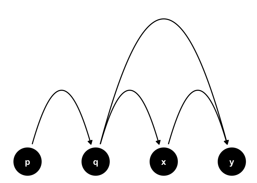
q, and a proxy confounder, p. The true adjustment set is q. Since p causes q, it contains information about q and can reduce the bias if we don’t have q measured.5.4.6 Saturate your DAG, then prune
In discussing Table 5.1, we mentioned saturated DAGs. These are DAGs where all possible arrows are included based on the time ordering, e.g., every variable causes variables that come after it in time.
Not including an arrow is a bigger assumption than including one. In other words, your default should be to have an arrow from one variable to a future variable. This default is counterintuitive to many people. How can it be that we need to be so careful about assessing causal effects yet be so liberal in applying causal assumptions in the DAG? The answer to this lies in the strength and prevalence of the cause. Technically, an arrow present means that for at least a single observation, the prior node causes the following node. The arrow similarly says nothing about the strength of the relationship. So, a minuscule causal effect on a single individual justifies the presence of an arrow. In practice, such a case is probably not relevant. There is effectively no arrow.
The more significant point, though, is that you should feel confident to add an arrow. The bar for justification is much lower than you think. Instead, it’s helpful to 1) determine your time ordering, 2) saturate the DAG, and 3) prune out implausible arrows.
Let’s experiment by working through a saturated version of the podcast-exam DAG.
First, the time-ordering. Presumably, the student’s sense of humor far predates the day of the exam. Mood in the morning, too, predates listening to the podcast or exam score, as does preparation. The saturated DAG given this ordering is:
podcast_dag: variables have all possible arrows going forward to other variables over time.There are a few new arrows here. Humor now causes the other two confounders, as well as exam score. Some of them make sense. Sense of humor probably affects mood for some people. What about preparedness? This relationship seems a little less plausible. Similarly, we know that a sense of humor does not affect exam scores in this case because the grading is blinded. Let’s prune those two.
This DAG seems more reasonable. So, was our original DAG wrong? That depends on several factors. Notably, both DAGs produce the same adjustment set: controlling for mood and prepared will give us an unbiased effect if either DAG is correct. Even if the new DAG were to produce a different adjustment set, whether the result is meaningfully different depends on the strength of the confounding.
5.4.7 Include instruments and precision variables
Technically, you do not need to include instrumental and precision variables in your DAG. The adjustment sets will be the same with and without them. However, adding them is helpful for two reasons. Firstly, they demonstrate your assumptions about their relationships and the variables under study. As discussed above, not including an arrow is a more significant assumption than including one, so it’s valuable information about how you think the causal structure operates. Secondly, it impacts your modeling decision. You should always include precision variables in your model to reduce variability in your estimate so it helps you identify those. Instruments are also helpful to see because they may guide alternative or complementary modeling strategies, as we’ll discuss in Chapter 24.
5.4.8 Focus on the causal structure, then consider measurement bias
As we saw above, missingness and measurement error can be a source of bias. As we’ll see in Chapter 17, we have several strategies to approach such a situation. Yet, almost everything we measure is inaccurate to some degree. The true DAG for the data at hand inherently conditions on the measured version of variables. In that sense, your data are always subtly-wrong, a sort of unreliable narrator. When should we include this information in the DAG? We recommend first focusing on the causal structure of the DAG as if you had perfectly measured each variable (Hernán and Robins 2021). Then, consider how mismeasurement and missingness might affect the realized data, particularly related to the exposure, outcome, and critical confounders. You may prefer to present this as an alternative DAG to consider strategies for addressing the bias arising from those sources, e.g., imputation or sensitivity analyses. After all, the DAG in Figure 5.25 makes you think the question is unanswerable because we have no method to close all backdoor paths. As with all open paths, that depends on the severity of the bias and our ability to reckon with it.
5.4.9 Pick adjustment sets most likely to be successful
One area where measurement error is an important consideration is when picking an adjustment set. In theory, if a DAG is correct, any adjustment set will work to create an unbiased result. In practice, variables have different levels of quality. Pick an adjustment set most likely to succeed because it contains accurate variables. Similarly, non-minimal adjustment sets are helpful to consider because, together, several variables with measurement error along a backdoor path may be enough to minimize the practical bias resulting from that path.
What if you don’t have certain critical variables measured and thus do not have a valid adjustment set? In that case, you should pick the adjustment set with the best chance of minimizing the bias from other backdoor paths. All is not lost if you don’t have every confounder measured: get the highest quality estimate you can, then conduct a sensitivity analysis about the unmeasured variables to understand the impact.
5.4.10 Use robustness checks
Finally, we recommend checking your DAG for robustness. You can never verify the correctness of your DAG under most conditions, but you can use the implications in your DAG to support it. Three types of robustness checks can be helpful depending on the circumstances.
- Negative controls (Lipsitch, Tchetgen Tchetgen, and Cohen 2010). These come in two flavors: negative exposure controls and negative outcome controls. The idea is to find something associated with one but not the other, e.g., the outcome but not the exposure, so there should be no effect. Since there should be no effect, you now have a measurement for how well you control for other effects (e.g., the difference from null). Ideally, the confounders for negative controls are similar to the research question.
- DAG-data consistency (Textor et al. 2017). Negative controls are an implication of your DAG. An extension of this idea is that there are many such implications. Because blocking a path removes statistical dependencies from that path, you can check those assumptions in several places in your DAG.
- Alternate adjustment sets. Adjustment sets should give roughly the same answer because, outside of random and measurement errors, they are all sets that block backdoor paths. If more than one adjustment set seems reasonable, you can use that as a sensitivity analysis by checking multiple models.
We’ll discuss these in detail in Chapter 21. The caveat here is that these should be complementary to your initial DAG, not a way of replacing it. In fact, if you use more than one adjustment set during your analysis, you should report the results from all of them to avoid overfitting your results to your data.
An essential but rarely observed detail of DAGs is that dag is also an affectionate Australian insult referring to the dung-caked fur of a sheep, a daglock.↩︎