10 Evaluating your propensity score model
Propensity scores are inherently balancing scores. The goal is to balance the exposure groups across confounders.
10.1 Calculating the standardized mean difference
One way to assess balance is the standardized mean difference. This measure helps you assess whether the average value for the confounder is balanced between exposure groups. For example, if you have some continuous confounder, \(Z\), and \(\bar{z}_{exposed} = \frac{\sum Z_i(X_i)}{\sum X_i}\) is the mean value of \(Z\) among the exposed, \(\bar{z}_{unexposed} = \frac{\sum Z_i(1-X_i)}{\sum 1-X_i}\) is the mean value of \(Z\) among the unexposed, \(s_{exposed}\) is the sample standard deviation of \(Z\) among the exposed and \(s_{unexposed}\) is the sample standard deviation of \(Z\) among the unexposed, then the standardized mean difference can be expressed as follows:
\[ d =\frac{\bar{z}_{exposed}-\bar{z}_{unexposued}}{\frac{\sqrt{s^2_{exposed}+s^2_{unexposed}}}{2}} \] In the case of a binary \(Z\) (a confounder with just two levels), \(\bar{z}\) is replaced with the sample proportion in each group (e.g., \(\hat{p}_{exposed}\) or \(\hat{p}_{unexposed}\) ) and \(s^2=\hat{p}(1-\hat{p})\). In the case where \(Z\) is categorical with more than two categories, \(\bar{z}\) is the vector of proportions of each category level within a group and the denominator is the multinomial covariance matrix (\(S\) below), as the above can be written more generally as:
\[ d = \sqrt{(\bar{z}_{exposed} - \bar{z}_{unexposed})^TS^{-1}(\bar{z}_{exposed} - \bar{z}_{unexposed})} \]
Often, we calculate the standardized mean difference for each confounder in the full, unadjusted, data set and then compare this to an adjusted standardized mean difference. If the propensity score is incorporated using matching, this adjusted standardized mean difference uses the exact equation as above, but restricts the sample considered to only those that were matched. If the propensity score is incorporated using weighting, this adjusted standardized mean difference weights each of the above components using the constructed propensity score weight.
In R, the halfmoon package has a function tidy_smd that will calculate this for a data set.
Let’s look at an example using the same data as Chapter 9.
library(broom)
library(touringplans)
library(propensity)

seven_dwarfs_9 <- seven_dwarfs_train_2018 |> filter(wait_hour == 9)

seven_dwarfs_9_with_ps <-
  glm(
    park_extra_magic_morning ~ park_ticket_season + park_close + park_temperature_high,
    data = seven_dwarfs_9,
    family = binomial()
  ) |>
  augment(type.predict = "response", data = seven_dwarfs_9)
seven_dwarfs_9_with_wt <- seven_dwarfs_9_with_ps |>
  mutate(w_ate = wt_ate(.fitted, park_extra_magic_morning))
Now, using the tidy_smd function, we can examine the standardized mean difference before and after weighting.
library(halfmoon)
smds <-
  seven_dwarfs_9_with_wt |>
  mutate(park_close = as.numeric(park_close)) |>
  tidy_smd(
    .vars = c(park_ticket_season, park_close, park_temperature_high),
    .group = park_extra_magic_morning,
    .wts = w_ate
  )
smds
# A tibble: 6 × 4
variable method park_extra_magic_mor…¹ smd
<chr> <chr> <chr> <dbl>
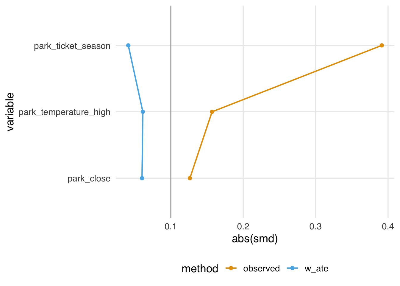
1 park_ticket_se… obser… 1 0.391
2 park_close obser… 1 0.126
3 park_temperatu… obser… 1 0.157
4 park_ticket_se… w_ate 1 0.0413
5 park_close w_ate 1 -0.0602
6 park_temperatu… w_ate 1 0.0613
# ℹ abbreviated name: ¹park_extra_magic_morningFor example, we see above that the observed standardized mean difference (prior to incorporating the propensity score) for ticket season is 0.39, however after incorporating the propensity score weight this is attenuated, now 0.04.
One downside of this metric is it only quantifying balance on the mean, which may not be sufficient for continuous confounders, as it is possible to be balanced on the mean but severely imbalanced in the tails. At the end of this chapter we will show you a few tools for examining balance across the full distribution of the confounder.
10.2 Visualizing balance
10.2.1 Love Plots
Let’s start by visualizing these standardized mean differences. To do so, we like to use a Love Plot (named for Thomas Love, as he was one of the first to popularize them). The halfmoon package has a function geom_love that simplifies this implementation.
10.2.2 Boxplots and eCDF plots
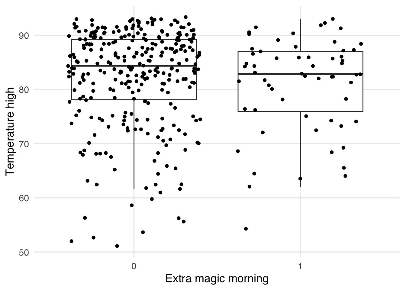
As mentioned above, one issue with the standardized mean differences is they only quantify balance on a single point for continuous confounders (the mean). It can be helpful to visualize the whole distribution to ensure that there is not residual imbalance in the tails. Let’s first use a boxplot. As an example, let’s use the park_temperature_high variable. When we make boxplots, we prefer to always jitter the points on top to make sure we aren’t masking and data anomolies – we use geom_jitter to accomplish this. First, we will make the unweighted boxplot.
ggplot(
  seven_dwarfs_9_with_wt,
  aes(
    x = factor(park_extra_magic_morning),
    y = park_temperature_high,
    group = park_extra_magic_morning
  )
) +
  geom_boxplot(outlier.color = NA) +
  geom_jitter() +
  labs(
    x = "Extra magic morning",
    y = "Temperature high"
  )
ggplot(
  seven_dwarfs_9_with_wt,
  aes(
    x = factor(park_extra_magic_morning),
    y = park_temperature_high,
    group = park_extra_magic_morning,
    weight = w_ate
  )
) +
  geom_boxplot(outlier.color = NA) +
  geom_jitter() +
  labs(
    x = "Extra magic morning",
    y = "Historic temperature high"
  )
Warning in fit$coef: partial match of 'coef' to
'coefficients'
Warning in fit$coef: partial match of 'coef' to
'coefficients'
Warning in fit$coef: partial match of 'coef' to
'coefficients'
Warning in fit$coef: partial match of 'coef' to
'coefficients'
Warning in fit$coef: partial match of 'coef' to
'coefficients'
Warning in fit$coef: partial match of 'coef' to
'coefficients'
Warning in fit$coef: partial match of 'coef' to
'coefficients'
Warning in fit$coef: partial match of 'coef' to
'coefficients'
Warning in fit$coef: partial match of 'coef' to
'coefficients'
Warning in fit$coef: partial match of 'coef' to
'coefficients'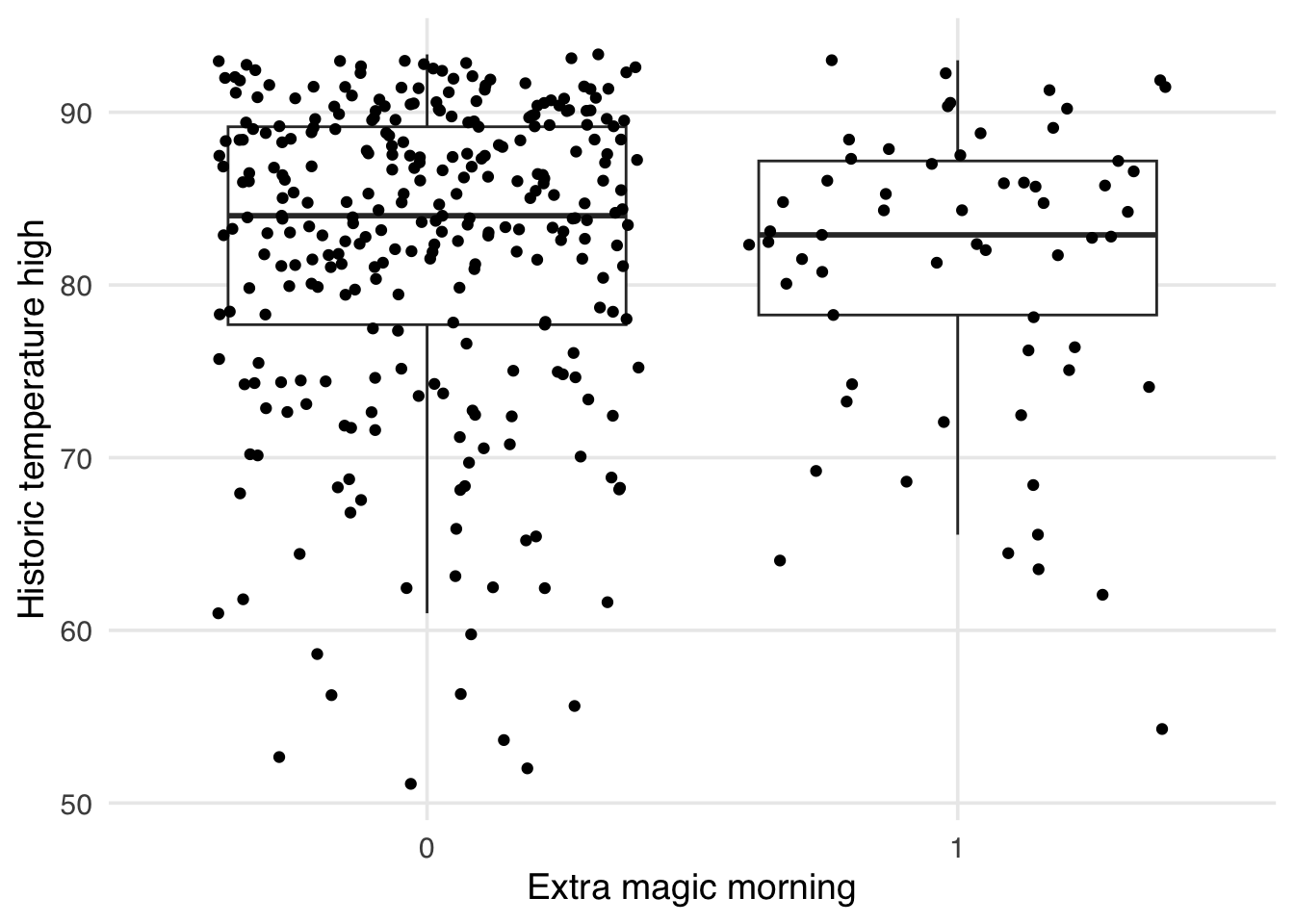
Similarly, we can also examine the empirical cumulative distribution function (eCDF) for the confounder stratified by each exposure group. The unweighted eCDF can be visualized using geom_ecdf
ggplot(
  seven_dwarfs_9_with_wt,
  aes(
    x = park_temperature_high,
    color = factor(park_extra_magic_morning)
  )
) +
  geom_ecdf() +
  scale_color_manual(
    "Extra Magic Morning",
    values = c("#5154B8", "#5DB854"),
    labels = c("Yes", "No")
  ) +
  labs(
    x = "Historic temperature high",
    y = "Proportion <= x"
  )
The halfmoon package allows for the additional weight argument to be passed to geom_ecdf to display a weighted eCDF plot.
ggplot(
  seven_dwarfs_9_with_wt,
  aes(
    x = park_temperature_high,
    color = factor(park_extra_magic_morning)
  )
) +
  geom_ecdf(aes(weights = w_ate)) +
  scale_color_manual(
    "Extra Magic Morning",
    values = c("#5154B8", "#5DB854"),
    labels = c("Yes", "No")
  ) +
  labs(
    x = "Historic temperature high",
    y = "Proportion <= x"
  )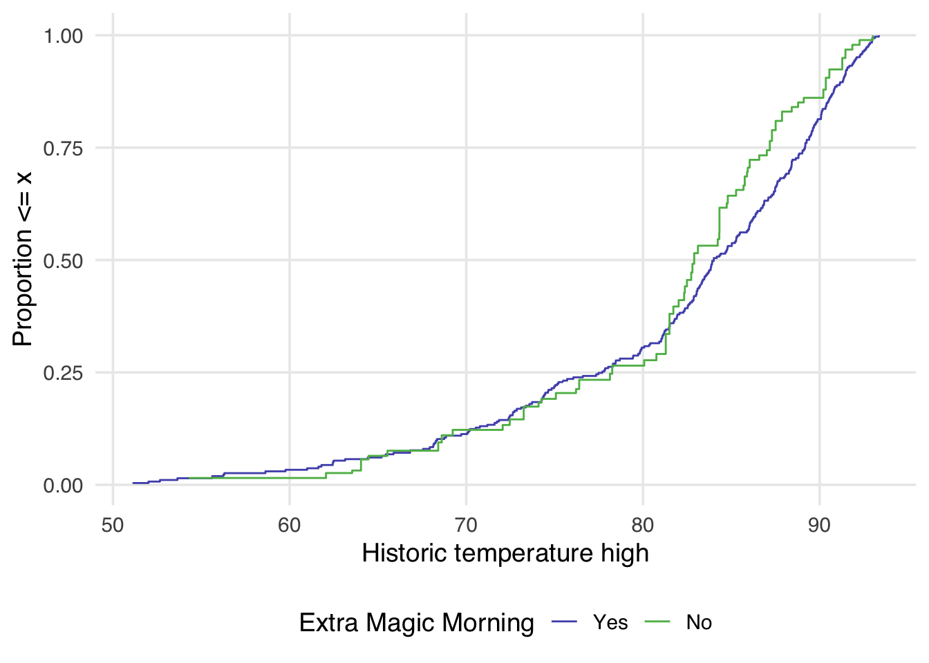
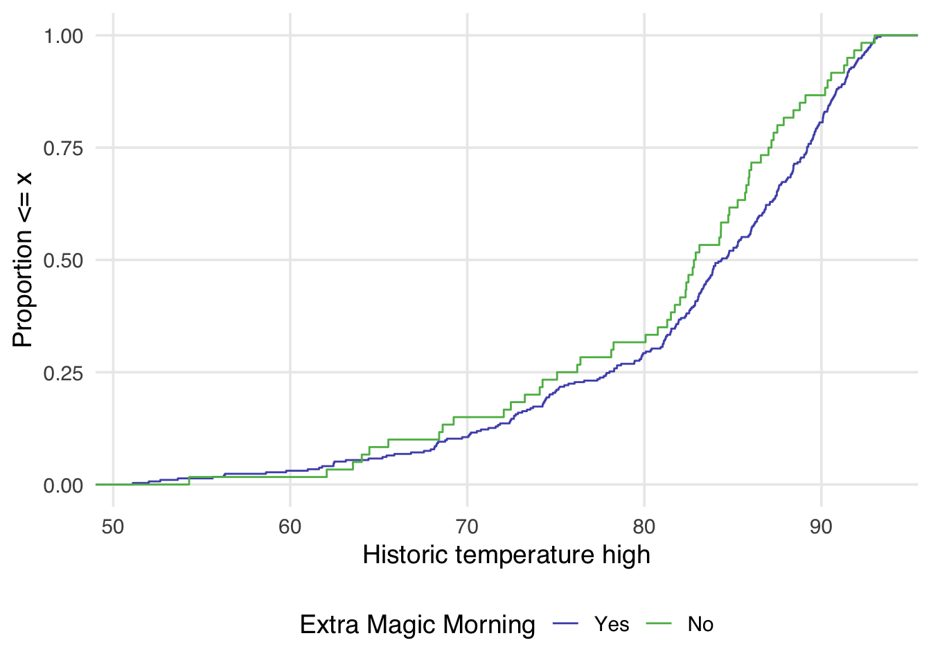
Examining Figure 10.4, we can notice a few things. First, compared to Figure 10.3 there is improvement in the overlap between the two distributions. In Figure 10.3, the green line is almost always noticeably above the purple, whereas in Figure 10.4 the two lines appear to mostly overlap until we reach slightly above 80 degrees. After 80 degrees, the lines appear to diverge in the weighted plot. This is why it can be useful to examine the full distribution rather than a single summary measure. If we had just used the standardized mean difference, for example, we would have likely said these two groups are balanced and moved on. Looking at Figure 10.4 suggests that perhaps there is a non-linear relationship between the probability of having an extra magic morning and the historic high temperature. Let’s try refitting our propensity score model using a natural spline. We can use the function splines::ns for this.
seven_dwarfs_9_with_ps <-
  glm(
    park_extra_magic_morning ~ park_ticket_season + park_close +
      splines::ns(park_temperature_high, df = 5), # refit model with a spline
    data = seven_dwarfs_9,
    family = binomial()
  ) |>
  augment(type.predict = "response", data = seven_dwarfs_9)
seven_dwarfs_9_with_wt <- seven_dwarfs_9_with_ps |>
  mutate(w_ate = wt_ate(.fitted, park_extra_magic_morning))
Now let’s see how that impacts the weighted eCDF plot
ggplot(
  seven_dwarfs_9_with_wt,
  aes(
    x = park_temperature_high,
    color = factor(park_extra_magic_morning)
  )
) +
  geom_ecdf(aes(weights = w_ate)) +
  scale_color_manual(
    "Extra Magic Morning",
    values = c("#5154B8", "#5DB854"),
    labels = c("Yes", "No")
  ) +
  labs(
    x = "Historic temperature high",
    y = "Proportion <= x"
  )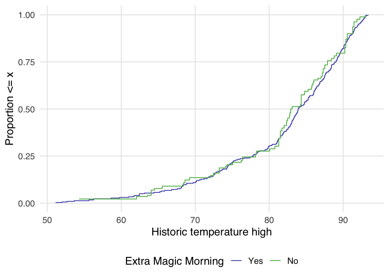
Now in Figure 10.5 the lines appear to overlap across the whole space.