8 Building propensity score models
Often we are interested in how some exposure (or treatment) impacts an outcome. For example, we could assess how an ad campaign (exposure) impacts sales (outcome), whether a particular medication (exposure) improves patient survival (outcome), or whether opening a theme park early to some visitors (exposure) reduces wait times later in the day (outcome). As defined in the Chapter 3, an exposure in the context of this book is often a modifiable event or condition that occurs before the outcome. In an ideal world, we would simply estimate the correlation between the exposure and outcome as the causal effect of the exposure. Randomized trials are the best practical examples of this idealized scenario: participants are randomly assigned to exposure groups. If all goes well, this allows for an unbiased estimate of the causal effect between the exposure and outcome. In the “real world,” outside this randomized trial setting, we are often exposed to something based on other factors. For example, when deciding what medication to give a diabetic patient, a doctor may consider the patient’s medical history, their likelihood to adhere to certain medications, and the severity of their disease. The treatment is no longer random; it is conditional on factors about that patient, also known as the patient’s covariates. If these covariates also affect the outcome, they are confounders.
A confounder is a common cause of exposure and outcome.
Suppose we could collect information about all of these factors. In that case, we could determine each patient’s probability of exposure and use this to inform an analysis assessing the relationship between that exposure and some outcome. This probability is the propensity score! When used appropriately, modeling with a propensity score can simulate what the relationship between exposure and outcome would have looked like if we had run a randomized trial. The correlation between exposure and outcome will estimate the causal effect after applying a propensity score. When fitting a propensity score model we want to condition on all known confounders.
A propensity score is the probability of being in the exposure group, conditioned on observed covariates.
Rosenbaum and Rubin (1983) showed in observational studies conditioning on propensity scores can lead to unbiased estimates of the exposure effect as long as certain assumptions hold:
- There are no unmeasured confounders
- Every subject has a nonzero probability of receiving either exposure
8.1 Logistic Regression
There are many ways to estimate the propensity score; typically, people use logistic regression for binary exposures. The logistic regression model predicts the exposure using known confounders. Each individual’s predicted value is the propensity score. The glm() function will fit a logistic regression model in R. Below is pseudo-code. The first argument is the model, with the exposure on the left side and the confounders on the right. The data argument takes the data frame, and the family = binomial() argument denotes the model should be fit using logistic regression (as opposed to a different generalized linear model).
We can extract the propensity scores by pulling out the predictions on the probability scale. Using the augment() function from the {broom} package, we can extract these propensity scores and add them to our original data frame. The argument type.predict is set to "response" to indicate that we want to extract the predicted values on the probability scale. By default, these will be on the linear logit scale. The data argument contains the original data frame. This code will output a new data frame consisting of all components in df with six additional columns corresponding to the logistic regression model that was fit. The .fitted column is the propensity score.
Let’s look at an example.
8.1.1 Extra Magic Hours at Magic Kingdom
Recall our causal question of interest from Section 7.1: Is there a relationship between whether there were “Extra Magic Hours” in the morning at Magic Kingdom and the average wait time for an attraction called the “Seven Dwarfs Mine Train” the same day between 9am and 10am in 2018? Below is a proposed DAG for this question.
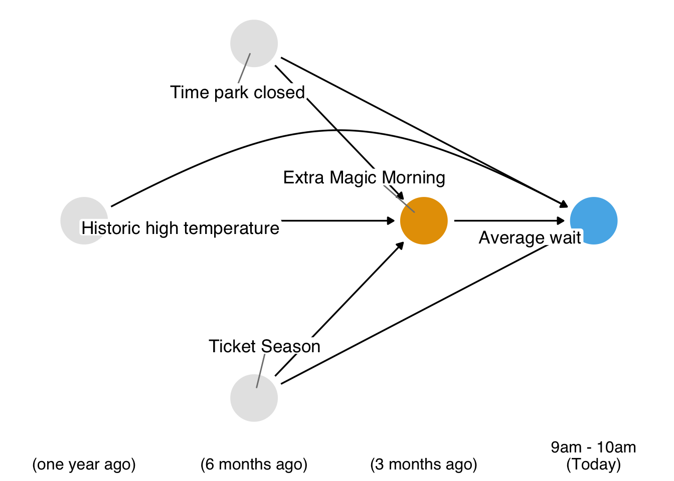
In Figure 8.1, we propose three confounders: the historic high temperature on the day, the time the park closed, and the ticket season: value, regular, or peak. We can build a propensity score model using the seven_dwarfs_train_2018 data set from the touringplans package. Each row of this dataset contains information about the Seven Dwarfs Mine Train during a particular hour on a given day. First, we need to subset the data to only include average wait times between 9 and 10 am. Then we will use the glm() function to fit the propensity score model, predicting park_extra_magic_morning using the four confounders specified above. We’ll add the propensity scores to the data frame (in a column called .fitted as set by the augment() function in the broom package).
library(broom)
library(touringplans)

seven_dwarfs_9 <- seven_dwarfs_train_2018 |> filter(wait_hour == 9)

seven_dwarfs_9_with_ps <-
  glm(
    park_extra_magic_morning ~ park_ticket_season + park_close + park_temperature_high,
    data = seven_dwarfs_9,
    family = binomial()
  ) |>
  augment(type.predict = "response", data = seven_dwarfs_9)
Let’s take a look at these propensity scores. Table 8.1 shows the propensity scores (in the .fitted column) for the first six days in the dataset, as well as the values of each day’s exposure, outcome, and confounders. The propensity score here is the probability that a given date will have Extra Magic Hours in the morning given the observed confounders, in this case, the historical high temperatures on a given date, the time the park closed, and Ticket Season. For example, on January 1, 2018, there was a 30.2% chance that there would be Extra Magic Hours at the Magic Kingdom given the Ticket Season (peak in this case), time of park closure (11 pm), and the historic high temperature on this date (58.6 degrees). On this particular day, there were not Extra Magic Hours in the morning (as indicated by the 0 in the first row of the park_extra_magic_morning column).
seven_dwarfs_9_with_ps |>
  select(
    .fitted,
    park_date,
    park_extra_magic_morning,
    park_ticket_season,
    park_close,
    park_temperature_high
  ) |>
  head() |>
knitr::kable()| .fitted | park_date | park_extra_magic_morning | park_ticket_season | park_close | park_temperature_high |
|---|---|---|---|---|---|
| 0.3019 | 2018-01-01 | 0 | peak | 23:00:00 | 58.63 |
| 0.2815 | 2018-01-02 | 0 | peak | 24:00:00 | 53.65 |
| 0.2900 | 2018-01-03 | 0 | peak | 24:00:00 | 51.11 |
| 0.1881 | 2018-01-04 | 0 | regular | 24:00:00 | 52.66 |
| 0.1841 | 2018-01-05 | 1 | regular | 24:00:00 | 54.29 |
| 0.2074 | 2018-01-06 | 0 | regular | 23:00:00 | 56.25 |
We can examine the distribution of propensity scores by exposure group. A nice way to visualize this is via mirrored histograms. We’ll use the {halfmoon} package’s geom_mirror_histogram() to create one. The code below creates two histograms of the propensity scores, one on the “top” for the exposed group (the dates with Extra Magic Hours in the morning) and one on the “bottom” for the unexposed group. We’ll also tweak the y-axis labels to use absolute values (rather than negative values for the bottom histogram) via scale_y_continuous(labels = abs).
library(halfmoon)
ggplot(
  seven_dwarfs_9_with_ps,
  aes(.fitted, fill = factor(park_extra_magic_morning))
) +
  geom_mirror_histogram(bins = 50) +
  scale_y_continuous(labels = abs) +
  labs(x = "propensity score", fill = "extra magic morning")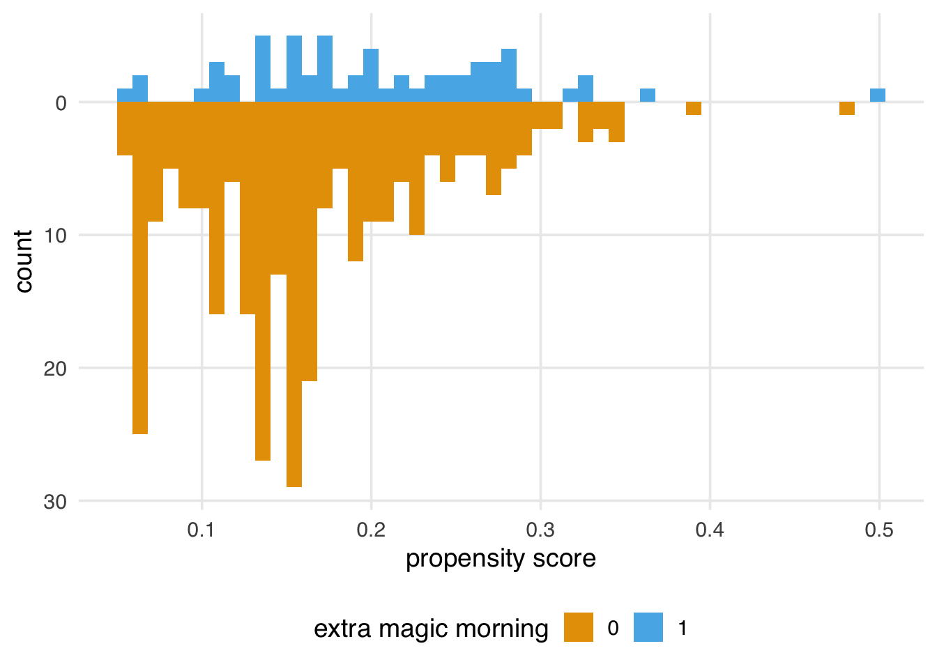
Here are some questions to ask to gain diagnostic insights we gain from Figure 8.2.
Look for lack of overlap as a potential positivity problem. But too much overlap may indicate a poor model
Avg treatment effect among treated is easier to estimate with precision (because of higher counts) than in the control group.
A single outlier in either group concerning range could be a problem and warrant data inspection
8.2 Choosing what variables to include
The best way to decide what variables to include in your propensity score model is to look at your DAG and have at least a minimal adjustment set of confounders. Of course, sometimes, essential variables are missing or measured with error. In addition, there is often more than one theoretical adjustment set that debiases your estimate; it may be that one of the minimal adjustment sets is measured well in your data set and another is not. If you have confounders on your DAG that you do not have access to, sensitivity analyses can help quantify the potential impact. See Chapter 11 for an in-depth discussion of sensitivity analyses.
Accurately specifying a DAG improves our ability to add the correct variables to our models. However, confounders are not the only necessary type of variable to consider. For example, variables that are predictors of the outcome but not the exposure can improve the precision of propensity score models. Conversely, including variables that are predictors of the exposure but not the outcome (instrumental variables) can bias the model. Luckily, this bias seems relatively negligible in practice, especially compared to the risk of confounding bias (Myers et al. 2011).
Some estimates, such as the odds and hazard ratios, suffer from an additional problem called non-collapsibility. For these estimates, adding noise variables (variables unrelated to the exposure or outcome) doesn’t reduce precision: they can bias the estimate as well—more the reason to avoid data-driven approaches to selecting variables for causal models.
Another variable to be wary of is a collider, a descendant of both the exposure and outcome. If you specify your DAG correctly, you can avoid colliders by only using adjustment sets that completely close backdoor paths from the exposure to the outcome. However, some circumstances make this difficult: some colliders are inherently stratified by the study’s design or the nature of follow-up. For example, loss-to-follow-up is a common source of collider-stratification bias; in Chapter XX, we’ll discuss this further.
A variable can also be both a confounder and a collider, as in the case of so-called butterfly bias:
ggdag(butterfly_bias()) +
  theme_dag()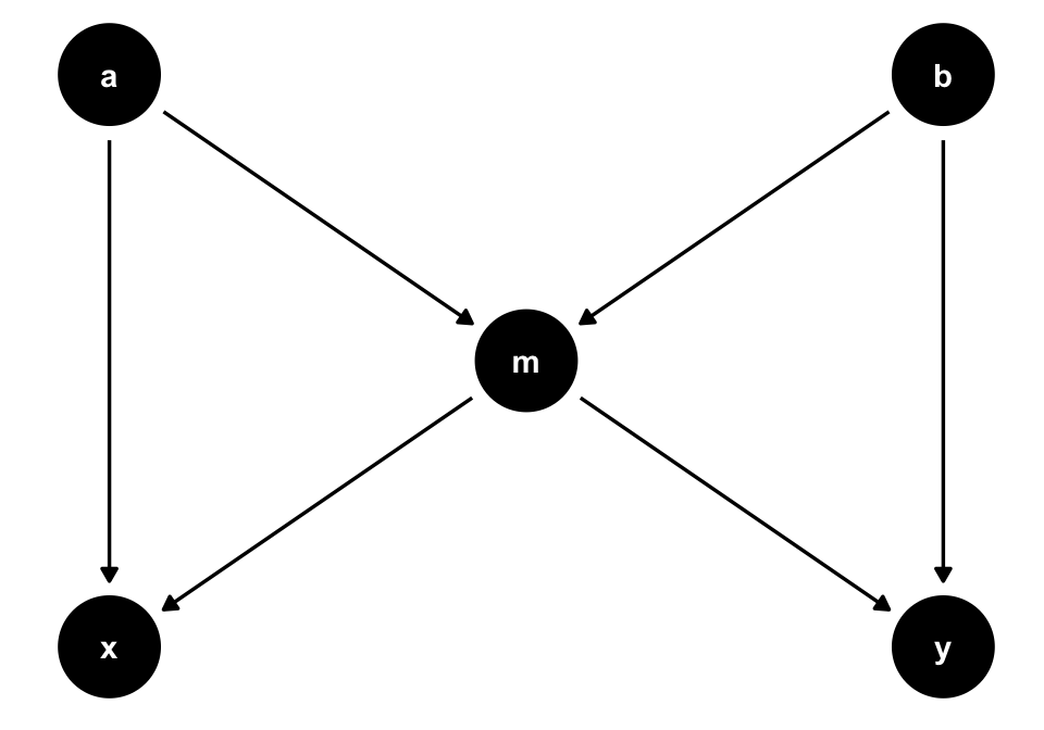
m, which is both a collider and a confounder for x and y. In situations where you don’t have all measured variables in a DAG, you may have to make a tough choice about which type of bias is the least bad.Consider Figure 8.3. To estimate the causal effect of x on y, we need to account for m because it’s a counfounder. However, m is also a collider between a and b, so controlling for it will induce a relationship between those variables, creating a second set of confounders. If we have all the variables measured well, we can avoid the bias from adjusting for m by adjusting for either a or b as well.
ggdag_adjustment_set(butterfly_bias()) +
  theme_dag() +
  theme(legend.position = "bottom")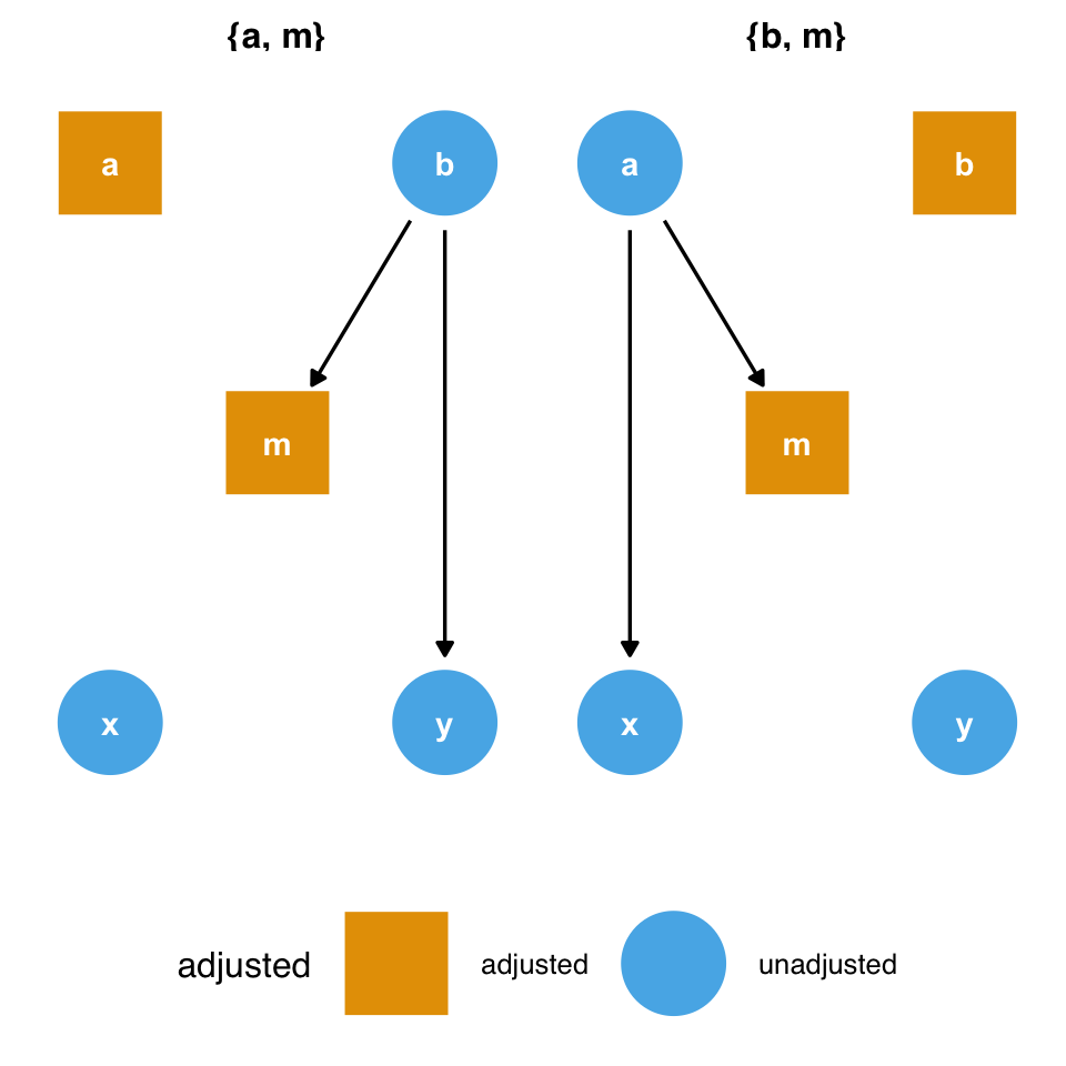
m and the collider bias induced by adjusting for it. But what if we don’t have a or b?However, what should we do if we don’t have those variables? Adjusting for m opens a biasing pathway that we cannot block through a and b(collider-stratification bias), but m is also a confounder for x and y. As in the case above, it appears that confounding bias is often the worse of the two options, so we should adjust for m unless we have reason to believe it will cause more problems than it solves (Ding and Miratrix 2015).
8.2.1 Don’t use prediction metrics for causal modeling
By and large, metrics commonly used for building prediction models are inappropriate for building causal models. Researchers and data scientists often make decisions about models using metrics like R2, AUC, accuracy, and (often inappropriately) p-values. However, a causal model’s goal is not to predict as much about the outcome as possible (Hernán and Robins 2021); the goal is to estimate the relationship between the exposure and outcome accurately. A causal model needn’t predict particularly well to be unbiased.
These metrics, however, may help identify a model’s best functional form. Generally, we’ll use DAGs and our domain knowledge to build the model itself. However, we may be unsure of the mathematical relationship between a confounder and the outcome or exposure. For instance, we may not know if the relationship is linear. Misspecifying this relationship can lead to residual confounding: we may only partially account for the confounder in question, leaving some bias in the estimate. Testing different functional forms using prediction-focused metrics can help improve the model’s accuracy, potentially allowing for better control.
Another technique researchers sometimes use to determine confounders is to add a variable, then calculate the percent change in the coefficient between the outcome and exposure. For instance, we first model y ~ x to estimate the relationship between x and y. Then, we model y ~ x + z and see how much the coefficient on x has changed. A common rule is to add a variable if it changes the coefficient ofx by 10%.
Unfortunately, this technique is unreliable. As we’ve discussed, controlling for mediators, colliders, and instrumental variables all affect the estimate of the relationship between x and y, and usually, they result in bias. In other words, there are many different types of variables besides confounders that can cause a change in the coefficient of the exposure. As discussed above, confounding bias is often the most crucial factor, but systematically searching your variables for anything that changes the exposure coefficient can compound many types of bias.